Creating engaging and visually appealing presentations is crucial in today’s information-centric world. Particularly when using Google Slides, mastering the art of layout can significantly elevate the delivery of your message.
This guide is your go-to resource for learning how to create text columns in Google Slides, an essential skill that enhances the clarity and visual appeal of your slides. Whether you’re aiming to compare data, organize information neatly, or simply make the best use of space on your slide, adding columns can transform your presentation slides into a more effective communication tool.
By mastering columns in Google Slides, your presentations will not only convey information more clearly but also capture the attention of your audience with a polished, professional look.
How to Add Text Columns in Google Slides?
Organizing text-heavy slides into columns can make your material more digestible:
Step 1: Start With a Blank Slide
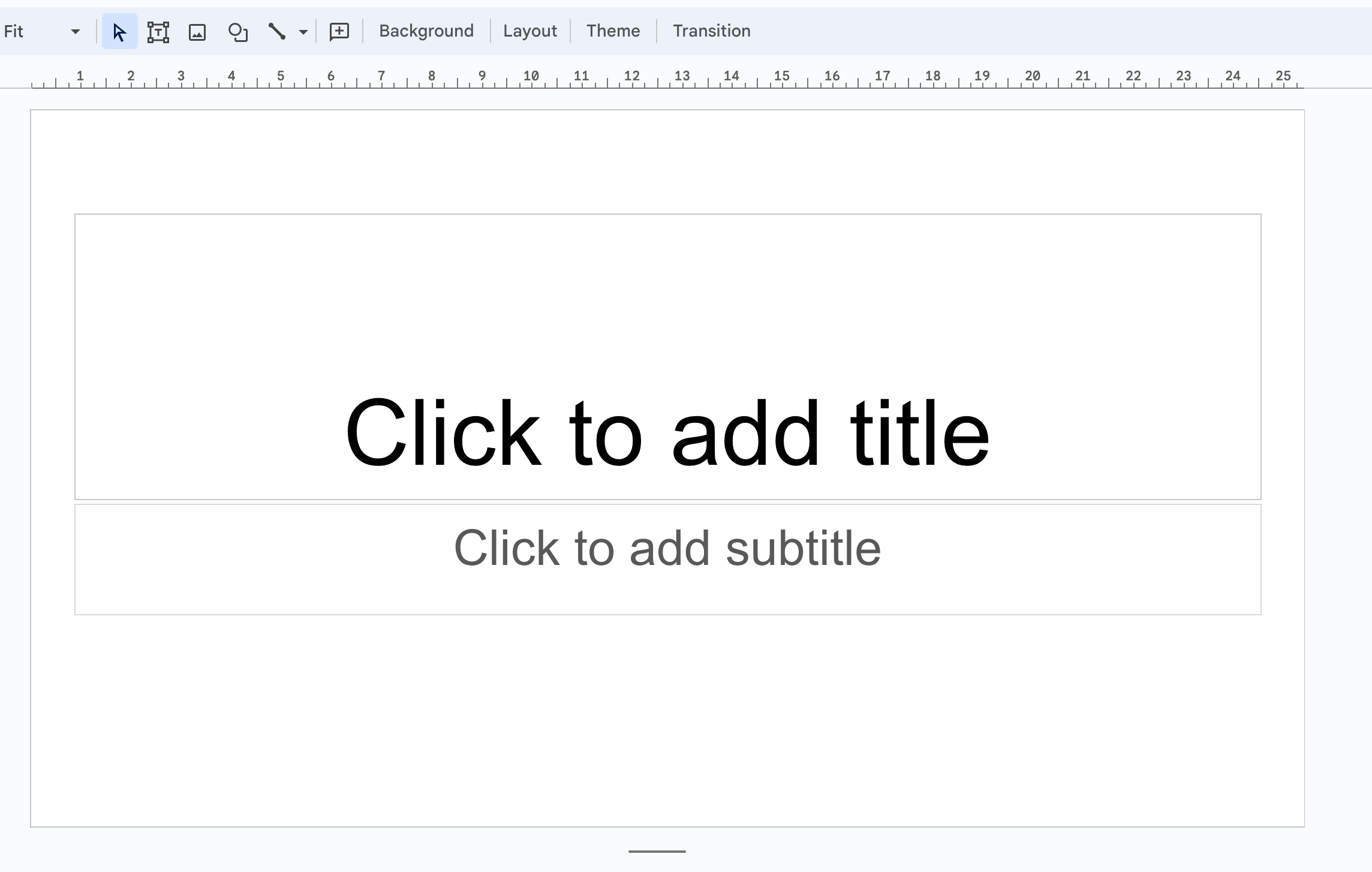
Open Google Slides. First things first, kick things off by opening a new, blank slide in your Google Slides presentation. This clean slate will serve as the foundation for your creative column layout.
Step 2: Use the Layout Menu
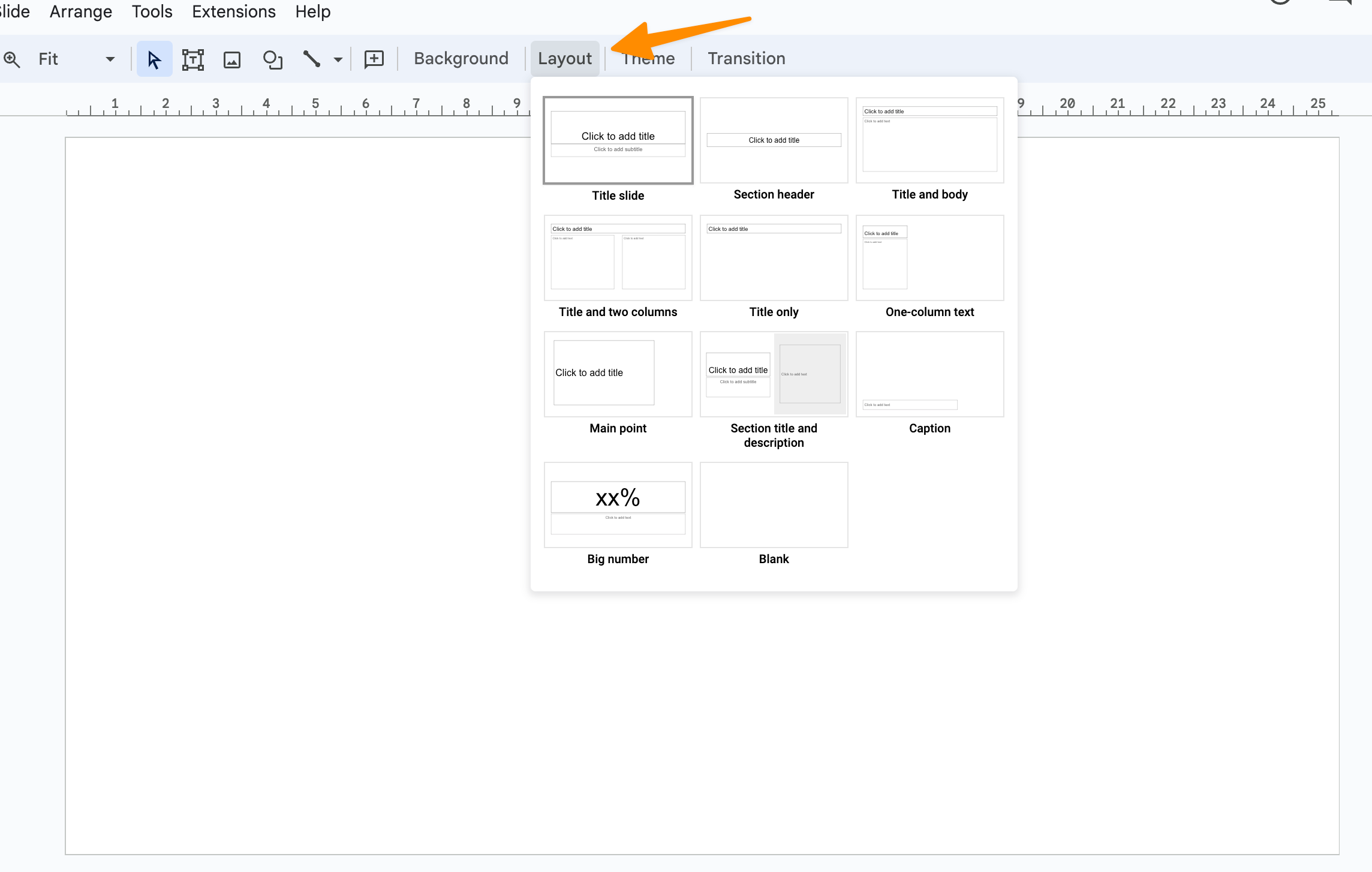
Next, take a peek at the Layout menu in the toolbar. Clicking on it reveals various layout options—including the straightforward “One column text” or the more columns like “Title and two columns”, use drag and drog to add columns;
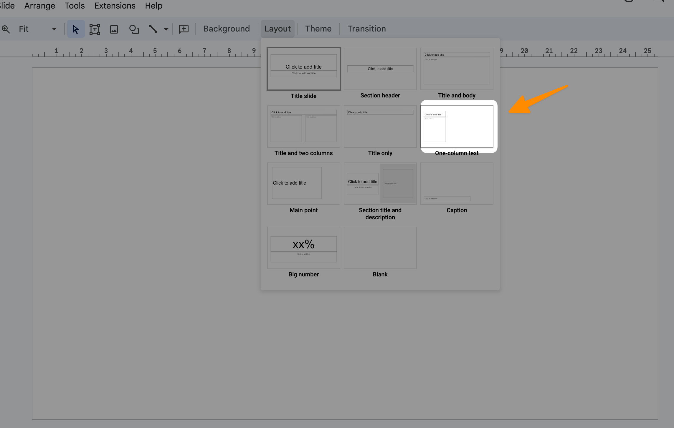
You can also add multiple columns to it using other text layouts menu.
Step 3: Adjust the Text Box
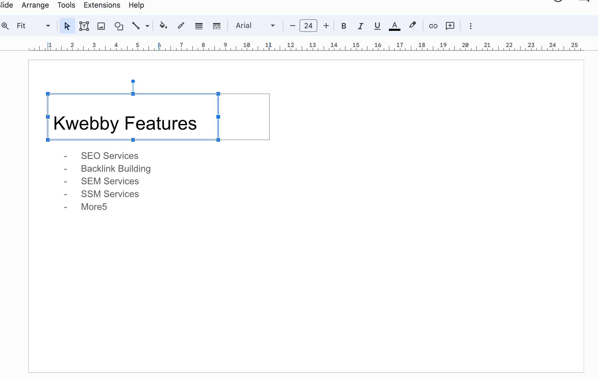
Once you’ve got your layout selected, it’s time to draw your text box over the slide. This is where the magic happens.
Stretch that box across your slide, then right-click (or control-click for Mac users) to access the Format options. Here, you can tweak the column settings to your heart’s content.
Step 4: Add Text Content
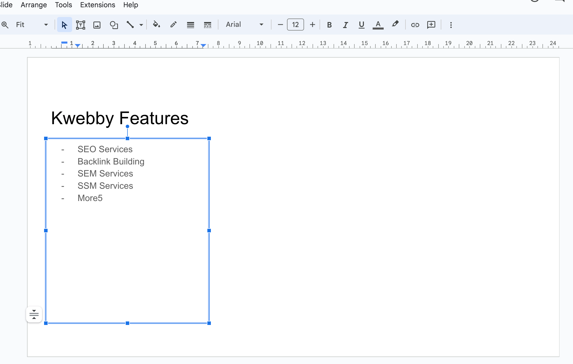
Now for the fun part—adding your content! Start typing or pasting your text into the designated columns. Feel free to play around with bullet points, numbering, or other formatting options to increase the readability of your slides. Remember, well-structured text columns not only make your Google Slides presentations look more professional but also help convey your message more effectively.
Step 5: Visual Enhancements
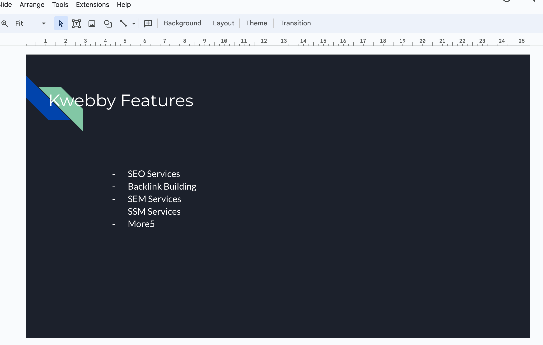
Finally, consider adding some visual elements to your slide. Whether it’s images, charts, or icons, these additions can illustrate key points or add an extra layer of visual interest to your slides.
And there you have it—a step-by-step guide to making your Google Slides columns stand out, enhancing the visual appeal and clarity of your presentation slides.
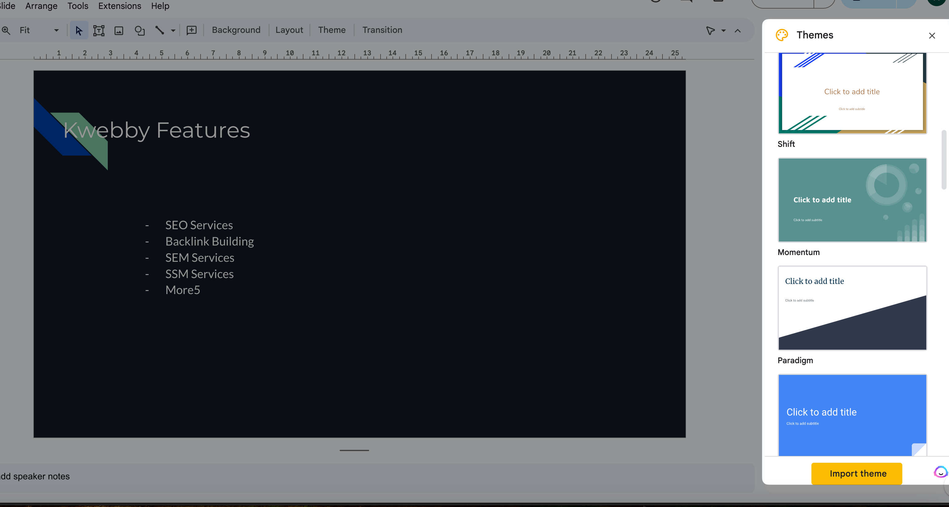
By following these straightforward steps, you’ll be well on your way to mastering how to create text columns in Google Slides. This skill is crucial for anyone looking to design Google Slides presentations that are not only informative but visually appealing.
Conclusion
Mastering how to create text columns in Google Slides is a valuable skill for anyone looking to make their presentations more engaging and visually appealing. By following the step-by-step guide outlined above, you can transform dense, text-heavy slides into clear, concise, and visually attractive presentations.
Incorporating columns in Google Slides not only enhances the visual appeal of your presentations but also aids in delivering your message in a more organized and digestible format.
From using the text box form and layout menu to insert new tables or add table columns, to exploring different methods like the insert tab or format tab for adding content or adjusting the layout, the possibilities are vast.
It’s clear that whether you’re working on a blank slide or an existing slide, the tools provided within Google Slides, such as the layout menu, dropdown menu, and formatting options, empower you to create columns that can significantly improve the delivery of your presentation.
Remember, the goal is to keep your audience engaged and informed from beginning to end. By efficiently utilizing the slide layout options to make columns in Google, integrating bullet points for clarity, and employing visual elements like images or tables for additional interest, your Google Slides presentations will not only convey your message effectively but also stand out as professionally designed pieces.


