So, you’ve got a dazzling website to show off, but those pesky large layout shifts are throwing a wrench in your plans!
Nobody likes it when their carefully crafted content jumps around like it’s on a trampoline.
To keep your pages looking sleek and polished, you want to embrace the art of avoiding large layout shifts. This means setting fixed height and width attributes for your images and snagging a bit of CSS magic to create placeholders for ads and embeds.
And hey, don’t forget about managing font loading — no one wants to deal with invisible text or unexpected shifts that leave your users scratching their heads.
By understanding the importance of cumulative layout shift and adopting responsive design principles, you can ensure a smooth ride for your visitors on any device. Let’s dive into these strategies and wave goodbye to layout instability for good!
How does Large Layout Shifts affect a page’s performance?
Picture this: you’re cruising through your favorite website, ready to click on that shiny button or fill out a contact form, and—bam!—the page shifts just as you’re about to engage. Talk about a buzzkill! This is where large layout shifts come into play.
When a page is unstable and elements dance around unexpectedly, it leads to unintentional clicks and a frustrating user experience.
This instability can drag down your cumulative layout shift score, or CLS, which might seem like a small number (only 5% impact on the Performance Score), but it’s a biggie when it comes to user perception. Let’s break down how these shifts mess with user interactions:
- Cumulative Layout Shift: This is the sum of all unexpected layout shifts during the lifespan of a page, highlighting how much the content has moved around while loaded.
- Impact on User Interaction: When things shift unexpectedly, it confuses users. They might tap on the wrong link or not know where to look, leading to frustration.
- Mobile Experience: On smaller screens, layout stability is critical. A poor CLS results in a janky experience that can drive users away.
- Visual Stability and Page Experience: An unstable layout not only affects immediate interactions but also overall page experience metrics, which are vital for SEO.
- Font Loading and Invisible Text: When fonts load slowly, it can lead to text shifting as a fallback font displays first, resulting in a disruptive experience.
- Image Dimensions and Responsive Design: If images don’t have defined dimensions, they can push other elements around as they load, causing layout shifts.
Avoid large layout shifts by ensuring your images have fixed dimensions, managing your font loading techniques, and reserving space for dynamic content.
All these strategies contribute to a smoother user experience, especially on mobile. Keep your pages polished and ready for action—no one likes dealing with layout instability!
By optimizing these aspects, not only will you enhance user interaction, but you’ll also be ticking off boxes in the technical SEO checklist, improving your Google Pagespeed Insight scores along the way.
Now, who’s ready to wave goodbye to the unpredictability of layout shifts?
How to Identify Elements that are Shifting on Your Page
Alright, let’s get into the nitty-gritty of identifying those pesky elements that are causing layout shifts. You don’t want your visitors experiencing spontaneous page gymnastics, right? Here are some handy methods to pinpoint what’s moving around on your site.
#1 Use PageSpeed Insights for Instant Feedback
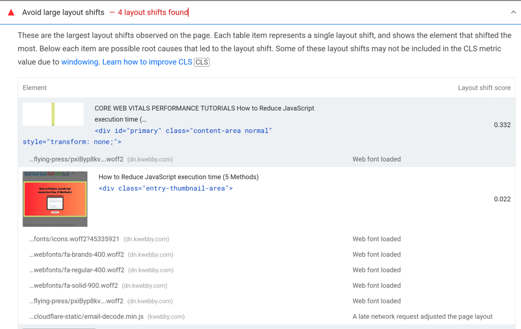
The “Avoid large layout shifts” warning in PageSpeed Insights can be your best friend. This feature tells you exactly which elements have the highest cumulative layout shift (CLS) scores, giving you a heads-up on what needs fixing. Just enter your URL, click on the diagnostics section, and see which elements are causing the most trouble.
#2 Leverage the Cumulative Layout Shift Debugger Tool
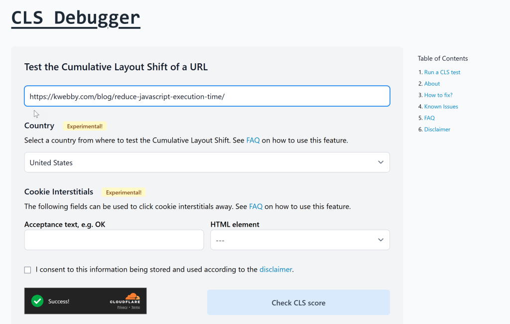
Feeling fancy?
The Cumulative Layout Shift Debugger tool uses the Layout Instability API to spot elements that are shifting. It works on both desktop and mobile devices, and it visualizes the layout shifts for easy identification. Just plug in your URL, and let the tool work its magic to show you where the instability lies.
#3 Create a Layout Shift GIF
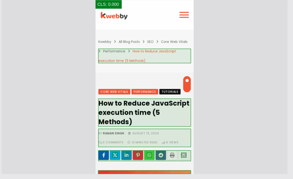
Want a moving picture of your woes?
The Layout Shift GIF Generator creates a GIF that showcases the elements on your site that are shifting. This is a powerful way to get a visual understanding of the cumulative layout shift issues at a glance. Share it with your team during your next brainstorming session!
#4 Dive into Chrome DevTools
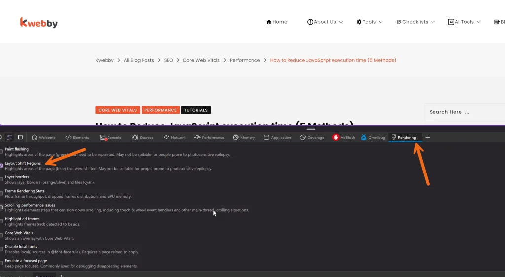
Google’s Chrome DevTools is a treasure trove for diagnosing layout shifts. Here’s how you can use it:
- Open the webpage you want to analyze.
- Right-click anywhere on the page and select “Inspect” to access the DevTools menu.
- Click on “More tools” and enable the Rendering tab.
- In the Rendering tab, choose “Layout Shift Regions” and reload the page.
- Voilà! Elements that shifted unexpectedly will be highlighted in blue, making it easy to see the culprits.
#5 Utilize GTmetrix for a Comprehensive Look
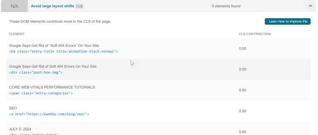
GTmetrix is another great tool that can trigger an audit of your page. It provides insights into your layout shift score and helps you understand the impact fraction of various elements in terms of user’s interaction. Just enter your URL, hit “Analyze,” and get a rundown of your layout shift metrics along with the suggestions for improvement.
By using these tools, you can effectively identify which page elements are contributing to unexpected shifts.
Say goodbye to unstable layouts and hello to a snappy, user-friendly experience!
Let’s optimize that cumulative layout shift, manage web fonts better, and reserve adequate space for dynamic content. Your visitors will thank you with every click!
You can also use Kwebby’s Website reviewer to get these metrics on the go.
How to Avoid Large Layout Shifts
#1 – Specify Your Image’s Height and Width (Dimensions)
To keep your web pages stable and prevent unexpected layout shifts, it’s essential to specify both the width and height for your images and video elements. By doing this, you reserve the correct spacing beforehand, allowing the content to load smoothly without creating chaos on the screen. If you want an alternative, consider using CSS aspect ratio boxes to maintain your layout’s integrity. This method helps maintain the right proportions regardless of the device being used, ensuring a delightful user experience.
For Non-WordPress Users
Here’s a quick example of how to set dimensions for an image in HTML:
<img src="your-image.jpg" alt="Description of image" width="600" height="400">This simple code snippet ensures the browser knows the size of the image before it’s fully loaded, thus avoiding any layout shifts that may frustrate users.
For WordPress Users
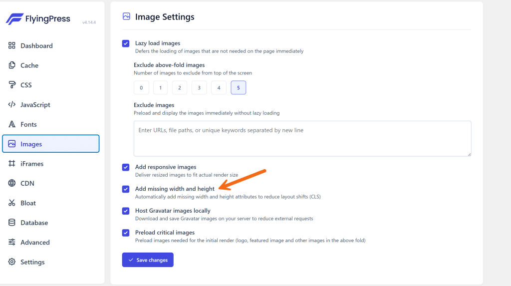
If you’re using WordPress, you can easily manage image dimensions using the FlyingPress plugin. Here’s how to get started:
- Install the FlyingPress Plugin: Navigate to your WordPress dashboard, go to Plugins > Add New, and search for ‘FlyingPress.
- Activate the Plugin: Once installed, click ‘Activate’ to enable it on your site.
- Access the FlyingPress Dashboard: In your WordPress dashboard, find ‘FlyingPress’ in the menu on the left.
- Select Image Settings: Click on the ‘Image’ tab within the FlyingPress dashboard.
- Enable Missing Image Dimensions: Find the option for missing image dimensions and toggle it on. This will auto-generate the necessary dimensions for your images, helping to minimize those pesky cumulative layout shift issues.
By following these steps, you’ll improve your layout stability and user interaction. With a lower cumulative layout shift score, you’re bound to see enhancements in your site’s performance metrics such as Google PageSpeed Insights and the largest contentful paint, making for a polished and user-friendly experience.
#2 – Use Placeholders for Shifts Caused by Ads, Embeds, Iframes
To tackle those annoying layout shifts that pop up thanks to ads, embeds, and iframes, it’s all about reserving the right space before the chaos begins.
By laying claim to the largest ad slot size ahead of loading the ad library, you prevent that last-minute scramble that throws your layout into disarray. And hey, if an ad doesn’t come through, use a placeholder to keep things looking neat instead of letting a gaping hole take over your page. Plus, moving ads to the bottom or out of the viewport can make a world of difference for a snappier user experience.
For Non-WordPress Users
Here’s a little HTML snippet to set up a placeholder for an ad:
<div style="width: 300px; height: 250px; background-color: #f0f0f0;">

<img src="path-to-placeholder-image.jpg" alt="Loading ad..." style="width: 100%; height: 100%; object-fit: cover;">

</div>

<!-- Actual ad will be loaded here once available -->
This code reserves a space for your ad, ensuring that when it loads, it won’t jolt your layout unexpectedly.
For WordPress Users
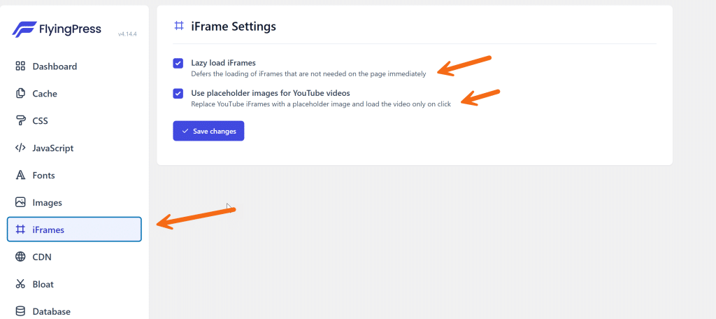
Using the FlyingPress plugin is a breeze! Here’s how you can get things sorted:
- Install the FlyingPress Plugin: Go to your WordPress dashboard, navigate to Plugins > Add New, and search for ‘FlyingPress’.
- Activate the Plugin: After installation, click ‘Activate’ to turn it on.
- Access the FlyingPress Dashboard: Find ‘FlyingPress’ in your left-hand menu.
- Navigate to the Iframes Tab: Click on the ‘Iframes’ tab within the FlyingPress dashboard.
- Enable the Following Options:
- Lazy load iFrames: This defers the loading of iframes that aren’t immediately needed, helping to reduce shift.
- Use placeholder images for YouTube videos: Replace YouTube iFrames with a placeholder image, which only loads the video upon click.
By reserving that all-important space and utilizing these tools, you’ll effectively optimize your cumulative layout shift scores and enhance your site’s performance metrics. No more unexpected layout shifts will disrupt your user interaction or frustrate visitors, leading to a more stable, enjoyable experience as they engage with your content.
#3 – Don’t Add Anything Above Existing Content
When it comes to web design, keeping your layout stable is key to delivering a smooth user experience. One effective way to avoid large layout shifts is to steer clear of inserting dynamic content—like banners, forms, or anything else that wiggles into view—above your existing content. This sneaky placement can lead to unexpected layout shifts, leaving users confused and frustrated. Instead, focus on these strategies:
- Position elements thoughtfully: If you’re planning to add something new, consider placing it below the existing content. This way, users can engage with what’s already there without interruptions.
- Respond to user interactions: If you must add something that could impact the layout, do it in response to a user action, such as a click. This helps maintain the flow and keeps the experience stable.
- Reserve space ahead of time: Plan for the size of your dynamic elements beforehand, which decreases the risk of layout instability. Using well-defined ad slots or placeholders for ads can help save space without leading to a layout change later.
Example Scenario
Imagine you have an amazing pop-up subscription form that you really want your visitors to see. Instead of letting it slide in from the top, pop that form up in the corner as a response to user interaction. It keeps things tidy and prevents any abrupt shifts that could ruin the overall experience.
By avoiding the insertion of dynamic content above existing elements, you’ll not only enhance your layout stability, but also optimize your cumulative layout shift score.
Plus, this attention to detail can significantly improve metrics like the largest contentful paint and overall page speed insights. Thank your users with a seamless experience that keeps them engaged rather than puzzled by unexpected shifts or layout instability.
#4 – Ensure Your Text Remains Visible
When it comes to maintaining a polished layout, you definitely want to tackle the Flash of Invisible Text (FOIT) issue, as it can wreak havoc on your cumulative layout shift score.
To keep your text visible while web fonts load, consider preloading these fonts and utilizing the font-display attribute.
For example, by using font-display: swap, you can display a fallback font until your custom font is fully loaded, ensuring your content remains readable.
This is especially crucial for avoiding large layout shifts that might confuse users and negatively impact their interaction with your site. Additionally, by optimizing font loading strategies, you can enhance your Google PageSpeed Insights metrics, making sure your site’s layout remains stable and your text legible during the loading process.
This proactive approach not only reduces unexpected shifts but also improves overall user experience and reinforces good technical SEO practices.
So, don’t let your fonts become an unstable element affecting your largest contentful paint!
#5 – Optimize Fonts
Custom fonts can be a sneaky culprit behind those annoying large layout shifts, impacting your cumulative layout shift score and overall user experience. When using downloaded fonts, you might encounter FOIT (flash of invisible text) or FOUT (flash of unstyled text), leading to confusion as users wait for the proper typography to load. But fear not! There’s a straightforward method to tackle these issues by preloading your custom fonts and leveraging the font-display property. By specifying `rel=”preload”` and using `font-display: optional`, you’ll avoid those sudden shifts that can disrupt your carefully crafted layout.
For Non-WordPress Users
Here’s how to get your custom fonts loading like a charm:
<link rel="preload" href="path-to-your-font.woff2" as="font" type="font/woff2" crossorigin="anonymous">

<style>

@font-face {

font-family: 'YourCustomFont';

src: url('path-to-your-font.woff2') format('woff2');

font-display: optional; /* This avoids FOIT */

}

</style>
This code snippet ensures your custom fonts are preloaded, minimising layout shifts and keeping your text visible.
For WordPress Users
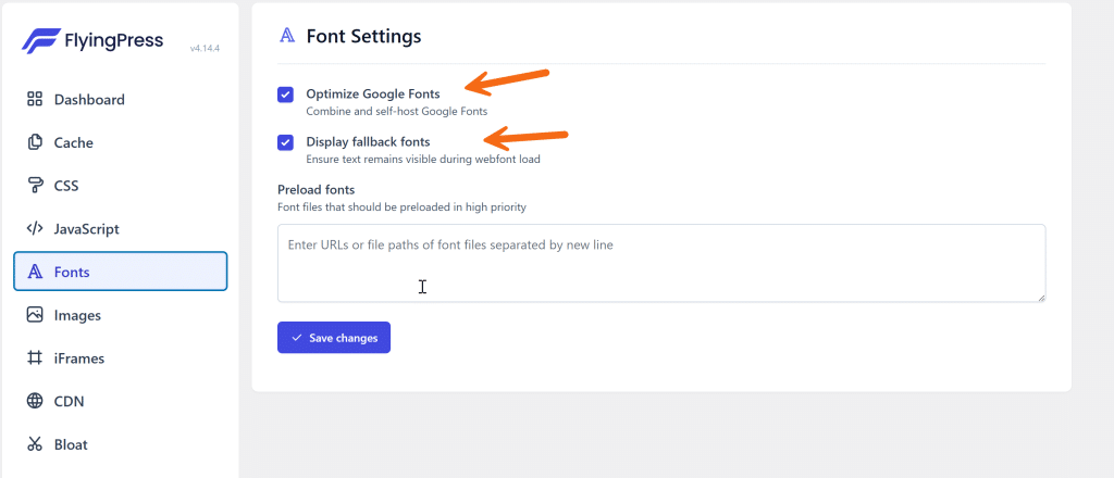
Using the FlyingPress plugin is a breeze for font optimization! Just follow these steps:
- Install the FlyingPress Plugin: Navigate to your WordPress dashboard, go to Plugins > Add New, and search for ‘FlyingPress’.
- Activate the Plugin: Once installed, click ‘Activate’ to get it up and running.
- Open the FlyingPress Dashboard: Find ‘FlyingPress’ in your left-hand menu.
- Select Fonts: Click on ‘Fonts’ from the sidebar.
- Enable the Following Options:
- Optimize Google Fonts: This setting addresses any unnecessary requests for external fonts and ensures your typography is loaded quickly.
- Display Fallback Fonts: This will show users an instant fallback font until your custom font is fully loaded.
- Preload Fonts: Enter links to your custom fonts to preload them, ensuring minimal layout shift.
By using these techniques, you’ll not only improve your Google PageSpeed Insights scores but also create a seamless experience for your users, helping you avoid large layout shifts and improve your overall layout stability. This proactive approach enhances your site’s technical SEO and keeps your content presenting beautifully without those pesky unexpected shifts.
#6 – Load Third Party Script Via Cloudflare’s Zaraz
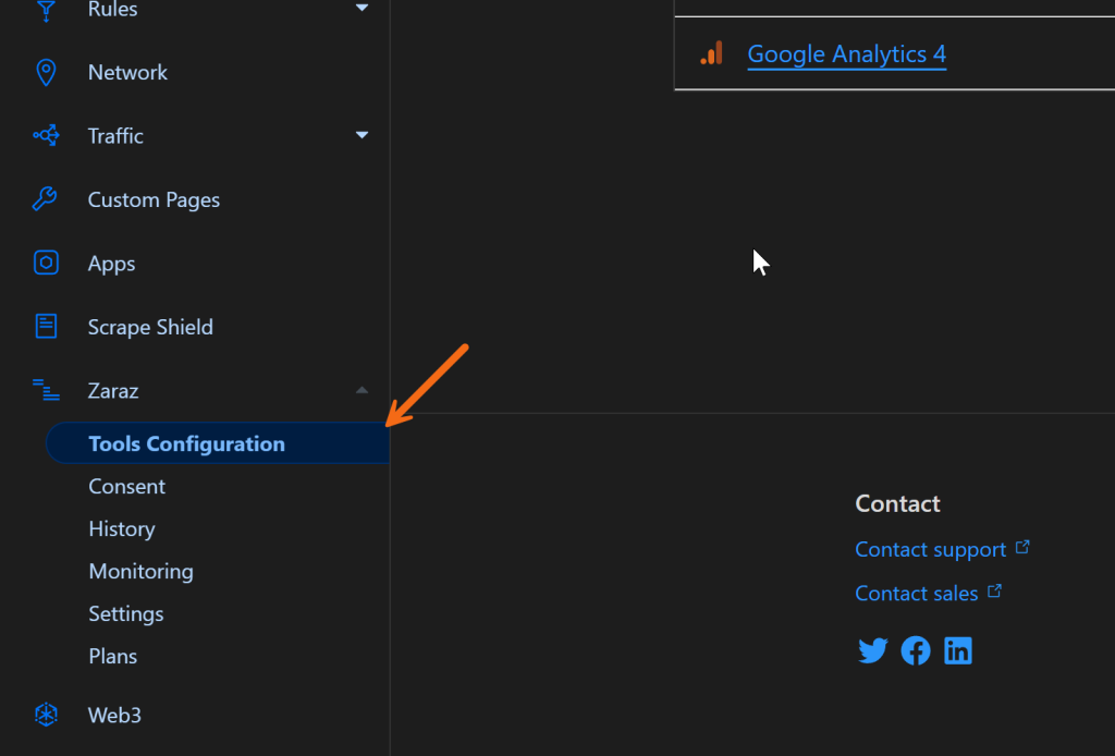
To enhance your site’s performance while avoiding those pesky shifts related to third-party scripts, using Cloudflare’s Zaraz is a smart move. Here’s a step-by-step guide to get you started:
- Access Cloudflare Dashboard: Begin by logging into your Cloudflare account. The dashboard will give you an overview of your site’s performance, security, and settings.
- Select Zaraz: From the left-hand menu, find and click on the Zaraz option. This tool is designed to help you manage third-party scripts efficiently, ensuring that your site’s layout remains stable.
- Add New Tool: Once you’re in the Zaraz interface, look for the “Add New Tool” button and click it. This is your gateway to integrating various third-party dependencies without causing layout instability.
- Choose a Template or Custom HTML: You will see a range of pre-made templates that can simplify the integration process. Select one that fits your needs, or opt for the custom HTML option if you want more control over how scripts are loaded.
- Configure Your Script: If using a template, follow the guided prompts to set up the tool effectively. If you’ve chosen the custom HTML option, paste your script code ensuring it’s optimized for loading. This ensures that your custom fonts and other elements do not introduce unwanted cumulative layout shift issues.
- Test and Monitor: After setting up, run tests to see how your changes are affecting your site’s performance through Google PageSpeed Insights. Keep an eye on your layout stability, ensuring that no unexpected shifts occur when users interact with your page.
By following these steps, you can efficiently manage third-party dependencies with Cloudflare’s Zaraz, which helps in reducing input delays, enhancing page speed insights, and ensuring a smooth user experience without the fear of layout instability.
This proactive approach not only optimizes cumulative layout shift measures but also reinforces good technical SEO practices that will keep your site performing at its best.
#7 – Don’t Use Non-Composited Animations
When it comes to creating smooth and visually appealing web experiences, non-composited animations can really throw a wrench in the works, leading to unwanted disruptions such as large layout shifts and increased input delay.
To keep things flowing seamlessly, stick to composited animations wherever possible. This approach minimizes the main-thread work, thereby avoiding the repainting of pixels during page load, which is crucial for enhancing your cumulative layout shift score.
By ensuring that animations occur on the GPU, rather than on the CPU, you’re significantly reducing the risk of unexpected shifts that can confuse users.
Additionally, when implementing dynamic content or transitioning page elements, consider aspects such as the height attribute and image dimensions to ensure that space is reserved ahead of time.
This way, you’re less likely to encounter issues with largest contentful paint and layout instability. Overall, prioritizing composited animations is a savvy way to optimize your page speed insights and reinforce good technical SEO practices, all while providing a better user experience.
Wrapping Up!
In conclusion, optimizing your site for performance while avoiding large layout shifts is crucial for creating a seamless user experience. By implementing strategies such as preloading web fonts, utilizing tools like Cloudflare’s Zaraz for managing third-party scripts, and focusing on composited animations, you can significantly improve your cumulative layout shift score.
Remember to consider aspects like image dimensions and the height attribute for dynamic content, which helps reserve space and reduce unexpected shifts during user interaction.
Keeping your Google PageSpeed Insights in check and minimizing input delay ensures that your site not only looks great but performs well, providing users with a smooth navigation experience.
As you tackle these cumulative layout shift measures, you’re reinforcing good technical SEO practices that will make your site more stable and efficient, laying the groundwork for higher engagement and better overall performance in the ever-evolving digital landscape.

