With the rise of mobile browsing and speed-conscious users, it is becoming increasingly crucial to properly size images for optimal performance. Google warns about the significance of properly sizing images, not just a mere suggestion, but a critical step in improving site load time and conserving cellular data.
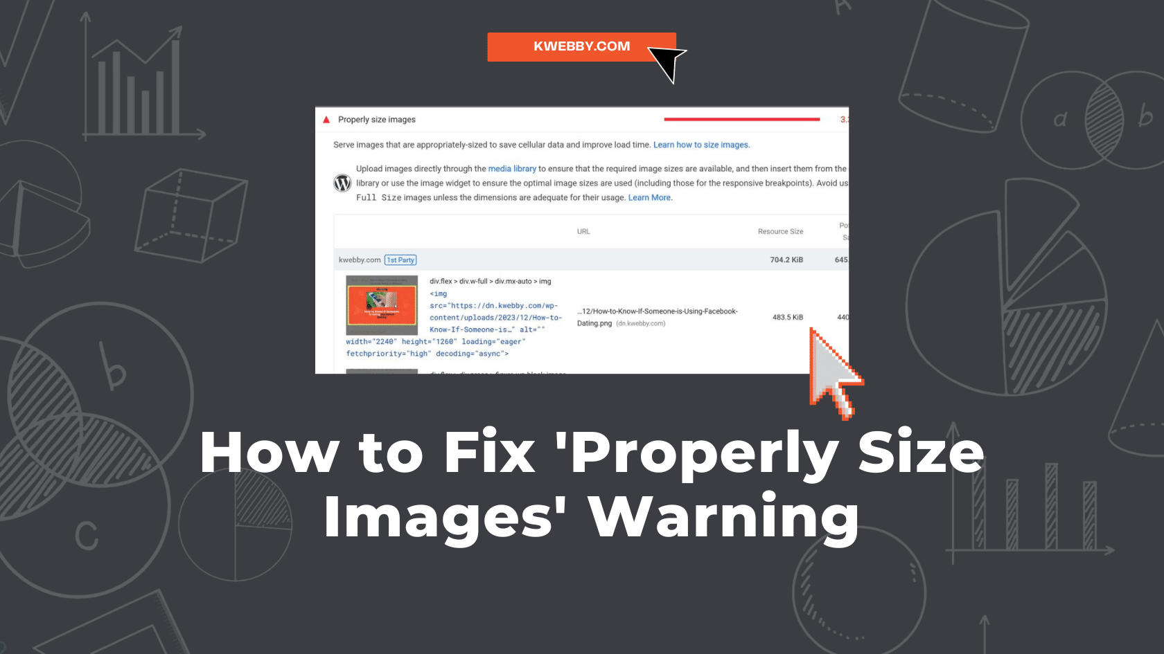
The “Properly Size Images” warning gets triggered when you run a site audit on Lighthouse or Pagespeed Insights and the warning looks like the below;

In this blog, we will discuss how to rectify this problem and serve images in proper sizes.
Perhaps you’ve encountered scenarios where the images you’ve uploaded far exceed the dimensions required for their specific use, leading to unnecessary data consumption and a sluggish loading process.
Have you thought about the consequences of serving an image that is much larger than its container?
In this guide, we will take a deep dive into practical tips to address this issue, exploring how to leverage the functionalities of WordPress and other tools to serve properly size images.
We’ll explore how to navigate situations where your theme or plugin demands a different image size to what you’ve already set in WordPress.
By the end of this guide, you’ll have a clear understanding of how to efficiently size your images to enhance your site’s performance and user experience.
Also read, What is Google Core Web Vitals? Step-by-step Guide to Improve it
How to Properly Size Images
Before delving into the specifics, it’s important to understand that WordPress simplifies image sizing considerably. No matter if you’re a seasoned developer or a beginner, WordPress provides tools and settings to make image sizing a breeze.
In this section, we’ll explore how you can effectively resize images directly within WordPress, ensuring your pages load quickly and your visuals look spot-on. Let’s get started.
#1 Resize Your Images to Correct Dimensions
The first step in properly sizing your images is to resize them to the correct dimensions. By using readily available software or online tools, you can achieve this with relative ease.
Use Online tools
For instance, Mac users can utilize the free Preview application, which allows for basic image editing including resizing, On the other hand, You may consider Canva, another free tool that offers a wide range of features including image resizing, compress images for properly sizing images for your website.
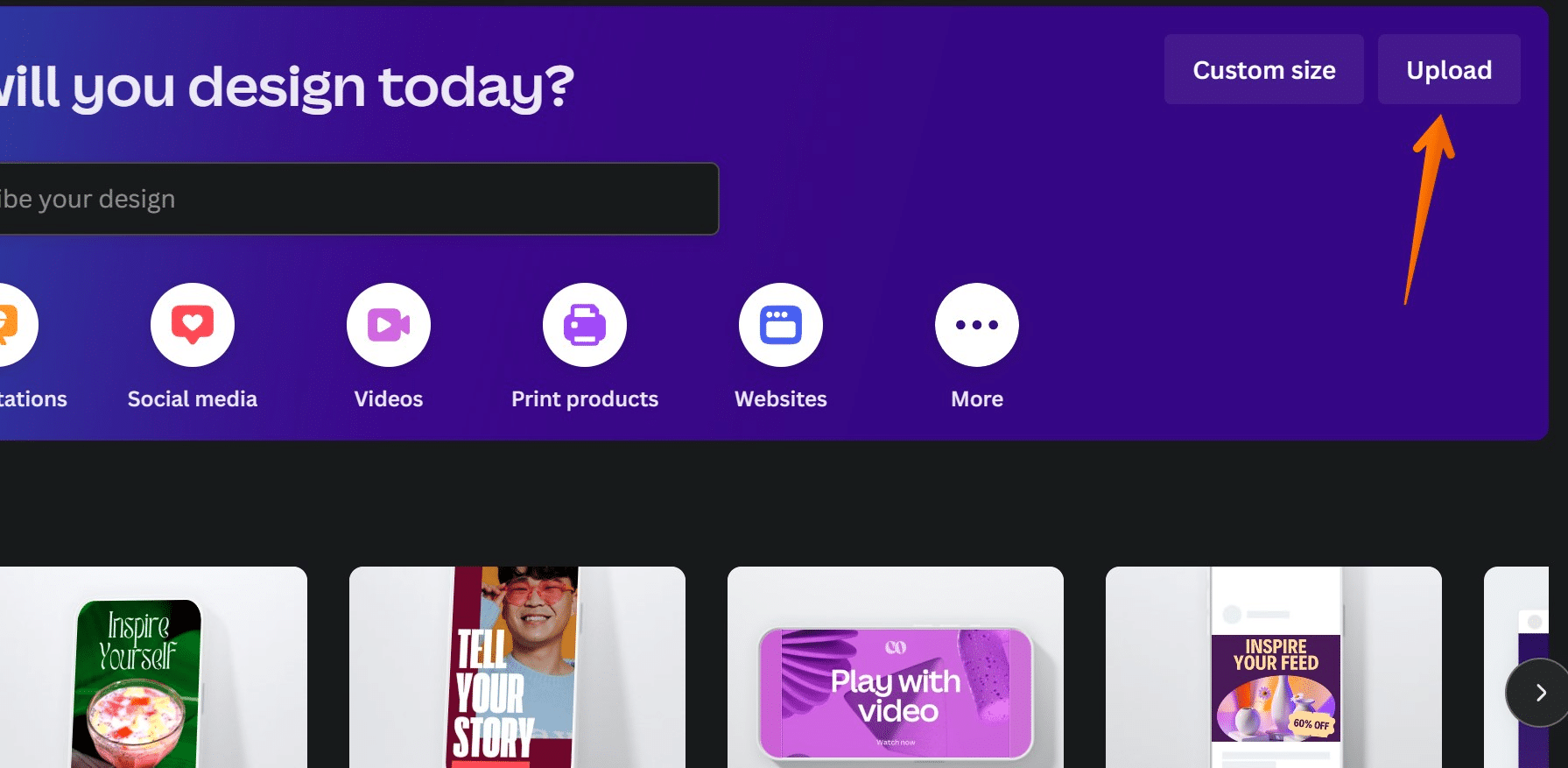
Upload images on Canva using the upload button;
Click on “use in a new design”;

Now select your custom size using “custom size images” option;
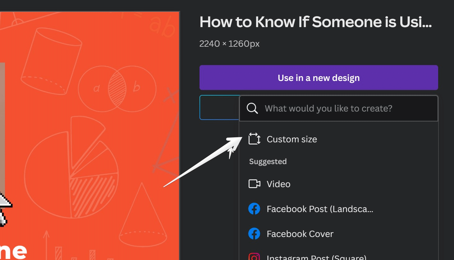
Then click on “create new design”
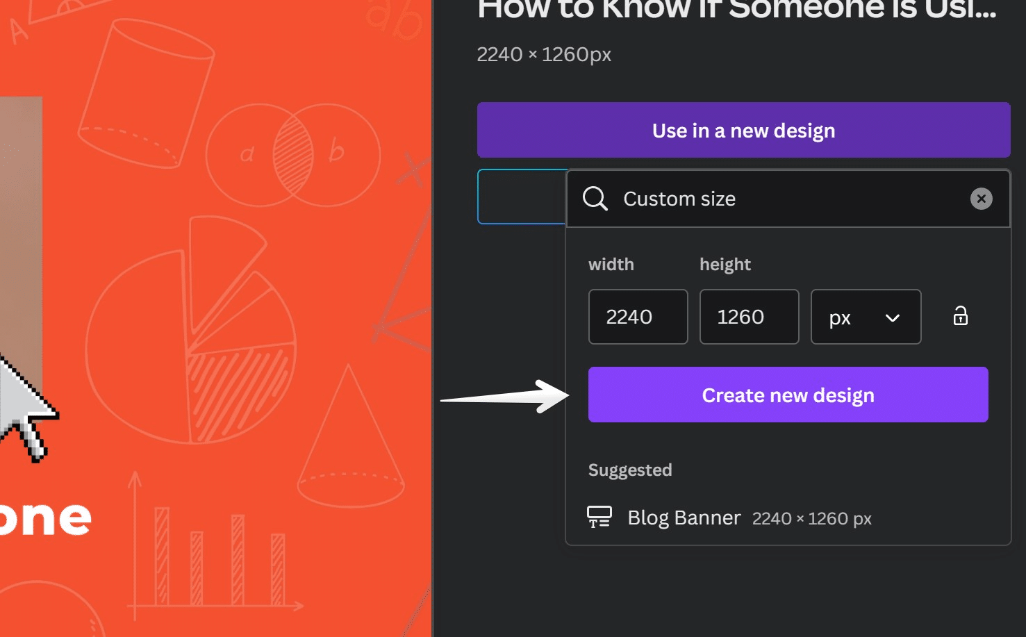
next, adjust your image to the custom size and then save and upload images to your website to serve images in required file size and removes properly size images warning.
While Photoshop and Lightroom are robust options, they may present a steep learning curve. For bulk resizing tasks, scripts like Imagemagick can automate the process, saving you considerable time and effort.
Use CDN
Besides software and online tools, an Image CDN (Content Delivery Network) can be a game-changer for your site. An Image CDN can transform, optimize, and deliver images, acting like an API that sorts the images used on your site according to the user device.
Leading CDN to serve images that properly size images is Bunny.net with Image Optimizer and Cloudflare’s Image Optimization tool which we have discussed below.
How does it work?
Each image loaded from an Image CDN has a URL that specifies the image to load, its size, format, and quality. This way, the CDN can transform and serve the image in the most optimized format. Furthermore, an Image CDN creates variations of an image for different use cases and reduces image byte consumption by a staggering 40%.
Companies that switched to an Image CDN, according to Google Developers, have saved a significant amount of data. Properly sizing your images has never been more crucial — or easier.
#2 Make Your Image Responsive
One of the most effective strategies for serving optimized images is the implementation of “responsive images”. This technique involves adjusting the height and width of images to fit any screen, be it mobile, tablet, or desktop. By optimizing images for the appropriate screen size, you can conserve bandwidth and accelerate browser execution.
To implement responsive images, you’ll need to create multiple versions of each image and specify in your HTML or CSS which one to use based on viewport dimensions and media queries. Keep in mind that the image size will vary according to your site’s layout breakpoints, which are the building blocks of responsive design.
Following Bootstrap standards, these are the viewport dimensions you should specify for each screen:
576px for portrait phones
768px for tablets
992px for laptops
1200px for large devices
But how does the browser know which image to serve based on the visitor’s screen? Checkout solution in the next section below.
#3 Serve Multiple Image Versions
Serving multiple versions of an image gives your website the ability to respond to the varying needs of your users. It allows the browser to select the most optimal image, saving data and improving your site’s load time. So, how does it work?
Before, you would use;
<img src="image.jpg">After, you use:
<img src="image.jpg" srcset="flower-small.jpg 480w, flower-large.jpg 1080w" sizes="50vw">The `<img>` tag utilizes the src, srcset, and sizes attributes to achieve this optimization. Here’s a breakdown of these attributes:
src attribute: This attribute serves as a fallback for browsers that do not support the srcset and sizes attributes. If a browser can’t read these attributes, it will default to loading the image specified by the src attribute. This image should be large enough to look good on all device sizes.
srcset attribute: The srcset attribute is a list of image filenames along with their width, or density descriptors. For example, 480w informs the browser that flower-small.jpg is 480px wide, and 1080w that flower-large.jpg is 1080px wide. These descriptors allow the browser to understand the width of an image without having to download it.
sizes attribute: The sizes attribute tells the browser how wide the image will display, which, along with the user’s device information, helps the browser determine which image to load. Note that this doesn’t affect the display size (that’s handled by CSS). If a browser doesn’t recognize the “sizes” attribute, it will default to loading the image specified by the “src” attribute.
You can also specify multiple slot sizes with the sizes attribute to accommodate different layouts for different viewport sizes. For bonus points, these concepts can be utilized for art direction, i.e., serving completely different images to different viewports.
#4 Use Cloudflare’s Image Resizing
Taking advantage of Cloudflare’s Image Resizing feature is a matter of a few simple steps. First, log in to the Cloudflare dashboard and select your account.
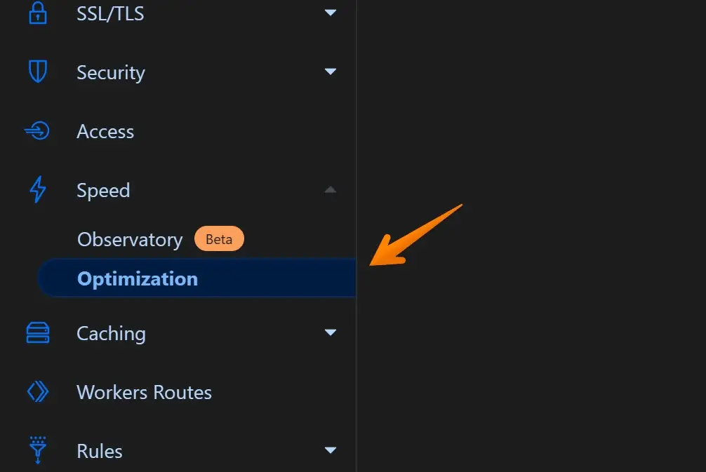
Then, navigate to Speed > Optimization.
Within the Image Optimization section, you’ll find the option to enable Image Resizing.
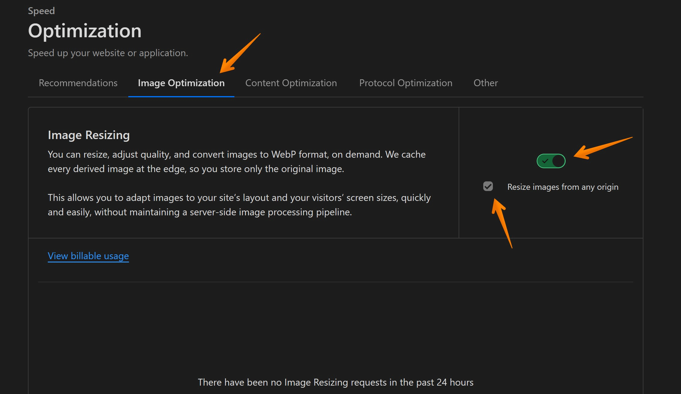
But what if you don’t want to resize images from any origin? No problem.
Just uncheck the box that says “Resize images from any origin,” and this feature will only resize images in the enabled zone.
This action prevents third-parties from resizing any image at any origin. Remember, if you’re using Image Resizing in a Worker, you need to include the appropriate logic in your Worker code to prevent resizing images from any origin.
Bear in mind that unchecking this option in the dash does not apply to image resizing requests coming from Cloudflare Workers.
Also read, How to Lazyload Images, Videos and Iframes in 2024
#5 Use Vector Based Image Formats
Utilizing vector-based image formats such as SVG (Scalable Vector Graphics) is another efficient strategy to optimize the resizing of your images. Unlike raster-based formats, SVG images can be scaled to any extent without compromising on quality due to the fact that they are coded with finite and scalable elements.
When comparing icon fonts and SVGs, SVGs stand out in delivering sharper and more scalable visuals.
Why is this important?
Well, the significance of image resizing cannot be overstated when it comes to enhancing web performance. But there’s more you can do to supercharge your website’s speed.
Have you considered other advanced optimization techniques such as encoding, compression, and using next-gen formats?
These methods can expedite your website’s load time and give your visitors a smooth user experience.
How to Properly Size Images in WordPress Site
Also read, How to Optimize Images for SEO In WordPress in 2024 (Only Guide You Need!)
#1 Regenerate Featured Images
Before you proceed to regenerate your featured images, it’s essential to evaluate your current media settings within WordPress. Are your images being generated at the correct dimensions? If not, you may need to register a new image size. Don’t fret! This is a common occurrence, especially when you’ve recently changed your WordPress theme or plugin, causing your thumbnail dimensions to be outdated.
What’s the solution, you ask?
Thumbnail regeneration. To make this task as seamless as possible, we highly recommend using one of these free plugins: Regenerate Thumbnails or reGenerate Thumbnails Advanced.
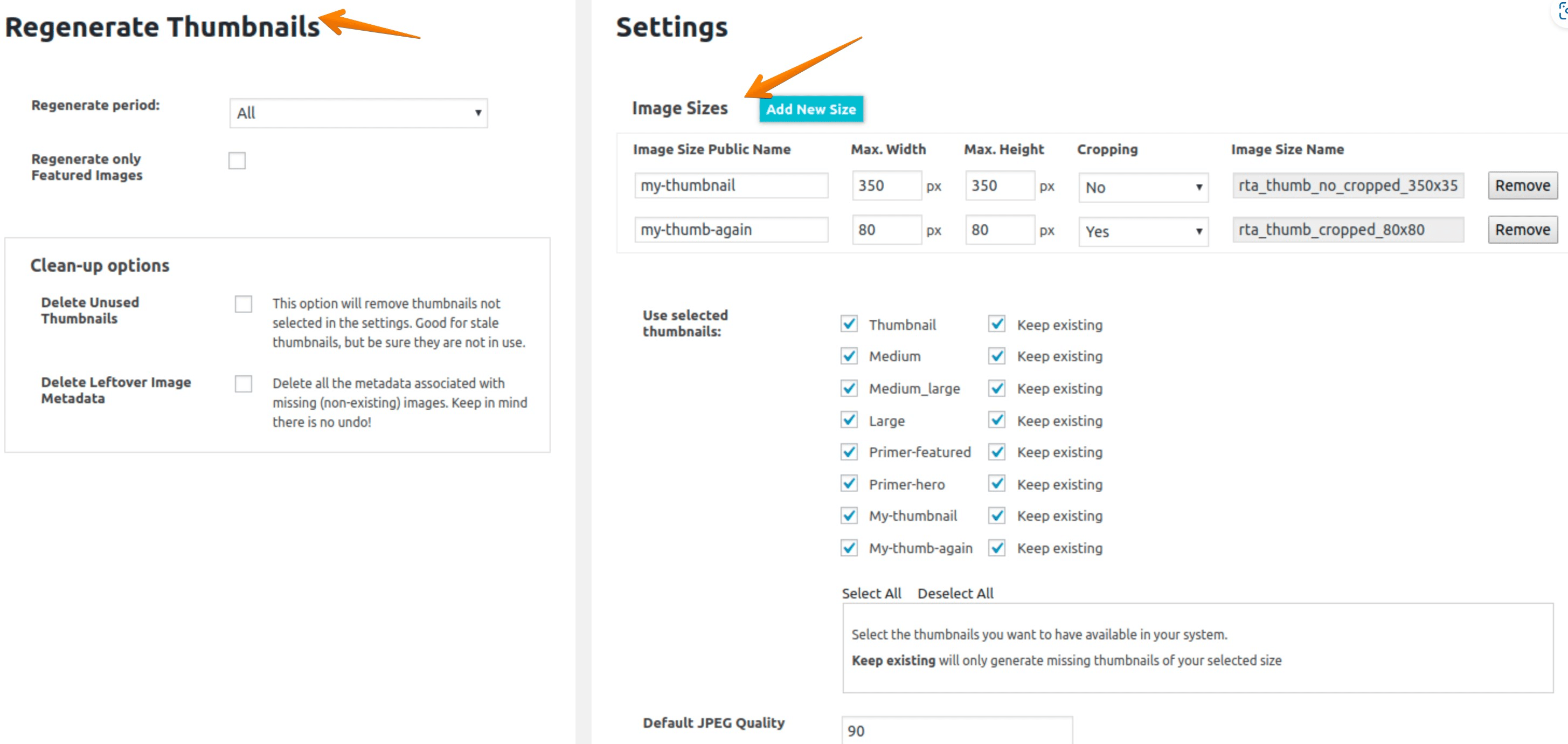
In the reGenerate Thumbnails, you have option of Image sizes from which you can properly size images from rendered image according to user’s device pixel ratio.
Before employing these plugins, don’t forget to back up your WordPress site, including your media library. This is a precautionary step to safeguard your content.
#2 Use Image Optimization Plugin
If you’re not sure whether your images are properly sized, or if they need further optimization, an image optimization plugin can help. These plugins allow you to compress and resize images automatically, saving you valuable time and effort. Some popular options include ShortPixel, Imagify, and Smush.
I recommend you use Imagify to Optimize images and remove the properly sized image warning.
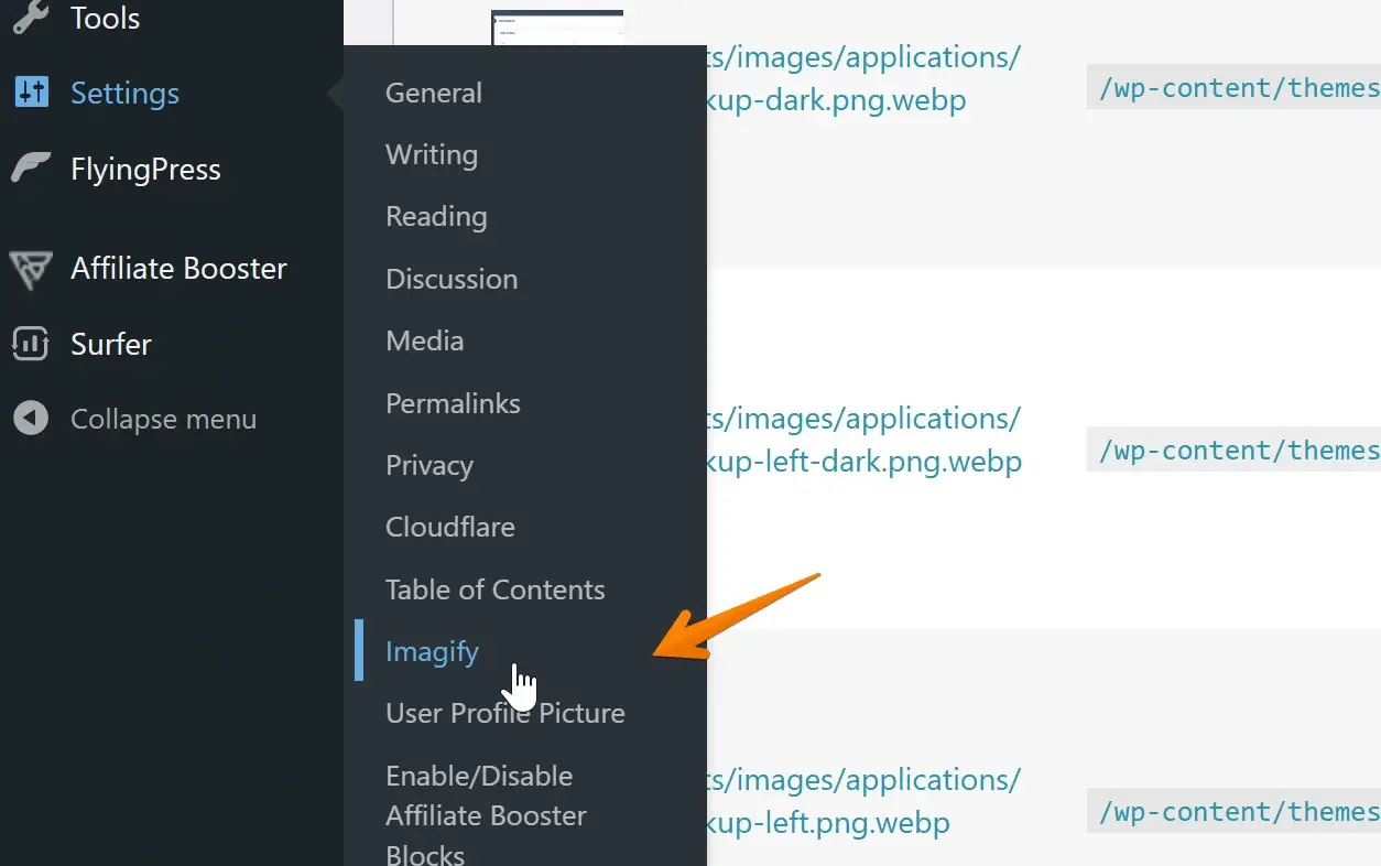
Download Imagify and After activation, click on Settings > Imagify;
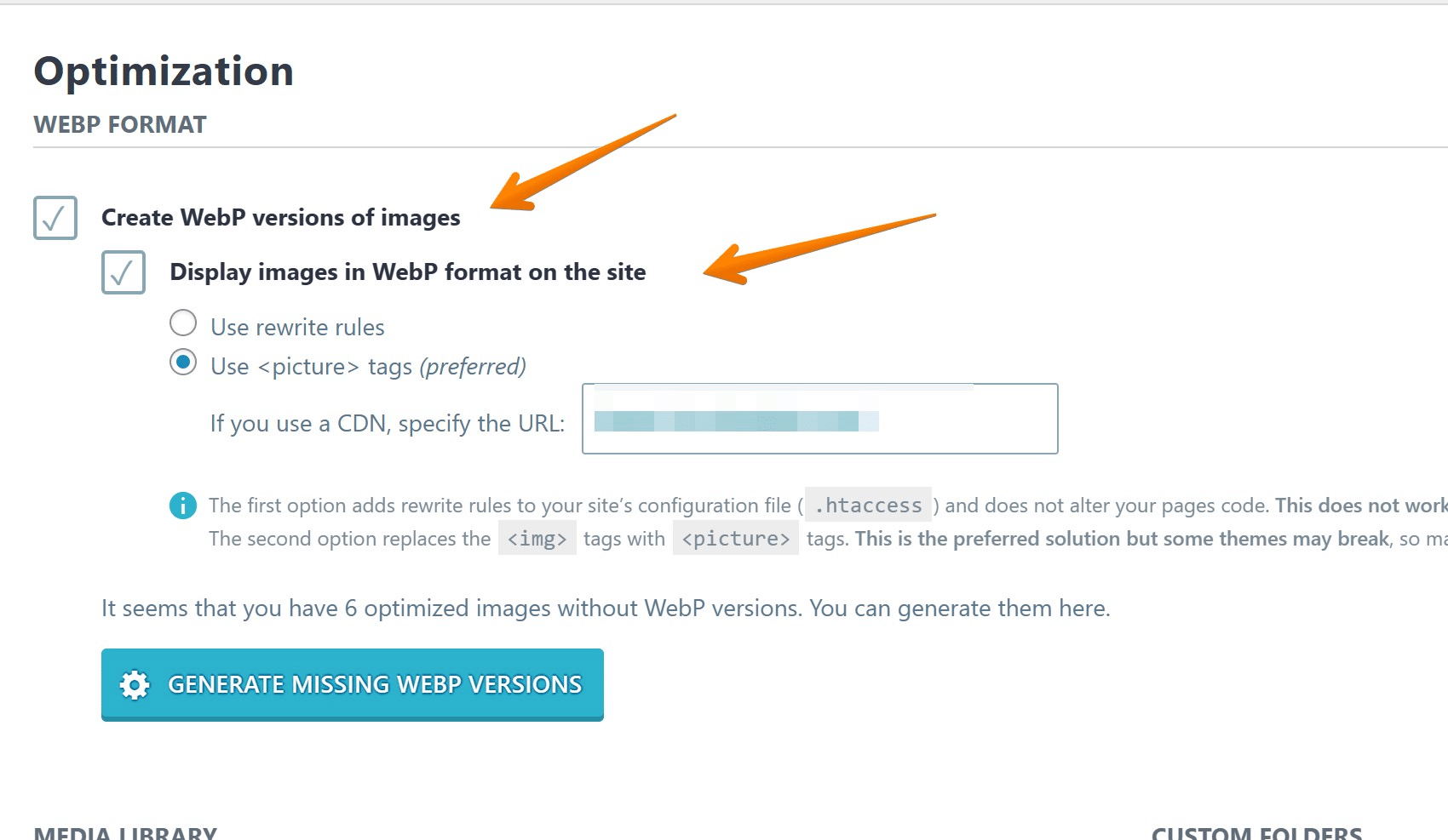
Use WEBP image format for all of your Images to compress images uploaded on your site to improve site speed and lossless quality, you can enable the same with the following options for all the images;
Next, if you have photography website with large image sizes then you can use Image compression to lower sizes from rendered size as below;
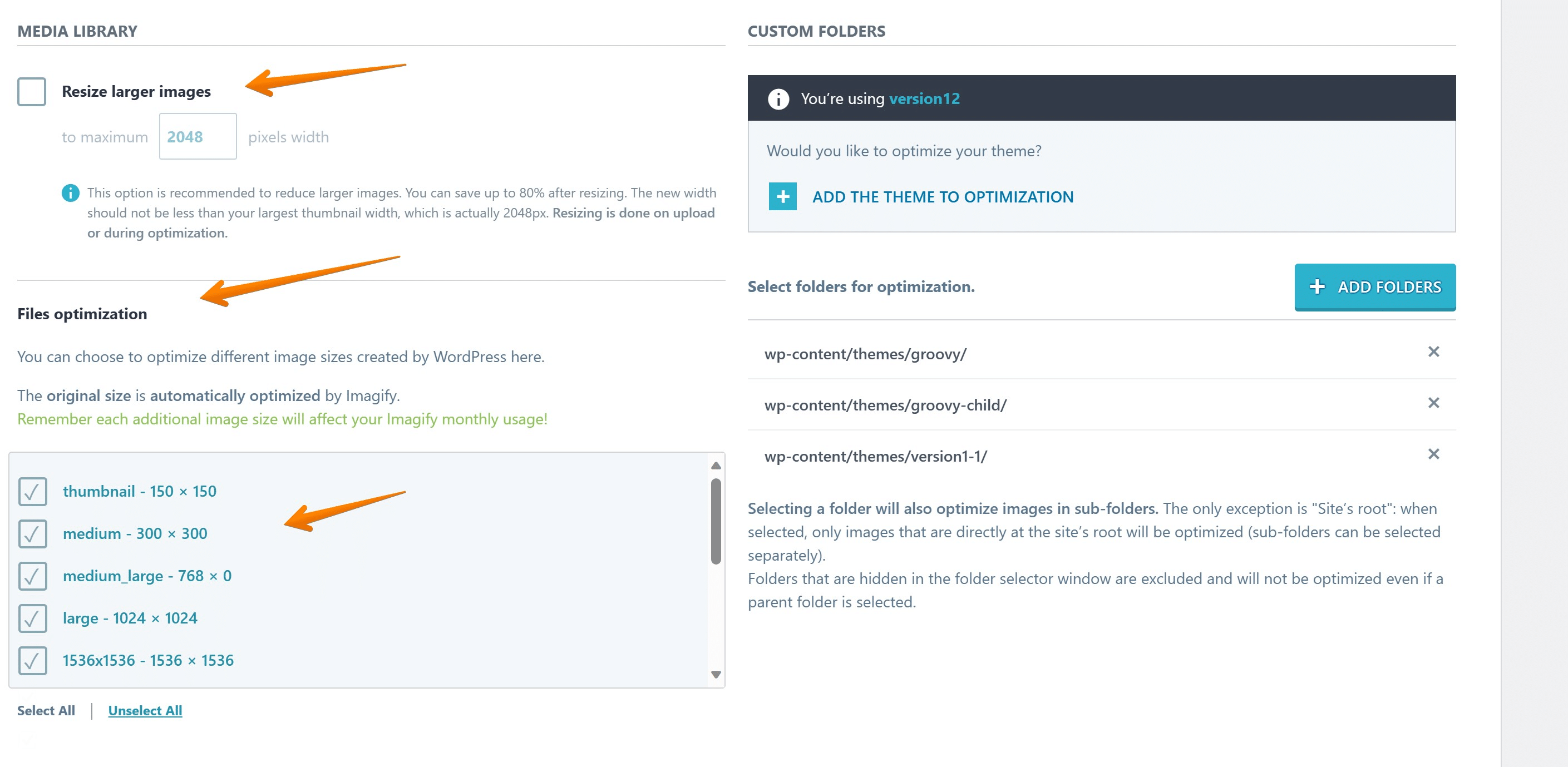
You must select the resize larger images option, file optimization option to optimize file size and select all required image sizes below it to properly size images and serve responsive images uploaded on your website.
To ensure your images display properly according to user’s device pixel ratio, it’s essential to specify different image sizes for each of these screen sizes. This will allow for a responsive design that adjusts accordingly based on the user’s device.
#3 Use Content Delivery Network (CDN) for Image Delivery
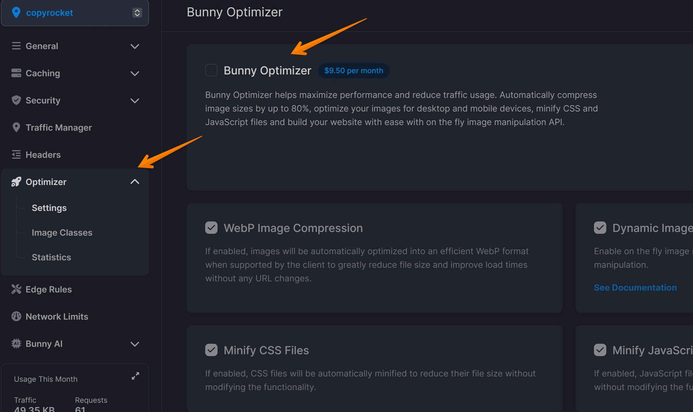
A content delivery network (CDN) plays an indispensable role in the rapid delivery of internet content, including images. A CDN permits the quick transfer of assets needed for loading Internet content including HTML pages, javascript files, stylesheets, and images.
However not all CDNs are created equal. When it comes to optimizing image delivery, we recommend using Bunny.net CDN.
Bunny.net is renowned for its superior performance, delivering your images swiftly and efficiently to provide a seamless user experience. It reduces latency by storing copies of your images in numerous locations worldwide, ensuring the actual image is served from the location nearest to your users.
But that’s not all. Bunny.net also excels in terms of security and scalability. It provides robust protection against DDoS attacks, ensuring your images and other assets are always accessible and secure.
And the best part?
It effortlessly scales with your needs. Whether you’re serving hundreds or millions of images, Bunny.net handles it all with aplomb.
In a digital world where speed and performance are paramount, can you really afford not to invest in a high-quality CDN like Bunny.net? Make the switch today and watch as your website’s performance soars to new heights.
Conclusion
Optimizing images is crucial for ensuring a fast, efficient, and visually appealing website. With the right tools and techniques, you can easily resize your images to suit different viewport sizes, regenerate featured images in WordPress, utilize image optimization plugins, and leverage content delivery networks for optimal image delivery.
By following these suggestions and incorporating them into your workflow, you can drastically improve your website’s performance and provide a seamless user experience.

