Google’s Page Speed Insights tool is a great way to identify Google’s core web vitals element render-blocking resources on your website. Render-blocking resources prevent the visible part of your web page from appearing until they load.
This can impact your page’s performance and cause visitors to have a negative experience.
This post will show you how to fix and eliminate render-blocking resources so your pages load faster and provide a better user experience.
Checkout, What are Google Core Web Vitals? Step-by-step Guide to Improve it
What render-blocking resources are and how they can impact your website’s performance
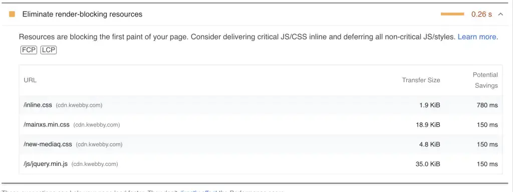
Website performance can be significantly affected by something as simple as a render-blocking resource.
These elements and code must be loaded before the page can start rendering; anything preventing it from doing so will cause delays in loading times.
Identifying any render-blocking resources on a website is essential to ensure fast and efficient performance.
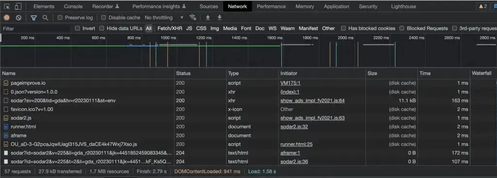
Resources like JavaScript and external CSS files should be placed at the bottom of the page or deferred loading to minimize their effect on the website’s speed.
Taking preventative measures like these ensures visitors don’t hesitate to return to your website, allowing you more opportunities to make meaningful connections with them.
Also learn, How to Lazyload Images, Videos and Iframes
How to identify render-blocking resources on your website
If you’re an experienced web designer, you know how important it is to constantly optimize your website’s performance.
Tools like Google PageSpeed Insights can be highly beneficial to achieve this goal.
They allow you to quickly and easily identify any resources causing a render-blocking resources issue on your website so that you can tackle these issues before they become a bigger problem.
With fewer render-blocking elements, your site will perform faster, leading to a better user experience.
Because of this, every web designer needs to take advantage of the free and valuable resources available from Google PageSpeed Insights!
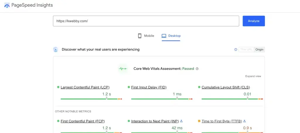
After you enter your webpage and click “Analyze” you will get your Core Web Vitals report. Afterwards check the reports below the scores;
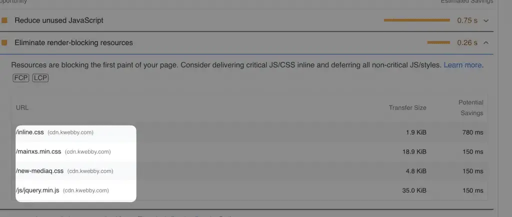
Click on the same and check the render-blocking resources on your webpage.
How to Eliminate Render Blocking Resources
There are different methods to eliminate render-blocking resources.
One way is to use asynchronous loading, which allows resources like JavaScript and CSS to be loaded simultaneously. This makes loading faster and the page performance better.
Inlining small JavaScript code and CSS code into HTML documents instead of using external files can also help. Inlining moves resource requests from external server calls to local memory, thus reducing the load time.
Another way to eliminate render-blocking resources is by optimizing images and ensuring they are properly compressed. This helps reduce the size of the file, which in turn decreases loading times.
Finally, use browser caching to store data on a visitor’s computer to retrieve it faster when they revisit your website.
Combining these methods can help reduce render-blocking resources and provide a better user experience.
By taking the steps necessary to eliminate render-blocking resources, you will be helping your website perform at its best! With fewer rendering issues, visitors can enjoy a smooth browsing experience with faster loading times.
We will discuss each method in detail for WordPress and non-WordPress websites below.
#1 Defer loading of Render Blocking JavaScript files until after the initial page load
JavaScript files are an essential part of web pages but can also be a source of lag and poor performance. There may be many render-blocking javascript files on your page that needs to be optimized.
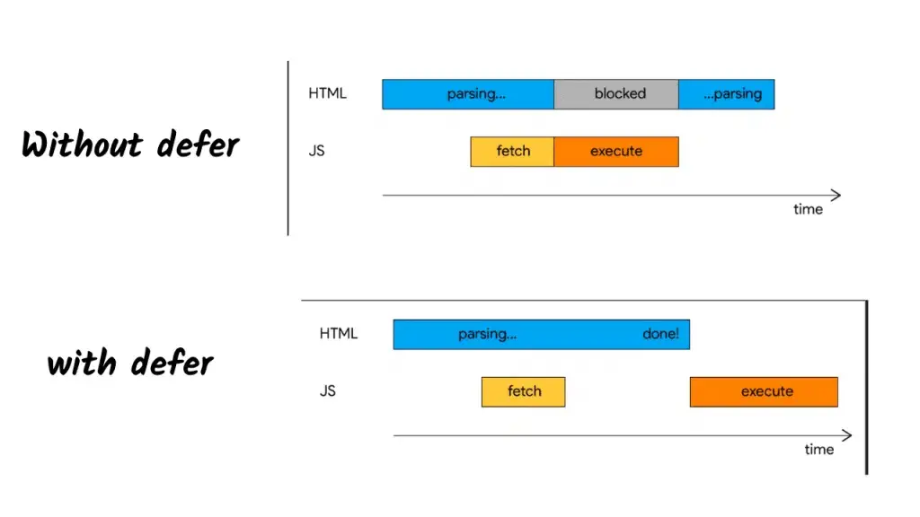
The best way to avoid poor performance caused by JavaScript resources is to defer loading all JavaScript files until after the initial page load.
This makes page layouts render faster, and users have a smoother experience.
Additionally, by implementing this practice with other techniques such as minifying, compressing, and caching, page load times can be further improved for better user experiences.
Deferring the loading of JavaScript files ensures that your users’ pages are loading optimally!
How to Defer the load of Javascript files on WordPress websites
For WordPress users, we have only one solution for all of your core web vitals problems, i.e. Flyinpress WordPress Plugin which is one of the best WordPress Plugins, signup for the account and download the plugin here.
After uploading and activating the plugin, you need to go to the settings and then click on Flyingpress option from your WordPress left sidebar;
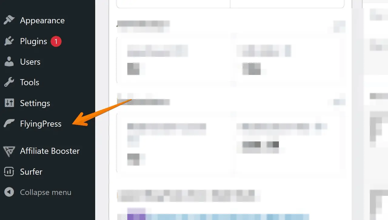
Flyingpress Dashboard will open and here you need to navigate to the Javascript option from the left and check the Defer javascript option as below;
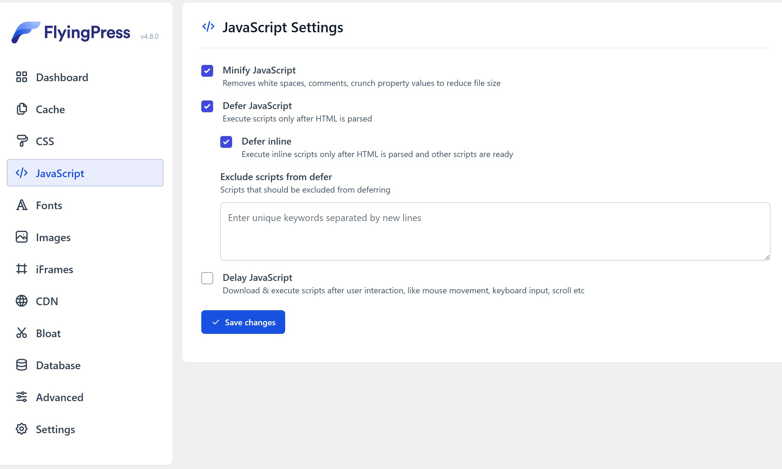
Now click on save changes, and this way you’ve eliminate render blocking javascript code from every single javascript file by rendering it as inline.
How to defer javascript on Non-WordPress Websites
If you use the custom script, then you may have a basic or advance knowledge of HTML, and then you can implement this easily; all you need to do is to add a defer attribute or async attribute to your render blocking resource i.e. javascript files that need to load defer.
For example, the below code is the basic structure of HTML Code;
<script src="js/main.js" defer> </script>Async attributes;
<script src="js/main.js" async> </script>After adding the defer or Async attribute to your script tags, your script file will load after the HTML page is loaded.
#2 Optimize Render Blocking CSS delivery
With the world of web development and design constantly growing, it’s essential to be prepared for every potential outcome.
By utilizing techniques such as inline CSS or media queries, web developers can optimize the delivery of their website’s critical resources such as CSS files, and render them as inline critical CSS or optimize CSS code with the following techniques.
Inline CSS is tremendously helpful when only a few elements are used, while media queries allow CSS changes based on different device sizes and resolutions.
By applying this powerful optimization correctly, web developers can ensure their websites look their best no matter the circumstance for such render-blocking stylesheets.
Remove Unused CSS to eliminate render-blocking CSS on WordPress
You can use the Flyingpress cache plugin to eliminate render-blocking CSS resources like CSS on WordPress. You are blessed to have a WP Plugin like Flyingpress that can elevate your WordPress speed to another level.
Go to Flyingpress Dashboard, navigate to CSS Tab and check the Remove Unused CSS option as below;
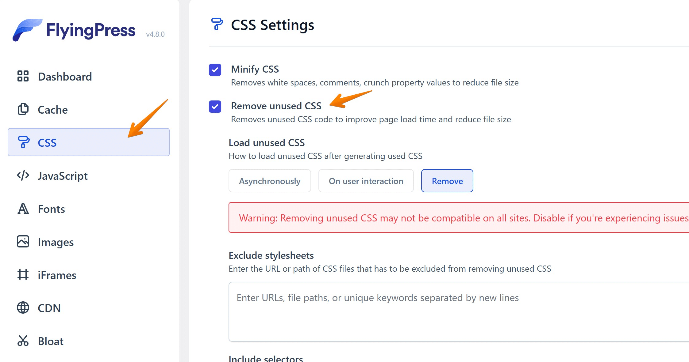
This will remove unused CSS and generate inline CSS from your Render blocking CSS files such that it will remove the blocking time of your website’s paint.
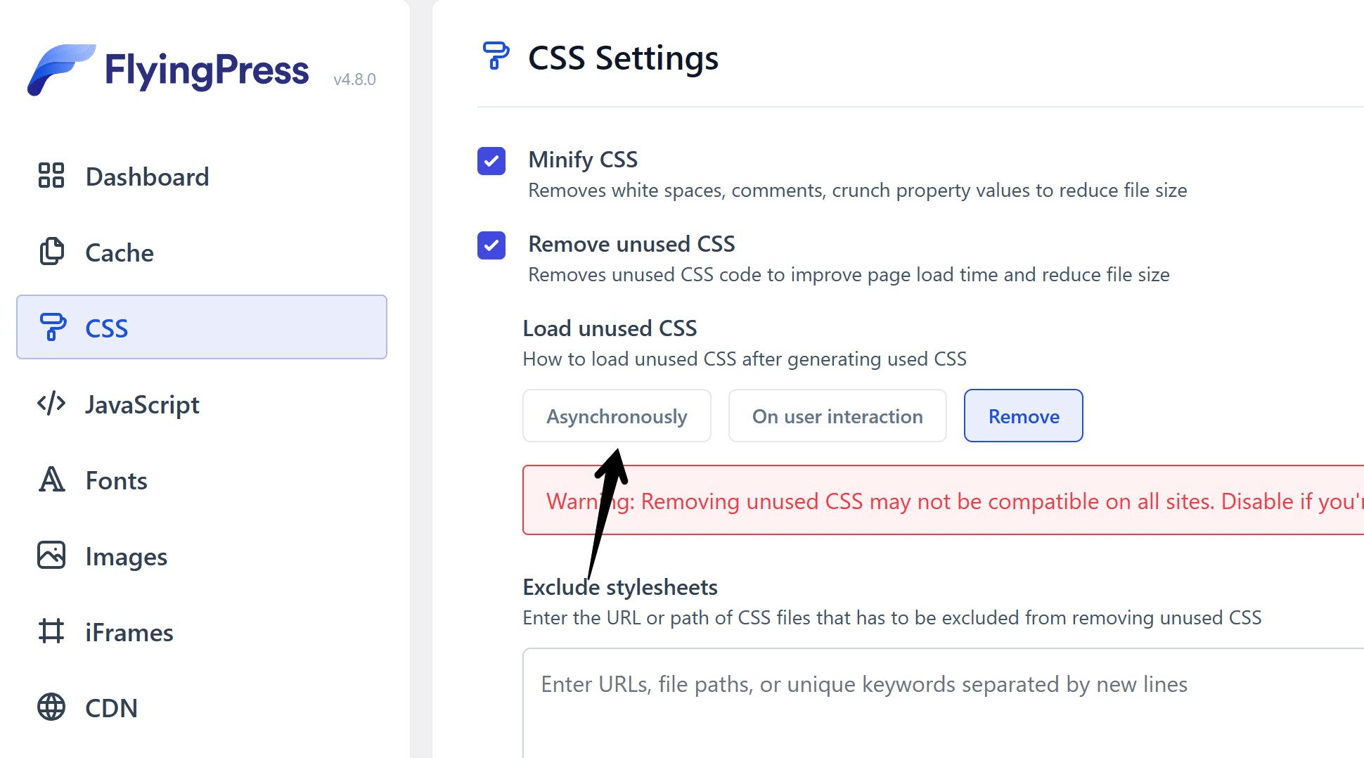
Alternatively, if your site gets broken after saving the above settings, then you can try selecting Asynchronous css loading option as below;
Eliminate Render Blocking CSS Manually
If you are using a custom Script, then you can implement it in your code by including the same style sheet twice, once with a media query and another with a deferred loading.
First, you need to extract the critical rendering path from your CSS files. Second, You will extract those Critical CSS and paste it as Inline CSS to improve render-blocking time.
Now you must be wondering how to know which CSS we should extract. Then we have a tool for you, i.e. Sitelocity’s Critical Path CSS Generator;
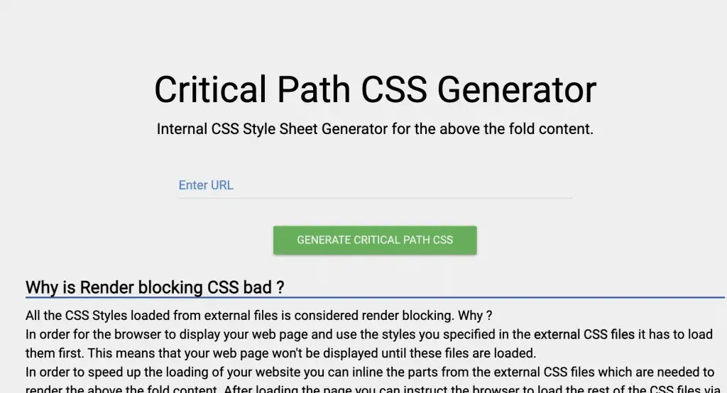
Enter your web page’s URL there and let the tool extract critical CSS for you as follows;
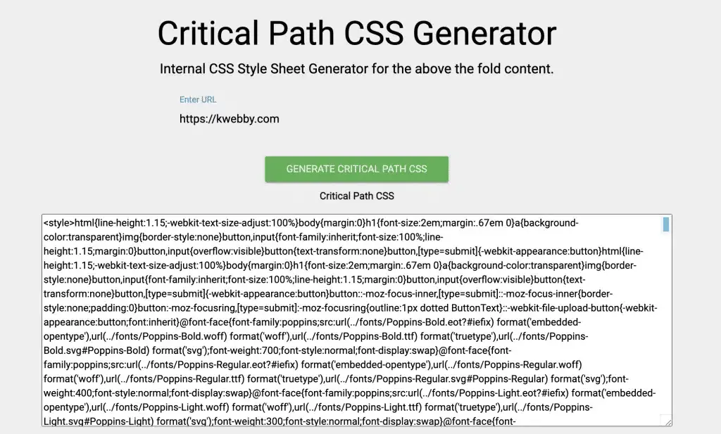
Now click on Combined Minified Critical CSS File using the red button below the results;
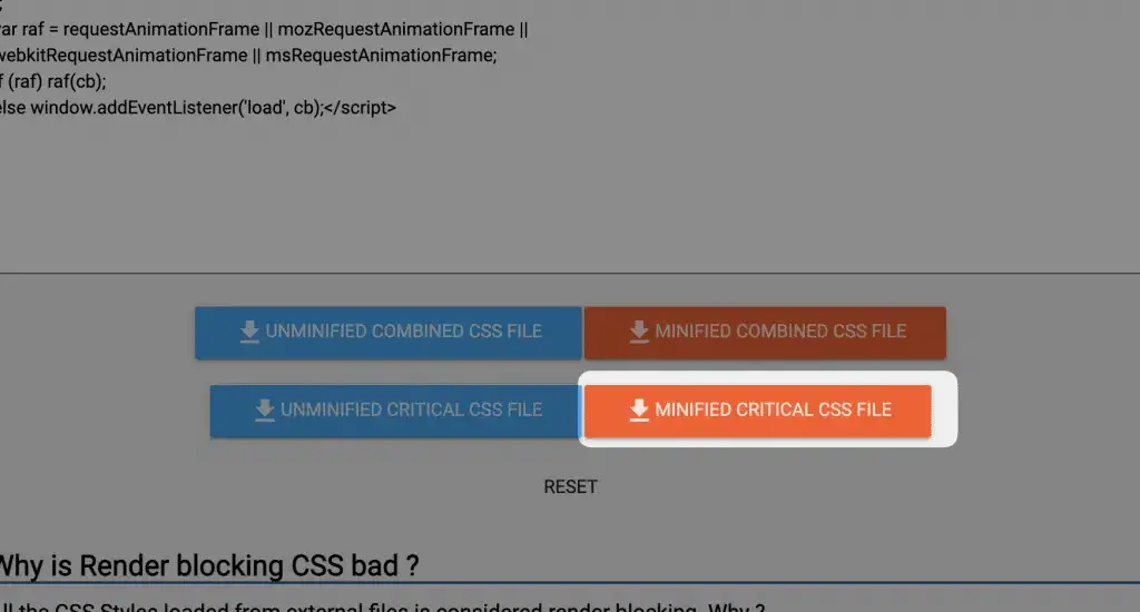
Now upload it to your static or resources files folder and link it to your webpage. You are good to go!
Remove @import Rule
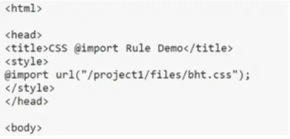
To remove the @import rule, you can follow these steps:
1. Identify all imported CSS files: The first step is to identify all the external CSS files that are being imported using the @import rule. This can be found in your main CSS file.
2. Create a new CSS file: Create a new CSS file that will contain all the code from the imported files.
3. Copy and paste code: Copy all the code from the imported files and paste it into the new CSS file.
4. Link new CSS file using <link> tag: Once you have transferred all the code, link the new CSS file to your HTML document using the <link> tag. Make sure to place this link above any other stylesheets in order for it to take precedence.
<head>

    <link rel="stylesheet" href="style.css">

</head>
5. Delete @import rules: Finally, go back to your main CSS file and delete all the @import rules that were previously used to import external stylesheets.
By removing the @import rule, you will improve performance as there will be no additional HTTP requests for downloading separate stylesheets. This also allows for better organization of your code as all stylesheets will be linked directly in your HTML document using <link> tags.
In situations where you need multiple CSS files, it is recommended to use concatenation instead of relying on multiple HTTP requests through @import rules or <link> tags. Concatenation involves combining multiple files into one large file which can then be minified and bundled for optimal performance.
In conclusion, while the @import rule may seem like a convenient way to add external stylesheets, it should be avoided for better performance and organization. Instead, use the <link> tag or concatenate your CSS files for a more efficient and streamlined approach.
Use Media Attribute for Responsive or Conditional CSS
When it comes to optimizing website performance, one of the key factors is reducing render blocking resources. These resources can significantly slow down page loading times, leading to a poor user experience and potentially affecting your search engine rankings. In our previous blog post on “Eliminate Render Blocking Resources,” we discussed how you can leverage techniques such as minifying and combining CSS files to reduce the number of render blocking resources on your website.
However, there’s another technique that can help eliminate render blocking resources – using the media attribute for conditional CSS. By default, all CSS files are considered render blocking by the browser. However, by adding this attribute to the <link> tag in your HTML code, you can specify certain conditions under which a particular CSS file should be applied.
This is particularly useful when you have different stylesheets for specific devices or viewport sizes. For example, if you have a separate CSS file for print pages or a responsive design that requires different styles for mobile and desktop devices, you can use the media attribute to define these conditions.
To use the media attribute effectively, you first need to understand media queries. These are expressions used in CSS files to apply different styles based on certain conditions such as device type, screen resolution, and orientation. With this attribute, you can specify any value that would be used in a regular media query in your CSS file.
Let’s take a look at an example:
<link href="printpage.css" rel="stylesheet" media="print">In this case, we’re specifying that the “print.css” stylesheet should only be applied when printing the webpage.
Similarly, we can define multiple conditions using logical operators:
<link href="xlscreens.css" rel="stylesheet" media="screen and (min-width: 1500px)">In this example, we’re telling the browser to apply “xlscreens.css” only when the screen width is at least 1500px.
You can also combine multiple conditions using the “,” operator:
<link href="mobile.css" rel="stylesheet" media="screen and (max-width: 600px), print">This will apply “mobile.css” when the screen width is less than 600px or when printing the webpage.
By using the media attribute, we can make our CSS files non-render blocking under certain conditions. This means that even though these files are still downloaded on all devices, they won’t block the rendering of our page if the condition evaluates as false. However, if it evaluates as true, the file will still be render blocking.
For instance, in our previous example, “mobile.css” will be render blocking on mobile devices with a maximum viewport width of 600px but non-render blocking on larger viewports.
#3 Minify CSS and javascript files
When it comes to optimizing website performance, every second counts. With users expecting fast loading times and search engines factoring in page speed as a ranking factor, it’s crucial to eliminate any possible delays in initial page rendering. One effective way to do this is by minifying your CSS and JavaScript files.
Checkout our tool;
On WordPress, you can use the Flyingpress plugin to minify both CSS and Javascript files by going to the CSS tab and enabling Minify CSS;

and similarly go to the javascript tab and enable Minify Javascript;

Minification refers to the process of removing unnecessary characters, such as white spaces, comments, and line breaks, from code without changing its functionality. This results in smaller file sizes that are quicker to download and process. In addition to reducing the size of render-blocking resources, minification can also improve the loading speed of non-render-blocking resources that are downloaded in the background.
Thankfully, there are various tools available that make minification a breeze. Some popular options include Minify, CSS Minifier, JS Minifier, and PostCSS. These tools follow best practices for minification and allow you to easily optimize your code without compromising on functionality or readability.
Many build tools also offer built-in minification functionalities that can significantly reduce the weight of render blocking resources. Webpack, Parcel, and Rollup are just a few examples of powerful build tools that can help you optimize your code for faster initial page rendering.
By minimizing the size of your CSS and JavaScript files through minification techniques, you can drastically improve the loading time of your website’s pages. This not only enhances user experience but also boosts your SEO efforts by keeping search engines happy with speedy site performance. So don’t delay – start optimizing your render blocking resources today with the help of minification!
#4 Prioritize Above the fold content
When it comes to optimizing your website’s performance, one key factor to consider is the above the fold content. This refers to the portion of your webpage that is visible without having to scroll down. It is important to prioritize this content in order to improve user experience and boost your website’s loading speed.
You must be wondering how you can measure it right?
Well, when you audit your website on Page speed insights, you see the snapshots from mobile as well as desktop like below;

So whatever element you’re seeing right now are above the fold elements for which you need prioritize when the page loads.
Here are some tips on how you can effectively prioritize above the fold content and fix any render blocking resources:
Identify critical resources: The first step in prioritizing above the fold content is identifying which resources are critical for rendering the above-the-fold portion of your webpage. These may include images, CSS files, or JavaScript codes.

Minimize and combine resources: Once you have identified the critical resources, try to minimize their size by compressing images and combining CSS or JavaScript files. This will help reduce the number of requests needed to load these resources and improve overall loading speed.
Use asynchronous loading: Another way to prioritize above the fold content is by using asynchronous loading for non-critical resources such as ads or social media widgets. This allows these elements to load after the rest of your webpage has finished rendering, avoiding any delays in displaying important content.
Utilize lazy loading: Lazy loading is a technique where images are loaded only when they become visible on a user’s screen. By implementing this method, you can reduce initial page load time and improve user experience.
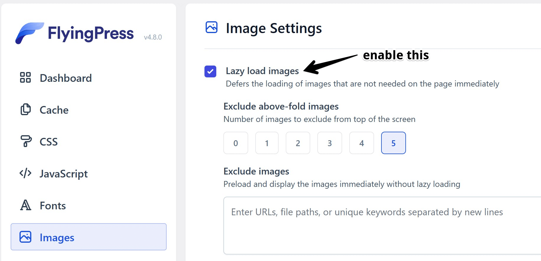
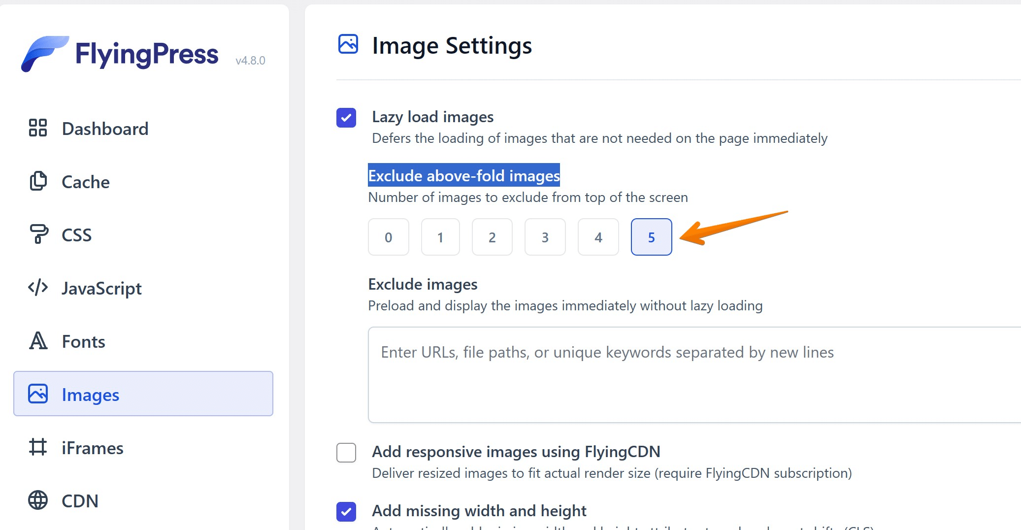
Exclude Above the Fold Images: Its the number of images to exclude lazy loading from top of the content, this way you are loading critical images which is required for the load, you can do this using flyingpress lazyload option and select the number of images to be excluded;
Consider deferring non-essential scripts: Some scripts may not be necessary for above-the-fold content but are still crucial for overall functionality of your webpage. In such cases, consider deferring their loading until after the main content has been displayed.
By prioritizing above-the-fold content and fixing any render blocking resources, you can significantly improve your website’s performance and create a better user experience for your visitors. Remember, every second counts in today’s fast-paced digital world, so make sure to optimize your website for a seamless browsing experience.
#5 Minimize the number of HTTP requests by using sprites or combining files
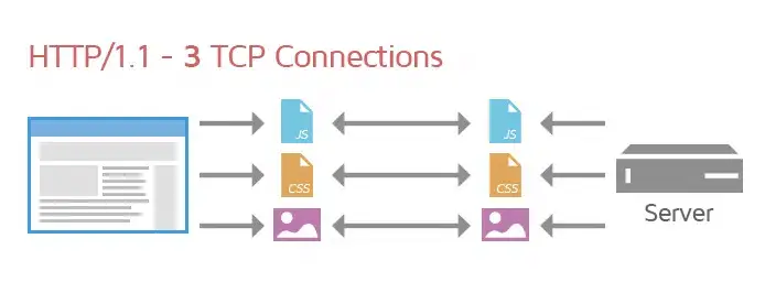
Every website needs to be fast and optimized, and a great way to ensure this is by reducing the number of HTTP requests.
One approach to making websites faster is to use sprites or combine files, which can reduce the number of resource requests on a web page.
Sprites are graphical objects used in a single image but can be seen as multiple entities on a website.
Creating one large image (containing smaller images) instead of several single images can significantly reduce the loading time for end-users, as there will be fewer requests to the server.
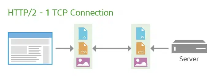
Similarly, combining files by compiling code into a single CSS or JavaScript document using tools such as YUI Compressor and Google Closure Compiler dramatically reduces the load time spent requesting individual files.
Making these changes can create drastic improvements in decreased load times, allowing you to provide your users with an even more enjoyable experience while visiting your website.
Also learn, How to use CSS Image Sprites To Reduce HTTP Requests and Increase Pagespeed
Note: Combining Javascript files is Not recommended if your site uses HTTP/2
How to Combine CSS & JS Files
If you do not use WordPress, then no worries; you will be able to combine manually.
Combine CSS Files
For all stylesheets on your page, You can use the same tool as above of Sitelocity, type your domain, and after the result, you do have an option of “Download Minified Combined CSS Files” as follows;
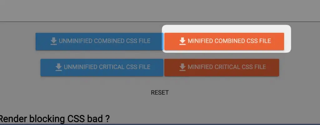
After the download, upload and link the new in-between <head></head> tags.
Combine JS Files
For combining JS files, you need to do it manually since it is not recommended to combine JS files because there may be a bunch of third-party resources attached, like Google Analytics, Google Tag Manager etc.
Therefore, download all files on your computer using the File Manager of your hosting and create a new file, i.e. Combined.js.
Paste all of your code into it and click on save.
Now upload the same file to your server and link them just before </body> tag.
Why is Combining CSS/JS Files Potentially Bad?
Combining files is a great way to reduce the number of HTTP requests on your page, but it can also cause some problems.
Reason#1 – The aggregate file size of the document may be significantly large.
If you combine many files, the resulting file may be much larger than it needs to be. This can cause your page to take longer to download and render, defeating the purpose of combining the files in the first place.
Reason#2 – Your page’s performance in users’ eyes could be impacted detrimentally.
Combining files can increase the total size of your page and make it appear to take longer to download and render. This is because the browser needs to download an entire large file, rather than several smaller ones that may already be in the cache.
Reason#3 – CSS/JS Combination Can Potentially Break Your Site
If you combine two CSS files and one overwrites the styles set in the other, your page’s style may break. You should avoid combining files until you are sure that they won’t conflict. Furthermore, an error in one of the combined JavaScript files can potentially cause errors on all of your pages.
Combining files should be done with caution and only when necessary. Make sure to test your website thoroughly after combining any files to ensure everything works properly.
Learn Next;
How to Improve Largest Contentful Paint (LCP)
How to Improve Cumulative Layout Shift (CLS) Easily
How to Improve First Input Delay (FID) in 2024
Interaction to Next Paint (INP) – Measure & Optimize
Conclusion
Render-blocking resources can hurt your website’s performance. However, there are ways to optimize CSS delivery and defer loading of JavaScript files to improve website speed.
Minimizing the number of HTTP requests can also help improve website performance.
By understanding what render-blocking resources are and how they can impact your website, you can take steps to ensure that your website loads quickly and efficiently.

