YouTube thumbnails decide if people click or scroll. Canva helps you build strong thumbnails fast, even if you do not have design skills. This guide shows the Top 10 Canva Tricks for Youtube Thumbnails that improve clarity, contrast, and click appeal. You will also learn the key rules that keep your thumbnail readable on phones and consistent across your channel.
Key Takeaways
- Use the correct YouTube thumbnail size in Canva to avoid blur and crop issues.
- Build a repeatable layout with templates, grids, and guides for faster output.
- Increase clicks with strong contrast, short text, and one clear focal point.
- Use Background Remover, Shadows, and Blur to separate the subject from the background.
- Keep your channel consistent with Brand Kit, styles, and saved color palettes.
- Export with the right settings so your thumbnail stays sharp after upload.
1) Start With the Right Canva Setup (Size, Safe Area, File Type)
Your design starts with the right canvas. This step prevents blurry thumbnails and cut-off text. It also makes your workflow faster because you do not fix errors later.
Use the correct YouTube thumbnail size
- Open Canva and search: YouTube Thumbnail.
- Select the preset size: 1280 x 720 (16:9).
- Keep key text and faces away from edges to reduce crop risk on different devices.
Add a simple safe area guide
- Go to Elements and add a rectangle outline.
- Resize it so you leave a margin around the edges.
- Lock it while you design, then delete it before export.
Pick a clean starting background
- Use a solid color or a soft gradient if your subject needs more contrast.
- Avoid busy photos behind small text.
Next, you will speed up your workflow with templates that still look unique.
2) Use Templates the Smart Way (So Your Thumbnails Do Not Look Generic)
Templates save time, but many creators use them without changes. That makes thumbnails look the same. You can use templates as a layout base, then replace key parts so your design looks original.
Choose templates by layout, not by style
- Search Canva templates for: YouTube thumbnail bold, podcast, reaction, or tutorial.
- Pick a template with a clear subject area and a clear text area.
- Ignore template colors and fonts at first.
Replace three things every time
- Replace the photo with your own subject or a relevant image.
- Replace the font with your channel font.
- Replace the colors with your channel palette.
Create a reusable thumbnail system
- Make 3 to 5 layouts for your main video types.
- Save them as separate Canva designs named by category.
- Duplicate the right layout for each new upload.
Now you need consistent alignment so your thumbnails look clean and professional.
3) Turn On Rulers, Guides, and Tidy Up With Position Tools
Alignment makes thumbnails feel high quality. Canva gives you tools that keep spacing even and layouts stable.
Use rulers and guides for fast alignment
- Go to File and enable Rulers and guides.
- Drag guides to create columns for text and subject placement.
- Keep text inside a consistent area across videos.
Use Position to align and layer elements
- Select an element and click Position.
- Use Center, Top, Left, and Tidy up for clean spacing.
- Use Forward and Backward to control layer order.
Lock what you do not want to move
- Lock the background and any frame shapes.
- This step prevents small shifts that reduce consistency.
Once alignment is solid, your next goal is a clear focal point that grabs attention.
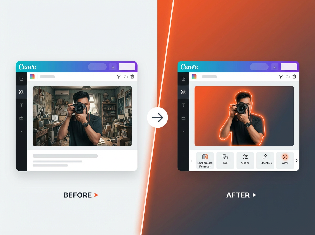
4) Use Background Remover + Outline to Make the Subject Pop
A strong thumbnail has one main subject. Canva Pro makes this step fast with Background Remover. You can also add an outline so the subject stays visible on any background.
Remove the background in one click (Canva Pro)
- Upload a photo with a clear subject.
- Select the photo, then go to Edit photo.
- Click Background Remover.
- Use the erase and restore brush to fix edges.
Add an outline using Shadows
- Select the cutout subject.
- Go to Edit photo → Shadows → Glow.
- Set blur low and size medium for a clean stroke effect.
- Pick a bright outline color that matches your brand.
Use a simple background blur for separation
- Place a background image behind the subject.
- Select the background image and increase Blur.
- Lower saturation if the background fights your text.

Next, you will improve click appeal by using contrast and color rules that work on small screens.
5) Use High Contrast Color Pairs (So It Reads on Mobile)
Most viewers see your thumbnail on a phone. If your text blends into the background, your click rate drops. Canva makes contrast control simple with overlays, transparency, and color tools.
Pick one main color and one accent color
- Use one strong brand color for blocks or shapes.
- Use one accent color for key words, arrows, or circles.
- Keep the rest neutral so the focal point stays clear.
Add a dark overlay behind text
- Add a rectangle shape behind your text.
- Set it to black or a dark brand color.
- Lower transparency to 40% to 70% so the image still shows.
Use Canva’s color tools for quick fixes
- Select a photo and go to Edit photo.
- Increase contrast slightly if the image looks flat.
- Lower highlights if bright areas reduce text readability.
Now you need thumbnail text that is short, bold, and easy to scan.
6) Make Thumbnail Text Short, Bold, and Skimmable
People do not read long lines on thumbnails. They scan. Canva helps you build text that stays readable at small sizes.
Use 2 to 5 words max
- Pick one clear promise, result, or emotion.
- Remove extra words like “how to” if the title already says it.
- Use numbers when they fit: “5 Mistakes” or “3 Steps”.
Use one bold font and one supporting font
- Pick a bold sans-serif font for the main words.
- Use a smaller font only if it stays readable on mobile.
- Avoid thin fonts and script fonts for thumbnails.
Add text effects for clarity
- Select text → Effects.
- Use Shadow or Lift to separate text from the background.
- Keep the effect subtle so the text stays clean.
Next, you will use frames, grids, and masking to create depth and structure.
7) Use Frames and Grids for Clean Layouts and Before/After Designs
Frames and grids help you control composition. They also help you make popular thumbnail formats like before/after, versus, and list videos.
Create a split-screen thumbnail with grids
- Go to Elements → Grids.
- Select a 2-column grid for before/after.
- Drop images into each side and adjust crop.
Use frames to shape images fast
- Go to Elements → Frames.
- Use circles for faces or icons.
- Use rounded rectangles to soften a harsh image edge.
Add a divider line for clarity
- Add a vertical line between two sides.
- Use a bright color so the split reads fast.
Now you will add visual cues that guide the eye to the main message.
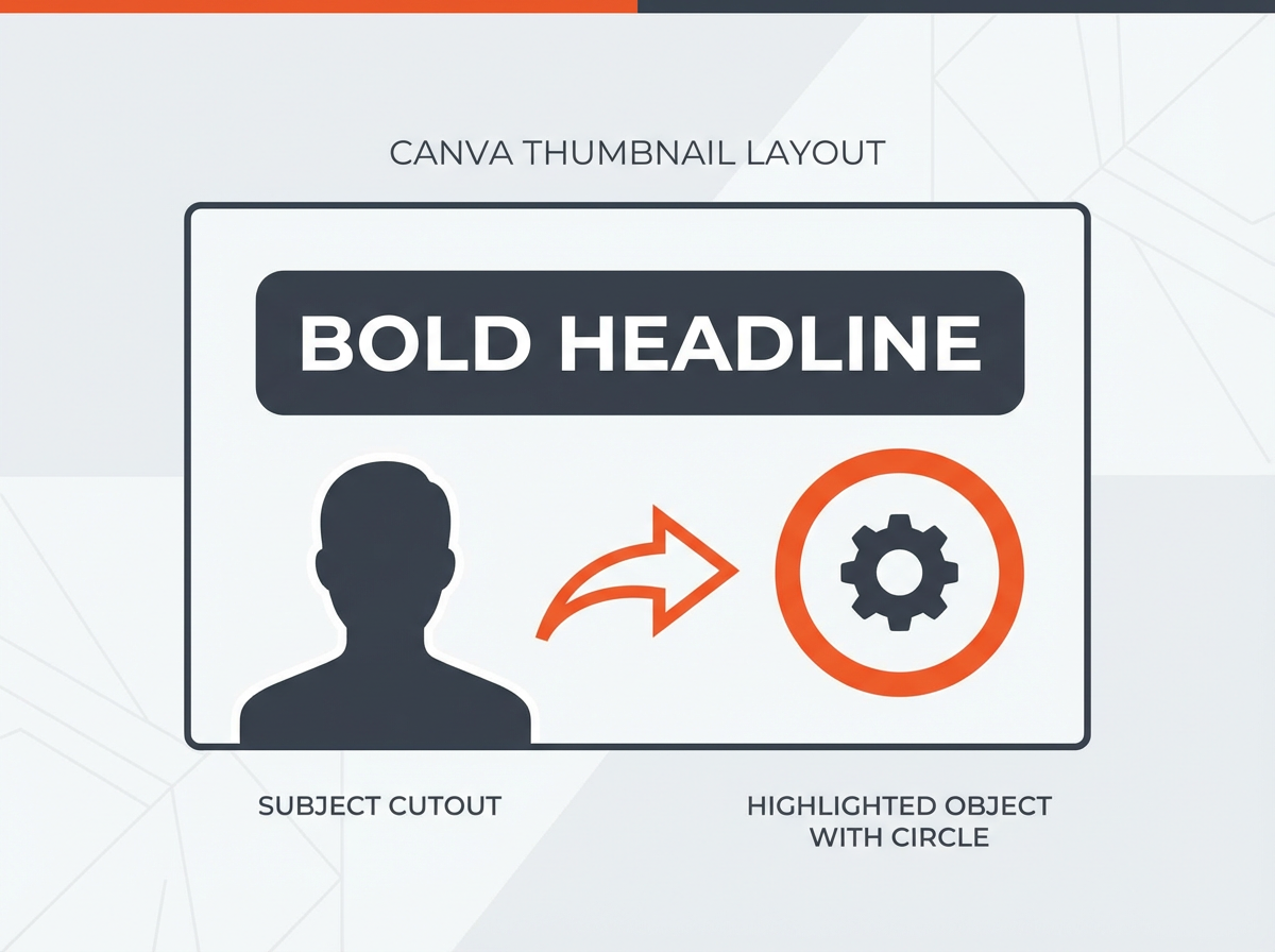
8) Use Arrows, Circles, and Stickers (But Keep Them Controlled)
Visual cues can increase clicks because they tell the viewer where to look. The risk is clutter. Canva has many sticker styles, so you should use a consistent set.
Use one cue per thumbnail
- Use one arrow or one circle, not five.
- Point the arrow at the result, the mistake, or the key object.
Match cue style to your channel
- Pick one arrow style and reuse it.
- Pick one circle highlight style and reuse it.
- Save them in a “Thumbnail Assets” Canva folder.
Use contrast and spacing
- Make the arrow color different from the background.
- Leave space around the cue so it does not fight the text.

Next, you will keep your channel look consistent with Brand Kit and styles.
9) Use Brand Kit and Styles for Fast, Consistent Thumbnails
Consistency builds recognition. Canva Pro helps with Brand Kit, but you can also save styles in free accounts with careful reuse.
Set up Brand Kit (Canva Pro)
- Add your logo.
- Add your brand colors.
- Add your brand fonts.
Use Styles to apply a look in seconds
- Open the Styles panel.
- Apply a color palette to your design.
- Apply font sets to keep text consistent.
Create a repeatable thumbnail header or badge
- Add a small badge for series videos like “EP 12” or “LIVE”.
- Place it in the same corner every time.
- Keep it small so it does not steal attention.
Now you will finish strong with export settings that keep your thumbnail sharp after upload.
10) Export the Right Way (So You Keep Sharpness and Color)
Export settings affect clarity. A sharp design in Canva can look soft on YouTube if you export wrong or if your file is too large.
Use the best export format for most thumbnails
- Use PNG for sharp text and graphics.
- Use JPG if you need a smaller file size.
Check size and quality before upload
- Aim to stay under YouTube’s thumbnail limit (often 2 MB).
- If your PNG is too large, try JPG with high quality.
- Zoom out to 25% in Canva and confirm text stays readable.
Use a simple naming system for testing
- Name files like: video-topic_thumb_A.png and video-topic_thumb_B.png.
- This helps you track changes if you test variants.
With the top 10 tricks covered, the next section answers the most common questions creators ask about Canva and thumbnails.
Frequently Asked Questions (FAQs)
How to use Canva for YouTube thumbnails?
Open Canva and select the YouTube Thumbnail preset (1280 x 720). Add a strong background, a subject image, and short bold text. Use alignment tools, then export as PNG or JPG and upload to YouTube.
Is Canva Pro good for YouTube thumbnails?
Yes. Canva Pro helps most with Background Remover, Brand Kit, premium fonts, and faster workflow. These features improve speed and consistency for frequent uploads.
What is the secret to a good YouTube thumbnail?
A good thumbnail uses one clear focal point, high contrast, and short readable text. It also matches the video topic and creates curiosity without confusing the viewer.
When designing a YouTube thumbnail in Canva, what is most important?
Readability on mobile is most important. Use large text, strong contrast, and a clear subject. Keep the layout simple so the message is clear in one second.
Should I put my face on my thumbnails?
A face can increase clicks if the expression matches the video emotion and the face is large enough to see on mobile. If your channel is topic-first, you can also use a strong object or result image as the main subject.
How many words should a YouTube thumbnail have?
Use 2 to 5 words in most cases. Use fewer words if your image already explains the topic. Use more words only if every word stays readable on a phone.
Final Thoughts
The Top 10 Canva Tricks for Youtube Thumbnails help you create thumbnails that look clean, read fast, and stay consistent across your channel. Start with the right size, build a repeatable layout, make your subject pop, and export with sharp settings. If you want faster results, build three reusable Canva thumbnail templates today and publish your next video with a clearer, bolder thumbnail.


