
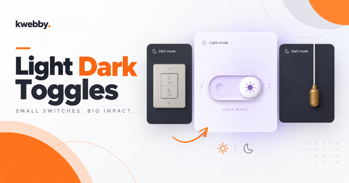
I built nine dark mode toggles to give you more ways to switch between light and dark. The collection includes a house rocker, a hanging rope, magic particles, and an emoji face that falls asleep. Each design sits inside its own interactive 4:5 canvas. Below, you can see every switch’s features and copy its complete HTML, CSS, and JavaScript.
Key Takeaways
- I built all nine switches with HTML, CSS, and JavaScript, without third-party runtime libraries.
- Each switch includes both light and dark states inside a 4:5 canvas.
- You can choose from physical controls, celestial effects, and an expressive emoji face.
- Every entry includes the full HTML, CSS, and JavaScript in separate code blocks.
- I included keyboard focus styles, switch state labels, and reduced motion support.
- You can run any example by saving its three code blocks as
index.html,styles.css, andscript.jsin the same folder, then openingindex.html.
1. 3D Wall Switch
I gave this toggle the look of a real house switch. You press the rocker to turn the lights on or off, and the canvas changes with it.
Features:
- A raised ceramic plate with recessed edges and screw details.
- Sun and moon icons with ON and OFF labels.
- A rocker that tilts in opposite directions for light and dark mode.
- A warm daylight background that changes to a dark night background.
HTML
<!doctype html>
<html lang="en">
<head>
  <meta charset="UTF-8">
  <meta name="viewport" content="width=device-width, initial-scale=1.0">
  <title>3D Wall Switch</title>
  <link rel="stylesheet" href="styles.css">
  <script src="script.js" defer></script>
</head>
<body>
<main class="export-wrap">
<div class="canvas" data-demo="wall-switch" data-theme="light" aria-label="The satisfying click interactive preview">
    <div class="scene">
      <div class="wall-wash" aria-hidden="true">
</div>
      <div class="wall-plate">
        <span class="wall-screw wall-screw--top" aria-hidden="true">
</span>
        <span class="wall-screw wall-screw--bottom" aria-hidden="true">
</span>
        <div class="wall-recess">
          <button class="demo-toggle wall-rocker" role="switch" aria-checked="true" aria-label="Toggle the wall light">
            <span class="wall-rocker-top" aria-hidden="true">
              <svg class="wall-sun" viewBox="0 0 24 24" fill="none" stroke="currentColor" stroke-width="1.5">
<circle cx="12" cy="12" r="3.5">
</circle>
<path d="M12 2v2M12 20v2M2 12h2M20 12h2M4.9 4.9l1.4 1.4m11.4 11.4 1.4 1.4M4.9 19.1l1.4-1.4M17.7 6.3l1.4-1.4">
</path>
</svg>
              <span class="wall-word">ON</span>
            </span>
            <span class="wall-rocker-bottom" aria-hidden="true">
              <svg class="wall-moon" viewBox="0 0 24 24" fill="none" stroke="currentColor" stroke-width="1.5">
<path d="M20.2 14.4A8.5 8.5 0 0 1 9.6 3.8 8.5 8.5 0 1 0 20.2 14.4Z">
</path>
</svg>
              <span class="wall-word">OFF</span>
            </span>
          </button>
        </div>
        <span class="wall-indicator" aria-hidden="true">
</span>
      </div>
</div>
    <div class="canvas-top">
<span class="theme-label">
<svg viewBox="0 0 24 24" fill="none" stroke="currentColor" stroke-width="1.6" stroke-linecap="round">
<circle cx="12" cy="12" r="4">
</circle>
<path d="M12 2v2m0 16v2M2 12h2m16 0h2M4.93 4.93l1.42 1.42m11.3 11.3 1.42 1.42M4.93 19.07l1.42-1.42m11.3-11.3 1.42-1.42">
</path>
</svg>
<span>Light mode</span>
</span>
</div>
    <div class="canvas-bottom">
<span class="canvas-hint">Go on, give it a click</span>
<span class="canvas-state">A little brighter</span>
</div>
  </div>
<h1 class="export-title">The satisfying click</h1>
</main>
</body>
</html>
CSS
* {
  box-sizing: border-box;
}

body {
  margin-top: 0px;
  margin-right: 0px;
  margin-bottom: 0px;
  margin-left: 0px;
  padding-top: 24px;
  padding-right: 24px;
  padding-bottom: 24px;
  padding-left: 24px;
  min-height: 100dvh;
  display: grid;
  align-items: center;
  justify-items: center;
  background-image: initial;
  background-position-x: initial;
  background-position-y: initial;
  background-size: initial;
  background-repeat: initial;
  background-attachment: initial;
  background-origin: initial;
  background-clip: initial;
  background-color: rgb(246, 246, 244);
  font-family: -apple-system, BlinkMacSystemFont, "Segoe UI", sans-serif;
}

.export-wrap {
  width: min(100%, 400px);
}

.export-title {
  text-align: center;
  font-size: 15px;
  font-weight: 500;
  margin-top: 20px;
  margin-right: 0px;
  margin-bottom: 6px;
  margin-left: 0px;
  color: rgb(69, 73, 66);
}

button:focus-visible {
  outline-color: rgb(222, 101, 65);
  outline-style: solid;
  outline-width: 3px;
  outline-offset: 5px;
}

.canvas {
  position: relative;
  aspect-ratio: 4 / 5;
  width: 100%;
  overflow-x: hidden;
  overflow-y: hidden;
  border-top-left-radius: 14px;
  border-top-right-radius: 14px;
  border-bottom-right-radius: 14px;
  border-bottom-left-radius: 14px;
  isolation: isolate;
  container-type: inline-size;
  background-image: initial;
  background-position-x: initial;
  background-position-y: initial;
  background-size: initial;
  background-repeat: initial;
  background-attachment: initial;
  background-origin: initial;
  background-clip: initial;
  background-color: rgb(240, 238, 232);
  color: rgb(101, 95, 80);
  transition-behavior: normal, normal;
  transition-duration: 0.75s, 0.6s;
  transition-timing-function: ease, ease;
  transition-delay: 0s, 0s;
  transition-property: background, color;
  font-family: -apple-system, BlinkMacSystemFont, "Segoe UI", sans-serif;
}

.canvas[data-theme="dark"] {
  color: rgb(217, 219, 232);
  color-scheme: dark;
}

.scene {
  position: absolute;
  top: 0px;
  right: 0px;
  bottom: 0px;
  left: 0px;
  display: grid;
  align-items: center;
  justify-items: center;
  perspective: 800px;
}

.demo-toggle {
  font-style: inherit;
  font-variant-ligatures: inherit;
  font-variant-caps: inherit;
  font-variant-numeric: inherit;
  font-variant-east-asian: inherit;
  font-variant-alternates: inherit;
  font-variant-position: inherit;
  font-variant-emoji: inherit;
  font-weight: inherit;
  font-stretch: inherit;
  font-size: inherit;
  line-height: inherit;
  font-family: inherit;
  font-optical-sizing: inherit;
  font-size-adjust: inherit;
  font-kerning: inherit;
  font-feature-settings: inherit;
  font-variation-settings: inherit;
  font-language-override: inherit;
  color: inherit;
  cursor: pointer;
  -webkit-tap-highlight-color: transparent;
  touch-action: manipulation;
  border-top-width: 0px;
  border-right-width: 0px;
  border-bottom-width: 0px;
  border-left-width: 0px;
  border-top-style: none;
  border-right-style: none;
  border-bottom-style: none;
  border-left-style: none;
  border-top-color: currentcolor;
  border-right-color: currentcolor;
  border-bottom-color: currentcolor;
  border-left-color: currentcolor;
  border-image-source: none;
  border-image-slice: 100%;
  border-image-width: 1;
  border-image-outset: 0;
  border-image-repeat: stretch;
  background-image: none;
  background-position-x: initial;
  background-position-y: initial;
  background-size: initial;
  background-repeat: initial;
  background-attachment: initial;
  background-origin: initial;
  background-clip: initial;
  background-color: initial;
  padding-top: 0px;
  padding-right: 0px;
  padding-bottom: 0px;
  padding-left: 0px;
}

.demo-toggle:focus-visible {
  outline-color: currentcolor;
  outline-style: solid;
  outline-width: 3px;
  outline-offset: 12px;
}

.canvas-top {
  position: absolute;
  left: 20px;
  right: 17px;
  top: 17px;
  display: flex;
  align-items: center;
  justify-content: space-between;
  z-index: 5;
  pointer-events: none;
}

.theme-label {
  display: inline-flex;
  align-items: center;
  row-gap: 6px;
  column-gap: 6px;
  font-size: 9px;
  font-weight: 500;
  line-height: 1;
  background-image: initial;
  background-position-x: initial;
  background-position-y: initial;
  background-size: initial;
  background-repeat: initial;
  background-attachment: initial;
  background-origin: initial;
  background-clip: initial;
  background-color: rgba(255, 255, 255, 0.25);
  padding-top: 7px;
  padding-right: 9px;
  padding-bottom: 7px;
  padding-left: 9px;
  border-top-left-radius: 20px;
  border-top-right-radius: 20px;
  border-bottom-right-radius: 20px;
  border-bottom-left-radius: 20px;
  backdrop-filter: blur(6px);
}

.theme-label svg {
  width: 11px;
  height: 11px;
  stroke-width: 1.5;
}

.canvas-expand {
  display: grid;
  align-items: center;
  justify-items: center;
  pointer-events: auto;
  border-top-width: 0px;
  border-right-width: 0px;
  border-bottom-width: 0px;
  border-left-width: 0px;
  border-top-style: none;
  border-right-style: none;
  border-bottom-style: none;
  border-left-style: none;
  border-top-color: currentcolor;
  border-right-color: currentcolor;
  border-bottom-color: currentcolor;
  border-left-color: currentcolor;
  border-image-source: none;
  border-image-slice: 100%;
  border-image-width: 1;
  border-image-outset: 0;
  border-image-repeat: stretch;
  background-image: initial;
  background-position-x: initial;
  background-position-y: initial;
  background-size: initial;
  background-repeat: initial;
  background-attachment: initial;
  background-origin: initial;
  background-clip: initial;
  background-color: transparent;
  color: inherit;
  width: 30px;
  height: 30px;
  border-top-left-radius: 7px;
  border-top-right-radius: 7px;
  border-bottom-right-radius: 7px;
  border-bottom-left-radius: 7px;
  cursor: pointer;
  opacity: 0.6;
  transition-behavior: normal, normal;
  transition-duration: 0.2s, 0.2s;
  transition-timing-function: ease, ease;
  transition-delay: 0s, 0s;
  transition-property: opacity, background;
}

.canvas-expand:hover {
  opacity: 1;
  background-image: initial;
  background-position-x: initial;
  background-position-y: initial;
  background-size: initial;
  background-repeat: initial;
  background-attachment: initial;
  background-origin: initial;
  background-clip: initial;
  background-color: rgba(255, 255, 255, 0.25);
}

.canvas-expand:focus-visible {
  outline-color: currentcolor;
  outline-style: solid;
  outline-width: 2px;
  outline-offset: 2px;
}

.canvas-expand svg {
  width: 14px;
  height: 14px;
}

.canvas-bottom {
  position: absolute;
  bottom: 27px;
  left: 14px;
  right: 14px;
  display: flex;
  align-items: center;
  flex-direction: column;
  row-gap: 6px;
  column-gap: 6px;
  z-index: 4;
  pointer-events: none;
  text-align: center;
}

.canvas-hint {
  font-size: 11px;
  font-weight: 500;
  letter-spacing: 0.05px;
  line-height: 1.4;
}

.canvas-state {
  font-size: 8px;
  opacity: 0.7;
  letter-spacing: 0.2px;
}

.canvas[data-theme="dark"] .theme-label {
  background-image: initial;
  background-position-x: initial;
  background-position-y: initial;
  background-size: initial;
  background-repeat: initial;
  background-attachment: initial;
  background-origin: initial;
  background-clip: initial;
  background-color: rgba(255, 255, 255, 0.05);
}

.canvas[data-theme="dark"] .canvas-expand:hover {
  background-image: initial;
  background-position-x: initial;
  background-position-y: initial;
  background-size: initial;
  background-repeat: initial;
  background-attachment: initial;
  background-origin: initial;
  background-clip: initial;
  background-color: rgba(255, 255, 255, 0.08);
}

@media (max-width: 1000px) and (min-width: 761px) {
  .canvas-top {
    left: 13px;
    right: 11px;
    top: 11px;
  }

  .canvas-bottom {
    bottom: 19px;
  }

  .canvas-hint {
    font-size: 9px;
  }

  .canvas-state {
    font-size: 7px;
  }

  .theme-label {
    font-size: 8px;
    padding-top: 6px;
    padding-right: 7px;
    padding-bottom: 6px;
    padding-left: 7px;
  }
}

@media (max-width: 760px) and (min-width: 501px) {
  .canvas-top {
    left: 13px;
    right: 11px;
    top: 11px;
  }

  .canvas-bottom {
    bottom: 18px;
  }

  .canvas-hint {
    font-size: 10px;
  }

  .theme-label {
    font-size: 8px;
  }
}

@media (prefers-reduced-motion: reduce) {
  .canvas *, .canvas ::before, .canvas ::after, .canvas {
    animation-duration: 0.01ms !important;
    animation-iteration-count: 1 !important;
    transition-duration: 0.01ms !important;
  }
}

@container (max-width: 320px) {
  .canvas .wall-plate {
    transform: translate(-50%, -50%) scale(0.85);
  }

  .canvas .magic-control {
    transform: translate(-50%, -50%) scale(0.85);
  }

  .canvas .magic-orbit {
    transform: translate(-50%, -50%) rotate(-22deg) scale(0.85);
  }

  .canvas .celestial-control {
    transform: translate(-50%, -50%) scale(0.8);
  }

  .canvas .mood-control {
    transform: translate(-50%, -50%) scale(0.85);
  }

  .canvas .horizon-switch {
    transform: translate(-50%, -50%) scale(0.8);
  }

  .canvas .eclipse-dial {
    transform: translate(-50%, -50%) scale(0.84);
  }

  .canvas .lamp-object {
    transform: translate(-50%, -50%) scale(0.8);
  }

  .canvas .arcade-switch {
    transform: translate(-50%, -50%) scale(0.85);
  }
}

.canvas[data-demo="wall-switch"] {
  background-image: radial-gradient(at 34% 10%, rgb(255, 253, 245) 0%, transparent 65%);
  background-position-x: initial;
  background-position-y: initial;
  background-size: initial;
  background-repeat: initial;
  background-attachment: initial;
  background-origin: initial;
  background-clip: initial;
  background-color: rgb(238, 235, 226);
  transition-behavior: normal, normal;
  transition-duration: 0.7s, 0.7s;
  transition-timing-function: ease, ease;
  transition-delay: 0s, 0s;
  transition-property: background-color, color;
}

.canvas[data-demo="wall-switch"][data-theme="dark"] {
  background-color: rgb(39, 43, 50);
  background-image: radial-gradient(at 34% 10%, rgb(62, 68, 78) 0%, transparent 65%);
}

.wall-wash {
  position: absolute;
  top: 0px;
  right: 0px;
  bottom: 0px;
  left: 0px;
  background-image: radial-gradient(at 50% 40%, rgba(255, 245, 194, 0.3), transparent 70%);
  background-position-x: initial;
  background-position-y: initial;
  background-size: initial;
  background-repeat: initial;
  background-attachment: initial;
  background-origin: initial;
  background-clip: initial;
  background-color: initial;
  opacity: 1;
  transition-behavior: normal;
  transition-duration: 0.7s;
  transition-timing-function: ease;
  transition-delay: 0s;
  transition-property: opacity;
}

[data-theme="dark"] .wall-wash {
  opacity: 0;
}

.wall-plate {
  position: absolute;
  width: 162px;
  height: 224px;
  left: 50%;
  top: 48%;
  transform: translate(-50%, -50%);
  border-top-left-radius: 17px;
  border-top-right-radius: 17px;
  border-bottom-right-radius: 17px;
  border-bottom-left-radius: 17px;
  border-top-width: 1px;
  border-right-width: 1px;
  border-bottom-width: 1px;
  border-left-width: 1px;
  border-top-style: solid;
  border-right-style: solid;
  border-bottom-style: solid;
  border-left-style: solid;
  border-top-color: rgb(247, 245, 238);
  border-right-color: rgb(247, 245, 238);
  border-bottom-color: rgb(247, 245, 238);
  border-left-color: rgb(247, 245, 238);
  border-image-source: none;
  border-image-slice: 100%;
  border-image-width: 1;
  border-image-outset: 0;
  border-image-repeat: stretch;
  background-image: linear-gradient(135deg, rgb(255, 254, 250) 0%, rgb(241, 238, 229) 35%, rgb(232, 229, 220) 100%);
  background-position-x: initial;
  background-position-y: initial;
  background-size: initial;
  background-repeat: initial;
  background-attachment: initial;
  background-origin: initial;
  background-clip: initial;
  background-color: initial;
  box-shadow: rgb(255, 255, 255) 2px 2px 3px inset, rgba(189, 185, 173, 0.44) -2px -3px 3px inset, rgb(197, 192, 180) 2px 3px 1px, rgba(129, 119, 104, 0.22) 5px 10px 12px, rgba(111, 100, 84, 0.157) 14px 24px 28px;
  transition-behavior: normal, normal;
  transition-duration: 0.65s, 0.65s;
  transition-timing-function: ease, ease;
  transition-delay: 0s, 0s;
  transition-property: filter, box-shadow;
}

.wall-plate::before {
  content: "";
  position: absolute;
  top: 5px;
  right: 5px;
  bottom: 5px;
  left: 5px;
  border-top-width: 1px;
  border-right-width: 1px;
  border-bottom-width: 1px;
  border-left-width: 1px;
  border-top-style: solid;
  border-right-style: solid;
  border-bottom-style: solid;
  border-left-style: solid;
  border-top-color: rgba(221, 217, 205, 0.376);
  border-right-color: rgba(221, 217, 205, 0.376);
  border-bottom-color: rgba(221, 217, 205, 0.376);
  border-left-color: rgba(221, 217, 205, 0.376);
  border-image-source: none;
  border-image-slice: 100%;
  border-image-width: 1;
  border-image-outset: 0;
  border-image-repeat: stretch;
  border-top-left-radius: 12px;
  border-top-right-radius: 12px;
  border-bottom-right-radius: 12px;
  border-bottom-left-radius: 12px;
  box-shadow: rgb(255, 255, 255) 0px 1px 2px inset;
}

.wall-screw {
  position: absolute;
  left: calc(50% - 5px);
  width: 10px;
  height: 10px;
  border-top-left-radius: 50%;
  border-top-right-radius: 50%;
  border-bottom-right-radius: 50%;
  border-bottom-left-radius: 50%;
  background-image: linear-gradient(135deg, rgb(248, 246, 239), rgb(188, 183, 170));
  background-position-x: initial;
  background-position-y: initial;
  background-size: initial;
  background-repeat: initial;
  background-attachment: initial;
  background-origin: initial;
  background-clip: initial;
  background-color: initial;
  box-shadow: rgb(155, 147, 136) 0px 1px 2px, rgb(255, 255, 255) 0px 1px 1px inset;
}

.wall-screw--top {
  top: 16px;
}

.wall-screw--bottom {
  bottom: 15px;
}

.wall-screw::after {
  content: "";
  position: absolute;
  width: 7px;
  height: 1px;
  top: 4px;
  left: 1.5px;
  background-image: initial;
  background-position-x: initial;
  background-position-y: initial;
  background-size: initial;
  background-repeat: initial;
  background-attachment: initial;
  background-origin: initial;
  background-clip: initial;
  background-color: rgb(139, 132, 118);
  transform: rotate(-30deg);
  box-shadow: rgba(255, 255, 255, 0.6) 0px 1px;
}

.wall-screw--bottom::after {
  transform: rotate(25deg);
}

.wall-recess {
  position: absolute;
  left: 33px;
  top: 45px;
  width: 94px;
  height: 133px;
  border-top-left-radius: 8px;
  border-top-right-radius: 8px;
  border-bottom-right-radius: 8px;
  border-bottom-left-radius: 8px;
  background-image: initial;
  background-position-x: initial;
  background-position-y: initial;
  background-size: initial;
  background-repeat: initial;
  background-attachment: initial;
  background-origin: initial;
  background-clip: initial;
  background-color: rgb(141, 138, 128);
  box-shadow: rgb(255, 255, 255) 0px 1px 0px, rgb(73, 70, 59) 1px 2px 4px inset;
  perspective: 500px;
}

.wall-rocker {
  position: absolute;
  top: 3px;
  right: 3px;
  bottom: 3px;
  left: 3px;
  width: 88px;
  height: 127px;
  cursor: pointer;
  border-top-width: 0px;
  border-right-width: 0px;
  border-bottom-width: 0px;
  border-left-width: 0px;
  border-top-style: none;
  border-right-style: none;
  border-bottom-style: none;
  border-left-style: none;
  border-top-color: currentcolor;
  border-right-color: currentcolor;
  border-bottom-color: currentcolor;
  border-left-color: currentcolor;
  border-image-source: none;
  border-image-slice: 100%;
  border-image-width: 1;
  border-image-outset: 0;
  border-image-repeat: stretch;
  padding-top: 0px;
  padding-right: 0px;
  padding-bottom: 0px;
  padding-left: 0px;
  border-top-left-radius: 5px;
  border-top-right-radius: 5px;
  border-bottom-right-radius: 5px;
  border-bottom-left-radius: 5px;
  transform: rotateX(-13deg);
  transform-style: preserve-3d;
  background-image: linear-gradient(rgb(231, 228, 220) 0%, rgb(245, 242, 233) 48%, rgb(255, 253, 247) 51%, rgb(249, 247, 237) 100%);
  background-position-x: initial;
  background-position-y: initial;
  background-size: initial;
  background-repeat: initial;
  background-attachment: initial;
  background-origin: initial;
  background-clip: initial;
  background-color: initial;
  box-shadow: rgb(255, 255, 255) 1px 0px 2px inset, rgb(187, 181, 169) -1px 0px 2px inset, rgb(209, 204, 192) 0px 7px 0px, rgba(69, 64, 54, 0.314) 0px 10px 6px;
  transition-behavior: normal, normal, normal;
  transition-duration: 0.28s, 0.28s, 0.4s;
  transition-timing-function: cubic-bezier(0.2, 0.8, 0.3, 1), ease, ease;
  transition-delay: 0s, 0s, 0s;
  transition-property: transform, box-shadow, background;
}

.wall-rocker::after {
  content: "";
  position: absolute;
  top: 50%;
  left: 9px;
  right: 9px;
  height: 1px;
  background-image: initial;
  background-position-x: initial;
  background-position-y: initial;
  background-size: initial;
  background-repeat: initial;
  background-attachment: initial;
  background-origin: initial;
  background-clip: initial;
  background-color: rgba(226, 223, 214, 0.333);
  box-shadow: rgba(255, 255, 255, 0.5) 0px 1px;
}

.wall-rocker-top, .wall-rocker-bottom {
  position: absolute;
  left: 0px;
  right: 0px;
  display: flex;
  flex-direction: column;
  align-items: center;
  row-gap: 3px;
  column-gap: 3px;
}

.wall-rocker-top {
  top: 17px;
  color: rgb(145, 135, 112);
}

.wall-rocker-bottom {
  bottom: 13px;
  color: rgb(189, 183, 171);
}

.wall-rocker svg {
  width: 19px;
  height: 19px;
}

.wall-word {
  font-family: inherit;
  font-size: 7px;
  line-height: 1.2;
  font-weight: 600;
  letter-spacing: 1.5px;
}

.wall-indicator {
  position: absolute;
  left: calc(50% - 3px);
  bottom: 33px;
  height: 3px;
  width: 6px;
  border-top-left-radius: 2px;
  border-top-right-radius: 2px;
  border-bottom-right-radius: 2px;
  border-bottom-left-radius: 2px;
  background-image: initial;
  background-position-x: initial;
  background-position-y: initial;
  background-size: initial;
  background-repeat: initial;
  background-attachment: initial;
  background-origin: initial;
  background-clip: initial;
  background-color: rgb(146, 170, 114);
  box-shadow: rgba(183, 206, 147, 0.467) 0px 0px 5px, rgb(209, 223, 184) 0px 1px inset;
  transition-behavior: normal, normal;
  transition-duration: 0.5s, 0.5s;
  transition-timing-function: ease, ease;
  transition-delay: 0s, 0s;
  transition-property: background, box-shadow;
}

[data-theme="dark"] .wall-plate {
  filter: brightness(0.74);
  box-shadow: rgb(255, 255, 255) 2px 2px 3px inset, rgba(189, 185, 173, 0.44) -2px -3px 3px inset, rgb(106, 107, 106) 2px 3px 1px, rgba(17, 21, 27, 0.4) 5px 10px 12px, rgba(16, 19, 23, 0.333) 14px 24px 28px;
}

[data-theme="dark"] .wall-rocker {
  transform: rotateX(13deg);
  background-image: linear-gradient(rgb(255, 253, 247) 0%, rgb(245, 242, 233) 49%, rgb(233, 230, 221) 52%, rgb(221, 217, 207) 100%);
  background-position-x: initial;
  background-position-y: initial;
  background-size: initial;
  background-repeat: initial;
  background-attachment: initial;
  background-origin: initial;
  background-clip: initial;
  background-color: initial;
  box-shadow: rgb(255, 255, 255) 1px 0px 2px inset, rgb(187, 181, 169) -1px 0px 2px inset, rgb(201, 197, 186) 0px -7px 0px, rgba(69, 64, 54, 0.25) 0px -9px 6px;
}

[data-theme="dark"] .wall-rocker-top {
  color: rgb(189, 183, 171);
}

[data-theme="dark"] .wall-rocker-bottom {
  color: rgb(141, 130, 113);
}

[data-theme="dark"] .wall-indicator {
  background-image: initial;
  background-position-x: initial;
  background-position-y: initial;
  background-size: initial;
  background-repeat: initial;
  background-attachment: initial;
  background-origin: initial;
  background-clip: initial;
  background-color: rgb(198, 164, 129);
  box-shadow: rgba(255, 200, 145, 0.69) 0px 0px 7px, rgb(235, 209, 182) 0px 1px inset;
}

.wall-rocker:focus-visible {
  outline-color: rgb(166, 130, 67);
  outline-style: solid;
  outline-width: 3px;
  outline-offset: 9px;
}

@keyframes cord-tug {
  0% {
    transform: translateY(0px) rotate(0deg);
  }

  18% {
    transform: translateY(29px) rotate(-2deg);
  }

  39% {
    transform: translateY(-9px) rotate(3deg);
  }

  59% {
    transform: translateY(5px) rotate(-2deg);
  }

  78% {
    transform: translateY(-2px) rotate(0.8deg);
  }

  100% {
    transform: translateY(0px) rotate(0deg);
  }
}

@keyframes cord-ring {
  0% {
    opacity: 0.8;
    transform: translate(-50%, -50%) scale(0.35);
  }

  100% {
    opacity: 0;
    transform: translate(-50%, -50%) scale(1.5);
  }
}

@keyframes lamp-nod {
  0%, 100% {
    transform: rotate(0deg);
  }

  25% {
    transform: rotate(-3deg);
  }

  55% {
    transform: rotate(1.7deg);
  }

  80% {
    transform: rotate(-0.6deg);
  }
}

@media (prefers-reduced-motion: reduce) {
  .wall-rocker, .wall-plate, .wall-wash, .wall-indicator, .cord-handle, .cord-lightpool, .lamp-object span, .lamp-ambient {
    transition-behavior: normal !important;
    transition-duration: 0s !important;
    transition-timing-function: ease !important;
    transition-delay: 0s !important;
    transition-property: none !important;
  }

  [data-demo="pull-cord"].is-animating .cord-assembly, [data-demo="pull-cord"].is-animating .cord-ripple, [data-demo="desk-lamp"].is-animating .lamp-shade, [data-demo="desk-lamp"].is-animating .lamp-shade-rim, [data-demo="desk-lamp"].is-animating .lamp-bulb {
    animation-duration: auto;
    animation-timing-function: ease;
    animation-delay: 0s;
    animation-iteration-count: 1;
    animation-direction: normal;
    animation-fill-mode: none;
    animation-play-state: running;
    animation-name: none;
    animation-timeline: auto;
    animation-range-start: normal;
    animation-range-end: normal;
  }
}
JavaScript
// The switch is on in light mode. Native buttons support Enter and Space.
const animations = new WeakMap();
document.querySelectorAll('.demo-toggle').forEach(button => {
  button.addEventListener('click', () => {
    const canvas = button.closest('.canvas');
    const light = canvas.dataset.theme !== 'light';
    canvas.dataset.theme = light ? 'light' : 'dark';
    button.setAttribute('aria-checked', String(light));
    canvas.querySelector('.theme-label').innerHTML = (light ? "<svg viewBox=\"0 0 24 24\" fill=\"none\" stroke=\"currentColor\" stroke-width=\"1.6\" stroke-linecap=\"round\"><circle cx=\"12\" cy=\"12\" r=\"4\"/><path d=\"M12 2v2m0 16v2M2 12h2m16 0h2M4.93 4.93l1.42 1.42m11.3 11.3 1.42 1.42M4.93 19.07l1.42-1.42m11.3-11.3 1.42-1.42\"/></svg>" : "<svg viewBox=\"0 0 24 24\" fill=\"none\" stroke=\"currentColor\" stroke-width=\"1.6\" stroke-linecap=\"round\" stroke-linejoin=\"round\"><path d=\"M20.9 13a9 9 0 0 1-9.9-9.9A9 9 0 1 0 20.9 13Z\"/></svg>") + '<span>' + (light ? 'Light mode' : 'Dark mode') + '</span>';
    canvas.querySelector('.canvas-state').textContent = light ? 'A little brighter' : 'A little quieter';
    clearTimeout(animations.get(canvas));
    canvas.classList.remove('is-animating');
    void canvas.offsetWidth;
    canvas.classList.add('is-animating');
    animations.set(canvas, setTimeout(() => canvas.classList.remove('is-animating'), 1100));
  });
});
2. 3D Magic Particle Switch
I added a sliding knob and a burst of particles to this switch. You get a short trail of movement each time you change the mode.
Features:
- A rounded track with a raised knob and soft violet shading.
- Sun and moon symbols that change with the selected mode.
- Ten particles with different movement paths and delays.
- Light lavender and deep violet canvas backgrounds.
HTML
<!doctype html>
<html lang="en">
<head>
  <meta charset="UTF-8">
  <meta name="viewport" content="width=device-width, initial-scale=1.0">
  <title>3D Magic Particle Switch</title>
  <link rel="stylesheet" href="styles.css">
  <script src="script.js" defer></script>
</head>
<body>
<main class="export-wrap">
<div class="canvas" data-demo="magic-switch" data-theme="dark" aria-label="A little magic interactive preview">
    <div class="scene">
<div class="magic-aura" aria-hidden="true">
</div>
      <div class="magic-orbit" aria-hidden="true">
<span>
</span>
<span>
</span>
<span>
</span>
</div>
      <div class="magic-control">
        <div class="magic-particles" aria-hidden="true">
<i class="magic-particle magic-particle-1" aria-hidden="true">
</i>
<i class="magic-particle magic-particle-2" aria-hidden="true">
</i>
<i class="magic-particle magic-particle-3" aria-hidden="true">
</i>
<i class="magic-particle magic-particle-4" aria-hidden="true">
</i>
<i class="magic-particle magic-particle-5" aria-hidden="true">
</i>
<i class="magic-particle magic-particle-6" aria-hidden="true">
</i>
<i class="magic-particle magic-particle-7" aria-hidden="true">
</i>
<i class="magic-particle magic-particle-8" aria-hidden="true">
</i>
<i class="magic-particle magic-particle-9" aria-hidden="true">
</i>
<i class="magic-particle magic-particle-10" aria-hidden="true">
</i>
</div>
        <button class="demo-toggle magic-toggle" role="switch" aria-checked="false" aria-label="Toggle the magic light">
          <span class="magic-track-shine" aria-hidden="true">
</span>
          <span class="magic-track-stars" aria-hidden="true">✦<i>✧</i>
</span>
          <span class="magic-day-dot" aria-hidden="true">
</span>
          <span class="magic-knob" aria-hidden="true">
<span class="magic-knob-sun">☀</span>
<span class="magic-knob-moon">☾</span>
</span>
        </button>
        <span class="magic-label" aria-hidden="true">
<span class="magic-label-day">LIGHT MAGIC</span>
<span class="magic-label-night">MIDNIGHT MAGIC</span>
</span>
      </div>
</div>
    <div class="canvas-top">
<span class="theme-label">
<svg viewBox="0 0 24 24" fill="none" stroke="currentColor" stroke-width="1.6" stroke-linecap="round" stroke-linejoin="round">
<path d="M20.9 13a9 9 0 0 1-9.9-9.9A9 9 0 1 0 20.9 13Z">
</path>
</svg>
<span>Dark mode</span>
</span>
</div>
    <div class="canvas-bottom">
<span class="canvas-hint">Make a little magic</span>
<span class="canvas-state">A little quieter</span>
</div>
  </div>
<h1 class="export-title">A little magic</h1>
</main>
</body>
</html>
CSS
* {
  box-sizing: border-box;
}

body {
  margin-top: 0px;
  margin-right: 0px;
  margin-bottom: 0px;
  margin-left: 0px;
  padding-top: 24px;
  padding-right: 24px;
  padding-bottom: 24px;
  padding-left: 24px;
  min-height: 100dvh;
  display: grid;
  align-items: center;
  justify-items: center;
  background-image: initial;
  background-position-x: initial;
  background-position-y: initial;
  background-size: initial;
  background-repeat: initial;
  background-attachment: initial;
  background-origin: initial;
  background-clip: initial;
  background-color: rgb(246, 246, 244);
  font-family: -apple-system, BlinkMacSystemFont, "Segoe UI", sans-serif;
}

.export-wrap {
  width: min(100%, 400px);
}

.export-title {
  text-align: center;
  font-size: 15px;
  font-weight: 500;
  margin-top: 20px;
  margin-right: 0px;
  margin-bottom: 6px;
  margin-left: 0px;
  color: rgb(69, 73, 66);
}

button:focus-visible {
  outline-color: rgb(222, 101, 65);
  outline-style: solid;
  outline-width: 3px;
  outline-offset: 5px;
}

.canvas {
  position: relative;
  aspect-ratio: 4 / 5;
  width: 100%;
  overflow-x: hidden;
  overflow-y: hidden;
  border-top-left-radius: 14px;
  border-top-right-radius: 14px;
  border-bottom-right-radius: 14px;
  border-bottom-left-radius: 14px;
  isolation: isolate;
  container-type: inline-size;
  background-image: initial;
  background-position-x: initial;
  background-position-y: initial;
  background-size: initial;
  background-repeat: initial;
  background-attachment: initial;
  background-origin: initial;
  background-clip: initial;
  background-color: rgb(240, 238, 232);
  color: rgb(101, 95, 80);
  transition-behavior: normal, normal;
  transition-duration: 0.75s, 0.6s;
  transition-timing-function: ease, ease;
  transition-delay: 0s, 0s;
  transition-property: background, color;
  font-family: -apple-system, BlinkMacSystemFont, "Segoe UI", sans-serif;
}

.canvas[data-theme="dark"] {
  color: rgb(217, 219, 232);
  color-scheme: dark;
}

.scene {
  position: absolute;
  top: 0px;
  right: 0px;
  bottom: 0px;
  left: 0px;
  display: grid;
  align-items: center;
  justify-items: center;
  perspective: 800px;
}

.demo-toggle {
  font-style: inherit;
  font-variant-ligatures: inherit;
  font-variant-caps: inherit;
  font-variant-numeric: inherit;
  font-variant-east-asian: inherit;
  font-variant-alternates: inherit;
  font-variant-position: inherit;
  font-variant-emoji: inherit;
  font-weight: inherit;
  font-stretch: inherit;
  font-size: inherit;
  line-height: inherit;
  font-family: inherit;
  font-optical-sizing: inherit;
  font-size-adjust: inherit;
  font-kerning: inherit;
  font-feature-settings: inherit;
  font-variation-settings: inherit;
  font-language-override: inherit;
  color: inherit;
  cursor: pointer;
  -webkit-tap-highlight-color: transparent;
  touch-action: manipulation;
  border-top-width: 0px;
  border-right-width: 0px;
  border-bottom-width: 0px;
  border-left-width: 0px;
  border-top-style: none;
  border-right-style: none;
  border-bottom-style: none;
  border-left-style: none;
  border-top-color: currentcolor;
  border-right-color: currentcolor;
  border-bottom-color: currentcolor;
  border-left-color: currentcolor;
  border-image-source: none;
  border-image-slice: 100%;
  border-image-width: 1;
  border-image-outset: 0;
  border-image-repeat: stretch;
  background-image: none;
  background-position-x: initial;
  background-position-y: initial;
  background-size: initial;
  background-repeat: initial;
  background-attachment: initial;
  background-origin: initial;
  background-clip: initial;
  background-color: initial;
  padding-top: 0px;
  padding-right: 0px;
  padding-bottom: 0px;
  padding-left: 0px;
}

.demo-toggle:focus-visible {
  outline-color: currentcolor;
  outline-style: solid;
  outline-width: 3px;
  outline-offset: 12px;
}

.canvas-top {
  position: absolute;
  left: 20px;
  right: 17px;
  top: 17px;
  display: flex;
  align-items: center;
  justify-content: space-between;
  z-index: 5;
  pointer-events: none;
}

.theme-label {
  display: inline-flex;
  align-items: center;
  row-gap: 6px;
  column-gap: 6px;
  font-size: 9px;
  font-weight: 500;
  line-height: 1;
  background-image: initial;
  background-position-x: initial;
  background-position-y: initial;
  background-size: initial;
  background-repeat: initial;
  background-attachment: initial;
  background-origin: initial;
  background-clip: initial;
  background-color: rgba(255, 255, 255, 0.25);
  padding-top: 7px;
  padding-right: 9px;
  padding-bottom: 7px;
  padding-left: 9px;
  border-top-left-radius: 20px;
  border-top-right-radius: 20px;
  border-bottom-right-radius: 20px;
  border-bottom-left-radius: 20px;
  backdrop-filter: blur(6px);
}

.theme-label svg {
  width: 11px;
  height: 11px;
  stroke-width: 1.5;
}

.canvas-expand {
  display: grid;
  align-items: center;
  justify-items: center;
  pointer-events: auto;
  border-top-width: 0px;
  border-right-width: 0px;
  border-bottom-width: 0px;
  border-left-width: 0px;
  border-top-style: none;
  border-right-style: none;
  border-bottom-style: none;
  border-left-style: none;
  border-top-color: currentcolor;
  border-right-color: currentcolor;
  border-bottom-color: currentcolor;
  border-left-color: currentcolor;
  border-image-source: none;
  border-image-slice: 100%;
  border-image-width: 1;
  border-image-outset: 0;
  border-image-repeat: stretch;
  background-image: initial;
  background-position-x: initial;
  background-position-y: initial;
  background-size: initial;
  background-repeat: initial;
  background-attachment: initial;
  background-origin: initial;
  background-clip: initial;
  background-color: transparent;
  color: inherit;
  width: 30px;
  height: 30px;
  border-top-left-radius: 7px;
  border-top-right-radius: 7px;
  border-bottom-right-radius: 7px;
  border-bottom-left-radius: 7px;
  cursor: pointer;
  opacity: 0.6;
  transition-behavior: normal, normal;
  transition-duration: 0.2s, 0.2s;
  transition-timing-function: ease, ease;
  transition-delay: 0s, 0s;
  transition-property: opacity, background;
}

.canvas-expand:hover {
  opacity: 1;
  background-image: initial;
  background-position-x: initial;
  background-position-y: initial;
  background-size: initial;
  background-repeat: initial;
  background-attachment: initial;
  background-origin: initial;
  background-clip: initial;
  background-color: rgba(255, 255, 255, 0.25);
}

.canvas-expand:focus-visible {
  outline-color: currentcolor;
  outline-style: solid;
  outline-width: 2px;
  outline-offset: 2px;
}

.canvas-expand svg {
  width: 14px;
  height: 14px;
}

.canvas-bottom {
  position: absolute;
  bottom: 27px;
  left: 14px;
  right: 14px;
  display: flex;
  align-items: center;
  flex-direction: column;
  row-gap: 6px;
  column-gap: 6px;
  z-index: 4;
  pointer-events: none;
  text-align: center;
}

.canvas-hint {
  font-size: 11px;
  font-weight: 500;
  letter-spacing: 0.05px;
  line-height: 1.4;
}

.canvas-state {
  font-size: 8px;
  opacity: 0.7;
  letter-spacing: 0.2px;
}

.canvas[data-theme="dark"] .theme-label {
  background-image: initial;
  background-position-x: initial;
  background-position-y: initial;
  background-size: initial;
  background-repeat: initial;
  background-attachment: initial;
  background-origin: initial;
  background-clip: initial;
  background-color: rgba(255, 255, 255, 0.05);
}

.canvas[data-theme="dark"] .canvas-expand:hover {
  background-image: initial;
  background-position-x: initial;
  background-position-y: initial;
  background-size: initial;
  background-repeat: initial;
  background-attachment: initial;
  background-origin: initial;
  background-clip: initial;
  background-color: rgba(255, 255, 255, 0.08);
}

@media (max-width: 1000px) and (min-width: 761px) {
  .canvas-top {
    left: 13px;
    right: 11px;
    top: 11px;
  }

  .canvas-bottom {
    bottom: 19px;
  }

  .canvas-hint {
    font-size: 9px;
  }

  .canvas-state {
    font-size: 7px;
  }

  .theme-label {
    font-size: 8px;
    padding-top: 6px;
    padding-right: 7px;
    padding-bottom: 6px;
    padding-left: 7px;
  }
}

@media (max-width: 760px) and (min-width: 501px) {
  .canvas-top {
    left: 13px;
    right: 11px;
    top: 11px;
  }

  .canvas-bottom {
    bottom: 18px;
  }

  .canvas-hint {
    font-size: 10px;
  }

  .theme-label {
    font-size: 8px;
  }
}

@media (prefers-reduced-motion: reduce) {
  .canvas *, .canvas ::before, .canvas ::after, .canvas {
    animation-duration: 0.01ms !important;
    animation-iteration-count: 1 !important;
    transition-duration: 0.01ms !important;
  }
}

@container (max-width: 320px) {
  .canvas .wall-plate {
    transform: translate(-50%, -50%) scale(0.85);
  }

  .canvas .magic-control {
    transform: translate(-50%, -50%) scale(0.85);
  }

  .canvas .magic-orbit {
    transform: translate(-50%, -50%) rotate(-22deg) scale(0.85);
  }

  .canvas .celestial-control {
    transform: translate(-50%, -50%) scale(0.8);
  }

  .canvas .mood-control {
    transform: translate(-50%, -50%) scale(0.85);
  }

  .canvas .horizon-switch {
    transform: translate(-50%, -50%) scale(0.8);
  }

  .canvas .eclipse-dial {
    transform: translate(-50%, -50%) scale(0.84);
  }

  .canvas .lamp-object {
    transform: translate(-50%, -50%) scale(0.8);
  }

  .canvas .arcade-switch {
    transform: translate(-50%, -50%) scale(0.85);
  }
}

.canvas[data-demo="magic-switch"] {
  background-image: initial;
  background-position-x: initial;
  background-position-y: initial;
  background-size: initial;
  background-repeat: initial;
  background-attachment: initial;
  background-origin: initial;
  background-clip: initial;
  background-color: rgb(238, 233, 251);
  color: rgb(89, 80, 112);
}

.canvas[data-demo="magic-switch"][data-theme="dark"] {
  background-image: initial;
  background-position-x: initial;
  background-position-y: initial;
  background-size: initial;
  background-repeat: initial;
  background-attachment: initial;
  background-origin: initial;
  background-clip: initial;
  background-color: rgb(36, 31, 60);
  color: rgb(221, 213, 240);
}

.magic-aura {
  position: absolute;
  width: 330px;
  height: 310px;
  left: 50%;
  top: 47%;
  transform: translate(-50%, -50%);
  border-top-left-radius: 50%;
  border-top-right-radius: 50%;
  border-bottom-right-radius: 50%;
  border-bottom-left-radius: 50%;
  background-image: radial-gradient(rgba(193, 163, 238, 0.5), rgba(211, 185, 247, 0.15) 45%, transparent 70%);
  background-position-x: initial;
  background-position-y: initial;
  background-size: initial;
  background-repeat: initial;
  background-attachment: initial;
  background-origin: initial;
  background-clip: initial;
  background-color: initial;
  transition-behavior: normal;
  transition-duration: 0.8s;
  transition-timing-function: ease;
  transition-delay: 0s;
  transition-property: background;
}

[data-theme="dark"] .magic-aura {
  background-image: radial-gradient(rgba(139, 91, 215, 0.27), rgba(122, 86, 193, 0.09) 45%, transparent 70%);
  background-position-x: initial;
  background-position-y: initial;
  background-size: initial;
  background-repeat: initial;
  background-attachment: initial;
  background-origin: initial;
  background-clip: initial;
  background-color: initial;
}

.magic-control {
  position: absolute;
  top: 49%;
  left: 50%;
  transform: translate(-50%, -50%);
  width: 216px;
  height: 104px;
}

.magic-toggle {
  position: relative;
  width: 216px;
  height: 104px;
  border-top-left-radius: 58px;
  border-top-right-radius: 58px;
  border-bottom-right-radius: 58px;
  border-bottom-left-radius: 58px;
  padding-top: 0px;
  padding-right: 0px;
  padding-bottom: 0px;
  padding-left: 0px;
  border-top-width: 1px;
  border-right-width: 1px;
  border-bottom-width: 1px;
  border-left-width: 1px;
  border-top-style: solid;
  border-right-style: solid;
  border-bottom-style: solid;
  border-left-style: solid;
  border-top-color: rgba(255, 255, 255, 0.6);
  border-right-color: rgba(255, 255, 255, 0.6);
  border-bottom-color: rgba(255, 255, 255, 0.6);
  border-left-color: rgba(255, 255, 255, 0.6);
  border-image-source: none;
  border-image-slice: 100%;
  border-image-width: 1;
  border-image-outset: 0;
  border-image-repeat: stretch;
  background-image: linear-gradient(145deg, rgb(203, 182, 228), rgb(228, 213, 241) 65%, rgb(244, 233, 252));
  background-position-x: initial;
  background-position-y: initial;
  background-size: initial;
  background-repeat: initial;
  background-attachment: initial;
  background-origin: initial;
  background-clip: initial;
  background-color: initial;
  box-shadow: rgb(167, 140, 191) 0px 4px 8px inset, rgb(255, 248, 255) 0px -3px 5px inset, rgba(101, 64, 145, 0.45) 0px 18px 25px -12px, rgb(198, 178, 220) 0px 3px 2px;
  cursor: pointer;
  transition-behavior: normal, normal, normal;
  transition-duration: 0.7s, 0.7s, 0.7s;
  transition-timing-function: ease, ease, ease;
  transition-delay: 0s, 0s, 0s;
  transition-property: background, box-shadow, border-color;
  -webkit-tap-highlight-color: transparent;
}

[data-theme="dark"] .magic-toggle {
  background-image: linear-gradient(145deg, rgb(22, 16, 34), rgb(48, 35, 69) 65%, rgb(64, 46, 89));
  background-position-x: initial;
  background-position-y: initial;
  background-size: initial;
  background-repeat: initial;
  background-attachment: initial;
  background-origin: initial;
  background-clip: initial;
  background-color: initial;
  border-top-color: rgb(75, 57, 101);
  border-right-color: rgb(75, 57, 101);
  border-bottom-color: rgb(75, 57, 101);
  border-left-color: rgb(75, 57, 101);
  box-shadow: rgb(14, 11, 23) 0px 5px 10px inset, rgb(113, 82, 140) 0px -2px 2px inset, rgb(16, 11, 27) 0px 18px 32px -9px, rgb(38, 26, 57) 0px 2px 2px;
}

.magic-track-shine {
  position: absolute;
  top: 5px;
  right: 5px;
  bottom: 5px;
  left: 5px;
  border-top-left-radius: 50px;
  border-top-right-radius: 50px;
  border-bottom-right-radius: 50px;
  border-bottom-left-radius: 50px;
  border-top-width: 1px;
  border-right-width: 1px;
  border-bottom-width: 1px;
  border-left-width: 1px;
  border-top-style: solid;
  border-right-style: solid;
  border-bottom-style: solid;
  border-left-style: solid;
  border-top-color: rgba(255, 255, 255, 0.15);
  border-right-color: rgba(255, 255, 255, 0.15);
  border-bottom-color: rgba(255, 255, 255, 0.15);
  border-left-color: rgba(255, 255, 255, 0.15);
  border-image-source: none;
  border-image-slice: 100%;
  border-image-width: 1;
  border-image-outset: 0;
  border-image-repeat: stretch;
  pointer-events: none;
}

.magic-knob {
  position: absolute;
  left: 9px;
  top: 9px;
  width: 84px;
  height: 84px;
  border-top-left-radius: 50%;
  border-top-right-radius: 50%;
  border-bottom-right-radius: 50%;
  border-bottom-left-radius: 50%;
  transform: translateX(110px);
  background-image: radial-gradient(circle at 33% 22%, rgb(255, 249, 255) 0%, rgb(251, 241, 255) 35%, rgb(222, 202, 239) 75%, rgb(192, 166, 215) 100%);
  background-position-x: initial;
  background-position-y: initial;
  background-size: initial;
  background-repeat: initial;
  background-attachment: initial;
  background-origin: initial;
  background-clip: initial;
  background-color: initial;
  border-top-width: 1px;
  border-right-width: 1px;
  border-bottom-width: 1px;
  border-left-width: 1px;
  border-top-style: solid;
  border-right-style: solid;
  border-bottom-style: solid;
  border-left-style: solid;
  border-top-color: rgb(248, 239, 255);
  border-right-color: rgb(248, 239, 255);
  border-bottom-color: rgb(248, 239, 255);
  border-left-color: rgb(248, 239, 255);
  border-image-source: none;
  border-image-slice: 100%;
  border-image-width: 1;
  border-image-outset: 0;
  border-image-repeat: stretch;
  box-shadow: rgb(255, 255, 255) 0px 2px 4px inset, rgb(180, 154, 197) -3px -4px 7px inset, rgba(144, 113, 169, 0.537) 3px 6px 10px, rgb(118, 85, 141) 0px 1px 2px;
  transition-behavior: normal, normal, normal;
  transition-duration: 0.7s, 0.65s, 0.65s;
  transition-timing-function: cubic-bezier(0.3, 1.4, 0.45, 1), ease, ease;
  transition-delay: 0s, 0s, 0s;
  transition-property: transform, background, box-shadow;
}

[data-theme="dark"] .magic-knob {
  transform: translateX(0px);
  background-image: radial-gradient(circle at 30% 20%, rgb(230, 216, 255) 0%, rgb(200, 169, 239) 40%, rgb(164, 118, 212) 80%, rgb(121, 84, 166) 100%);
  background-position-x: initial;
  background-position-y: initial;
  background-size: initial;
  background-repeat: initial;
  background-attachment: initial;
  background-origin: initial;
  background-clip: initial;
  background-color: initial;
  border-top-color: rgb(217, 187, 251);
  border-right-color: rgb(217, 187, 251);
  border-bottom-color: rgb(217, 187, 251);
  border-left-color: rgb(217, 187, 251);
  box-shadow: rgb(242, 231, 255) 0px 2px 5px inset, rgb(125, 80, 172) -3px -4px 8px inset, rgba(6, 2, 13, 0.467) 3px 5px 10px, rgba(183, 128, 239, 0.2) 0px 0px 25px;
}

.magic-knob-sun, .magic-knob-moon {
  position: absolute;
  top: 0px;
  right: 0px;
  bottom: 0px;
  left: 0px;
  display: grid;
  align-items: center;
  justify-items: center;
  color: rgb(134, 97, 169);
  font-style: normal;
  font-variant-caps: normal;
  font-variant-ligatures: normal;
  font-variant-numeric: normal;
  font-variant-east-asian: normal;
  font-variant-alternates: normal;
  font-size-adjust: none;
  font-language-override: normal;
  font-kerning: auto;
  font-optical-sizing: auto;
  font-feature-settings: normal;
  font-variation-settings: normal;
  font-variant-position: normal;
  font-variant-emoji: normal;
  font-weight: normal;
  font-stretch: normal;
  font-size: 42px;
  line-height: 1;
  font-family: Georgia, serif;
  text-shadow: rgb(255, 255, 255) 0px 1px 1px;
  transition-behavior: normal, normal;
  transition-duration: 0.4s, 0.65s;
  transition-timing-function: ease, ease;
  transition-delay: 0s, 0s;
  transition-property: opacity, transform;
}

.magic-knob-moon {
  opacity: 0;
  transform: rotate(-80deg) scale(0.6);
  color: rgb(107, 65, 146);
  font-size: 49px;
}

[data-theme="dark"] .magic-knob-sun {
  opacity: 0;
  transform: rotate(80deg) scale(0.6);
}

[data-theme="dark"] .magic-knob-moon {
  opacity: 1;
  transform: rotate(-15deg) scale(1);
}

.magic-track-stars {
  position: absolute;
  left: 137px;
  top: 27px;
  font-size: 25px;
  color: rgb(217, 195, 246);
  opacity: 0;
  transition-behavior: normal;
  transition-duration: 0.5s;
  transition-timing-function: ease;
  transition-delay: 0s;
  transition-property: opacity;
  text-shadow: rgb(173, 126, 230) 0px 0px 10px;
}

.magic-track-stars i {
  position: absolute;
  left: 26px;
  top: 24px;
  font-style: normal;
  font-size: 13px;
}

[data-theme="dark"] .magic-track-stars {
  opacity: 1;
}

.magic-day-dot {
  position: absolute;
  left: 38px;
  top: 40px;
  height: 20px;
  width: 20px;
  border-top-left-radius: 50%;
  border-top-right-radius: 50%;
  border-bottom-right-radius: 50%;
  border-bottom-left-radius: 50%;
  border-top-width: 2px;
  border-right-width: 2px;
  border-bottom-width: 2px;
  border-left-width: 2px;
  border-top-style: solid;
  border-right-style: solid;
  border-bottom-style: solid;
  border-left-style: solid;
  border-top-color: rgb(172, 143, 197);
  border-right-color: rgb(172, 143, 197);
  border-bottom-color: rgb(172, 143, 197);
  border-left-color: rgb(172, 143, 197);
  border-image-source: none;
  border-image-slice: 100%;
  border-image-width: 1;
  border-image-outset: 0;
  border-image-repeat: stretch;
  opacity: 0.65;
  transition-behavior: normal;
  transition-duration: 0.4s;
  transition-timing-function: ease;
  transition-delay: 0s;
  transition-property: opacity;
}

[data-theme="dark"] .magic-day-dot {
  opacity: 0;
}

.magic-label {
  position: absolute;
  top: 135px;
  left: 0px;
  right: 0px;
  height: 14px;
  text-align: center;
  font-size: 9px;
  font-weight: 600;
  letter-spacing: 2.1px;
  color: rgb(138, 116, 157);
}

.magic-label-day, .magic-label-night {
  position: absolute;
  top: 0px;
  right: 0px;
  bottom: 0px;
  left: 0px;
  transition-behavior: normal;
  transition-duration: 0.4s;
  transition-timing-function: ease;
  transition-delay: 0s;
  transition-property: opacity;
}

.magic-label-night {
  opacity: 0;
  color: rgb(184, 163, 208);
}

[data-theme="dark"] .magic-label-day {
  opacity: 0;
}

[data-theme="dark"] .magic-label-night {
  opacity: 1;
}

.magic-orbit {
  position: absolute;
  top: 49%;
  left: 50%;
  width: 294px;
  height: 198px;
  transform: translate(-50%, -50%) rotate(-22deg);
  border-top-left-radius: 50%;
  border-top-right-radius: 50%;
  border-bottom-right-radius: 50%;
  border-bottom-left-radius: 50%;
  border-top-width: 1px;
  border-right-width: 1px;
  border-bottom-width: 1px;
  border-left-width: 1px;
  border-top-style: solid;
  border-right-style: solid;
  border-bottom-style: solid;
  border-left-style: solid;
  border-top-color: rgba(182, 154, 202, 0.22);
  border-right-color: rgba(182, 154, 202, 0.22);
  border-bottom-color: rgba(182, 154, 202, 0.22);
  border-left-color: rgba(182, 154, 202, 0.22);
  border-image-source: none;
  border-image-slice: 100%;
  border-image-width: 1;
  border-image-outset: 0;
  border-image-repeat: stretch;
  pointer-events: none;
}

.magic-orbit span {
  position: absolute;
  width: 5px;
  height: 5px;
  border-top-left-radius: 50%;
  border-top-right-radius: 50%;
  border-bottom-right-radius: 50%;
  border-bottom-left-radius: 50%;
  background-image: initial;
  background-position-x: initial;
  background-position-y: initial;
  background-size: initial;
  background-repeat: initial;
  background-attachment: initial;
  background-origin: initial;
  background-clip: initial;
  background-color: rgb(188, 156, 219);
  top: 28px;
  left: 33px;
  box-shadow: rgb(214, 180, 244) 0px 0px 8px;
}

.magic-orbit span:nth-child(2) {
  left: auto;
  right: 12px;
  top: 133px;
  width: 4px;
  height: 4px;
}

.magic-orbit span:nth-child(3) {
  left: 103px;
  top: auto;
  bottom: 0px;
  width: 3px;
  height: 3px;
  opacity: 0.7;
}

[data-theme="dark"] .magic-orbit {
  border-top-color: rgba(173, 134, 214, 0.17);
  border-right-color: rgba(173, 134, 214, 0.17);
  border-bottom-color: rgba(173, 134, 214, 0.17);
  border-left-color: rgba(173, 134, 214, 0.17);
}

.magic-particles {
  position: absolute;
  top: 0px;
  right: 0px;
  bottom: 0px;
  left: 0px;
  pointer-events: none;
  z-index: 2;
}

.magic-particle {
  position: absolute;
  left: 50%;
  top: 50%;
  width: 8px;
  height: 8px;
  opacity: 0;
  background-image: initial;
  background-position-x: initial;
  background-position-y: initial;
  background-size: initial;
  background-repeat: initial;
  background-attachment: initial;
  background-origin: initial;
  background-clip: initial;
  background-color: rgb(255, 243, 208);
  box-shadow: rgb(255, 196, 244) 0px 0px 8px;
  clip-path: polygon(50% 0px, 62% 38%, 100% 50%, 62% 62%, 50% 100%, 38% 62%, 0px 50%, 38% 38%);
}

.magic-particle-1 {
  --px: -118px;
  --py: -64px;
  --delay: 0ms;
}

.magic-particle-2 {
  --px: -50px;
  --py: -97px;
  --delay: 45ms;
}

.magic-particle-3 {
  --px: 28px;
  --py: -86px;
  --delay: 100ms;
}

.magic-particle-4 {
  --px: 105px;
  --py: -67px;
  --delay: 150ms;
}

.magic-particle-5 {
  --px: 145px;
  --py: 0px;
  --delay: 40ms;
}

.magic-particle-6 {
  --px: 100px;
  --py: 70px;
  --delay: 80ms;
}

.magic-particle-7 {
  --px: 35px;
  --py: 81px;
  --delay: 160ms;
}

.magic-particle-8 {
  --px: -52px;
  --py: 74px;
  --delay: 110ms;
}

.magic-particle-9 {
  --px: -139px;
  --py: 26px;
  --delay: 30ms;
}

.magic-particle-10 {
  --px: 5px;
  --py: -117px;
  --delay: 200ms;
}

.is-animating .magic-particle {
  animation-duration: ;
  animation-timing-function: ;
  animation-delay: ;
  animation-iteration-count: ;
  animation-direction: ;
  animation-fill-mode: ;
  animation-play-state: ;
  animation-name: ;
  animation-timeline: ;
  animation-range-start: ;
  animation-range-end: ;
}

@keyframes magic-burst {
  0% {
    opacity: 0;
    transform: translate(0px, 0px) scale(0.2) rotate(0deg);
  }

  18% {
    opacity: 1;
  }

  65% {
    opacity: 1;
  }

  100% {
    opacity: 0;
    transform: translate(var(--px),var(--py)) scale(.3) rotate(180deg);
  }
}

@keyframes celestial-shadow {
  50% {
    transform: scale(0.7);
    opacity: 0.1;
  }
}

@media (max-width: 480px) {
  .magic-control {
    transform: translate(-50%, -50%) scale(0.92);
  }

  .magic-orbit {
    transform: translate(-50%, -50%) rotate(-22deg) scale(0.92);
  }

  .celestial-control {
    transform: translate(-50%, -50%) scale(0.92);
  }

  .mood-control {
    transform: translate(-50%, -50%) scale(0.94);
  }
}
JavaScript
// The switch is on in light mode. Native buttons support Enter and Space.
const animations = new WeakMap();
document.querySelectorAll('.demo-toggle').forEach(button => {
  button.addEventListener('click', () => {
    const canvas = button.closest('.canvas');
    const light = canvas.dataset.theme !== 'light';
    canvas.dataset.theme = light ? 'light' : 'dark';
    button.setAttribute('aria-checked', String(light));
    canvas.querySelector('.theme-label').innerHTML = (light ? "<svg viewBox=\"0 0 24 24\" fill=\"none\" stroke=\"currentColor\" stroke-width=\"1.6\" stroke-linecap=\"round\"><circle cx=\"12\" cy=\"12\" r=\"4\"/><path d=\"M12 2v2m0 16v2M2 12h2m16 0h2M4.93 4.93l1.42 1.42m11.3 11.3 1.42 1.42M4.93 19.07l1.42-1.42m11.3-11.3 1.42-1.42\"/></svg>" : "<svg viewBox=\"0 0 24 24\" fill=\"none\" stroke=\"currentColor\" stroke-width=\"1.6\" stroke-linecap=\"round\" stroke-linejoin=\"round\"><path d=\"M20.9 13a9 9 0 0 1-9.9-9.9A9 9 0 1 0 20.9 13Z\"/></svg>") + '<span>' + (light ? 'Light mode' : 'Dark mode') + '</span>';
    canvas.querySelector('.canvas-state').textContent = light ? 'A little brighter' : 'A little quieter';
    clearTimeout(animations.get(canvas));
    canvas.classList.remove('is-animating');
    void canvas.offsetWidth;
    canvas.classList.add('is-animating');
    animations.set(canvas, setTimeout(() => canvas.classList.remove('is-animating'), 1100));
  });
});
3. Hanging Rope Light Switch
I used a brass pull handle suspended from the top of the canvas. You click or tap the handle, and it performs a pulling animation as the light changes.
Features:
- A textured rope that hangs from the top edge.
- A brass handle with grooves, highlights, and shadows.
- A downward tug followed by a spring motion.
- An expanding ripple and separate light and dark backgrounds.
HTML
<!doctype html>
<html lang="en">
<head>
  <meta charset="UTF-8">
  <meta name="viewport" content="width=device-width, initial-scale=1.0">
  <title>Hanging Rope Light Switch</title>
  <link rel="stylesheet" href="styles.css">
  <script src="script.js" defer></script>
</head>
<body>
<main class="export-wrap">
<div class="canvas" data-demo="pull-cord" data-theme="light" aria-label="A little pull of magic interactive preview">
    <div class="scene">
      <div class="cord-lightpool" aria-hidden="true">
</div>
      <div class="cord-mount" aria-hidden="true">
</div>
      <div class="cord-assembly">
        <span class="cord-string" aria-hidden="true">
</span>
        <button class="demo-toggle cord-handle" role="switch" aria-checked="true" aria-label="Pull the cord to toggle the light">
          <span class="cord-neck" aria-hidden="true">
</span>
          <span class="cord-grip" aria-hidden="true">
<span class="cord-groove">
</span>
<span class="cord-groove">
</span>
<span class="cord-groove">
</span>
<span class="cord-groove">
</span>
</span>
          <span class="cord-end" aria-hidden="true">
</span>
        </button>
      </div>
      <div class="cord-ripple" aria-hidden="true">
</div>
</div>
    <div class="canvas-top">
<span class="theme-label">
<svg viewBox="0 0 24 24" fill="none" stroke="currentColor" stroke-width="1.6" stroke-linecap="round">
<circle cx="12" cy="12" r="4">
</circle>
<path d="M12 2v2m0 16v2M2 12h2m16 0h2M4.93 4.93l1.42 1.42m11.3 11.3 1.42 1.42M4.93 19.07l1.42-1.42m11.3-11.3 1.42-1.42">
</path>
</svg>
<span>Light mode</span>
</span>
</div>
    <div class="canvas-bottom">
<span class="canvas-hint">Pull to change the mood</span>
<span class="canvas-state">A little brighter</span>
</div>
  </div>
<h1 class="export-title">A little pull of magic</h1>
</main>
</body>
</html>
CSS
* {
  box-sizing: border-box;
}

body {
  margin-top: 0px;
  margin-right: 0px;
  margin-bottom: 0px;
  margin-left: 0px;
  padding-top: 24px;
  padding-right: 24px;
  padding-bottom: 24px;
  padding-left: 24px;
  min-height: 100dvh;
  display: grid;
  align-items: center;
  justify-items: center;
  background-image: initial;
  background-position-x: initial;
  background-position-y: initial;
  background-size: initial;
  background-repeat: initial;
  background-attachment: initial;
  background-origin: initial;
  background-clip: initial;
  background-color: rgb(246, 246, 244);
  font-family: -apple-system, BlinkMacSystemFont, "Segoe UI", sans-serif;
}

.export-wrap {
  width: min(100%, 400px);
}

.export-title {
  text-align: center;
  font-size: 15px;
  font-weight: 500;
  margin-top: 20px;
  margin-right: 0px;
  margin-bottom: 6px;
  margin-left: 0px;
  color: rgb(69, 73, 66);
}

button:focus-visible {
  outline-color: rgb(222, 101, 65);
  outline-style: solid;
  outline-width: 3px;
  outline-offset: 5px;
}

.canvas {
  position: relative;
  aspect-ratio: 4 / 5;
  width: 100%;
  overflow-x: hidden;
  overflow-y: hidden;
  border-top-left-radius: 14px;
  border-top-right-radius: 14px;
  border-bottom-right-radius: 14px;
  border-bottom-left-radius: 14px;
  isolation: isolate;
  container-type: inline-size;
  background-image: initial;
  background-position-x: initial;
  background-position-y: initial;
  background-size: initial;
  background-repeat: initial;
  background-attachment: initial;
  background-origin: initial;
  background-clip: initial;
  background-color: rgb(240, 238, 232);
  color: rgb(101, 95, 80);
  transition-behavior: normal, normal;
  transition-duration: 0.75s, 0.6s;
  transition-timing-function: ease, ease;
  transition-delay: 0s, 0s;
  transition-property: background, color;
  font-family: -apple-system, BlinkMacSystemFont, "Segoe UI", sans-serif;
}

.canvas[data-theme="dark"] {
  color: rgb(217, 219, 232);
  color-scheme: dark;
}

.scene {
  position: absolute;
  top: 0px;
  right: 0px;
  bottom: 0px;
  left: 0px;
  display: grid;
  align-items: center;
  justify-items: center;
  perspective: 800px;
}

.demo-toggle {
  font-style: inherit;
  font-variant-ligatures: inherit;
  font-variant-caps: inherit;
  font-variant-numeric: inherit;
  font-variant-east-asian: inherit;
  font-variant-alternates: inherit;
  font-variant-position: inherit;
  font-variant-emoji: inherit;
  font-weight: inherit;
  font-stretch: inherit;
  font-size: inherit;
  line-height: inherit;
  font-family: inherit;
  font-optical-sizing: inherit;
  font-size-adjust: inherit;
  font-kerning: inherit;
  font-feature-settings: inherit;
  font-variation-settings: inherit;
  font-language-override: inherit;
  color: inherit;
  cursor: pointer;
  -webkit-tap-highlight-color: transparent;
  touch-action: manipulation;
  border-top-width: 0px;
  border-right-width: 0px;
  border-bottom-width: 0px;
  border-left-width: 0px;
  border-top-style: none;
  border-right-style: none;
  border-bottom-style: none;
  border-left-style: none;
  border-top-color: currentcolor;
  border-right-color: currentcolor;
  border-bottom-color: currentcolor;
  border-left-color: currentcolor;
  border-image-source: none;
  border-image-slice: 100%;
  border-image-width: 1;
  border-image-outset: 0;
  border-image-repeat: stretch;
  background-image: none;
  background-position-x: initial;
  background-position-y: initial;
  background-size: initial;
  background-repeat: initial;
  background-attachment: initial;
  background-origin: initial;
  background-clip: initial;
  background-color: initial;
  padding-top: 0px;
  padding-right: 0px;
  padding-bottom: 0px;
  padding-left: 0px;
}

.demo-toggle:focus-visible {
  outline-color: currentcolor;
  outline-style: solid;
  outline-width: 3px;
  outline-offset: 12px;
}

.canvas-top {
  position: absolute;
  left: 20px;
  right: 17px;
  top: 17px;
  display: flex;
  align-items: center;
  justify-content: space-between;
  z-index: 5;
  pointer-events: none;
}

.theme-label {
  display: inline-flex;
  align-items: center;
  row-gap: 6px;
  column-gap: 6px;
  font-size: 9px;
  font-weight: 500;
  line-height: 1;
  background-image: initial;
  background-position-x: initial;
  background-position-y: initial;
  background-size: initial;
  background-repeat: initial;
  background-attachment: initial;
  background-origin: initial;
  background-clip: initial;
  background-color: rgba(255, 255, 255, 0.25);
  padding-top: 7px;
  padding-right: 9px;
  padding-bottom: 7px;
  padding-left: 9px;
  border-top-left-radius: 20px;
  border-top-right-radius: 20px;
  border-bottom-right-radius: 20px;
  border-bottom-left-radius: 20px;
  backdrop-filter: blur(6px);
}

.theme-label svg {
  width: 11px;
  height: 11px;
  stroke-width: 1.5;
}

.canvas-expand {
  display: grid;
  align-items: center;
  justify-items: center;
  pointer-events: auto;
  border-top-width: 0px;
  border-right-width: 0px;
  border-bottom-width: 0px;
  border-left-width: 0px;
  border-top-style: none;
  border-right-style: none;
  border-bottom-style: none;
  border-left-style: none;
  border-top-color: currentcolor;
  border-right-color: currentcolor;
  border-bottom-color: currentcolor;
  border-left-color: currentcolor;
  border-image-source: none;
  border-image-slice: 100%;
  border-image-width: 1;
  border-image-outset: 0;
  border-image-repeat: stretch;
  background-image: initial;
  background-position-x: initial;
  background-position-y: initial;
  background-size: initial;
  background-repeat: initial;
  background-attachment: initial;
  background-origin: initial;
  background-clip: initial;
  background-color: transparent;
  color: inherit;
  width: 30px;
  height: 30px;
  border-top-left-radius: 7px;
  border-top-right-radius: 7px;
  border-bottom-right-radius: 7px;
  border-bottom-left-radius: 7px;
  cursor: pointer;
  opacity: 0.6;
  transition-behavior: normal, normal;
  transition-duration: 0.2s, 0.2s;
  transition-timing-function: ease, ease;
  transition-delay: 0s, 0s;
  transition-property: opacity, background;
}

.canvas-expand:hover {
  opacity: 1;
  background-image: initial;
  background-position-x: initial;
  background-position-y: initial;
  background-size: initial;
  background-repeat: initial;
  background-attachment: initial;
  background-origin: initial;
  background-clip: initial;
  background-color: rgba(255, 255, 255, 0.25);
}

.canvas-expand:focus-visible {
  outline-color: currentcolor;
  outline-style: solid;
  outline-width: 2px;
  outline-offset: 2px;
}

.canvas-expand svg {
  width: 14px;
  height: 14px;
}

.canvas-bottom {
  position: absolute;
  bottom: 27px;
  left: 14px;
  right: 14px;
  display: flex;
  align-items: center;
  flex-direction: column;
  row-gap: 6px;
  column-gap: 6px;
  z-index: 4;
  pointer-events: none;
  text-align: center;
}

.canvas-hint {
  font-size: 11px;
  font-weight: 500;
  letter-spacing: 0.05px;
  line-height: 1.4;
}

.canvas-state {
  font-size: 8px;
  opacity: 0.7;
  letter-spacing: 0.2px;
}

.canvas[data-theme="dark"] .theme-label {
  background-image: initial;
  background-position-x: initial;
  background-position-y: initial;
  background-size: initial;
  background-repeat: initial;
  background-attachment: initial;
  background-origin: initial;
  background-clip: initial;
  background-color: rgba(255, 255, 255, 0.05);
}

.canvas[data-theme="dark"] .canvas-expand:hover {
  background-image: initial;
  background-position-x: initial;
  background-position-y: initial;
  background-size: initial;
  background-repeat: initial;
  background-attachment: initial;
  background-origin: initial;
  background-clip: initial;
  background-color: rgba(255, 255, 255, 0.08);
}

@media (max-width: 1000px) and (min-width: 761px) {
  .canvas-top {
    left: 13px;
    right: 11px;
    top: 11px;
  }

  .canvas-bottom {
    bottom: 19px;
  }

  .canvas-hint {
    font-size: 9px;
  }

  .canvas-state {
    font-size: 7px;
  }

  .theme-label {
    font-size: 8px;
    padding-top: 6px;
    padding-right: 7px;
    padding-bottom: 6px;
    padding-left: 7px;
  }
}

@media (max-width: 760px) and (min-width: 501px) {
  .canvas-top {
    left: 13px;
    right: 11px;
    top: 11px;
  }

  .canvas-bottom {
    bottom: 18px;
  }

  .canvas-hint {
    font-size: 10px;
  }

  .theme-label {
    font-size: 8px;
  }
}

@media (prefers-reduced-motion: reduce) {
  .canvas *, .canvas ::before, .canvas ::after, .canvas {
    animation-duration: 0.01ms !important;
    animation-iteration-count: 1 !important;
    transition-duration: 0.01ms !important;
  }
}

@container (max-width: 320px) {
  .canvas .wall-plate {
    transform: translate(-50%, -50%) scale(0.85);
  }

  .canvas .magic-control {
    transform: translate(-50%, -50%) scale(0.85);
  }

  .canvas .magic-orbit {
    transform: translate(-50%, -50%) rotate(-22deg) scale(0.85);
  }

  .canvas .celestial-control {
    transform: translate(-50%, -50%) scale(0.8);
  }

  .canvas .mood-control {
    transform: translate(-50%, -50%) scale(0.85);
  }

  .canvas .horizon-switch {
    transform: translate(-50%, -50%) scale(0.8);
  }

  .canvas .eclipse-dial {
    transform: translate(-50%, -50%) scale(0.84);
  }

  .canvas .lamp-object {
    transform: translate(-50%, -50%) scale(0.8);
  }

  .canvas .arcade-switch {
    transform: translate(-50%, -50%) scale(0.85);
  }
}

.canvas[data-demo="pull-cord"] {
  background-image: initial;
  background-position-x: initial;
  background-position-y: initial;
  background-size: initial;
  background-repeat: initial;
  background-attachment: initial;
  background-origin: initial;
  background-clip: initial;
  background-color: rgb(246, 236, 205);
  transition-behavior: normal;
  transition-duration: 0.7s;
  transition-timing-function: ease;
  transition-delay: 0s;
  transition-property: background-color;
}

.canvas[data-demo="pull-cord"][data-theme="dark"] {
  background-image: initial;
  background-position-x: initial;
  background-position-y: initial;
  background-size: initial;
  background-repeat: initial;
  background-attachment: initial;
  background-origin: initial;
  background-clip: initial;
  background-color: rgb(41, 44, 59);
}

.cord-lightpool {
  position: absolute;
  top: 0px;
  right: 0px;
  bottom: 0px;
  left: 0px;
  background-image: radial-gradient(at 50% 10%, rgb(255, 254, 245) 0%, rgba(255, 247, 207, 0.69) 27%, transparent 75%);
  background-position-x: initial;
  background-position-y: initial;
  background-size: initial;
  background-repeat: initial;
  background-attachment: initial;
  background-origin: initial;
  background-clip: initial;
  background-color: initial;
  transition-behavior: normal;
  transition-duration: 0.7s;
  transition-timing-function: ease;
  transition-delay: 0s;
  transition-property: opacity;
}

[data-theme="dark"] .cord-lightpool {
  opacity: 0;
}

.cord-mount {
  position: absolute;
  top: -13px;
  left: calc(50% - 23px);
  width: 46px;
  height: 25px;
  border-top-left-radius: 50%;
  border-top-right-radius: 50%;
  border-bottom-right-radius: 50%;
  border-bottom-left-radius: 50%;
  background-image: linear-gradient(90deg, rgb(182, 164, 124), rgb(239, 223, 180) 45%, rgb(181, 161, 124));
  background-position-x: initial;
  background-position-y: initial;
  background-size: initial;
  background-repeat: initial;
  background-attachment: initial;
  background-origin: initial;
  background-clip: initial;
  background-color: initial;
  box-shadow: rgba(113, 97, 62, 0.22) 0px 4px 5px;
}

.cord-assembly {
  position: absolute;
  left: calc(50% - 38px);
  top: 0px;
  width: 76px;
  height: 52%;
  transform-origin: center top;
}

.cord-string {
  position: absolute;
  width: 3px;
  top: 2px;
  bottom: 34px;
  left: calc(50% - 1.5px);
  background-image: repeating-linear-gradient(135deg, rgb(172, 158, 127) 0px, rgb(222, 210, 174) 1px, rgb(249, 239, 207) 2px, rgb(189, 174, 138) 3px);
  background-position-x: initial;
  background-position-y: initial;
  background-size: initial;
  background-repeat: initial;
  background-attachment: initial;
  background-origin: initial;
  background-clip: initial;
  background-color: initial;
  box-shadow: rgba(168, 155, 120, 0.25) 2px 0px 1px;
  transform-origin: center top;
}

.cord-handle {
  position: absolute;
  bottom: -22px;
  left: 12px;
  width: 52px;
  height: 83px;
  padding-top: 0px;
  padding-right: 0px;
  padding-bottom: 0px;
  padding-left: 0px;
  border-top-width: 0px;
  border-right-width: 0px;
  border-bottom-width: 0px;
  border-left-width: 0px;
  border-top-style: none;
  border-right-style: none;
  border-bottom-style: none;
  border-left-style: none;
  border-top-color: currentcolor;
  border-right-color: currentcolor;
  border-bottom-color: currentcolor;
  border-left-color: currentcolor;
  border-image-source: none;
  border-image-slice: 100%;
  border-image-width: 1;
  border-image-outset: 0;
  border-image-repeat: stretch;
  background-image: initial;
  background-position-x: initial;
  background-position-y: initial;
  background-size: initial;
  background-repeat: initial;
  background-attachment: initial;
  background-origin: initial;
  background-clip: initial;
  background-color: transparent;
  cursor: pointer;
  filter: drop-shadow(rgba(139, 121, 67, 0.184) 5px 7px 4px);
  transition-behavior: normal;
  transition-duration: 0.5s;
  transition-timing-function: ease;
  transition-delay: 0s;
  transition-property: filter;
}

.cord-neck {
  position: absolute;
  top: 0px;
  left: 21px;
  height: 17px;
  width: 10px;
  border-top-left-radius: 5px;
  border-top-right-radius: 5px;
  border-bottom-right-radius: 2px;
  border-bottom-left-radius: 2px;
  background-image: linear-gradient(90deg, rgb(140, 107, 52), rgb(227, 198, 140) 40%, rgb(189, 150, 84) 72%, rgb(119, 88, 46));
  background-position-x: initial;
  background-position-y: initial;
  background-size: initial;
  background-repeat: initial;
  background-attachment: initial;
  background-origin: initial;
  background-clip: initial;
  background-color: initial;
  box-shadow: rgb(244, 222, 180) 0px 1px 1px inset;
}

.cord-grip {
  position: absolute;
  top: 12px;
  left: 12px;
  width: 28px;
  height: 58px;
  border-top-left-radius: 11px;
  border-top-right-radius: 11px;
  border-bottom-right-radius: 12px;
  border-bottom-left-radius: 12px;
  background-image: linear-gradient(90deg, rgb(144, 105, 50) 0%, rgb(187, 145, 78) 13%, rgb(237, 205, 140) 36%, rgb(210, 171, 103) 56%, rgb(181, 137, 71) 80%, rgb(128, 93, 45) 100%);
  background-position-x: initial;
  background-position-y: initial;
  background-size: initial;
  background-repeat: initial;
  background-attachment: initial;
  background-origin: initial;
  background-clip: initial;
  background-color: initial;
  box-shadow: rgb(255, 230, 173) 0px 2px 1px inset, rgb(111, 75, 32) 0px -2px 3px inset;
  display: flex;
  flex-direction: column;
  justify-content: center;
  row-gap: 5px;
  column-gap: 5px;
  overflow-x: hidden;
  overflow-y: hidden;
}

.cord-groove {
  display: block;
  height: 1px;
  width: 100%;
  background-image: initial;
  background-position-x: initial;
  background-position-y: initial;
  background-size: initial;
  background-repeat: initial;
  background-attachment: initial;
  background-origin: initial;
  background-clip: initial;
  background-color: rgba(120, 88, 38, 0.4);
  box-shadow: rgba(243, 219, 162, 0.5) 0px 1px 0px;
}

.cord-end {
  position: absolute;
  top: 65px;
  left: 17px;
  width: 18px;
  height: 8px;
  background-image: linear-gradient(90deg, rgb(148, 112, 57), rgb(233, 198, 134) 40%, rgb(152, 112, 59));
  background-position-x: initial;
  background-position-y: initial;
  background-size: initial;
  background-repeat: initial;
  background-attachment: initial;
  background-origin: initial;
  background-clip: initial;
  background-color: initial;
  border-top-left-radius: 0px;
  border-top-right-radius: 0px;
  border-bottom-right-radius: 10px;
  border-bottom-left-radius: 10px;
  box-shadow: rgba(115, 80, 36, 0.25) 0px -2px 1px inset;
}

[data-theme="dark"] .cord-handle {
  filter: brightness(0.73) drop-shadow(rgba(16, 20, 34, 0.44) 5px 7px 4px);
}

[data-theme="dark"] .cord-string {
  filter: brightness(0.7);
}

.cord-handle:focus-visible {
  outline-color: rgb(189, 160, 106);
  outline-style: solid;
  outline-width: 3px;
  outline-offset: 8px;
  border-top-left-radius: 20px;
  border-top-right-radius: 20px;
  border-bottom-right-radius: 20px;
  border-bottom-left-radius: 20px;
}

.cord-ripple {
  position: absolute;
  left: 50%;
  top: 52%;
  width: 90px;
  height: 90px;
  border-top-width: 1px;
  border-right-width: 1px;
  border-bottom-width: 1px;
  border-left-width: 1px;
  border-top-style: solid;
  border-right-style: solid;
  border-bottom-style: solid;
  border-left-style: solid;
  border-top-color: rgba(193, 166, 96, 0.333);
  border-right-color: rgba(193, 166, 96, 0.333);
  border-bottom-color: rgba(193, 166, 96, 0.333);
  border-left-color: rgba(193, 166, 96, 0.333);
  border-image-source: none;
  border-image-slice: 100%;
  border-image-width: 1;
  border-image-outset: 0;
  border-image-repeat: stretch;
  border-top-left-radius: 50%;
  border-top-right-radius: 50%;
  border-bottom-right-radius: 50%;
  border-bottom-left-radius: 50%;
  transform: translate(-50%, -50%) scale(0.4);
  opacity: 0;
  pointer-events: none;
}

[data-demo="pull-cord"].is-animating .cord-assembly {
  animation-duration: 0.85s;
  animation-timing-function: cubic-bezier(0.22, 0.6, 0.38, 1);
  animation-delay: 0s;
  animation-iteration-count: 1;
  animation-direction: normal;
  animation-fill-mode: none;
  animation-play-state: running;
  animation-name: cord-tug;
  animation-timeline: auto;
  animation-range-start: normal;
  animation-range-end: normal;
}

[data-demo="pull-cord"].is-animating .cord-ripple {
  animation-duration: 0.8s;
  animation-timing-function: ease-out;
  animation-delay: 0s;
  animation-iteration-count: 1;
  animation-direction: normal;
  animation-fill-mode: none;
  animation-play-state: running;
  animation-name: cord-ring;
  animation-timeline: auto;
  animation-range-start: normal;
  animation-range-end: normal;
}

@keyframes cord-tug {
  0% {
    transform: translateY(0px) rotate(0deg);
  }

  18% {
    transform: translateY(29px) rotate(-2deg);
  }

  39% {
    transform: translateY(-9px) rotate(3deg);
  }

  59% {
    transform: translateY(5px) rotate(-2deg);
  }

  78% {
    transform: translateY(-2px) rotate(0.8deg);
  }

  100% {
    transform: translateY(0px) rotate(0deg);
  }
}

@keyframes cord-ring {
  0% {
    opacity: 0.8;
    transform: translate(-50%, -50%) scale(0.35);
  }

  100% {
    opacity: 0;
    transform: translate(-50%, -50%) scale(1.5);
  }
}

@keyframes lamp-nod {
  0%, 100% {
    transform: rotate(0deg);
  }

  25% {
    transform: rotate(-3deg);
  }

  55% {
    transform: rotate(1.7deg);
  }

  80% {
    transform: rotate(-0.6deg);
  }
}

@media (prefers-reduced-motion: reduce) {
  .wall-rocker, .wall-plate, .wall-wash, .wall-indicator, .cord-handle, .cord-lightpool, .lamp-object span, .lamp-ambient {
    transition-behavior: normal !important;
    transition-duration: 0s !important;
    transition-timing-function: ease !important;
    transition-delay: 0s !important;
    transition-property: none !important;
  }

  [data-demo="pull-cord"].is-animating .cord-assembly, [data-demo="pull-cord"].is-animating .cord-ripple, [data-demo="desk-lamp"].is-animating .lamp-shade, [data-demo="desk-lamp"].is-animating .lamp-shade-rim, [data-demo="desk-lamp"].is-animating .lamp-bulb {
    animation-duration: auto;
    animation-timing-function: ease;
    animation-delay: 0s;
    animation-iteration-count: 1;
    animation-direction: normal;
    animation-fill-mode: none;
    animation-play-state: running;
    animation-name: none;
    animation-timeline: auto;
    animation-range-start: normal;
    animation-range-end: normal;
  }
}
JavaScript
// The switch is on in light mode. Native buttons support Enter and Space.
const animations = new WeakMap();
document.querySelectorAll('.demo-toggle').forEach(button => {
  button.addEventListener('click', () => {
    const canvas = button.closest('.canvas');
    const light = canvas.dataset.theme !== 'light';
    canvas.dataset.theme = light ? 'light' : 'dark';
    button.setAttribute('aria-checked', String(light));
    canvas.querySelector('.theme-label').innerHTML = (light ? "<svg viewBox=\"0 0 24 24\" fill=\"none\" stroke=\"currentColor\" stroke-width=\"1.6\" stroke-linecap=\"round\"><circle cx=\"12\" cy=\"12\" r=\"4\"/><path d=\"M12 2v2m0 16v2M2 12h2m16 0h2M4.93 4.93l1.42 1.42m11.3 11.3 1.42 1.42M4.93 19.07l1.42-1.42m11.3-11.3 1.42-1.42\"/></svg>" : "<svg viewBox=\"0 0 24 24\" fill=\"none\" stroke=\"currentColor\" stroke-width=\"1.6\" stroke-linecap=\"round\" stroke-linejoin=\"round\"><path d=\"M20.9 13a9 9 0 0 1-9.9-9.9A9 9 0 1 0 20.9 13Z\"/></svg>") + '<span>' + (light ? 'Light mode' : 'Dark mode') + '</span>';
    canvas.querySelector('.canvas-state').textContent = light ? 'A little brighter' : 'A little quieter';
    clearTimeout(animations.get(canvas));
    canvas.classList.remove('is-animating');
    void canvas.offsetWidth;
    canvas.classList.add('is-animating');
    animations.set(canvas, setTimeout(() => canvas.classList.remove('is-animating'), 1100));
  });
});
4. 3D Sun and Moon Toggle
I made the sun itself the control in this version. When you press it, the rays fold inward and a cratered moon rotates into view.
Features:
- A sculpted sun with twelve raised rays.
- A moon with four crater details.
- Rotation, scaling, and fading during the transition.
- A peach daytime canvas and a dark blue canvas with stars.
HTML
<!doctype html>
<html lang="en">
<head>
  <meta charset="UTF-8">
  <meta name="viewport" content="width=device-width, initial-scale=1.0">
  <title>3D Sun and Moon Toggle</title>
  <link rel="stylesheet" href="styles.css">
  <script src="script.js" defer></script>
</head>
<body>
<main class="export-wrap">
<div class="canvas" data-demo="celestial" data-theme="light" aria-label="Around the sun interactive preview">
    <div class="scene">
<div class="celestial-halo" aria-hidden="true">
</div>
      <div class="celestial-stars" aria-hidden="true">
<i>
</i>
<i>
</i>
<i>
</i>
<i>
</i>
<i>
</i>
<i>
</i>
</div>
      <div class="celestial-control">
        <div class="celestial-rays" aria-hidden="true">
<i class="celestial-ray" style="--ray:0" aria-hidden="true">
</i>
<i class="celestial-ray" style="--ray:1" aria-hidden="true">
</i>
<i class="celestial-ray" style="--ray:2" aria-hidden="true">
</i>
<i class="celestial-ray" style="--ray:3" aria-hidden="true">
</i>
<i class="celestial-ray" style="--ray:4" aria-hidden="true">
</i>
<i class="celestial-ray" style="--ray:5" aria-hidden="true">
</i>
<i class="celestial-ray" style="--ray:6" aria-hidden="true">
</i>
<i class="celestial-ray" style="--ray:7" aria-hidden="true">
</i>
<i class="celestial-ray" style="--ray:8" aria-hidden="true">
</i>
<i class="celestial-ray" style="--ray:9" aria-hidden="true">
</i>
<i class="celestial-ray" style="--ray:10" aria-hidden="true">
</i>
<i class="celestial-ray" style="--ray:11" aria-hidden="true">
</i>
</div>
        <button class="demo-toggle celestial-toggle" role="switch" aria-checked="true" aria-label="Switch between sun and moon">
          <span class="celestial-sun" aria-hidden="true">
<span>
</span>
</span>
          <span class="celestial-moon" aria-hidden="true">
<i class="celestial-crater crater-one">
</i>
<i class="celestial-crater crater-two">
</i>
<i class="celestial-crater crater-three">
</i>
<i class="celestial-crater crater-four">
</i>
</span>
        </button>
        <span class="celestial-orb-shadow" aria-hidden="true">
</span>
      </div>
</div>
    <div class="canvas-top">
<span class="theme-label">
<svg viewBox="0 0 24 24" fill="none" stroke="currentColor" stroke-width="1.6" stroke-linecap="round">
<circle cx="12" cy="12" r="4">
</circle>
<path d="M12 2v2m0 16v2M2 12h2m16 0h2M4.93 4.93l1.42 1.42m11.3 11.3 1.42 1.42M4.93 19.07l1.42-1.42m11.3-11.3 1.42-1.42">
</path>
</svg>
<span>Light mode</span>
</span>
</div>
    <div class="canvas-bottom">
<span class="canvas-hint">Give it a little spin</span>
<span class="canvas-state">A little brighter</span>
</div>
  </div>
<h1 class="export-title">Around the sun</h1>
</main>
</body>
</html>
CSS
* {
  box-sizing: border-box;
}

body {
  margin-top: 0px;
  margin-right: 0px;
  margin-bottom: 0px;
  margin-left: 0px;
  padding-top: 24px;
  padding-right: 24px;
  padding-bottom: 24px;
  padding-left: 24px;
  min-height: 100dvh;
  display: grid;
  align-items: center;
  justify-items: center;
  background-image: initial;
  background-position-x: initial;
  background-position-y: initial;
  background-size: initial;
  background-repeat: initial;
  background-attachment: initial;
  background-origin: initial;
  background-clip: initial;
  background-color: rgb(246, 246, 244);
  font-family: -apple-system, BlinkMacSystemFont, "Segoe UI", sans-serif;
}

.export-wrap {
  width: min(100%, 400px);
}

.export-title {
  text-align: center;
  font-size: 15px;
  font-weight: 500;
  margin-top: 20px;
  margin-right: 0px;
  margin-bottom: 6px;
  margin-left: 0px;
  color: rgb(69, 73, 66);
}

button:focus-visible {
  outline-color: rgb(222, 101, 65);
  outline-style: solid;
  outline-width: 3px;
  outline-offset: 5px;
}

.canvas {
  position: relative;
  aspect-ratio: 4 / 5;
  width: 100%;
  overflow-x: hidden;
  overflow-y: hidden;
  border-top-left-radius: 14px;
  border-top-right-radius: 14px;
  border-bottom-right-radius: 14px;
  border-bottom-left-radius: 14px;
  isolation: isolate;
  container-type: inline-size;
  background-image: initial;
  background-position-x: initial;
  background-position-y: initial;
  background-size: initial;
  background-repeat: initial;
  background-attachment: initial;
  background-origin: initial;
  background-clip: initial;
  background-color: rgb(240, 238, 232);
  color: rgb(101, 95, 80);
  transition-behavior: normal, normal;
  transition-duration: 0.75s, 0.6s;
  transition-timing-function: ease, ease;
  transition-delay: 0s, 0s;
  transition-property: background, color;
  font-family: -apple-system, BlinkMacSystemFont, "Segoe UI", sans-serif;
}

.canvas[data-theme="dark"] {
  color: rgb(217, 219, 232);
  color-scheme: dark;
}

.scene {
  position: absolute;
  top: 0px;
  right: 0px;
  bottom: 0px;
  left: 0px;
  display: grid;
  align-items: center;
  justify-items: center;
  perspective: 800px;
}

.demo-toggle {
  font-style: inherit;
  font-variant-ligatures: inherit;
  font-variant-caps: inherit;
  font-variant-numeric: inherit;
  font-variant-east-asian: inherit;
  font-variant-alternates: inherit;
  font-variant-position: inherit;
  font-variant-emoji: inherit;
  font-weight: inherit;
  font-stretch: inherit;
  font-size: inherit;
  line-height: inherit;
  font-family: inherit;
  font-optical-sizing: inherit;
  font-size-adjust: inherit;
  font-kerning: inherit;
  font-feature-settings: inherit;
  font-variation-settings: inherit;
  font-language-override: inherit;
  color: inherit;
  cursor: pointer;
  -webkit-tap-highlight-color: transparent;
  touch-action: manipulation;
  border-top-width: 0px;
  border-right-width: 0px;
  border-bottom-width: 0px;
  border-left-width: 0px;
  border-top-style: none;
  border-right-style: none;
  border-bottom-style: none;
  border-left-style: none;
  border-top-color: currentcolor;
  border-right-color: currentcolor;
  border-bottom-color: currentcolor;
  border-left-color: currentcolor;
  border-image-source: none;
  border-image-slice: 100%;
  border-image-width: 1;
  border-image-outset: 0;
  border-image-repeat: stretch;
  background-image: none;
  background-position-x: initial;
  background-position-y: initial;
  background-size: initial;
  background-repeat: initial;
  background-attachment: initial;
  background-origin: initial;
  background-clip: initial;
  background-color: initial;
  padding-top: 0px;
  padding-right: 0px;
  padding-bottom: 0px;
  padding-left: 0px;
}

.demo-toggle:focus-visible {
  outline-color: currentcolor;
  outline-style: solid;
  outline-width: 3px;
  outline-offset: 12px;
}

.canvas-top {
  position: absolute;
  left: 20px;
  right: 17px;
  top: 17px;
  display: flex;
  align-items: center;
  justify-content: space-between;
  z-index: 5;
  pointer-events: none;
}

.theme-label {
  display: inline-flex;
  align-items: center;
  row-gap: 6px;
  column-gap: 6px;
  font-size: 9px;
  font-weight: 500;
  line-height: 1;
  background-image: initial;
  background-position-x: initial;
  background-position-y: initial;
  background-size: initial;
  background-repeat: initial;
  background-attachment: initial;
  background-origin: initial;
  background-clip: initial;
  background-color: rgba(255, 255, 255, 0.25);
  padding-top: 7px;
  padding-right: 9px;
  padding-bottom: 7px;
  padding-left: 9px;
  border-top-left-radius: 20px;
  border-top-right-radius: 20px;
  border-bottom-right-radius: 20px;
  border-bottom-left-radius: 20px;
  backdrop-filter: blur(6px);
}

.theme-label svg {
  width: 11px;
  height: 11px;
  stroke-width: 1.5;
}

.canvas-expand {
  display: grid;
  align-items: center;
  justify-items: center;
  pointer-events: auto;
  border-top-width: 0px;
  border-right-width: 0px;
  border-bottom-width: 0px;
  border-left-width: 0px;
  border-top-style: none;
  border-right-style: none;
  border-bottom-style: none;
  border-left-style: none;
  border-top-color: currentcolor;
  border-right-color: currentcolor;
  border-bottom-color: currentcolor;
  border-left-color: currentcolor;
  border-image-source: none;
  border-image-slice: 100%;
  border-image-width: 1;
  border-image-outset: 0;
  border-image-repeat: stretch;
  background-image: initial;
  background-position-x: initial;
  background-position-y: initial;
  background-size: initial;
  background-repeat: initial;
  background-attachment: initial;
  background-origin: initial;
  background-clip: initial;
  background-color: transparent;
  color: inherit;
  width: 30px;
  height: 30px;
  border-top-left-radius: 7px;
  border-top-right-radius: 7px;
  border-bottom-right-radius: 7px;
  border-bottom-left-radius: 7px;
  cursor: pointer;
  opacity: 0.6;
  transition-behavior: normal, normal;
  transition-duration: 0.2s, 0.2s;
  transition-timing-function: ease, ease;
  transition-delay: 0s, 0s;
  transition-property: opacity, background;
}

.canvas-expand:hover {
  opacity: 1;
  background-image: initial;
  background-position-x: initial;
  background-position-y: initial;
  background-size: initial;
  background-repeat: initial;
  background-attachment: initial;
  background-origin: initial;
  background-clip: initial;
  background-color: rgba(255, 255, 255, 0.25);
}

.canvas-expand:focus-visible {
  outline-color: currentcolor;
  outline-style: solid;
  outline-width: 2px;
  outline-offset: 2px;
}

.canvas-expand svg {
  width: 14px;
  height: 14px;
}

.canvas-bottom {
  position: absolute;
  bottom: 27px;
  left: 14px;
  right: 14px;
  display: flex;
  align-items: center;
  flex-direction: column;
  row-gap: 6px;
  column-gap: 6px;
  z-index: 4;
  pointer-events: none;
  text-align: center;
}

.canvas-hint {
  font-size: 11px;
  font-weight: 500;
  letter-spacing: 0.05px;
  line-height: 1.4;
}

.canvas-state {
  font-size: 8px;
  opacity: 0.7;
  letter-spacing: 0.2px;
}

.canvas[data-theme="dark"] .theme-label {
  background-image: initial;
  background-position-x: initial;
  background-position-y: initial;
  background-size: initial;
  background-repeat: initial;
  background-attachment: initial;
  background-origin: initial;
  background-clip: initial;
  background-color: rgba(255, 255, 255, 0.05);
}

.canvas[data-theme="dark"] .canvas-expand:hover {
  background-image: initial;
  background-position-x: initial;
  background-position-y: initial;
  background-size: initial;
  background-repeat: initial;
  background-attachment: initial;
  background-origin: initial;
  background-clip: initial;
  background-color: rgba(255, 255, 255, 0.08);
}

@media (max-width: 1000px) and (min-width: 761px) {
  .canvas-top {
    left: 13px;
    right: 11px;
    top: 11px;
  }

  .canvas-bottom {
    bottom: 19px;
  }

  .canvas-hint {
    font-size: 9px;
  }

  .canvas-state {
    font-size: 7px;
  }

  .theme-label {
    font-size: 8px;
    padding-top: 6px;
    padding-right: 7px;
    padding-bottom: 6px;
    padding-left: 7px;
  }
}

@media (max-width: 760px) and (min-width: 501px) {
  .canvas-top {
    left: 13px;
    right: 11px;
    top: 11px;
  }

  .canvas-bottom {
    bottom: 18px;
  }

  .canvas-hint {
    font-size: 10px;
  }

  .theme-label {
    font-size: 8px;
  }
}

@media (prefers-reduced-motion: reduce) {
  .canvas *, .canvas ::before, .canvas ::after, .canvas {
    animation-duration: 0.01ms !important;
    animation-iteration-count: 1 !important;
    transition-duration: 0.01ms !important;
  }
}

@container (max-width: 320px) {
  .canvas .wall-plate {
    transform: translate(-50%, -50%) scale(0.85);
  }

  .canvas .magic-control {
    transform: translate(-50%, -50%) scale(0.85);
  }

  .canvas .magic-orbit {
    transform: translate(-50%, -50%) rotate(-22deg) scale(0.85);
  }

  .canvas .celestial-control {
    transform: translate(-50%, -50%) scale(0.8);
  }

  .canvas .mood-control {
    transform: translate(-50%, -50%) scale(0.85);
  }

  .canvas .horizon-switch {
    transform: translate(-50%, -50%) scale(0.8);
  }

  .canvas .eclipse-dial {
    transform: translate(-50%, -50%) scale(0.84);
  }

  .canvas .lamp-object {
    transform: translate(-50%, -50%) scale(0.8);
  }

  .canvas .arcade-switch {
    transform: translate(-50%, -50%) scale(0.85);
  }
}

@keyframes magic-burst {
  0% {
    opacity: 0;
    transform: translate(0px, 0px) scale(0.2) rotate(0deg);
  }

  18% {
    opacity: 1;
  }

  65% {
    opacity: 1;
  }

  100% {
    opacity: 0;
    transform: translate(var(--px),var(--py)) scale(.3) rotate(180deg);
  }
}

.canvas[data-demo="celestial"] {
  background-image: initial;
  background-position-x: initial;
  background-position-y: initial;
  background-size: initial;
  background-repeat: initial;
  background-attachment: initial;
  background-origin: initial;
  background-clip: initial;
  background-color: rgb(249, 233, 216);
  color: rgb(121, 96, 78);
}

.canvas[data-demo="celestial"][data-theme="dark"] {
  background-image: initial;
  background-position-x: initial;
  background-position-y: initial;
  background-size: initial;
  background-repeat: initial;
  background-attachment: initial;
  background-origin: initial;
  background-clip: initial;
  background-color: rgb(37, 43, 72);
  color: rgb(216, 220, 237);
}

.celestial-halo {
  position: absolute;
  left: 50%;
  top: 47%;
  width: 328px;
  height: 328px;
  transform: translate(-50%, -50%);
  border-top-left-radius: 50%;
  border-top-right-radius: 50%;
  border-bottom-right-radius: 50%;
  border-bottom-left-radius: 50%;
  background-image: radial-gradient(circle, rgba(255, 217, 155, 0.467) 25%, rgba(255, 226, 178, 0.24) 50%, transparent 70%);
  background-position-x: initial;
  background-position-y: initial;
  background-size: initial;
  background-repeat: initial;
  background-attachment: initial;
  background-origin: initial;
  background-clip: initial;
  background-color: initial;
  transition-behavior: normal;
  transition-duration: 0.8s;
  transition-timing-function: ease;
  transition-delay: 0s;
  transition-property: background;
}

[data-theme="dark"] .celestial-halo {
  background-image: radial-gradient(circle, rgba(172, 185, 227, 0.11) 25%, rgba(121, 133, 189, 0.055) 50%, transparent 70%);
  background-position-x: initial;
  background-position-y: initial;
  background-size: initial;
  background-repeat: initial;
  background-attachment: initial;
  background-origin: initial;
  background-clip: initial;
  background-color: initial;
}

.celestial-control {
  position: absolute;
  width: 154px;
  height: 154px;
  left: 50%;
  top: 47%;
  transform: translate(-50%, -50%);
}

.celestial-toggle {
  position: relative;
  width: 154px;
  height: 154px;
  border-top-width: 0px;
  border-right-width: 0px;
  border-bottom-width: 0px;
  border-left-width: 0px;
  border-top-style: none;
  border-right-style: none;
  border-bottom-style: none;
  border-left-style: none;
  border-top-color: currentcolor;
  border-right-color: currentcolor;
  border-bottom-color: currentcolor;
  border-left-color: currentcolor;
  border-image-source: none;
  border-image-slice: 100%;
  border-image-width: 1;
  border-image-outset: 0;
  border-image-repeat: stretch;
  border-top-left-radius: 50%;
  border-top-right-radius: 50%;
  border-bottom-right-radius: 50%;
  border-bottom-left-radius: 50%;
  background-image: initial;
  background-position-x: initial;
  background-position-y: initial;
  background-size: initial;
  background-repeat: initial;
  background-attachment: initial;
  background-origin: initial;
  background-clip: initial;
  background-color: transparent;
  padding-top: 0px;
  padding-right: 0px;
  padding-bottom: 0px;
  padding-left: 0px;
  cursor: pointer;
  -webkit-tap-highlight-color: transparent;
  perspective: 600px;
}

.celestial-sun, .celestial-moon {
  position: absolute;
  top: 0px;
  right: 0px;
  bottom: 0px;
  left: 0px;
  border-top-left-radius: 50%;
  border-top-right-radius: 50%;
  border-bottom-right-radius: 50%;
  border-bottom-left-radius: 50%;
  transition-behavior: normal, normal;
  transition-duration: 0.85s, 0.5s;
  transition-timing-function: cubic-bezier(0.22, 1, 0.36, 1), ease;
  transition-delay: 0s, 0s;
  transition-property: transform, opacity;
}

.celestial-sun {
  background-image: radial-gradient(circle at 32% 24%, rgb(255, 240, 160) 0%, rgb(255, 207, 91) 38%, rgb(245, 167, 44) 74%, rgb(229, 139, 23) 100%);
  background-position-x: initial;
  background-position-y: initial;
  background-size: initial;
  background-repeat: initial;
  background-attachment: initial;
  background-origin: initial;
  background-clip: initial;
  background-color: initial;
  box-shadow: rgb(255, 244, 168) 2px 3px 7px inset, rgba(201, 123, 27, 0.533) -5px -7px 10px inset, rgba(200, 141, 58, 0.22) 5px 9px 15px, rgba(255, 208, 108, 0.27) 0px 0px 32px;
}

.celestial-sun > span {
  position: absolute;
  left: 30px;
  top: 21px;
  width: 60px;
  height: 40px;
  transform: rotate(-30deg);
  border-top-left-radius: 50%;
  border-top-right-radius: 50%;
  border-bottom-right-radius: 50%;
  border-bottom-left-radius: 50%;
  background-image: linear-gradient(rgba(255, 249, 208, 0.36), transparent);
  background-position-x: initial;
  background-position-y: initial;
  background-size: initial;
  background-repeat: initial;
  background-attachment: initial;
  background-origin: initial;
  background-clip: initial;
  background-color: initial;
  filter: blur(4px);
}

.celestial-rays {
  position: absolute;
  top: -42px;
  right: -42px;
  bottom: -42px;
  left: -42px;
  transition-behavior: normal, normal;
  transition-duration: 0.9s, 0.5s;
  transition-timing-function: cubic-bezier(0.2, 0.8, 0.3, 1), ease;
  transition-delay: 0s, 0s;
  transition-property: transform, opacity;
}

.celestial-ray {
  position: absolute;
  width: 12px;
  height: 26px;
  left: calc(50% - 6px);
  top: 0px;
  border-top-left-radius: 9px;
  border-top-right-radius: 9px;
  border-bottom-right-radius: 9px;
  border-bottom-left-radius: 9px;
  transform-origin: 6px 119px;
  transform: rotate(calc(var(--ray)*30deg));
  background-image: linear-gradient(90deg, rgb(245, 182, 74), rgb(255, 215, 128) 45%, rgb(237, 170, 55));
  background-position-x: initial;
  background-position-y: initial;
  background-size: initial;
  background-repeat: initial;
  background-attachment: initial;
  background-origin: initial;
  background-clip: initial;
  background-color: initial;
  box-shadow: rgb(255, 241, 186) 1px 1px 2px inset, rgba(199, 146, 53, 0.2) 2px 2px 3px;
}

.celestial-moon {
  opacity: 0;
  transform: rotate(-100deg) scale(0.72);
  background-image: radial-gradient(circle at 30% 22%, rgb(241, 240, 229) 0%, rgb(220, 220, 207) 40%, rgb(177, 185, 188) 75%, rgb(141, 155, 170) 100%);
  background-position-x: initial;
  background-position-y: initial;
  background-size: initial;
  background-repeat: initial;
  background-attachment: initial;
  background-origin: initial;
  background-clip: initial;
  background-color: initial;
  box-shadow: rgba(255, 255, 237, 0.6) 3px 3px 8px inset, rgba(109, 126, 153, 0.533) -7px -9px 13px inset, rgba(18, 25, 52, 0.333) 6px 8px 14px, rgba(226, 231, 241, 0.063) 0px 0px 40px;
  overflow-x: hidden;
  overflow-y: hidden;
}

.celestial-crater {
  position: absolute;
  border-top-left-radius: 50%;
  border-top-right-radius: 50%;
  border-bottom-right-radius: 50%;
  border-bottom-left-radius: 50%;
  background-image: linear-gradient(135deg, rgba(155, 168, 176, 0.48), rgba(196, 203, 202, 0.467));
  background-position-x: initial;
  background-position-y: initial;
  background-size: initial;
  background-repeat: initial;
  background-attachment: initial;
  background-origin: initial;
  background-clip: initial;
  background-color: initial;
  box-shadow: rgba(130, 144, 156, 0.467) 3px 4px 6px inset, rgba(241, 244, 222, 0.667) 1px 2px 2px;
}

.crater-one {
  width: 37px;
  height: 37px;
  left: 34px;
  top: 27px;
}

.crater-two {
  width: 22px;
  height: 22px;
  right: 25px;
  top: 68px;
}

.crater-three {
  width: 29px;
  height: 29px;
  left: 49px;
  bottom: 24px;
}

.crater-four {
  width: 12px;
  height: 12px;
  left: 19px;
  top: 80px;
}

[data-theme="dark"] .celestial-sun {
  opacity: 0;
  transform: rotate(100deg) scale(0.72);
}

[data-theme="dark"] .celestial-moon {
  opacity: 1;
  transform: rotate(0deg) scale(1);
}

[data-theme="dark"] .celestial-rays {
  transform: rotate(65deg) scale(0.45);
  opacity: 0;
}

.celestial-orb-shadow {
  position: absolute;
  bottom: -72px;
  width: 134px;
  height: 17px;
  left: 10px;
  border-top-left-radius: 50%;
  border-top-right-radius: 50%;
  border-bottom-right-radius: 50%;
  border-bottom-left-radius: 50%;
  background-image: initial;
  background-position-x: initial;
  background-position-y: initial;
  background-size: initial;
  background-repeat: initial;
  background-attachment: initial;
  background-origin: initial;
  background-clip: initial;
  background-color: rgb(199, 147, 74);
  filter: blur(10px);
  opacity: 0.2;
  transition-behavior: normal, normal;
  transition-duration: 0.7s, 0.7s;
  transition-timing-function: ease, ease;
  transition-delay: 0s, 0s;
  transition-property: background, opacity;
  pointer-events: none;
}

[data-theme="dark"] .celestial-orb-shadow {
  background-image: initial;
  background-position-x: initial;
  background-position-y: initial;
  background-size: initial;
  background-repeat: initial;
  background-attachment: initial;
  background-origin: initial;
  background-clip: initial;
  background-color: rgb(2, 10, 36);
  opacity: 0.6;
}

.celestial-stars {
  position: absolute;
  width: 294px;
  height: 260px;
  left: 50%;
  top: 46%;
  transform: translate(-50%, -50%);
  opacity: 0;
  transition-behavior: normal;
  transition-duration: 0.7s;
  transition-timing-function: ease;
  transition-delay: 0.1s;
  transition-property: opacity;
}

.celestial-stars i {
  position: absolute;
  width: 4px;
  height: 4px;
  border-top-left-radius: 50%;
  border-top-right-radius: 50%;
  border-bottom-right-radius: 50%;
  border-bottom-left-radius: 50%;
  background-image: initial;
  background-position-x: initial;
  background-position-y: initial;
  background-size: initial;
  background-repeat: initial;
  background-attachment: initial;
  background-origin: initial;
  background-clip: initial;
  background-color: rgb(236, 237, 235);
  box-shadow: rgba(248, 246, 218, 0.333) 0px 0px 7px;
}

.celestial-stars i:nth-child(1) {
  left: 32px;
  top: 47px;
}

.celestial-stars i:nth-child(2) {
  right: 32px;
  top: 20px;
  width: 3px;
  height: 3px;
}

.celestial-stars i:nth-child(3) {
  left: 8px;
  top: 160px;
  width: 3px;
  height: 3px;
}

.celestial-stars i:nth-child(4) {
  right: 5px;
  top: 133px;
}

.celestial-stars i:nth-child(5) {
  left: 76px;
  bottom: 16px;
  width: 3px;
  height: 3px;
}

.celestial-stars i:nth-child(6) {
  right: 44px;
  bottom: 14px;
  width: 8px;
  height: 8px;
  clip-path: polygon(50% 0px, 62% 38%, 100% 50%, 62% 62%, 50% 100%, 38% 62%, 0px 50%, 38% 38%);
  border-top-left-radius: 0px;
  border-top-right-radius: 0px;
  border-bottom-right-radius: 0px;
  border-bottom-left-radius: 0px;
}

[data-theme="dark"] .celestial-stars {
  opacity: 0.8;
}

.is-animating .celestial-orb-shadow {
  animation-duration: 0.8s;
  animation-timing-function: ease;
  animation-delay: 0s;
  animation-iteration-count: 1;
  animation-direction: normal;
  animation-fill-mode: both;
  animation-play-state: running;
  animation-name: celestial-shadow;
  animation-timeline: auto;
  animation-range-start: normal;
  animation-range-end: normal;
}

@keyframes celestial-shadow {
  50% {
    transform: scale(0.7);
    opacity: 0.1;
  }
}

.is-animating .mood-floor-shadow {
  animation-duration: 0.8s;
  animation-timing-function: ease;
  animation-delay: 0s;
  animation-iteration-count: 1;
  animation-direction: normal;
  animation-fill-mode: both;
  animation-play-state: running;
  animation-name: celestial-shadow;
  animation-timeline: auto;
  animation-range-start: normal;
  animation-range-end: normal;
}

@media (max-width: 480px) {
  .magic-control {
    transform: translate(-50%, -50%) scale(0.92);
  }

  .magic-orbit {
    transform: translate(-50%, -50%) rotate(-22deg) scale(0.92);
  }

  .celestial-control {
    transform: translate(-50%, -50%) scale(0.92);
  }

  .mood-control {
    transform: translate(-50%, -50%) scale(0.94);
  }
}
JavaScript
// The switch is on in light mode. Native buttons support Enter and Space.
const animations = new WeakMap();
document.querySelectorAll('.demo-toggle').forEach(button => {
  button.addEventListener('click', () => {
    const canvas = button.closest('.canvas');
    const light = canvas.dataset.theme !== 'light';
    canvas.dataset.theme = light ? 'light' : 'dark';
    button.setAttribute('aria-checked', String(light));
    canvas.querySelector('.theme-label').innerHTML = (light ? "<svg viewBox=\"0 0 24 24\" fill=\"none\" stroke=\"currentColor\" stroke-width=\"1.6\" stroke-linecap=\"round\"><circle cx=\"12\" cy=\"12\" r=\"4\"/><path d=\"M12 2v2m0 16v2M2 12h2m16 0h2M4.93 4.93l1.42 1.42m11.3 11.3 1.42 1.42M4.93 19.07l1.42-1.42m11.3-11.3 1.42-1.42\"/></svg>" : "<svg viewBox=\"0 0 24 24\" fill=\"none\" stroke=\"currentColor\" stroke-width=\"1.6\" stroke-linecap=\"round\" stroke-linejoin=\"round\"><path d=\"M20.9 13a9 9 0 0 1-9.9-9.9A9 9 0 1 0 20.9 13Z\"/></svg>") + '<span>' + (light ? 'Light mode' : 'Dark mode') + '</span>';
    canvas.querySelector('.canvas-state').textContent = light ? 'A little brighter' : 'A little quieter';
    clearTimeout(animations.get(canvas));
    canvas.classList.remove('is-animating');
    void canvas.offsetWidth;
    canvas.classList.add('is-animating');
    animations.set(canvas, setTimeout(() => canvas.classList.remove('is-animating'), 1100));
  });
});
5. Sunglasses and Sleeping Emoji Toggle
I gave this toggle a face that changes its expression with the theme. You see sunglasses and a smile in light mode, then sleepy eyes and floating Z characters in dark mode.
Features:
- A rounded yellow face with dimensional shading.
- Sunglasses that lift away when you switch to dark mode.
- Closed eyes, a small open mouth, and Z characters for the sleeping state.
- Separate daylight and night palettes for the face and canvas.
HTML
<!doctype html>
<html lang="en">
<head>
  <meta charset="UTF-8">
  <meta name="viewport" content="width=device-width, initial-scale=1.0">
  <title>Sunglasses and Sleeping Emoji Toggle</title>
  <link rel="stylesheet" href="styles.css">
  <script src="script.js" defer></script>
</head>
<body>
<main class="export-wrap">
<div class="canvas" data-demo="mood-face" data-theme="light" aria-label="Current mood interactive preview">
    <div class="scene">
<div class="mood-ambient" aria-hidden="true">
</div>
      <div class="mood-control">
        <div class="mood-zzz" aria-hidden="true">
<span>z</span>
<span>z</span>
<span>Z</span>
</div>
        <button class="demo-toggle mood-toggle" role="switch" aria-checked="true" aria-label="Switch between sunny and sleepy mood">
          <span class="mood-face" aria-hidden="true">
            <span class="mood-brow mood-brow-left">
</span>
<span class="mood-brow mood-brow-right">
</span>
            <span class="mood-sleepy-eye mood-sleepy-left">
</span>
<span class="mood-sleepy-eye mood-sleepy-right">
</span>
            <span class="mood-glasses">
<span class="mood-lens mood-lens-left">
</span>
<span class="mood-bridge">
</span>
<span class="mood-lens mood-lens-right">
</span>
<span class="mood-glasses-arm mood-arm-left">
</span>
<span class="mood-glasses-arm mood-arm-right">
</span>
</span>
            <span class="mood-cheek mood-cheek-left">
</span>
<span class="mood-cheek mood-cheek-right">
</span>
            <span class="mood-smile">
<span>
</span>
</span>
<span class="mood-sleepy-mouth">
</span>
          </span>
        </button>
        <span class="mood-floor-shadow" aria-hidden="true">
</span>
      </div>
</div>
    <div class="canvas-top">
<span class="theme-label">
<svg viewBox="0 0 24 24" fill="none" stroke="currentColor" stroke-width="1.6" stroke-linecap="round">
<circle cx="12" cy="12" r="4">
</circle>
<path d="M12 2v2m0 16v2M2 12h2m16 0h2M4.93 4.93l1.42 1.42m11.3 11.3 1.42 1.42M4.93 19.07l1.42-1.42m11.3-11.3 1.42-1.42">
</path>
</svg>
<span>Light mode</span>
</span>
</div>
    <div class="canvas-bottom">
<span class="canvas-hint">Switch up the mood</span>
<span class="canvas-state">A little brighter</span>
</div>
  </div>
<h1 class="export-title">Current mood</h1>
</main>
</body>
</html>
CSS
* {
  box-sizing: border-box;
}

body {
  margin-top: 0px;
  margin-right: 0px;
  margin-bottom: 0px;
  margin-left: 0px;
  padding-top: 24px;
  padding-right: 24px;
  padding-bottom: 24px;
  padding-left: 24px;
  min-height: 100dvh;
  display: grid;
  align-items: center;
  justify-items: center;
  background-image: initial;
  background-position-x: initial;
  background-position-y: initial;
  background-size: initial;
  background-repeat: initial;
  background-attachment: initial;
  background-origin: initial;
  background-clip: initial;
  background-color: rgb(246, 246, 244);
  font-family: -apple-system, BlinkMacSystemFont, "Segoe UI", sans-serif;
}

.export-wrap {
  width: min(100%, 400px);
}

.export-title {
  text-align: center;
  font-size: 15px;
  font-weight: 500;
  margin-top: 20px;
  margin-right: 0px;
  margin-bottom: 6px;
  margin-left: 0px;
  color: rgb(69, 73, 66);
}

button:focus-visible {
  outline-color: rgb(222, 101, 65);
  outline-style: solid;
  outline-width: 3px;
  outline-offset: 5px;
}

.canvas {
  position: relative;
  aspect-ratio: 4 / 5;
  width: 100%;
  overflow-x: hidden;
  overflow-y: hidden;
  border-top-left-radius: 14px;
  border-top-right-radius: 14px;
  border-bottom-right-radius: 14px;
  border-bottom-left-radius: 14px;
  isolation: isolate;
  container-type: inline-size;
  background-image: initial;
  background-position-x: initial;
  background-position-y: initial;
  background-size: initial;
  background-repeat: initial;
  background-attachment: initial;
  background-origin: initial;
  background-clip: initial;
  background-color: rgb(240, 238, 232);
  color: rgb(101, 95, 80);
  transition-behavior: normal, normal;
  transition-duration: 0.75s, 0.6s;
  transition-timing-function: ease, ease;
  transition-delay: 0s, 0s;
  transition-property: background, color;
  font-family: -apple-system, BlinkMacSystemFont, "Segoe UI", sans-serif;
}

.canvas[data-theme="dark"] {
  color: rgb(217, 219, 232);
  color-scheme: dark;
}

.scene {
  position: absolute;
  top: 0px;
  right: 0px;
  bottom: 0px;
  left: 0px;
  display: grid;
  align-items: center;
  justify-items: center;
  perspective: 800px;
}

.demo-toggle {
  font-style: inherit;
  font-variant-ligatures: inherit;
  font-variant-caps: inherit;
  font-variant-numeric: inherit;
  font-variant-east-asian: inherit;
  font-variant-alternates: inherit;
  font-variant-position: inherit;
  font-variant-emoji: inherit;
  font-weight: inherit;
  font-stretch: inherit;
  font-size: inherit;
  line-height: inherit;
  font-family: inherit;
  font-optical-sizing: inherit;
  font-size-adjust: inherit;
  font-kerning: inherit;
  font-feature-settings: inherit;
  font-variation-settings: inherit;
  font-language-override: inherit;
  color: inherit;
  cursor: pointer;
  -webkit-tap-highlight-color: transparent;
  touch-action: manipulation;
  border-top-width: 0px;
  border-right-width: 0px;
  border-bottom-width: 0px;
  border-left-width: 0px;
  border-top-style: none;
  border-right-style: none;
  border-bottom-style: none;
  border-left-style: none;
  border-top-color: currentcolor;
  border-right-color: currentcolor;
  border-bottom-color: currentcolor;
  border-left-color: currentcolor;
  border-image-source: none;
  border-image-slice: 100%;
  border-image-width: 1;
  border-image-outset: 0;
  border-image-repeat: stretch;
  background-image: none;
  background-position-x: initial;
  background-position-y: initial;
  background-size: initial;
  background-repeat: initial;
  background-attachment: initial;
  background-origin: initial;
  background-clip: initial;
  background-color: initial;
  padding-top: 0px;
  padding-right: 0px;
  padding-bottom: 0px;
  padding-left: 0px;
}

.demo-toggle:focus-visible {
  outline-color: currentcolor;
  outline-style: solid;
  outline-width: 3px;
  outline-offset: 12px;
}

.canvas-top {
  position: absolute;
  left: 20px;
  right: 17px;
  top: 17px;
  display: flex;
  align-items: center;
  justify-content: space-between;
  z-index: 5;
  pointer-events: none;
}

.theme-label {
  display: inline-flex;
  align-items: center;
  row-gap: 6px;
  column-gap: 6px;
  font-size: 9px;
  font-weight: 500;
  line-height: 1;
  background-image: initial;
  background-position-x: initial;
  background-position-y: initial;
  background-size: initial;
  background-repeat: initial;
  background-attachment: initial;
  background-origin: initial;
  background-clip: initial;
  background-color: rgba(255, 255, 255, 0.25);
  padding-top: 7px;
  padding-right: 9px;
  padding-bottom: 7px;
  padding-left: 9px;
  border-top-left-radius: 20px;
  border-top-right-radius: 20px;
  border-bottom-right-radius: 20px;
  border-bottom-left-radius: 20px;
  backdrop-filter: blur(6px);
}

.theme-label svg {
  width: 11px;
  height: 11px;
  stroke-width: 1.5;
}

.canvas-expand {
  display: grid;
  align-items: center;
  justify-items: center;
  pointer-events: auto;
  border-top-width: 0px;
  border-right-width: 0px;
  border-bottom-width: 0px;
  border-left-width: 0px;
  border-top-style: none;
  border-right-style: none;
  border-bottom-style: none;
  border-left-style: none;
  border-top-color: currentcolor;
  border-right-color: currentcolor;
  border-bottom-color: currentcolor;
  border-left-color: currentcolor;
  border-image-source: none;
  border-image-slice: 100%;
  border-image-width: 1;
  border-image-outset: 0;
  border-image-repeat: stretch;
  background-image: initial;
  background-position-x: initial;
  background-position-y: initial;
  background-size: initial;
  background-repeat: initial;
  background-attachment: initial;
  background-origin: initial;
  background-clip: initial;
  background-color: transparent;
  color: inherit;
  width: 30px;
  height: 30px;
  border-top-left-radius: 7px;
  border-top-right-radius: 7px;
  border-bottom-right-radius: 7px;
  border-bottom-left-radius: 7px;
  cursor: pointer;
  opacity: 0.6;
  transition-behavior: normal, normal;
  transition-duration: 0.2s, 0.2s;
  transition-timing-function: ease, ease;
  transition-delay: 0s, 0s;
  transition-property: opacity, background;
}

.canvas-expand:hover {
  opacity: 1;
  background-image: initial;
  background-position-x: initial;
  background-position-y: initial;
  background-size: initial;
  background-repeat: initial;
  background-attachment: initial;
  background-origin: initial;
  background-clip: initial;
  background-color: rgba(255, 255, 255, 0.25);
}

.canvas-expand:focus-visible {
  outline-color: currentcolor;
  outline-style: solid;
  outline-width: 2px;
  outline-offset: 2px;
}

.canvas-expand svg {
  width: 14px;
  height: 14px;
}

.canvas-bottom {
  position: absolute;
  bottom: 27px;
  left: 14px;
  right: 14px;
  display: flex;
  align-items: center;
  flex-direction: column;
  row-gap: 6px;
  column-gap: 6px;
  z-index: 4;
  pointer-events: none;
  text-align: center;
}

.canvas-hint {
  font-size: 11px;
  font-weight: 500;
  letter-spacing: 0.05px;
  line-height: 1.4;
}

.canvas-state {
  font-size: 8px;
  opacity: 0.7;
  letter-spacing: 0.2px;
}

.canvas[data-theme="dark"] .theme-label {
  background-image: initial;
  background-position-x: initial;
  background-position-y: initial;
  background-size: initial;
  background-repeat: initial;
  background-attachment: initial;
  background-origin: initial;
  background-clip: initial;
  background-color: rgba(255, 255, 255, 0.05);
}

.canvas[data-theme="dark"] .canvas-expand:hover {
  background-image: initial;
  background-position-x: initial;
  background-position-y: initial;
  background-size: initial;
  background-repeat: initial;
  background-attachment: initial;
  background-origin: initial;
  background-clip: initial;
  background-color: rgba(255, 255, 255, 0.08);
}

@media (max-width: 1000px) and (min-width: 761px) {
  .canvas-top {
    left: 13px;
    right: 11px;
    top: 11px;
  }

  .canvas-bottom {
    bottom: 19px;
  }

  .canvas-hint {
    font-size: 9px;
  }

  .canvas-state {
    font-size: 7px;
  }

  .theme-label {
    font-size: 8px;
    padding-top: 6px;
    padding-right: 7px;
    padding-bottom: 6px;
    padding-left: 7px;
  }
}

@media (max-width: 760px) and (min-width: 501px) {
  .canvas-top {
    left: 13px;
    right: 11px;
    top: 11px;
  }

  .canvas-bottom {
    bottom: 18px;
  }

  .canvas-hint {
    font-size: 10px;
  }

  .theme-label {
    font-size: 8px;
  }
}

@media (prefers-reduced-motion: reduce) {
  .canvas *, .canvas ::before, .canvas ::after, .canvas {
    animation-duration: 0.01ms !important;
    animation-iteration-count: 1 !important;
    transition-duration: 0.01ms !important;
  }
}

@container (max-width: 320px) {
  .canvas .wall-plate {
    transform: translate(-50%, -50%) scale(0.85);
  }

  .canvas .magic-control {
    transform: translate(-50%, -50%) scale(0.85);
  }

  .canvas .magic-orbit {
    transform: translate(-50%, -50%) rotate(-22deg) scale(0.85);
  }

  .canvas .celestial-control {
    transform: translate(-50%, -50%) scale(0.8);
  }

  .canvas .mood-control {
    transform: translate(-50%, -50%) scale(0.85);
  }

  .canvas .horizon-switch {
    transform: translate(-50%, -50%) scale(0.8);
  }

  .canvas .eclipse-dial {
    transform: translate(-50%, -50%) scale(0.84);
  }

  .canvas .lamp-object {
    transform: translate(-50%, -50%) scale(0.8);
  }

  .canvas .arcade-switch {
    transform: translate(-50%, -50%) scale(0.85);
  }
}

@keyframes magic-burst {
  0% {
    opacity: 0;
    transform: translate(0px, 0px) scale(0.2) rotate(0deg);
  }

  18% {
    opacity: 1;
  }

  65% {
    opacity: 1;
  }

  100% {
    opacity: 0;
    transform: translate(var(--px),var(--py)) scale(.3) rotate(180deg);
  }
}

@keyframes celestial-shadow {
  50% {
    transform: scale(0.7);
    opacity: 0.1;
  }
}

.canvas[data-demo="mood-face"] {
  background-image: initial;
  background-position-x: initial;
  background-position-y: initial;
  background-size: initial;
  background-repeat: initial;
  background-attachment: initial;
  background-origin: initial;
  background-clip: initial;
  background-color: rgb(223, 238, 241);
  color: rgb(78, 109, 119);
}

.canvas[data-demo="mood-face"][data-theme="dark"] {
  background-image: initial;
  background-position-x: initial;
  background-position-y: initial;
  background-size: initial;
  background-repeat: initial;
  background-attachment: initial;
  background-origin: initial;
  background-clip: initial;
  background-color: rgb(32, 55, 67);
  color: rgb(209, 225, 230);
}

.mood-ambient {
  position: absolute;
  width: 330px;
  height: 330px;
  left: 50%;
  top: 46%;
  transform: translate(-50%, -50%);
  background-image: radial-gradient(circle, rgba(245, 252, 255, 0.6), transparent 65%);
  background-position-x: initial;
  background-position-y: initial;
  background-size: initial;
  background-repeat: initial;
  background-attachment: initial;
  background-origin: initial;
  background-clip: initial;
  background-color: initial;
  border-top-left-radius: 50%;
  border-top-right-radius: 50%;
  border-bottom-right-radius: 50%;
  border-bottom-left-radius: 50%;
  opacity: 0.7;
  transition-behavior: normal;
  transition-duration: 0.6s;
  transition-timing-function: ease;
  transition-delay: 0s;
  transition-property: opacity;
}

[data-theme="dark"] .mood-ambient {
  opacity: 0.08;
}

.mood-control {
  width: 176px;
  height: 176px;
  position: absolute;
  left: 50%;
  top: 47%;
  transform: translate(-50%, -50%);
}

.mood-toggle {
  position: relative;
  width: 176px;
  height: 176px;
  padding-top: 0px;
  padding-right: 0px;
  padding-bottom: 0px;
  padding-left: 0px;
  border-top-width: 0px;
  border-right-width: 0px;
  border-bottom-width: 0px;
  border-left-width: 0px;
  border-top-style: none;
  border-right-style: none;
  border-bottom-style: none;
  border-left-style: none;
  border-top-color: currentcolor;
  border-right-color: currentcolor;
  border-bottom-color: currentcolor;
  border-left-color: currentcolor;
  border-image-source: none;
  border-image-slice: 100%;
  border-image-width: 1;
  border-image-outset: 0;
  border-image-repeat: stretch;
  border-top-left-radius: 50%;
  border-top-right-radius: 50%;
  border-bottom-right-radius: 50%;
  border-bottom-left-radius: 50%;
  background-image: initial;
  background-position-x: initial;
  background-position-y: initial;
  background-size: initial;
  background-repeat: initial;
  background-attachment: initial;
  background-origin: initial;
  background-clip: initial;
  background-color: transparent;
  cursor: pointer;
  -webkit-tap-highlight-color: transparent;
  transition-behavior: normal;
  transition-duration: 0.8s;
  transition-timing-function: cubic-bezier(0.2, 0.9, 0.3, 1);
  transition-delay: 0s;
  transition-property: transform;
}

.mood-face {
  position: absolute;
  top: 0px;
  right: 0px;
  bottom: 0px;
  left: 0px;
  display: block;
  overflow-x: hidden;
  overflow-y: hidden;
  border-top-left-radius: 50%;
  border-top-right-radius: 50%;
  border-bottom-right-radius: 50%;
  border-bottom-left-radius: 50%;
  background-image: radial-gradient(circle at 32% 24%, rgb(255, 233, 153) 0%, rgb(255, 206, 67) 40%, rgb(245, 175, 32) 75%, rgb(226, 138, 19) 100%);
  background-position-x: initial;
  background-position-y: initial;
  background-size: initial;
  background-repeat: initial;
  background-attachment: initial;
  background-origin: initial;
  background-clip: initial;
  background-color: initial;
  box-shadow: rgb(255, 241, 162) 3px 4px 7px inset, rgba(197, 117, 19, 0.6) -6px -7px 11px inset, rgba(119, 147, 153, 0.333) 7px 10px 17px;
  transition-behavior: normal, normal;
  transition-duration: 0.7s, 0.7s;
  transition-timing-function: ease, ease;
  transition-delay: 0s, 0s;
  transition-property: background, box-shadow;
}

[data-theme="dark"] .mood-toggle {
  transform: rotate(-10deg) translateY(3px);
}

[data-theme="dark"] .mood-face {
  background-image: radial-gradient(circle at 32% 24%, rgb(255, 230, 160) 0%, rgb(238, 193, 91) 40%, rgb(220, 163, 58) 75%, rgb(200, 138, 45) 100%);
  background-position-x: initial;
  background-position-y: initial;
  background-size: initial;
  background-repeat: initial;
  background-attachment: initial;
  background-origin: initial;
  background-clip: initial;
  background-color: initial;
  box-shadow: rgba(255, 235, 178, 0.4) 3px 4px 7px inset, rgba(145, 97, 35, 0.6) -6px -7px 11px inset, rgba(7, 24, 34, 0.4) 7px 10px 17px;
}

.mood-glasses {
  position: absolute;
  top: 53px;
  left: 9px;
  width: 158px;
  height: 55px;
  transform: rotate(-3deg);
  filter: drop-shadow(rgba(183, 133, 54, 0.6) 0px 4px 2px);
  z-index: 3;
  transition-behavior: normal, normal;
  transition-duration: 0.6s, 0.35s;
  transition-timing-function: cubic-bezier(0.4, 0, 0.3, 1), ease;
  transition-delay: 0s, 0s;
  transition-property: transform, opacity;
}

.mood-lens {
  position: absolute;
  top: 0px;
  width: 67px;
  height: 47px;
  border-top-left-radius: 9px;
  border-top-right-radius: 9px;
  border-bottom-right-radius: 24px;
  border-bottom-left-radius: 24px;
  border-top-width: 5px;
  border-right-width: 5px;
  border-bottom-width: 5px;
  border-left-width: 5px;
  border-top-style: solid;
  border-right-style: solid;
  border-bottom-style: solid;
  border-left-style: solid;
  border-top-color: rgb(37, 42, 49);
  border-right-color: rgb(37, 42, 49);
  border-bottom-color: rgb(37, 42, 49);
  border-left-color: rgb(37, 42, 49);
  border-image-source: none;
  border-image-slice: 100%;
  border-image-width: 1;
  border-image-outset: 0;
  border-image-repeat: stretch;
  background-image: linear-gradient(140deg, rgb(64, 81, 91) 0px, rgb(64, 81, 91) 34%, rgb(98, 113, 122) 35%, rgb(98, 113, 122) 39%, rgb(34, 45, 54) 40%, rgb(34, 45, 54) 51%, rgb(77, 93, 104) 52%, rgb(77, 93, 104) 56%, rgb(24, 35, 45) 57%, rgb(24, 35, 45) 100%);
  background-position-x: initial;
  background-position-y: initial;
  background-size: initial;
  background-repeat: initial;
  background-attachment: initial;
  background-origin: initial;
  background-clip: initial;
  background-color: initial;
  box-shadow: rgb(9, 14, 20) 0px 2px 3px inset, rgba(255, 245, 160, 0.3) 0px 1px 1px;
}

.mood-lens-left {
  left: 4px;
  transform: rotate(2deg);
}

.mood-lens-right {
  right: 4px;
  transform: rotate(-2deg);
}

.mood-bridge {
  position: absolute;
  left: 69px;
  top: 8px;
  width: 20px;
  height: 15px;
  border-top-width: 7px;
  border-top-style: solid;
  border-top-color: rgb(37, 42, 49);
  border-top-left-radius: 40%;
  border-top-right-radius: 40%;
  border-bottom-right-radius: 40%;
  border-bottom-left-radius: 40%;
}

.mood-glasses-arm {
  position: absolute;
  top: 3px;
  width: 12px;
  height: 8px;
  background-image: initial;
  background-position-x: initial;
  background-position-y: initial;
  background-size: initial;
  background-repeat: initial;
  background-attachment: initial;
  background-origin: initial;
  background-clip: initial;
  background-color: rgb(37, 42, 49);
  border-top-left-radius: 4px;
  border-top-right-radius: 4px;
  border-bottom-right-radius: 4px;
  border-bottom-left-radius: 4px;
}

.mood-arm-left {
  left: -3px;
  transform: rotate(14deg);
}

.mood-arm-right {
  right: -3px;
  transform: rotate(-14deg);
}

[data-theme="dark"] .mood-glasses {
  transform: translateY(-75px) rotate(-20deg);
  opacity: 0;
}

.mood-cheek {
  position: absolute;
  width: 26px;
  height: 13px;
  top: 109px;
  border-top-left-radius: 50%;
  border-top-right-radius: 50%;
  border-bottom-right-radius: 50%;
  border-bottom-left-radius: 50%;
  background-image: initial;
  background-position-x: initial;
  background-position-y: initial;
  background-size: initial;
  background-repeat: initial;
  background-attachment: initial;
  background-origin: initial;
  background-clip: initial;
  background-color: rgb(235, 142, 61);
  filter: blur(4px);
  opacity: 0.35;
  transition-behavior: normal;
  transition-duration: 0.5s;
  transition-timing-function: ease;
  transition-delay: 0s;
  transition-property: opacity;
}

.mood-cheek-left {
  left: 23px;
}

.mood-cheek-right {
  right: 23px;
}

[data-theme="dark"] .mood-cheek {
  opacity: 0.55;
}

.mood-smile {
  position: absolute;
  top: 114px;
  left: 60px;
  width: 60px;
  height: 28px;
  border-top-left-radius: 4px;
  border-top-right-radius: 4px;
  border-bottom-right-radius: 35px;
  border-bottom-left-radius: 35px;
  background-image: initial;
  background-position-x: initial;
  background-position-y: initial;
  background-size: initial;
  background-repeat: initial;
  background-attachment: initial;
  background-origin: initial;
  background-clip: initial;
  background-color: rgb(101, 58, 35);
  overflow-x: hidden;
  overflow-y: hidden;
  transform: rotate(-6deg);
  box-shadow: rgba(255, 232, 154, 0.533) 0px 2px 1px;
  transition-behavior: normal, normal;
  transition-duration: 0.3s, 0.5s;
  transition-timing-function: ease, ease;
  transition-delay: 0s, 0s;
  transition-property: opacity, transform;
}

.mood-smile > span {
  position: absolute;
  top: -1px;
  left: 5px;
  right: 5px;
  height: 9px;
  border-top-left-radius: 0px;
  border-top-right-radius: 0px;
  border-bottom-right-radius: 10px;
  border-bottom-left-radius: 10px;
  background-image: initial;
  background-position-x: initial;
  background-position-y: initial;
  background-size: initial;
  background-repeat: initial;
  background-attachment: initial;
  background-origin: initial;
  background-clip: initial;
  background-color: rgb(255, 244, 214);
}

[data-theme="dark"] .mood-smile {
  opacity: 0;
  transform: translateY(3px) scale(0.4);
}

.mood-sleepy-eye {
  position: absolute;
  width: 32px;
  height: 18px;
  top: 74px;
  border-bottom-width: 5px;
  border-bottom-style: solid;
  border-bottom-color: rgb(121, 85, 39);
  border-top-left-radius: 50%;
  border-top-right-radius: 50%;
  border-bottom-right-radius: 50%;
  border-bottom-left-radius: 50%;
  opacity: 0;
  transform: translateY(-5px);
  box-shadow: rgba(255, 234, 162, 0.4) 0px 2px 1px;
  transition-behavior: normal, normal;
  transition-duration: 0.5s, 0.3s;
  transition-timing-function: ease, ease;
  transition-delay: 0.1s, 0.1s;
  transition-property: transform, opacity;
}

.mood-sleepy-left {
  left: 35px;
  transform: translateY(-5px) rotate(-5deg);
}

.mood-sleepy-right {
  right: 35px;
  transform: translateY(-5px) rotate(5deg);
}

[data-theme="dark"] .mood-sleepy-eye {
  opacity: 1;
  transform: translateY(0px);
}

.mood-brow {
  position: absolute;
  width: 25px;
  height: 9px;
  top: 54px;
  border-top-width: 3px;
  border-top-style: solid;
  border-top-color: rgb(173, 127, 60);
  border-top-left-radius: 50%;
  border-top-right-radius: 50%;
  border-bottom-right-radius: 50%;
  border-bottom-left-radius: 50%;
  opacity: 0;
  transition-behavior: normal;
  transition-duration: 0.4s;
  transition-timing-function: ease;
  transition-delay: 0s;
  transition-property: opacity;
}

.mood-brow-left {
  left: 38px;
  transform: rotate(-9deg);
}

.mood-brow-right {
  right: 38px;
  transform: rotate(9deg);
}

[data-theme="dark"] .mood-brow {
  opacity: 0.65;
}

.mood-sleepy-mouth {
  position: absolute;
  left: 79px;
  top: 120px;
  width: 18px;
  height: 22px;
  border-top-left-radius: 50%;
  border-top-right-radius: 50%;
  border-bottom-right-radius: 50%;
  border-bottom-left-radius: 50%;
  background-image: initial;
  background-position-x: initial;
  background-position-y: initial;
  background-size: initial;
  background-repeat: initial;
  background-attachment: initial;
  background-origin: initial;
  background-clip: initial;
  background-color: rgb(128, 80, 41);
  box-shadow: rgba(72, 48, 24, 0.533) 0px 3px 4px inset, rgba(255, 229, 154, 0.533) 0px 2px 1px;
  opacity: 0;
  transform: scale(0.4);
  transition-behavior: normal, normal;
  transition-duration: 0.6s, 0.3s;
  transition-timing-function: ease, ease;
  transition-delay: 0.1s, 0.1s;
  transition-property: transform, opacity;
}

[data-theme="dark"] .mood-sleepy-mouth {
  opacity: 1;
  transform: scale(1);
}

.mood-zzz {
  position: absolute;
  right: -33px;
  top: -33px;
  width: 64px;
  height: 80px;
  pointer-events: none;
  color: rgb(198, 220, 229);
  font-style: normal;
  font-variant-caps: normal;
  font-variant-ligatures: normal;
  font-variant-numeric: normal;
  font-variant-east-asian: normal;
  font-variant-alternates: normal;
  font-size-adjust: none;
  font-language-override: normal;
  font-kerning: auto;
  font-optical-sizing: auto;
  font-feature-settings: normal;
  font-variation-settings: normal;
  font-variant-position: normal;
  font-variant-emoji: normal;
  font-weight: 700;
  font-stretch: normal;
  font-size: 20px;
  line-height: 1;
  font-family: ui-rounded, system-ui, sans-serif;
  opacity: 0;
  transform: translateY(10px) rotate(-10deg);
  transition-behavior: normal, normal;
  transition-duration: 0.7s, 1s;
  transition-timing-function: ease, ease;
  transition-delay: 0.2s, 0.1s;
  transition-property: opacity, transform;
}

.mood-zzz span {
  position: absolute;
  bottom: 0px;
  left: 0px;
}

.mood-zzz span:nth-child(2) {
  left: 22px;
  bottom: 24px;
  font-size: 26px;
}

.mood-zzz span:nth-child(3) {
  left: 43px;
  bottom: 53px;
  font-size: 31px;
}

[data-theme="dark"] .mood-zzz {
  opacity: 0.8;
  transform: translateY(0px) rotate(-10deg);
}

.mood-floor-shadow {
  position: absolute;
  width: 126px;
  height: 16px;
  bottom: -45px;
  left: 25px;
  background-image: initial;
  background-position-x: initial;
  background-position-y: initial;
  background-size: initial;
  background-repeat: initial;
  background-attachment: initial;
  background-origin: initial;
  background-clip: initial;
  background-color: rgb(97, 125, 133);
  opacity: 0.22;
  filter: blur(9px);
  border-top-left-radius: 50%;
  border-top-right-radius: 50%;
  border-bottom-right-radius: 50%;
  border-bottom-left-radius: 50%;
  transition-behavior: normal;
  transition-duration: 0.7s;
  transition-timing-function: ease;
  transition-delay: 0s;
  transition-property: background;
  pointer-events: none;
}

[data-theme="dark"] .mood-floor-shadow {
  background-image: initial;
  background-position-x: initial;
  background-position-y: initial;
  background-size: initial;
  background-repeat: initial;
  background-attachment: initial;
  background-origin: initial;
  background-clip: initial;
  background-color: rgb(6, 24, 33);
  opacity: 0.7;
}

.is-animating .mood-floor-shadow {
  animation-duration: 0.8s;
  animation-timing-function: ease;
  animation-delay: 0s;
  animation-iteration-count: 1;
  animation-direction: normal;
  animation-fill-mode: both;
  animation-play-state: running;
  animation-name: celestial-shadow;
  animation-timeline: auto;
  animation-range-start: normal;
  animation-range-end: normal;
}

@media (max-width: 480px) {
  .magic-control {
    transform: translate(-50%, -50%) scale(0.92);
  }

  .magic-orbit {
    transform: translate(-50%, -50%) rotate(-22deg) scale(0.92);
  }

  .celestial-control {
    transform: translate(-50%, -50%) scale(0.92);
  }

  .mood-control {
    transform: translate(-50%, -50%) scale(0.94);
  }
}
JavaScript
// The switch is on in light mode. Native buttons support Enter and Space.
const animations = new WeakMap();
document.querySelectorAll('.demo-toggle').forEach(button => {
  button.addEventListener('click', () => {
    const canvas = button.closest('.canvas');
    const light = canvas.dataset.theme !== 'light';
    canvas.dataset.theme = light ? 'light' : 'dark';
    button.setAttribute('aria-checked', String(light));
    canvas.querySelector('.theme-label').innerHTML = (light ? "<svg viewBox=\"0 0 24 24\" fill=\"none\" stroke=\"currentColor\" stroke-width=\"1.6\" stroke-linecap=\"round\"><circle cx=\"12\" cy=\"12\" r=\"4\"/><path d=\"M12 2v2m0 16v2M2 12h2m16 0h2M4.93 4.93l1.42 1.42m11.3 11.3 1.42 1.42M4.93 19.07l1.42-1.42m11.3-11.3 1.42-1.42\"/></svg>" : "<svg viewBox=\"0 0 24 24\" fill=\"none\" stroke=\"currentColor\" stroke-width=\"1.6\" stroke-linecap=\"round\" stroke-linejoin=\"round\"><path d=\"M20.9 13a9 9 0 0 1-9.9-9.9A9 9 0 1 0 20.9 13Z\"/></svg>") + '<span>' + (light ? 'Light mode' : 'Dark mode') + '</span>';
    canvas.querySelector('.canvas-state').textContent = light ? 'A little brighter' : 'A little quieter';
    clearTimeout(animations.get(canvas));
    canvas.classList.remove('is-animating');
    void canvas.offsetWidth;
    canvas.classList.add('is-animating');
    animations.set(canvas, setTimeout(() => canvas.classList.remove('is-animating'), 1100));
  });
});
6. Day and Night Landscape Switch
I put a small landscape inside a pill switch. You move from clouds and a bright sun to stars, a moon, and blue hills with one press.
Features:
- A miniature landscape with three mountain layers.
- A sliding sun that becomes a cratered moon.
- Clouds that fade out as stars appear.
- A raised frame with highlights, shadows, and a glass effect.
HTML
<!doctype html>
<html lang="en">
<head>
  <meta charset="UTF-8">
  <meta name="viewport" content="width=device-width, initial-scale=1.0">
  <title>Day and Night Landscape Switch</title>
  <link rel="stylesheet" href="styles.css">
  <script src="script.js" defer></script>
</head>
<body>
<main class="export-wrap">
<div class="canvas" data-demo="horizon" data-theme="light" aria-label="Pocket horizon interactive preview">
    <div class="scene">
<button class="demo-toggle horizon-switch" role="switch" aria-checked="true" aria-label="Toggle the pocket horizon between day and night">
      <span class="horizon-landscape" aria-hidden="true">
        <span class="horizon-star horizon-star-one">
</span>
<span class="horizon-star horizon-star-two">
</span>
<span class="horizon-star horizon-star-three">
</span>
<span class="horizon-star horizon-star-four">
</span>
<span class="horizon-star horizon-star-five">
</span>
        <span class="horizon-cloud horizon-cloud-one">
</span>
<span class="horizon-cloud horizon-cloud-two">
</span>
        <span class="horizon-orbit">
<span class="horizon-crater horizon-crater-one">
</span>
<span class="horizon-crater horizon-crater-two">
</span>
<span class="horizon-crater horizon-crater-three">
</span>
</span>
        <span class="horizon-mountain horizon-mountain-back">
</span>
<span class="horizon-mountain horizon-mountain-middle">
</span>
<span class="horizon-mountain horizon-mountain-front">
</span>
      </span>
      <span class="horizon-glass" aria-hidden="true">
</span>
    </button>
</div>
    <div class="canvas-top">
<span class="theme-label">
<svg viewBox="0 0 24 24" fill="none" stroke="currentColor" stroke-width="1.6" stroke-linecap="round">
<circle cx="12" cy="12" r="4">
</circle>
<path d="M12 2v2m0 16v2M2 12h2m16 0h2M4.93 4.93l1.42 1.42m11.3 11.3 1.42 1.42M4.93 19.07l1.42-1.42m11.3-11.3 1.42-1.42">
</path>
</svg>
<span>Light mode</span>
</span>
</div>
    <div class="canvas-bottom">
<span class="canvas-hint">Move the sun beyond the hills</span>
<span class="canvas-state">A little brighter</span>
</div>
  </div>
<h1 class="export-title">Pocket horizon</h1>
</main>
</body>
</html>
CSS
* {
  box-sizing: border-box;
}

body {
  margin-top: 0px;
  margin-right: 0px;
  margin-bottom: 0px;
  margin-left: 0px;
  padding-top: 24px;
  padding-right: 24px;
  padding-bottom: 24px;
  padding-left: 24px;
  min-height: 100dvh;
  display: grid;
  align-items: center;
  justify-items: center;
  background-image: initial;
  background-position-x: initial;
  background-position-y: initial;
  background-size: initial;
  background-repeat: initial;
  background-attachment: initial;
  background-origin: initial;
  background-clip: initial;
  background-color: rgb(246, 246, 244);
  font-family: -apple-system, BlinkMacSystemFont, "Segoe UI", sans-serif;
}

.export-wrap {
  width: min(100%, 400px);
}

.export-title {
  text-align: center;
  font-size: 15px;
  font-weight: 500;
  margin-top: 20px;
  margin-right: 0px;
  margin-bottom: 6px;
  margin-left: 0px;
  color: rgb(69, 73, 66);
}

button:focus-visible {
  outline-color: rgb(222, 101, 65);
  outline-style: solid;
  outline-width: 3px;
  outline-offset: 5px;
}

.canvas {
  position: relative;
  aspect-ratio: 4 / 5;
  width: 100%;
  overflow-x: hidden;
  overflow-y: hidden;
  border-top-left-radius: 14px;
  border-top-right-radius: 14px;
  border-bottom-right-radius: 14px;
  border-bottom-left-radius: 14px;
  isolation: isolate;
  container-type: inline-size;
  background-image: initial;
  background-position-x: initial;
  background-position-y: initial;
  background-size: initial;
  background-repeat: initial;
  background-attachment: initial;
  background-origin: initial;
  background-clip: initial;
  background-color: rgb(240, 238, 232);
  color: rgb(101, 95, 80);
  transition-behavior: normal, normal;
  transition-duration: 0.75s, 0.6s;
  transition-timing-function: ease, ease;
  transition-delay: 0s, 0s;
  transition-property: background, color;
  font-family: -apple-system, BlinkMacSystemFont, "Segoe UI", sans-serif;
}

.canvas[data-theme="dark"] {
  color: rgb(217, 219, 232);
  color-scheme: dark;
}

.scene {
  position: absolute;
  top: 0px;
  right: 0px;
  bottom: 0px;
  left: 0px;
  display: grid;
  align-items: center;
  justify-items: center;
  perspective: 800px;
}

.demo-toggle {
  font-style: inherit;
  font-variant-ligatures: inherit;
  font-variant-caps: inherit;
  font-variant-numeric: inherit;
  font-variant-east-asian: inherit;
  font-variant-alternates: inherit;
  font-variant-position: inherit;
  font-variant-emoji: inherit;
  font-weight: inherit;
  font-stretch: inherit;
  font-size: inherit;
  line-height: inherit;
  font-family: inherit;
  font-optical-sizing: inherit;
  font-size-adjust: inherit;
  font-kerning: inherit;
  font-feature-settings: inherit;
  font-variation-settings: inherit;
  font-language-override: inherit;
  color: inherit;
  cursor: pointer;
  -webkit-tap-highlight-color: transparent;
  touch-action: manipulation;
  border-top-width: 0px;
  border-right-width: 0px;
  border-bottom-width: 0px;
  border-left-width: 0px;
  border-top-style: none;
  border-right-style: none;
  border-bottom-style: none;
  border-left-style: none;
  border-top-color: currentcolor;
  border-right-color: currentcolor;
  border-bottom-color: currentcolor;
  border-left-color: currentcolor;
  border-image-source: none;
  border-image-slice: 100%;
  border-image-width: 1;
  border-image-outset: 0;
  border-image-repeat: stretch;
  background-image: none;
  background-position-x: initial;
  background-position-y: initial;
  background-size: initial;
  background-repeat: initial;
  background-attachment: initial;
  background-origin: initial;
  background-clip: initial;
  background-color: initial;
  padding-top: 0px;
  padding-right: 0px;
  padding-bottom: 0px;
  padding-left: 0px;
}

.demo-toggle:focus-visible {
  outline-color: currentcolor;
  outline-style: solid;
  outline-width: 3px;
  outline-offset: 12px;
}

.canvas-top {
  position: absolute;
  left: 20px;
  right: 17px;
  top: 17px;
  display: flex;
  align-items: center;
  justify-content: space-between;
  z-index: 5;
  pointer-events: none;
}

.theme-label {
  display: inline-flex;
  align-items: center;
  row-gap: 6px;
  column-gap: 6px;
  font-size: 9px;
  font-weight: 500;
  line-height: 1;
  background-image: initial;
  background-position-x: initial;
  background-position-y: initial;
  background-size: initial;
  background-repeat: initial;
  background-attachment: initial;
  background-origin: initial;
  background-clip: initial;
  background-color: rgba(255, 255, 255, 0.25);
  padding-top: 7px;
  padding-right: 9px;
  padding-bottom: 7px;
  padding-left: 9px;
  border-top-left-radius: 20px;
  border-top-right-radius: 20px;
  border-bottom-right-radius: 20px;
  border-bottom-left-radius: 20px;
  backdrop-filter: blur(6px);
}

.theme-label svg {
  width: 11px;
  height: 11px;
  stroke-width: 1.5;
}

.canvas-expand {
  display: grid;
  align-items: center;
  justify-items: center;
  pointer-events: auto;
  border-top-width: 0px;
  border-right-width: 0px;
  border-bottom-width: 0px;
  border-left-width: 0px;
  border-top-style: none;
  border-right-style: none;
  border-bottom-style: none;
  border-left-style: none;
  border-top-color: currentcolor;
  border-right-color: currentcolor;
  border-bottom-color: currentcolor;
  border-left-color: currentcolor;
  border-image-source: none;
  border-image-slice: 100%;
  border-image-width: 1;
  border-image-outset: 0;
  border-image-repeat: stretch;
  background-image: initial;
  background-position-x: initial;
  background-position-y: initial;
  background-size: initial;
  background-repeat: initial;
  background-attachment: initial;
  background-origin: initial;
  background-clip: initial;
  background-color: transparent;
  color: inherit;
  width: 30px;
  height: 30px;
  border-top-left-radius: 7px;
  border-top-right-radius: 7px;
  border-bottom-right-radius: 7px;
  border-bottom-left-radius: 7px;
  cursor: pointer;
  opacity: 0.6;
  transition-behavior: normal, normal;
  transition-duration: 0.2s, 0.2s;
  transition-timing-function: ease, ease;
  transition-delay: 0s, 0s;
  transition-property: opacity, background;
}

.canvas-expand:hover {
  opacity: 1;
  background-image: initial;
  background-position-x: initial;
  background-position-y: initial;
  background-size: initial;
  background-repeat: initial;
  background-attachment: initial;
  background-origin: initial;
  background-clip: initial;
  background-color: rgba(255, 255, 255, 0.25);
}

.canvas-expand:focus-visible {
  outline-color: currentcolor;
  outline-style: solid;
  outline-width: 2px;
  outline-offset: 2px;
}

.canvas-expand svg {
  width: 14px;
  height: 14px;
}

.canvas-bottom {
  position: absolute;
  bottom: 27px;
  left: 14px;
  right: 14px;
  display: flex;
  align-items: center;
  flex-direction: column;
  row-gap: 6px;
  column-gap: 6px;
  z-index: 4;
  pointer-events: none;
  text-align: center;
}

.canvas-hint {
  font-size: 11px;
  font-weight: 500;
  letter-spacing: 0.05px;
  line-height: 1.4;
}

.canvas-state {
  font-size: 8px;
  opacity: 0.7;
  letter-spacing: 0.2px;
}

.canvas[data-theme="dark"] .theme-label {
  background-image: initial;
  background-position-x: initial;
  background-position-y: initial;
  background-size: initial;
  background-repeat: initial;
  background-attachment: initial;
  background-origin: initial;
  background-clip: initial;
  background-color: rgba(255, 255, 255, 0.05);
}

.canvas[data-theme="dark"] .canvas-expand:hover {
  background-image: initial;
  background-position-x: initial;
  background-position-y: initial;
  background-size: initial;
  background-repeat: initial;
  background-attachment: initial;
  background-origin: initial;
  background-clip: initial;
  background-color: rgba(255, 255, 255, 0.08);
}

@media (max-width: 1000px) and (min-width: 761px) {
  .canvas-top {
    left: 13px;
    right: 11px;
    top: 11px;
  }

  .canvas-bottom {
    bottom: 19px;
  }

  .canvas-hint {
    font-size: 9px;
  }

  .canvas-state {
    font-size: 7px;
  }

  .theme-label {
    font-size: 8px;
    padding-top: 6px;
    padding-right: 7px;
    padding-bottom: 6px;
    padding-left: 7px;
  }
}

@media (max-width: 760px) and (min-width: 501px) {
  .canvas-top {
    left: 13px;
    right: 11px;
    top: 11px;
  }

  .canvas-bottom {
    bottom: 18px;
  }

  .canvas-hint {
    font-size: 10px;
  }

  .theme-label {
    font-size: 8px;
  }
}

@media (prefers-reduced-motion: reduce) {
  .canvas *, .canvas ::before, .canvas ::after, .canvas {
    animation-duration: 0.01ms !important;
    animation-iteration-count: 1 !important;
    transition-duration: 0.01ms !important;
  }
}

@container (max-width: 320px) {
  .canvas .wall-plate {
    transform: translate(-50%, -50%) scale(0.85);
  }

  .canvas .magic-control {
    transform: translate(-50%, -50%) scale(0.85);
  }

  .canvas .magic-orbit {
    transform: translate(-50%, -50%) rotate(-22deg) scale(0.85);
  }

  .canvas .celestial-control {
    transform: translate(-50%, -50%) scale(0.8);
  }

  .canvas .mood-control {
    transform: translate(-50%, -50%) scale(0.85);
  }

  .canvas .horizon-switch {
    transform: translate(-50%, -50%) scale(0.8);
  }

  .canvas .eclipse-dial {
    transform: translate(-50%, -50%) scale(0.84);
  }

  .canvas .lamp-object {
    transform: translate(-50%, -50%) scale(0.8);
  }

  .canvas .arcade-switch {
    transform: translate(-50%, -50%) scale(0.85);
  }
}

.canvas[data-demo="horizon"] {
  background-image: initial;
  background-position-x: initial;
  background-position-y: initial;
  background-size: initial;
  background-repeat: initial;
  background-attachment: initial;
  background-origin: initial;
  background-clip: initial;
  background-color: rgb(231, 238, 231);
}

.canvas[data-demo="horizon"][data-theme="dark"] {
  background-image: initial;
  background-position-x: initial;
  background-position-y: initial;
  background-size: initial;
  background-repeat: initial;
  background-attachment: initial;
  background-origin: initial;
  background-clip: initial;
  background-color: rgb(21, 45, 42);
}

.horizon-switch {
  position: absolute;
  top: 49%;
  left: 50%;
  width: 272px;
  height: 132px;
  padding-top: 8px;
  padding-right: 8px;
  padding-bottom: 8px;
  padding-left: 8px;
  transform: translate(-50%, -50%);
  border-top-width: 0px;
  border-right-width: 0px;
  border-bottom-width: 0px;
  border-left-width: 0px;
  border-top-style: none;
  border-right-style: none;
  border-bottom-style: none;
  border-left-style: none;
  border-top-color: currentcolor;
  border-right-color: currentcolor;
  border-bottom-color: currentcolor;
  border-left-color: currentcolor;
  border-image-source: none;
  border-image-slice: 100%;
  border-image-width: 1;
  border-image-outset: 0;
  border-image-repeat: stretch;
  border-top-left-radius: 75px;
  border-top-right-radius: 75px;
  border-bottom-right-radius: 75px;
  border-bottom-left-radius: 75px;
  background-image: linear-gradient(145deg, rgb(248, 252, 244) 4%, rgb(211, 221, 206) 52%, rgb(244, 248, 239) 100%);
  background-position-x: initial;
  background-position-y: initial;
  background-size: initial;
  background-repeat: initial;
  background-attachment: initial;
  background-origin: initial;
  background-clip: initial;
  background-color: initial;
  box-shadow: rgb(255, 255, 255) 0px 2px 1px inset, rgb(183, 197, 176) 0px -2px 2px inset, rgba(83, 106, 83, 0.44) 0px 12px 18px -9px, rgba(53, 95, 57, 0.44) 0px 30px 40px -24px;
  cursor: pointer;
  -webkit-tap-highlight-color: transparent;
  transition-behavior: normal, normal, normal;
  transition-duration: 0.65s, 0.65s, 0.2s;
  transition-timing-function: ease, ease, ease;
  transition-delay: 0s, 0s, 0s;
  transition-property: background, box-shadow, scale;
}

.horizon-switch:active {
  scale: 0.975;
}

.horizon-switch:focus-visible {
  outline-color: rgb(71, 128, 109);
  outline-style: solid;
  outline-width: 3px;
  outline-offset: 8px;
}

.horizon-landscape {
  display: block;
  position: absolute;
  top: 8px;
  right: 8px;
  bottom: 8px;
  left: 8px;
  overflow-x: hidden;
  overflow-y: hidden;
  border-top-left-radius: 65px;
  border-top-right-radius: 65px;
  border-bottom-right-radius: 65px;
  border-bottom-left-radius: 65px;
  background-image: linear-gradient(rgb(142, 208, 215) 0%, rgb(196, 226, 207) 57%, rgb(240, 228, 173) 100%);
  background-position-x: initial;
  background-position-y: initial;
  background-size: initial;
  background-repeat: initial;
  background-attachment: initial;
  background-origin: initial;
  background-clip: initial;
  background-color: initial;
  box-shadow: rgba(49, 88, 73, 0.25) 0px 4px 7px inset, rgba(255, 255, 255, 0.533) 0px -1px 0px inset;
  transition-behavior: normal;
  transition-duration: 0.8s;
  transition-timing-function: ease;
  transition-delay: 0s;
  transition-property: background;
}

.horizon-landscape::before {
  content: "";
  position: absolute;
  top: 0px;
  right: 0px;
  bottom: 0px;
  left: 0px;
  background-image: linear-gradient(rgb(24, 41, 61) 0%, rgb(53, 87, 116) 60%, rgb(109, 140, 157) 100%);
  background-position-x: initial;
  background-position-y: initial;
  background-size: initial;
  background-repeat: initial;
  background-attachment: initial;
  background-origin: initial;
  background-clip: initial;
  background-color: initial;
  opacity: 0;
  transition-behavior: normal;
  transition-duration: 0.8s;
  transition-timing-function: ease;
  transition-delay: 0s;
  transition-property: opacity;
}

.horizon-orbit {
  position: absolute;
  left: 22px;
  top: 16px;
  width: 69px;
  height: 69px;
  border-top-left-radius: 50%;
  border-top-right-radius: 50%;
  border-bottom-right-radius: 50%;
  border-bottom-left-radius: 50%;
  background-image: radial-gradient(circle at 35% 27%, rgb(255, 246, 192) 0%, rgb(255, 225, 137) 56%, rgb(241, 187, 88) 100%);
  background-position-x: initial;
  background-position-y: initial;
  background-size: initial;
  background-repeat: initial;
  background-attachment: initial;
  background-origin: initial;
  background-clip: initial;
  background-color: initial;
  box-shadow: rgba(255, 228, 162, 0.094) 0px 0px 0px 12px, rgba(255, 240, 193, 0.08) 0px 0px 0px 25px, rgba(178, 145, 92, 0.25) 0px 3px 5px, rgb(255, 247, 191) 0px 2px 2px inset;
  transition-behavior: normal, normal, normal;
  transition-duration: 0.9s, 0.8s, 0.8s;
  transition-timing-function: cubic-bezier(0.22, 0.8, 0.21, 1), ease, ease;
  transition-delay: 0s, 0s, 0s;
  transition-property: transform, background, box-shadow;
}

.horizon-crater {
  position: absolute;
  background-image: initial;
  background-position-x: initial;
  background-position-y: initial;
  background-size: initial;
  background-repeat: initial;
  background-attachment: initial;
  background-origin: initial;
  background-clip: initial;
  background-color: rgb(150, 178, 189);
  border-top-left-radius: 50%;
  border-top-right-radius: 50%;
  border-bottom-right-radius: 50%;
  border-bottom-left-radius: 50%;
  box-shadow: rgba(102, 136, 151, 0.4) 1px 2px 3px inset, rgb(247, 255, 255) 0px 1px 0px;
  opacity: 0;
  transition-behavior: normal;
  transition-duration: 0.5s;
  transition-timing-function: ease;
  transition-delay: 0.15s;
  transition-property: opacity;
}

.horizon-crater-one {
  width: 17px;
  height: 17px;
  top: 16px;
  left: 13px;
}

.horizon-crater-two {
  width: 11px;
  height: 11px;
  top: 38px;
  left: 39px;
}

.horizon-crater-three {
  width: 7px;
  height: 7px;
  top: 15px;
  left: 44px;
}

.horizon-mountain {
  position: absolute;
  left: 0px;
  bottom: -1px;
  width: 100%;
  transition-behavior: normal, normal;
  transition-duration: 1s, 0.8s;
  transition-timing-function: cubic-bezier(0.22, 0.8, 0.21, 1), ease;
  transition-delay: 0s, 0s;
  transition-property: transform, background;
}

.horizon-mountain-back {
  height: 57px;
  background-image: initial;
  background-position-x: initial;
  background-position-y: initial;
  background-size: initial;
  background-repeat: initial;
  background-attachment: initial;
  background-origin: initial;
  background-clip: initial;
  background-color: rgb(116, 155, 126);
  clip-path: polygon(0px 40%, 14% 12%, 26% 45%, 42% 5%, 62% 65%, 79% 17%, 100% 57%, 100% 100%, 0px 100%);
}

.horizon-mountain-middle {
  height: 41px;
  background-image: initial;
  background-position-x: initial;
  background-position-y: initial;
  background-size: initial;
  background-repeat: initial;
  background-attachment: initial;
  background-origin: initial;
  background-clip: initial;
  background-color: rgb(74, 127, 103);
  clip-path: polygon(0px 50%, 23% 5%, 43% 50%, 59% 24%, 78% 63%, 100% 16%, 100% 100%, 0px 100%);
}

.horizon-mountain-front {
  height: 28px;
  background-image: initial;
  background-position-x: initial;
  background-position-y: initial;
  background-size: initial;
  background-repeat: initial;
  background-attachment: initial;
  background-origin: initial;
  background-clip: initial;
  background-color: rgb(47, 95, 82);
  clip-path: polygon(0px 35%, 22% 55%, 43% 5%, 63% 62%, 84% 31%, 100% 60%, 100% 100%, 0px 100%);
}

.horizon-cloud {
  position: absolute;
  width: 39px;
  height: 10px;
  border-top-left-radius: 15px;
  border-top-right-radius: 15px;
  border-bottom-right-radius: 15px;
  border-bottom-left-radius: 15px;
  background-image: initial;
  background-position-x: initial;
  background-position-y: initial;
  background-size: initial;
  background-repeat: initial;
  background-attachment: initial;
  background-origin: initial;
  background-clip: initial;
  background-color: rgba(255, 253, 241, 0.85);
  filter: drop-shadow(rgba(120, 161, 162, 0.1) 0px 2px 1px);
  transition-behavior: normal, normal;
  transition-duration: 0.9s, 0.55s;
  transition-timing-function: ease, ease;
  transition-delay: 0s, 0s;
  transition-property: transform, opacity;
}

.horizon-cloud::before, .horizon-cloud::after {
  content: "";
  position: absolute;
  bottom: 3px;
  border-top-left-radius: 50%;
  border-top-right-radius: 50%;
  border-bottom-right-radius: 50%;
  border-bottom-left-radius: 50%;
  background-image: inherit;
  background-position-x: inherit;
  background-position-y: inherit;
  background-size: inherit;
  background-repeat: inherit;
  background-attachment: inherit;
  background-origin: inherit;
  background-clip: inherit;
  background-color: inherit;
}

.horizon-cloud::before {
  left: 5px;
  width: 17px;
  height: 17px;
}

.horizon-cloud::after {
  left: 18px;
  width: 13px;
  height: 13px;
}

.horizon-cloud-one {
  top: 29px;
  right: 30px;
}

.horizon-cloud-two {
  top: 52px;
  right: 65px;
  scale: 0.7;
  opacity: 0.8;
}

.horizon-star {
  position: absolute;
  width: 3px;
  height: 3px;
  border-top-left-radius: 50%;
  border-top-right-radius: 50%;
  border-bottom-right-radius: 50%;
  border-bottom-left-radius: 50%;
  background-image: initial;
  background-position-x: initial;
  background-position-y: initial;
  background-size: initial;
  background-repeat: initial;
  background-attachment: initial;
  background-origin: initial;
  background-clip: initial;
  background-color: rgb(242, 246, 223);
  opacity: 0;
  scale: 0.2;
  box-shadow: rgba(247, 251, 220, 0.533) 0px 0px 5px;
  transition-behavior: normal, normal;
  transition-duration: 0.6s, 0.6s;
  transition-timing-function: ease, ease;
  transition-delay: 0.2s, 0.2s;
  transition-property: opacity, scale;
}

.horizon-star-one {
  top: 25px;
  left: 38px;
}

.horizon-star-two {
  top: 44px;
  left: 75px;
  width: 2px;
  height: 2px;
}

.horizon-star-three {
  top: 17px;
  left: 111px;
}

.horizon-star-four {
  top: 53px;
  left: 24px;
  width: 2px;
  height: 2px;
}

.horizon-star-five {
  top: 34px;
  left: 126px;
  width: 2px;
  height: 2px;
}

.horizon-glass {
  pointer-events: none;
  position: absolute;
  top: 8px;
  right: 8px;
  bottom: 8px;
  left: 8px;
  border-top-left-radius: 65px;
  border-top-right-radius: 65px;
  border-bottom-right-radius: 65px;
  border-bottom-left-radius: 65px;
  box-shadow: rgba(16, 42, 50, 0.227) 0px 3px 5px inset, rgba(255, 255, 255, 0.333) 0px -1px 1px inset;
  background-image: linear-gradient(150deg, rgba(255, 255, 255, 0.09), transparent 45%);
  background-position-x: initial;
  background-position-y: initial;
  background-size: initial;
  background-repeat: initial;
  background-attachment: initial;
  background-origin: initial;
  background-clip: initial;
  background-color: initial;
}

.canvas[data-demo="horizon"][data-theme="dark"] .horizon-switch {
  background-image: linear-gradient(145deg, rgb(68, 96, 91), rgb(35, 63, 60) 52%, rgb(82, 112, 106));
  background-position-x: initial;
  background-position-y: initial;
  background-size: initial;
  background-repeat: initial;
  background-attachment: initial;
  background-origin: initial;
  background-clip: initial;
  background-color: initial;
  box-shadow: rgba(147, 180, 168, 0.36) 0px 1px 1px inset, rgb(13, 33, 30) 0px -2px 2px inset, rgba(3, 17, 13, 0.61) 0px 14px 18px -8px, rgba(7, 23, 19, 0.7) 0px 30px 42px -22px;
}

.canvas[data-demo="horizon"][data-theme="dark"] .horizon-landscape::before {
  opacity: 1;
}

.canvas[data-demo="horizon"][data-theme="dark"] .horizon-orbit {
  transform: translateX(140px);
  background-image: radial-gradient(circle at 35% 27%, rgb(240, 249, 237), rgb(201, 224, 222) 60%, rgb(170, 200, 206));
  background-position-x: initial;
  background-position-y: initial;
  background-size: initial;
  background-repeat: initial;
  background-attachment: initial;
  background-origin: initial;
  background-clip: initial;
  background-color: initial;
  box-shadow: rgba(204, 237, 239, 0.03) 0px 0px 0px 12px, rgba(204, 237, 239, 0.027) 0px 0px 0px 25px, rgba(200, 233, 231, 0.192) 0px 0px 18px, rgb(246, 255, 247) 0px 2px 2px inset;
}

.canvas[data-demo="horizon"][data-theme="dark"] .horizon-crater {
  opacity: 0.7;
}

.canvas[data-demo="horizon"][data-theme="dark"] .horizon-cloud {
  opacity: 0;
  transform: translateX(-40px);
}

.canvas[data-demo="horizon"][data-theme="dark"] .horizon-star {
  opacity: 0.9;
  scale: 1;
}

.canvas[data-demo="horizon"][data-theme="dark"] .horizon-mountain-back {
  background-image: initial;
  background-position-x: initial;
  background-position-y: initial;
  background-size: initial;
  background-repeat: initial;
  background-attachment: initial;
  background-origin: initial;
  background-clip: initial;
  background-color: rgb(66, 102, 122);
  transform: translateY(2px);
}

.canvas[data-demo="horizon"][data-theme="dark"] .horizon-mountain-middle {
  background-image: initial;
  background-position-x: initial;
  background-position-y: initial;
  background-size: initial;
  background-repeat: initial;
  background-attachment: initial;
  background-origin: initial;
  background-clip: initial;
  background-color: rgb(45, 77, 97);
  transform: translateY(3px);
}

.canvas[data-demo="horizon"][data-theme="dark"] .horizon-mountain-front {
  background-image: initial;
  background-position-x: initial;
  background-position-y: initial;
  background-size: initial;
  background-repeat: initial;
  background-attachment: initial;
  background-origin: initial;
  background-clip: initial;
  background-color: rgb(29, 57, 73);
  transform: translateY(2px);
}

@keyframes arcade-press {
  0% {
    transform: translateY(-6px);
  }

  26% {
    transform: translateY(1px);
  }

  58% {
    transform: translateY(-8px);
  }

  78% {
    transform: translateY(-5px);
  }

  100% {
    transform: translateY(-6px);
  }
}

@media (max-width: 370px) {
  .horizon-switch {
    width: 246px;
    height: 124px;
  }

  .canvas[data-demo="horizon"][data-theme="dark"] .horizon-orbit {
    transform: translateX(114px);
  }
}

@media (prefers-reduced-motion: reduce) {
  .horizon-switch, .horizon-switch *, .horizon-switch ::before, .eclipse-dial, .eclipse-dial *, .arcade-switch *, .arcade-switch ::before {
    transition-duration: 0.01ms !important;
    animation-duration: 0.01ms !important;
    animation-iteration-count: 1 !important;
  }
}
JavaScript
// The switch is on in light mode. Native buttons support Enter and Space.
const animations = new WeakMap();
document.querySelectorAll('.demo-toggle').forEach(button => {
  button.addEventListener('click', () => {
    const canvas = button.closest('.canvas');
    const light = canvas.dataset.theme !== 'light';
    canvas.dataset.theme = light ? 'light' : 'dark';
    button.setAttribute('aria-checked', String(light));
    canvas.querySelector('.theme-label').innerHTML = (light ? "<svg viewBox=\"0 0 24 24\" fill=\"none\" stroke=\"currentColor\" stroke-width=\"1.6\" stroke-linecap=\"round\"><circle cx=\"12\" cy=\"12\" r=\"4\"/><path d=\"M12 2v2m0 16v2M2 12h2m16 0h2M4.93 4.93l1.42 1.42m11.3 11.3 1.42 1.42M4.93 19.07l1.42-1.42m11.3-11.3 1.42-1.42\"/></svg>" : "<svg viewBox=\"0 0 24 24\" fill=\"none\" stroke=\"currentColor\" stroke-width=\"1.6\" stroke-linecap=\"round\" stroke-linejoin=\"round\"><path d=\"M20.9 13a9 9 0 0 1-9.9-9.9A9 9 0 1 0 20.9 13Z\"/></svg>") + '<span>' + (light ? 'Light mode' : 'Dark mode') + '</span>';
    canvas.querySelector('.canvas-state').textContent = light ? 'A little brighter' : 'A little quieter';
    clearTimeout(animations.get(canvas));
    canvas.classList.remove('is-animating');
    void canvas.offsetWidth;
    canvas.classList.add('is-animating');
    animations.set(canvas, setTimeout(() => canvas.classList.remove('is-animating'), 1100));
  });
});
7. Metal Eclipse Dial
I used a circular metal dial for this version. You click it to rotate the rim and move a dark disc across the glowing sun.
Features:
- A metal finish with fine ticks and a position marker.
- A bezel that rotates between the two states.
- An eclipse effect inside a circular window.
- A pale blue light canvas and a deep navy dark canvas.
HTML
<!doctype html>
<html lang="en">
<head>
  <meta charset="UTF-8">
  <meta name="viewport" content="width=device-width, initial-scale=1.0">
  <title>Metal Eclipse Dial</title>
  <link rel="stylesheet" href="styles.css">
  <script src="script.js" defer></script>
</head>
<body>
<main class="export-wrap">
<div class="canvas" data-demo="eclipse" data-theme="light" aria-label="The eclipse dial interactive preview">
    <div class="scene">
<button class="demo-toggle eclipse-dial" role="switch" aria-checked="true" aria-label="Turn the eclipse dial between light and dark">
      <span class="eclipse-ticks" aria-hidden="true">
</span>
      <span class="eclipse-bezel" aria-hidden="true">
<span class="eclipse-pointer">
</span>
</span>
      <span class="eclipse-window" aria-hidden="true">
<span class="eclipse-star eclipse-star-one">
</span>
<span class="eclipse-star eclipse-star-two">
</span>
<span class="eclipse-star eclipse-star-three">
</span>
<span class="eclipse-aura">
</span>
<span class="eclipse-sun">
</span>
<span class="eclipse-moon">
</span>
</span>
      <span class="eclipse-marker eclipse-marker-light" aria-hidden="true">
</span>
<span class="eclipse-marker eclipse-marker-dark" aria-hidden="true">
</span>
    </button>
</div>
    <div class="canvas-top">
<span class="theme-label">
<svg viewBox="0 0 24 24" fill="none" stroke="currentColor" stroke-width="1.6" stroke-linecap="round">
<circle cx="12" cy="12" r="4">
</circle>
<path d="M12 2v2m0 16v2M2 12h2m16 0h2M4.93 4.93l1.42 1.42m11.3 11.3 1.42 1.42M4.93 19.07l1.42-1.42m11.3-11.3 1.42-1.42">
</path>
</svg>
<span>Light mode</span>
</span>
</div>
    <div class="canvas-bottom">
<span class="canvas-hint">Give the universe a little turn</span>
<span class="canvas-state">A little brighter</span>
</div>
  </div>
<h1 class="export-title">The eclipse dial</h1>
</main>
</body>
</html>
CSS
* {
  box-sizing: border-box;
}

body {
  margin-top: 0px;
  margin-right: 0px;
  margin-bottom: 0px;
  margin-left: 0px;
  padding-top: 24px;
  padding-right: 24px;
  padding-bottom: 24px;
  padding-left: 24px;
  min-height: 100dvh;
  display: grid;
  align-items: center;
  justify-items: center;
  background-image: initial;
  background-position-x: initial;
  background-position-y: initial;
  background-size: initial;
  background-repeat: initial;
  background-attachment: initial;
  background-origin: initial;
  background-clip: initial;
  background-color: rgb(246, 246, 244);
  font-family: -apple-system, BlinkMacSystemFont, "Segoe UI", sans-serif;
}

.export-wrap {
  width: min(100%, 400px);
}

.export-title {
  text-align: center;
  font-size: 15px;
  font-weight: 500;
  margin-top: 20px;
  margin-right: 0px;
  margin-bottom: 6px;
  margin-left: 0px;
  color: rgb(69, 73, 66);
}

button:focus-visible {
  outline-color: rgb(222, 101, 65);
  outline-style: solid;
  outline-width: 3px;
  outline-offset: 5px;
}

.canvas {
  position: relative;
  aspect-ratio: 4 / 5;
  width: 100%;
  overflow-x: hidden;
  overflow-y: hidden;
  border-top-left-radius: 14px;
  border-top-right-radius: 14px;
  border-bottom-right-radius: 14px;
  border-bottom-left-radius: 14px;
  isolation: isolate;
  container-type: inline-size;
  background-image: initial;
  background-position-x: initial;
  background-position-y: initial;
  background-size: initial;
  background-repeat: initial;
  background-attachment: initial;
  background-origin: initial;
  background-clip: initial;
  background-color: rgb(240, 238, 232);
  color: rgb(101, 95, 80);
  transition-behavior: normal, normal;
  transition-duration: 0.75s, 0.6s;
  transition-timing-function: ease, ease;
  transition-delay: 0s, 0s;
  transition-property: background, color;
  font-family: -apple-system, BlinkMacSystemFont, "Segoe UI", sans-serif;
}

.canvas[data-theme="dark"] {
  color: rgb(217, 219, 232);
  color-scheme: dark;
}

.scene {
  position: absolute;
  top: 0px;
  right: 0px;
  bottom: 0px;
  left: 0px;
  display: grid;
  align-items: center;
  justify-items: center;
  perspective: 800px;
}

.demo-toggle {
  font-style: inherit;
  font-variant-ligatures: inherit;
  font-variant-caps: inherit;
  font-variant-numeric: inherit;
  font-variant-east-asian: inherit;
  font-variant-alternates: inherit;
  font-variant-position: inherit;
  font-variant-emoji: inherit;
  font-weight: inherit;
  font-stretch: inherit;
  font-size: inherit;
  line-height: inherit;
  font-family: inherit;
  font-optical-sizing: inherit;
  font-size-adjust: inherit;
  font-kerning: inherit;
  font-feature-settings: inherit;
  font-variation-settings: inherit;
  font-language-override: inherit;
  color: inherit;
  cursor: pointer;
  -webkit-tap-highlight-color: transparent;
  touch-action: manipulation;
  border-top-width: 0px;
  border-right-width: 0px;
  border-bottom-width: 0px;
  border-left-width: 0px;
  border-top-style: none;
  border-right-style: none;
  border-bottom-style: none;
  border-left-style: none;
  border-top-color: currentcolor;
  border-right-color: currentcolor;
  border-bottom-color: currentcolor;
  border-left-color: currentcolor;
  border-image-source: none;
  border-image-slice: 100%;
  border-image-width: 1;
  border-image-outset: 0;
  border-image-repeat: stretch;
  background-image: none;
  background-position-x: initial;
  background-position-y: initial;
  background-size: initial;
  background-repeat: initial;
  background-attachment: initial;
  background-origin: initial;
  background-clip: initial;
  background-color: initial;
  padding-top: 0px;
  padding-right: 0px;
  padding-bottom: 0px;
  padding-left: 0px;
}

.demo-toggle:focus-visible {
  outline-color: currentcolor;
  outline-style: solid;
  outline-width: 3px;
  outline-offset: 12px;
}

.canvas-top {
  position: absolute;
  left: 20px;
  right: 17px;
  top: 17px;
  display: flex;
  align-items: center;
  justify-content: space-between;
  z-index: 5;
  pointer-events: none;
}

.theme-label {
  display: inline-flex;
  align-items: center;
  row-gap: 6px;
  column-gap: 6px;
  font-size: 9px;
  font-weight: 500;
  line-height: 1;
  background-image: initial;
  background-position-x: initial;
  background-position-y: initial;
  background-size: initial;
  background-repeat: initial;
  background-attachment: initial;
  background-origin: initial;
  background-clip: initial;
  background-color: rgba(255, 255, 255, 0.25);
  padding-top: 7px;
  padding-right: 9px;
  padding-bottom: 7px;
  padding-left: 9px;
  border-top-left-radius: 20px;
  border-top-right-radius: 20px;
  border-bottom-right-radius: 20px;
  border-bottom-left-radius: 20px;
  backdrop-filter: blur(6px);
}

.theme-label svg {
  width: 11px;
  height: 11px;
  stroke-width: 1.5;
}

.canvas-expand {
  display: grid;
  align-items: center;
  justify-items: center;
  pointer-events: auto;
  border-top-width: 0px;
  border-right-width: 0px;
  border-bottom-width: 0px;
  border-left-width: 0px;
  border-top-style: none;
  border-right-style: none;
  border-bottom-style: none;
  border-left-style: none;
  border-top-color: currentcolor;
  border-right-color: currentcolor;
  border-bottom-color: currentcolor;
  border-left-color: currentcolor;
  border-image-source: none;
  border-image-slice: 100%;
  border-image-width: 1;
  border-image-outset: 0;
  border-image-repeat: stretch;
  background-image: initial;
  background-position-x: initial;
  background-position-y: initial;
  background-size: initial;
  background-repeat: initial;
  background-attachment: initial;
  background-origin: initial;
  background-clip: initial;
  background-color: transparent;
  color: inherit;
  width: 30px;
  height: 30px;
  border-top-left-radius: 7px;
  border-top-right-radius: 7px;
  border-bottom-right-radius: 7px;
  border-bottom-left-radius: 7px;
  cursor: pointer;
  opacity: 0.6;
  transition-behavior: normal, normal;
  transition-duration: 0.2s, 0.2s;
  transition-timing-function: ease, ease;
  transition-delay: 0s, 0s;
  transition-property: opacity, background;
}

.canvas-expand:hover {
  opacity: 1;
  background-image: initial;
  background-position-x: initial;
  background-position-y: initial;
  background-size: initial;
  background-repeat: initial;
  background-attachment: initial;
  background-origin: initial;
  background-clip: initial;
  background-color: rgba(255, 255, 255, 0.25);
}

.canvas-expand:focus-visible {
  outline-color: currentcolor;
  outline-style: solid;
  outline-width: 2px;
  outline-offset: 2px;
}

.canvas-expand svg {
  width: 14px;
  height: 14px;
}

.canvas-bottom {
  position: absolute;
  bottom: 27px;
  left: 14px;
  right: 14px;
  display: flex;
  align-items: center;
  flex-direction: column;
  row-gap: 6px;
  column-gap: 6px;
  z-index: 4;
  pointer-events: none;
  text-align: center;
}

.canvas-hint {
  font-size: 11px;
  font-weight: 500;
  letter-spacing: 0.05px;
  line-height: 1.4;
}

.canvas-state {
  font-size: 8px;
  opacity: 0.7;
  letter-spacing: 0.2px;
}

.canvas[data-theme="dark"] .theme-label {
  background-image: initial;
  background-position-x: initial;
  background-position-y: initial;
  background-size: initial;
  background-repeat: initial;
  background-attachment: initial;
  background-origin: initial;
  background-clip: initial;
  background-color: rgba(255, 255, 255, 0.05);
}

.canvas[data-theme="dark"] .canvas-expand:hover {
  background-image: initial;
  background-position-x: initial;
  background-position-y: initial;
  background-size: initial;
  background-repeat: initial;
  background-attachment: initial;
  background-origin: initial;
  background-clip: initial;
  background-color: rgba(255, 255, 255, 0.08);
}

@media (max-width: 1000px) and (min-width: 761px) {
  .canvas-top {
    left: 13px;
    right: 11px;
    top: 11px;
  }

  .canvas-bottom {
    bottom: 19px;
  }

  .canvas-hint {
    font-size: 9px;
  }

  .canvas-state {
    font-size: 7px;
  }

  .theme-label {
    font-size: 8px;
    padding-top: 6px;
    padding-right: 7px;
    padding-bottom: 6px;
    padding-left: 7px;
  }
}

@media (max-width: 760px) and (min-width: 501px) {
  .canvas-top {
    left: 13px;
    right: 11px;
    top: 11px;
  }

  .canvas-bottom {
    bottom: 18px;
  }

  .canvas-hint {
    font-size: 10px;
  }

  .theme-label {
    font-size: 8px;
  }
}

@media (prefers-reduced-motion: reduce) {
  .canvas *, .canvas ::before, .canvas ::after, .canvas {
    animation-duration: 0.01ms !important;
    animation-iteration-count: 1 !important;
    transition-duration: 0.01ms !important;
  }
}

@container (max-width: 320px) {
  .canvas .wall-plate {
    transform: translate(-50%, -50%) scale(0.85);
  }

  .canvas .magic-control {
    transform: translate(-50%, -50%) scale(0.85);
  }

  .canvas .magic-orbit {
    transform: translate(-50%, -50%) rotate(-22deg) scale(0.85);
  }

  .canvas .celestial-control {
    transform: translate(-50%, -50%) scale(0.8);
  }

  .canvas .mood-control {
    transform: translate(-50%, -50%) scale(0.85);
  }

  .canvas .horizon-switch {
    transform: translate(-50%, -50%) scale(0.8);
  }

  .canvas .eclipse-dial {
    transform: translate(-50%, -50%) scale(0.84);
  }

  .canvas .lamp-object {
    transform: translate(-50%, -50%) scale(0.8);
  }

  .canvas .arcade-switch {
    transform: translate(-50%, -50%) scale(0.85);
  }
}

.canvas[data-demo="eclipse"] {
  background-image: initial;
  background-position-x: initial;
  background-position-y: initial;
  background-size: initial;
  background-repeat: initial;
  background-attachment: initial;
  background-origin: initial;
  background-clip: initial;
  background-color: rgb(229, 237, 245);
}

.canvas[data-demo="eclipse"][data-theme="dark"] {
  background-image: initial;
  background-position-x: initial;
  background-position-y: initial;
  background-size: initial;
  background-repeat: initial;
  background-attachment: initial;
  background-origin: initial;
  background-clip: initial;
  background-color: rgb(23, 34, 50);
}

.eclipse-dial {
  position: absolute;
  top: 48.5%;
  left: 50%;
  transform: translate(-50%, -50%);
  width: 222px;
  height: 222px;
  padding-top: 0px;
  padding-right: 0px;
  padding-bottom: 0px;
  padding-left: 0px;
  border-top-width: 0px;
  border-right-width: 0px;
  border-bottom-width: 0px;
  border-left-width: 0px;
  border-top-style: none;
  border-right-style: none;
  border-bottom-style: none;
  border-left-style: none;
  border-top-color: currentcolor;
  border-right-color: currentcolor;
  border-bottom-color: currentcolor;
  border-left-color: currentcolor;
  border-image-source: none;
  border-image-slice: 100%;
  border-image-width: 1;
  border-image-outset: 0;
  border-image-repeat: stretch;
  border-top-left-radius: 50%;
  border-top-right-radius: 50%;
  border-bottom-right-radius: 50%;
  border-bottom-left-radius: 50%;
  cursor: pointer;
  -webkit-tap-highlight-color: transparent;
  background-image: conic-gradient(from 30deg, rgb(215, 224, 233), rgb(246, 250, 255) 15%, rgb(197, 207, 217) 28%, rgb(234, 240, 247) 45%, rgb(183, 196, 208) 66%, rgb(246, 250, 255) 83%, rgb(215, 224, 233));
  background-position-x: initial;
  background-position-y: initial;
  background-size: initial;
  background-repeat: initial;
  background-attachment: initial;
  background-origin: initial;
  background-clip: initial;
  background-color: initial;
  box-shadow: rgb(255, 255, 255) 0px 2px 2px inset, rgb(168, 182, 196) 0px -2px 3px inset, rgba(114, 137, 154, 0.44) 0px 14px 19px -6px, rgba(105, 129, 151, 0.376) 0px 28px 32px -18px;
  transition-behavior: normal, normal;
  transition-duration: 0.8s, 0.8s;
  transition-timing-function: ease, ease;
  transition-delay: 0s, 0s;
  transition-property: box-shadow, background;
}

.eclipse-dial:focus-visible {
  outline-color: rgb(96, 124, 151);
  outline-style: solid;
  outline-width: 3px;
  outline-offset: 8px;
}

.eclipse-dial:active .eclipse-bezel {
  scale: 0.985;
}

.eclipse-ticks {
  position: absolute;
  top: 7px;
  right: 7px;
  bottom: 7px;
  left: 7px;
  border-top-left-radius: 50%;
  border-top-right-radius: 50%;
  border-bottom-right-radius: 50%;
  border-bottom-left-radius: 50%;
  background-image: repeating-conic-gradient(from -1deg, rgba(102, 125, 142, 0.37) 0deg, rgba(102, 125, 142, 0.37) 1deg, transparent 1deg, transparent 10deg);
  background-position-x: initial;
  background-position-y: initial;
  background-size: initial;
  background-repeat: initial;
  background-attachment: initial;
  background-origin: initial;
  background-clip: initial;
  background-color: initial;
  mask-image: radial-gradient(transparent 66%, rgb(0, 0, 0) 66.5%);
  -webkit-mask-position-x: 0%;
  -webkit-mask-position-y: 0%;
  mask-size: auto;
  mask-repeat: repeat;
  mask-origin: border-box;
  mask-clip: border-box;
  mask-composite: add;
  mask-mode: match-source;
}

.eclipse-bezel {
  position: absolute;
  top: 17px;
  right: 17px;
  bottom: 17px;
  left: 17px;
  border-top-left-radius: 50%;
  border-top-right-radius: 50%;
  border-bottom-right-radius: 50%;
  border-bottom-left-radius: 50%;
  border-top-width: 1px;
  border-right-width: 1px;
  border-bottom-width: 1px;
  border-left-width: 1px;
  border-top-style: solid;
  border-right-style: solid;
  border-bottom-style: solid;
  border-left-style: solid;
  border-top-color: rgba(255, 255, 255, 0.71);
  border-right-color: rgba(255, 255, 255, 0.71);
  border-bottom-color: rgba(255, 255, 255, 0.71);
  border-left-color: rgba(255, 255, 255, 0.71);
  border-image-source: none;
  border-image-slice: 100%;
  border-image-width: 1;
  border-image-outset: 0;
  border-image-repeat: stretch;
  background-image: conic-gradient(from -50deg, rgb(245, 250, 255), rgb(182, 195, 207) 24%, rgb(225, 233, 241) 40%, rgb(248, 252, 255) 58%, rgb(193, 206, 217) 76%, rgb(245, 250, 255));
  background-position-x: initial;
  background-position-y: initial;
  background-size: initial;
  background-repeat: initial;
  background-attachment: initial;
  background-origin: initial;
  background-clip: initial;
  background-color: initial;
  box-shadow: rgb(255, 255, 255) 0px 2px 3px inset, rgba(54, 78, 96, 0.3) 0px 3px 6px, rgb(118, 139, 156) 0px -1px 2px inset;
  transform: rotate(-45deg);
  transition-behavior: normal, normal;
  transition-duration: 1.1s, 0.2s;
  transition-timing-function: cubic-bezier(0.25, 0.8, 0.2, 1), ease;
  transition-delay: 0s, 0s;
  transition-property: transform, scale;
}

.eclipse-pointer {
  position: absolute;
  top: 5px;
  left: calc(50% - 2px);
  width: 4px;
  height: 8px;
  border-top-left-radius: 3px;
  border-top-right-radius: 3px;
  border-bottom-right-radius: 3px;
  border-bottom-left-radius: 3px;
  background-image: initial;
  background-position-x: initial;
  background-position-y: initial;
  background-size: initial;
  background-repeat: initial;
  background-attachment: initial;
  background-origin: initial;
  background-clip: initial;
  background-color: rgb(126, 142, 158);
  box-shadow: rgb(255, 255, 255) 0px 1px 1px;
}

.eclipse-window {
  position: absolute;
  top: 33px;
  right: 33px;
  bottom: 33px;
  left: 33px;
  overflow-x: hidden;
  overflow-y: hidden;
  border-top-left-radius: 50%;
  border-top-right-radius: 50%;
  border-bottom-right-radius: 50%;
  border-bottom-left-radius: 50%;
  background-image: radial-gradient(circle at 50% 43%, rgb(234, 240, 244), rgb(194, 209, 223));
  background-position-x: initial;
  background-position-y: initial;
  background-size: initial;
  background-repeat: initial;
  background-attachment: initial;
  background-origin: initial;
  background-clip: initial;
  background-color: initial;
  box-shadow: rgba(75, 100, 117, 0.3) 0px 5px 10px inset, rgb(255, 255, 255) 0px 1px 1px;
  transition-behavior: normal;
  transition-duration: 0.8s;
  transition-timing-function: ease;
  transition-delay: 0s;
  transition-property: background;
}

.eclipse-window::after {
  content: "";
  position: absolute;
  top: 0px;
  right: 0px;
  bottom: 0px;
  left: 0px;
  pointer-events: none;
  border-top-left-radius: 50%;
  border-top-right-radius: 50%;
  border-bottom-right-radius: 50%;
  border-bottom-left-radius: 50%;
  background-image: linear-gradient(135deg, rgba(255, 255, 255, 0.133), transparent 45%, rgba(25, 50, 74, 0.04));
  background-position-x: initial;
  background-position-y: initial;
  background-size: initial;
  background-repeat: initial;
  background-attachment: initial;
  background-origin: initial;
  background-clip: initial;
  background-color: initial;
  box-shadow: rgba(38, 62, 80, 0.22) 0px 4px 7px inset;
}

.eclipse-sun {
  position: absolute;
  width: 83px;
  height: 83px;
  top: 36px;
  left: 36px;
  border-top-left-radius: 50%;
  border-top-right-radius: 50%;
  border-bottom-right-radius: 50%;
  border-bottom-left-radius: 50%;
  background-image: radial-gradient(circle at 35% 28%, rgb(255, 241, 172), rgb(255, 212, 112) 52%, rgb(237, 170, 56) 100%);
  background-position-x: initial;
  background-position-y: initial;
  background-size: initial;
  background-repeat: initial;
  background-attachment: initial;
  background-origin: initial;
  background-clip: initial;
  background-color: initial;
  box-shadow: rgba(255, 212, 125, 0.61) 0px 0px 18px, rgba(255, 194, 84, 0.3) 0px 0px 35px, rgb(255, 245, 192) 0px 2px 2px inset, rgba(217, 153, 48, 0.44) 0px -2px 4px inset;
  transition-behavior: normal, normal;
  transition-duration: 0.8s, 1.1s;
  transition-timing-function: ease, ease;
  transition-delay: 0s, 0s;
  transition-property: box-shadow, transform;
}

.eclipse-aura {
  position: absolute;
  top: 17px;
  right: 17px;
  bottom: 17px;
  left: 17px;
  border-top-width: 1px;
  border-right-width: 1px;
  border-bottom-width: 1px;
  border-left-width: 1px;
  border-top-style: solid;
  border-right-style: solid;
  border-bottom-style: solid;
  border-left-style: solid;
  border-top-color: rgba(213, 173, 91, 0.17);
  border-right-color: rgba(213, 173, 91, 0.17);
  border-bottom-color: rgba(213, 173, 91, 0.17);
  border-left-color: rgba(213, 173, 91, 0.17);
  border-image-source: none;
  border-image-slice: 100%;
  border-image-width: 1;
  border-image-outset: 0;
  border-image-repeat: stretch;
  border-top-left-radius: 50%;
  border-top-right-radius: 50%;
  border-bottom-right-radius: 50%;
  border-bottom-left-radius: 50%;
  box-shadow: rgba(255, 216, 139, 0.07) 0px 0px 0px 9px;
  transition-behavior: normal;
  transition-duration: 0.7s;
  transition-timing-function: ease;
  transition-delay: 0s;
  transition-property: opacity;
}

.eclipse-moon {
  position: absolute;
  width: 81px;
  height: 81px;
  top: 36px;
  left: 36px;
  border-top-left-radius: 50%;
  border-top-right-radius: 50%;
  border-bottom-right-radius: 50%;
  border-bottom-left-radius: 50%;
  background-image: radial-gradient(circle at 55% 40%, rgb(34, 53, 72), rgb(27, 44, 63));
  background-position-x: initial;
  background-position-y: initial;
  background-size: initial;
  background-repeat: initial;
  background-attachment: initial;
  background-origin: initial;
  background-clip: initial;
  background-color: initial;
  transform: translate(101px, -85px);
  opacity: 0;
  transition-behavior: normal, normal;
  transition-duration: 1.1s, 0.6s;
  transition-timing-function: cubic-bezier(0.25, 0.8, 0.2, 1), ease;
  transition-delay: 0s, 0s;
  transition-property: transform, opacity;
}

.eclipse-star {
  position: absolute;
  width: 2px;
  height: 2px;
  border-top-left-radius: 50%;
  border-top-right-radius: 50%;
  border-bottom-right-radius: 50%;
  border-bottom-left-radius: 50%;
  background-image: initial;
  background-position-x: initial;
  background-position-y: initial;
  background-size: initial;
  background-repeat: initial;
  background-attachment: initial;
  background-origin: initial;
  background-clip: initial;
  background-color: rgb(213, 228, 237);
  opacity: 0;
  transition-behavior: normal;
  transition-duration: 0.8s;
  transition-timing-function: ease;
  transition-delay: 0.1s;
  transition-property: opacity;
}

.eclipse-star-one {
  left: 24px;
  top: 44px;
}

.eclipse-star-two {
  left: 117px;
  top: 114px;
  width: 3px;
  height: 3px;
}

.eclipse-star-three {
  left: 45px;
  top: 124px;
}

.eclipse-marker {
  position: absolute;
  width: 3px;
  height: 3px;
  background-image: initial;
  background-position-x: initial;
  background-position-y: initial;
  background-size: initial;
  background-repeat: initial;
  background-attachment: initial;
  background-origin: initial;
  background-clip: initial;
  background-color: rgb(113, 136, 154);
  border-top-left-radius: 50%;
  border-top-right-radius: 50%;
  border-bottom-right-radius: 50%;
  border-bottom-left-radius: 50%;
  bottom: 20px;
}

.eclipse-marker-light {
  left: 72px;
}

.eclipse-marker-dark {
  right: 72px;
}

.canvas[data-demo="eclipse"][data-theme="dark"] .eclipse-dial {
  background-image: conic-gradient(from 30deg, rgb(84, 97, 113), rgb(137, 150, 166) 15%, rgb(57, 72, 89) 28%, rgb(101, 116, 134) 45%, rgb(46, 61, 78) 66%, rgb(135, 148, 162) 83%, rgb(84, 97, 113));
  background-position-x: initial;
  background-position-y: initial;
  background-size: initial;
  background-repeat: initial;
  background-attachment: initial;
  background-origin: initial;
  background-clip: initial;
  background-color: initial;
  box-shadow: rgba(162, 178, 192, 0.42) 0px 2px 2px inset, rgb(16, 30, 44) 0px -2px 3px inset, rgba(6, 14, 26, 0.61) 0px 14px 19px -6px, rgb(12, 21, 34) 0px 28px 36px -18px;
}

.canvas[data-demo="eclipse"][data-theme="dark"] .eclipse-bezel {
  transform: rotate(135deg);
  border-top-color: rgba(177, 198, 213, 0.24);
  border-right-color: rgba(177, 198, 213, 0.24);
  border-bottom-color: rgba(177, 198, 213, 0.24);
  border-left-color: rgba(177, 198, 213, 0.24);
  background-image: conic-gradient(from -50deg, rgb(130, 148, 165), rgb(58, 77, 97) 24%, rgb(102, 120, 139) 40%, rgb(142, 160, 177) 58%, rgb(67, 85, 107) 76%, rgb(130, 148, 165));
  background-position-x: initial;
  background-position-y: initial;
  background-size: initial;
  background-repeat: initial;
  background-attachment: initial;
  background-origin: initial;
  background-clip: initial;
  background-color: initial;
  box-shadow: rgba(200, 220, 231, 0.3) 0px 2px 3px inset, rgba(4, 18, 33, 0.58) 0px 3px 6px, rgb(27, 48, 65) 0px -1px 2px inset;
}

.canvas[data-demo="eclipse"][data-theme="dark"] .eclipse-pointer {
  background-image: initial;
  background-position-x: initial;
  background-position-y: initial;
  background-size: initial;
  background-repeat: initial;
  background-attachment: initial;
  background-origin: initial;
  background-clip: initial;
  background-color: rgb(214, 189, 122);
  box-shadow: rgba(247, 214, 152, 0.4) 0px 0px 4px;
}

.canvas[data-demo="eclipse"][data-theme="dark"] .eclipse-window {
  background-image: radial-gradient(circle at 50% 43%, rgb(38, 57, 76), rgb(22, 40, 59));
  background-position-x: initial;
  background-position-y: initial;
  background-size: initial;
  background-repeat: initial;
  background-attachment: initial;
  background-origin: initial;
  background-clip: initial;
  background-color: initial;
  box-shadow: rgba(6, 17, 31, 0.6) 0px 5px 10px inset, rgba(183, 202, 210, 0.33) 0px 1px 1px;
}

.canvas[data-demo="eclipse"][data-theme="dark"] .eclipse-sun {
  transform: rotate(-18deg);
  box-shadow: rgba(255, 212, 125, 0.404) 0px 0px 15px, rgba(255, 194, 84, 0.16) 0px 0px 28px, rgb(255, 245, 192) 0px 2px 2px inset, rgba(217, 153, 48, 0.44) 0px -2px 4px inset;
}

.canvas[data-demo="eclipse"][data-theme="dark"] .eclipse-moon {
  transform: translate(19px, -14px);
  opacity: 1;
}

.canvas[data-demo="eclipse"][data-theme="dark"] .eclipse-aura {
  opacity: 0.3;
}

.canvas[data-demo="eclipse"][data-theme="dark"] .eclipse-star {
  opacity: 0.75;
}

@keyframes arcade-press {
  0% {
    transform: translateY(-6px);
  }

  26% {
    transform: translateY(1px);
  }

  58% {
    transform: translateY(-8px);
  }

  78% {
    transform: translateY(-5px);
  }

  100% {
    transform: translateY(-6px);
  }
}

@media (prefers-reduced-motion: reduce) {
  .horizon-switch, .horizon-switch *, .horizon-switch ::before, .eclipse-dial, .eclipse-dial *, .arcade-switch *, .arcade-switch ::before {
    transition-duration: 0.01ms !important;
    animation-duration: 0.01ms !important;
    animation-iteration-count: 1 !important;
  }
}
JavaScript
// The switch is on in light mode. Native buttons support Enter and Space.
const animations = new WeakMap();
document.querySelectorAll('.demo-toggle').forEach(button => {
  button.addEventListener('click', () => {
    const canvas = button.closest('.canvas');
    const light = canvas.dataset.theme !== 'light';
    canvas.dataset.theme = light ? 'light' : 'dark';
    button.setAttribute('aria-checked', String(light));
    canvas.querySelector('.theme-label').innerHTML = (light ? "<svg viewBox=\"0 0 24 24\" fill=\"none\" stroke=\"currentColor\" stroke-width=\"1.6\" stroke-linecap=\"round\"><circle cx=\"12\" cy=\"12\" r=\"4\"/><path d=\"M12 2v2m0 16v2M2 12h2m16 0h2M4.93 4.93l1.42 1.42m11.3 11.3 1.42 1.42M4.93 19.07l1.42-1.42m11.3-11.3 1.42-1.42\"/></svg>" : "<svg viewBox=\"0 0 24 24\" fill=\"none\" stroke=\"currentColor\" stroke-width=\"1.6\" stroke-linecap=\"round\" stroke-linejoin=\"round\"><path d=\"M20.9 13a9 9 0 0 1-9.9-9.9A9 9 0 1 0 20.9 13Z\"/></svg>") + '<span>' + (light ? 'Light mode' : 'Dark mode') + '</span>';
    canvas.querySelector('.canvas-state').textContent = light ? 'A little brighter' : 'A little quieter';
    clearTimeout(animations.get(canvas));
    canvas.classList.remove('is-animating');
    void canvas.offsetWidth;
    canvas.classList.add('is-animating');
    animations.set(canvas, setTimeout(() => canvas.classList.remove('is-animating'), 1100));
  });
});
8. 3D Desk Lamp Switch
I added a reading lamp with a warm pool of light. You press the lamp to turn the glow off or on, and the shade responds with a small nod.
Features:
- An orange shade, angled stem, and rounded base.
- A glowing bulb, light cone, and soft floor illumination.
- A brief nod animation when you change the mode.
- A dark state that dims the lamp and removes its light.
HTML
<!doctype html>
<html lang="en">
<head>
  <meta charset="UTF-8">
  <meta name="viewport" content="width=device-width, initial-scale=1.0">
  <title>3D Desk Lamp Switch</title>
  <link rel="stylesheet" href="styles.css">
  <script src="script.js" defer></script>
</head>
<body>
<main class="export-wrap">
<div class="canvas" data-demo="desk-lamp" data-theme="light" aria-label="Stay a little longer interactive preview">
    <div class="scene">
      <div class="lamp-ambient" aria-hidden="true">
</div>
      <button class="demo-toggle lamp-object" role="switch" aria-checked="true" aria-label="Toggle the desk lamp">
        <span class="lamp-floor-light" aria-hidden="true">
</span>
        <span class="lamp-light-cone" aria-hidden="true">
</span>
        <span class="lamp-base-shadow" aria-hidden="true">
</span>
        <span class="lamp-base" aria-hidden="true">
</span>
        <span class="lamp-stem" aria-hidden="true">
</span>
        <span class="lamp-neck" aria-hidden="true">
</span>
        <span class="lamp-shade" aria-hidden="true">
</span>
        <span class="lamp-shade-rim" aria-hidden="true">
</span>
        <span class="lamp-bulb" aria-hidden="true">
</span>
        <span class="lamp-base-button" aria-hidden="true">
</span>
      </button>
</div>
    <div class="canvas-top">
<span class="theme-label">
<svg viewBox="0 0 24 24" fill="none" stroke="currentColor" stroke-width="1.6" stroke-linecap="round">
<circle cx="12" cy="12" r="4">
</circle>
<path d="M12 2v2m0 16v2M2 12h2m16 0h2M4.93 4.93l1.42 1.42m11.3 11.3 1.42 1.42M4.93 19.07l1.42-1.42m11.3-11.3 1.42-1.42">
</path>
</svg>
<span>Light mode</span>
</span>
</div>
    <div class="canvas-bottom">
<span class="canvas-hint">Tap the lamp to unwind</span>
<span class="canvas-state">A little brighter</span>
</div>
  </div>
<h1 class="export-title">Stay a little longer</h1>
</main>
</body>
</html>
CSS
* {
  box-sizing: border-box;
}

body {
  margin-top: 0px;
  margin-right: 0px;
  margin-bottom: 0px;
  margin-left: 0px;
  padding-top: 24px;
  padding-right: 24px;
  padding-bottom: 24px;
  padding-left: 24px;
  min-height: 100dvh;
  display: grid;
  align-items: center;
  justify-items: center;
  background-image: initial;
  background-position-x: initial;
  background-position-y: initial;
  background-size: initial;
  background-repeat: initial;
  background-attachment: initial;
  background-origin: initial;
  background-clip: initial;
  background-color: rgb(246, 246, 244);
  font-family: -apple-system, BlinkMacSystemFont, "Segoe UI", sans-serif;
}

.export-wrap {
  width: min(100%, 400px);
}

.export-title {
  text-align: center;
  font-size: 15px;
  font-weight: 500;
  margin-top: 20px;
  margin-right: 0px;
  margin-bottom: 6px;
  margin-left: 0px;
  color: rgb(69, 73, 66);
}

button:focus-visible {
  outline-color: rgb(222, 101, 65);
  outline-style: solid;
  outline-width: 3px;
  outline-offset: 5px;
}

.canvas {
  position: relative;
  aspect-ratio: 4 / 5;
  width: 100%;
  overflow-x: hidden;
  overflow-y: hidden;
  border-top-left-radius: 14px;
  border-top-right-radius: 14px;
  border-bottom-right-radius: 14px;
  border-bottom-left-radius: 14px;
  isolation: isolate;
  container-type: inline-size;
  background-image: initial;
  background-position-x: initial;
  background-position-y: initial;
  background-size: initial;
  background-repeat: initial;
  background-attachment: initial;
  background-origin: initial;
  background-clip: initial;
  background-color: rgb(240, 238, 232);
  color: rgb(101, 95, 80);
  transition-behavior: normal, normal;
  transition-duration: 0.75s, 0.6s;
  transition-timing-function: ease, ease;
  transition-delay: 0s, 0s;
  transition-property: background, color;
  font-family: -apple-system, BlinkMacSystemFont, "Segoe UI", sans-serif;
}

.canvas[data-theme="dark"] {
  color: rgb(217, 219, 232);
  color-scheme: dark;
}

.scene {
  position: absolute;
  top: 0px;
  right: 0px;
  bottom: 0px;
  left: 0px;
  display: grid;
  align-items: center;
  justify-items: center;
  perspective: 800px;
}

.demo-toggle {
  font-style: inherit;
  font-variant-ligatures: inherit;
  font-variant-caps: inherit;
  font-variant-numeric: inherit;
  font-variant-east-asian: inherit;
  font-variant-alternates: inherit;
  font-variant-position: inherit;
  font-variant-emoji: inherit;
  font-weight: inherit;
  font-stretch: inherit;
  font-size: inherit;
  line-height: inherit;
  font-family: inherit;
  font-optical-sizing: inherit;
  font-size-adjust: inherit;
  font-kerning: inherit;
  font-feature-settings: inherit;
  font-variation-settings: inherit;
  font-language-override: inherit;
  color: inherit;
  cursor: pointer;
  -webkit-tap-highlight-color: transparent;
  touch-action: manipulation;
  border-top-width: 0px;
  border-right-width: 0px;
  border-bottom-width: 0px;
  border-left-width: 0px;
  border-top-style: none;
  border-right-style: none;
  border-bottom-style: none;
  border-left-style: none;
  border-top-color: currentcolor;
  border-right-color: currentcolor;
  border-bottom-color: currentcolor;
  border-left-color: currentcolor;
  border-image-source: none;
  border-image-slice: 100%;
  border-image-width: 1;
  border-image-outset: 0;
  border-image-repeat: stretch;
  background-image: none;
  background-position-x: initial;
  background-position-y: initial;
  background-size: initial;
  background-repeat: initial;
  background-attachment: initial;
  background-origin: initial;
  background-clip: initial;
  background-color: initial;
  padding-top: 0px;
  padding-right: 0px;
  padding-bottom: 0px;
  padding-left: 0px;
}

.demo-toggle:focus-visible {
  outline-color: currentcolor;
  outline-style: solid;
  outline-width: 3px;
  outline-offset: 12px;
}

.canvas-top {
  position: absolute;
  left: 20px;
  right: 17px;
  top: 17px;
  display: flex;
  align-items: center;
  justify-content: space-between;
  z-index: 5;
  pointer-events: none;
}

.theme-label {
  display: inline-flex;
  align-items: center;
  row-gap: 6px;
  column-gap: 6px;
  font-size: 9px;
  font-weight: 500;
  line-height: 1;
  background-image: initial;
  background-position-x: initial;
  background-position-y: initial;
  background-size: initial;
  background-repeat: initial;
  background-attachment: initial;
  background-origin: initial;
  background-clip: initial;
  background-color: rgba(255, 255, 255, 0.25);
  padding-top: 7px;
  padding-right: 9px;
  padding-bottom: 7px;
  padding-left: 9px;
  border-top-left-radius: 20px;
  border-top-right-radius: 20px;
  border-bottom-right-radius: 20px;
  border-bottom-left-radius: 20px;
  backdrop-filter: blur(6px);
}

.theme-label svg {
  width: 11px;
  height: 11px;
  stroke-width: 1.5;
}

.canvas-expand {
  display: grid;
  align-items: center;
  justify-items: center;
  pointer-events: auto;
  border-top-width: 0px;
  border-right-width: 0px;
  border-bottom-width: 0px;
  border-left-width: 0px;
  border-top-style: none;
  border-right-style: none;
  border-bottom-style: none;
  border-left-style: none;
  border-top-color: currentcolor;
  border-right-color: currentcolor;
  border-bottom-color: currentcolor;
  border-left-color: currentcolor;
  border-image-source: none;
  border-image-slice: 100%;
  border-image-width: 1;
  border-image-outset: 0;
  border-image-repeat: stretch;
  background-image: initial;
  background-position-x: initial;
  background-position-y: initial;
  background-size: initial;
  background-repeat: initial;
  background-attachment: initial;
  background-origin: initial;
  background-clip: initial;
  background-color: transparent;
  color: inherit;
  width: 30px;
  height: 30px;
  border-top-left-radius: 7px;
  border-top-right-radius: 7px;
  border-bottom-right-radius: 7px;
  border-bottom-left-radius: 7px;
  cursor: pointer;
  opacity: 0.6;
  transition-behavior: normal, normal;
  transition-duration: 0.2s, 0.2s;
  transition-timing-function: ease, ease;
  transition-delay: 0s, 0s;
  transition-property: opacity, background;
}

.canvas-expand:hover {
  opacity: 1;
  background-image: initial;
  background-position-x: initial;
  background-position-y: initial;
  background-size: initial;
  background-repeat: initial;
  background-attachment: initial;
  background-origin: initial;
  background-clip: initial;
  background-color: rgba(255, 255, 255, 0.25);
}

.canvas-expand:focus-visible {
  outline-color: currentcolor;
  outline-style: solid;
  outline-width: 2px;
  outline-offset: 2px;
}

.canvas-expand svg {
  width: 14px;
  height: 14px;
}

.canvas-bottom {
  position: absolute;
  bottom: 27px;
  left: 14px;
  right: 14px;
  display: flex;
  align-items: center;
  flex-direction: column;
  row-gap: 6px;
  column-gap: 6px;
  z-index: 4;
  pointer-events: none;
  text-align: center;
}

.canvas-hint {
  font-size: 11px;
  font-weight: 500;
  letter-spacing: 0.05px;
  line-height: 1.4;
}

.canvas-state {
  font-size: 8px;
  opacity: 0.7;
  letter-spacing: 0.2px;
}

.canvas[data-theme="dark"] .theme-label {
  background-image: initial;
  background-position-x: initial;
  background-position-y: initial;
  background-size: initial;
  background-repeat: initial;
  background-attachment: initial;
  background-origin: initial;
  background-clip: initial;
  background-color: rgba(255, 255, 255, 0.05);
}

.canvas[data-theme="dark"] .canvas-expand:hover {
  background-image: initial;
  background-position-x: initial;
  background-position-y: initial;
  background-size: initial;
  background-repeat: initial;
  background-attachment: initial;
  background-origin: initial;
  background-clip: initial;
  background-color: rgba(255, 255, 255, 0.08);
}

@media (max-width: 1000px) and (min-width: 761px) {
  .canvas-top {
    left: 13px;
    right: 11px;
    top: 11px;
  }

  .canvas-bottom {
    bottom: 19px;
  }

  .canvas-hint {
    font-size: 9px;
  }

  .canvas-state {
    font-size: 7px;
  }

  .theme-label {
    font-size: 8px;
    padding-top: 6px;
    padding-right: 7px;
    padding-bottom: 6px;
    padding-left: 7px;
  }
}

@media (max-width: 760px) and (min-width: 501px) {
  .canvas-top {
    left: 13px;
    right: 11px;
    top: 11px;
  }

  .canvas-bottom {
    bottom: 18px;
  }

  .canvas-hint {
    font-size: 10px;
  }

  .theme-label {
    font-size: 8px;
  }
}

@media (prefers-reduced-motion: reduce) {
  .canvas *, .canvas ::before, .canvas ::after, .canvas {
    animation-duration: 0.01ms !important;
    animation-iteration-count: 1 !important;
    transition-duration: 0.01ms !important;
  }
}

@container (max-width: 320px) {
  .canvas .wall-plate {
    transform: translate(-50%, -50%) scale(0.85);
  }

  .canvas .magic-control {
    transform: translate(-50%, -50%) scale(0.85);
  }

  .canvas .magic-orbit {
    transform: translate(-50%, -50%) rotate(-22deg) scale(0.85);
  }

  .canvas .celestial-control {
    transform: translate(-50%, -50%) scale(0.8);
  }

  .canvas .mood-control {
    transform: translate(-50%, -50%) scale(0.85);
  }

  .canvas .horizon-switch {
    transform: translate(-50%, -50%) scale(0.8);
  }

  .canvas .eclipse-dial {
    transform: translate(-50%, -50%) scale(0.84);
  }

  .canvas .lamp-object {
    transform: translate(-50%, -50%) scale(0.8);
  }

  .canvas .arcade-switch {
    transform: translate(-50%, -50%) scale(0.85);
  }
}

@keyframes cord-tug {
  0% {
    transform: translateY(0px) rotate(0deg);
  }

  18% {
    transform: translateY(29px) rotate(-2deg);
  }

  39% {
    transform: translateY(-9px) rotate(3deg);
  }

  59% {
    transform: translateY(5px) rotate(-2deg);
  }

  78% {
    transform: translateY(-2px) rotate(0.8deg);
  }

  100% {
    transform: translateY(0px) rotate(0deg);
  }
}

@keyframes cord-ring {
  0% {
    opacity: 0.8;
    transform: translate(-50%, -50%) scale(0.35);
  }

  100% {
    opacity: 0;
    transform: translate(-50%, -50%) scale(1.5);
  }
}

.canvas[data-demo="desk-lamp"] {
  background-image: initial;
  background-position-x: initial;
  background-position-y: initial;
  background-size: initial;
  background-repeat: initial;
  background-attachment: initial;
  background-origin: initial;
  background-clip: initial;
  background-color: rgb(241, 222, 215);
  transition-behavior: normal;
  transition-duration: 0.7s;
  transition-timing-function: ease;
  transition-delay: 0s;
  transition-property: background-color;
}

.canvas[data-demo="desk-lamp"][data-theme="dark"] {
  background-image: initial;
  background-position-x: initial;
  background-position-y: initial;
  background-size: initial;
  background-repeat: initial;
  background-attachment: initial;
  background-origin: initial;
  background-clip: initial;
  background-color: rgb(49, 44, 53);
}

.lamp-ambient {
  position: absolute;
  top: 0px;
  right: 0px;
  bottom: 0px;
  left: 0px;
  background-image: radial-gradient(at 50% 44%, rgba(255, 247, 223, 0.6), transparent 70%);
  background-position-x: initial;
  background-position-y: initial;
  background-size: initial;
  background-repeat: initial;
  background-attachment: initial;
  background-origin: initial;
  background-clip: initial;
  background-color: initial;
  transition-behavior: normal;
  transition-duration: 0.7s;
  transition-timing-function: ease;
  transition-delay: 0s;
  transition-property: opacity;
}

[data-theme="dark"] .lamp-ambient {
  opacity: 0;
}

.lamp-object {
  position: absolute;
  left: 50%;
  top: 48%;
  width: 270px;
  height: 285px;
  transform: translate(-50%, -50%);
  border-top-width: 0px;
  border-right-width: 0px;
  border-bottom-width: 0px;
  border-left-width: 0px;
  border-top-style: none;
  border-right-style: none;
  border-bottom-style: none;
  border-left-style: none;
  border-top-color: currentcolor;
  border-right-color: currentcolor;
  border-bottom-color: currentcolor;
  border-left-color: currentcolor;
  border-image-source: none;
  border-image-slice: 100%;
  border-image-width: 1;
  border-image-outset: 0;
  border-image-repeat: stretch;
  background-image: initial;
  background-position-x: initial;
  background-position-y: initial;
  background-size: initial;
  background-repeat: initial;
  background-attachment: initial;
  background-origin: initial;
  background-clip: initial;
  background-color: transparent;
  padding-top: 0px;
  padding-right: 0px;
  padding-bottom: 0px;
  padding-left: 0px;
  cursor: pointer;
}

.lamp-object span {
  position: absolute;
  display: block;
  pointer-events: none;
}

.lamp-base-shadow {
  width: 174px;
  height: 35px;
  left: 56px;
  bottom: 18px;
  border-top-left-radius: 50%;
  border-top-right-radius: 50%;
  border-bottom-right-radius: 50%;
  border-bottom-left-radius: 50%;
  background-image: initial;
  background-position-x: initial;
  background-position-y: initial;
  background-size: initial;
  background-repeat: initial;
  background-attachment: initial;
  background-origin: initial;
  background-clip: initial;
  background-color: rgba(108, 60, 50, 0.27);
  filter: blur(8px);
  transform: rotate(-5deg);
}

.lamp-base {
  width: 162px;
  height: 42px;
  left: 62px;
  bottom: 33px;
  border-top-left-radius: 50%;
  border-top-right-radius: 50%;
  border-bottom-right-radius: 50%;
  border-bottom-left-radius: 50%;
  background-image: linear-gradient(170deg, rgb(237, 149, 114) 5%, rgb(217, 106, 71) 45%, rgb(170, 68, 47) 100%);
  background-position-x: initial;
  background-position-y: initial;
  background-size: initial;
  background-repeat: initial;
  background-attachment: initial;
  background-origin: initial;
  background-clip: initial;
  background-color: initial;
  box-shadow: rgb(255, 192, 155) 0px 2px 2px inset, rgb(142, 57, 45) 0px -5px 2px inset, rgb(164, 66, 48) 0px 5px 0px, rgba(102, 53, 46, 0.22) 0px 7px 3px;
  transition-behavior: normal;
  transition-duration: 0.5s;
  transition-timing-function: ease;
  transition-delay: 0s;
  transition-property: filter;
}

.lamp-stem {
  width: 17px;
  height: 145px;
  left: 151px;
  bottom: 57px;
  border-top-left-radius: 9px;
  border-top-right-radius: 9px;
  border-bottom-right-radius: 9px;
  border-bottom-left-radius: 9px;
  transform: rotate(-11deg);
  transform-origin: center bottom;
  background-image: linear-gradient(90deg, rgb(144, 60, 44), rgb(236, 149, 112) 42%, rgb(189, 83, 56) 75%, rgb(145, 62, 46));
  background-position-x: initial;
  background-position-y: initial;
  background-size: initial;
  background-repeat: initial;
  background-attachment: initial;
  background-origin: initial;
  background-clip: initial;
  background-color: initial;
  box-shadow: rgba(141, 68, 43, 0.07) 3px 0px 3px;
}

.lamp-neck {
  width: 35px;
  height: 35px;
  border-top-left-radius: 50%;
  border-top-right-radius: 50%;
  border-bottom-right-radius: 50%;
  border-bottom-left-radius: 50%;
  left: 113px;
  top: 69px;
  background-image: radial-gradient(circle at 35% 32%, rgb(243, 176, 138), rgb(213, 123, 82) 53%, rgb(169, 79, 50));
  background-position-x: initial;
  background-position-y: initial;
  background-size: initial;
  background-repeat: initial;
  background-attachment: initial;
  background-origin: initial;
  background-clip: initial;
  background-color: initial;
  box-shadow: rgb(255, 209, 164) 0px 2px 1px inset;
}

.lamp-shade {
  left: 52px;
  top: 43px;
  width: 165px;
  height: 95px;
  border-top-left-radius: 90px 91px;
  border-top-right-radius: 90px 91px;
  border-bottom-right-radius: 19px 16px;
  border-bottom-left-radius: 19px 16px;
  background-image: radial-gradient(at 34% 17%, rgb(255, 188, 141) 0%, rgb(236, 141, 99) 31%, rgb(219, 113, 77) 57%, rgb(177, 73, 50) 100%);
  background-position-x: initial;
  background-position-y: initial;
  background-size: initial;
  background-repeat: initial;
  background-attachment: initial;
  background-origin: initial;
  background-clip: initial;
  background-color: initial;
  box-shadow: rgb(255, 209, 161) 0px 3px 3px inset, rgba(142, 57, 44, 0.19) -7px -2px 9px inset, rgba(120, 66, 42, 0.04) 6px 4px 9px;
  transition-behavior: normal;
  transition-duration: 0.5s;
  transition-timing-function: ease;
  transition-delay: 0s;
  transition-property: filter;
}

.lamp-shade::before {
  content: "";
  position: absolute;
  left: 22px;
  top: 13px;
  width: 55px;
  height: 52px;
  border-top-left-radius: 70%;
  border-top-right-radius: 70%;
  border-bottom-right-radius: 70%;
  border-bottom-left-radius: 70%;
  transform: rotate(27deg);
  background-image: linear-gradient(135deg, rgba(255, 237, 208, 0.42), transparent 66%);
  background-position-x: initial;
  background-position-y: initial;
  background-size: initial;
  background-repeat: initial;
  background-attachment: initial;
  background-origin: initial;
  background-clip: initial;
  background-color: initial;
  filter: blur(3px);
}

.lamp-shade-rim {
  left: 52px;
  top: 118px;
  width: 165px;
  height: 30px;
  border-top-left-radius: 50%;
  border-top-right-radius: 50%;
  border-bottom-right-radius: 50%;
  border-bottom-left-radius: 50%;
  background-image: radial-gradient(rgb(255, 233, 174) 0%, rgb(249, 197, 125) 54%, rgb(178, 86, 55) 63%, rgb(211, 120, 81) 74%);
  background-position-x: initial;
  background-position-y: initial;
  background-size: initial;
  background-repeat: initial;
  background-attachment: initial;
  background-origin: initial;
  background-clip: initial;
  background-color: initial;
  box-shadow: rgba(143, 62, 44, 0.314) 0px 2px 2px, rgb(251, 168, 121) 0px -2px 1px inset;
  transition-behavior: normal;
  transition-duration: 0.5s;
  transition-timing-function: ease;
  transition-delay: 0s;
  transition-property: background;
}

.lamp-bulb {
  left: 116px;
  top: 125px;
  width: 40px;
  height: 18px;
  border-top-left-radius: 50%;
  border-top-right-radius: 50%;
  border-bottom-right-radius: 50%;
  border-bottom-left-radius: 50%;
  background-image: initial;
  background-position-x: initial;
  background-position-y: initial;
  background-size: initial;
  background-repeat: initial;
  background-attachment: initial;
  background-origin: initial;
  background-clip: initial;
  background-color: rgb(255, 248, 205);
  box-shadow: rgba(255, 235, 157, 0.61) 0px 0px 14px 5px;
  transition-behavior: normal, normal;
  transition-duration: 0.5s, 0.5s;
  transition-timing-function: ease, ease;
  transition-delay: 0s, 0s;
  transition-property: background, box-shadow;
}

.lamp-light-cone {
  left: 20px;
  top: 130px;
  width: 240px;
  height: 124px;
  clip-path: polygon(22% 0px, 77% 0px, 100% 100%, 0px 100%);
  background-image: linear-gradient(rgba(255, 242, 178, 0.3), rgba(255, 243, 184, 0.02));
  background-position-x: initial;
  background-position-y: initial;
  background-size: initial;
  background-repeat: initial;
  background-attachment: initial;
  background-origin: initial;
  background-clip: initial;
  background-color: initial;
  filter: blur(5px);
  transition-behavior: normal;
  transition-duration: 0.5s;
  transition-timing-function: ease;
  transition-delay: 0s;
  transition-property: opacity;
}

.lamp-floor-light {
  left: 9px;
  bottom: 20px;
  width: 250px;
  height: 74px;
  border-top-left-radius: 50%;
  border-top-right-radius: 50%;
  border-bottom-right-radius: 50%;
  border-bottom-left-radius: 50%;
  background-image: radial-gradient(rgba(255, 241, 182, 0.44) 0%, rgba(255, 232, 161, 0.24) 34%, transparent 70%);
  background-position-x: initial;
  background-position-y: initial;
  background-size: initial;
  background-repeat: initial;
  background-attachment: initial;
  background-origin: initial;
  background-clip: initial;
  background-color: initial;
  filter: blur(10px);
  transition-behavior: normal;
  transition-duration: 0.5s;
  transition-timing-function: ease;
  transition-delay: 0s;
  transition-property: opacity;
}

.lamp-base-button {
  left: 179px;
  bottom: 50px;
  width: 16px;
  height: 9px;
  background-image: linear-gradient(rgb(248, 194, 154), rgb(180, 91, 61));
  background-position-x: initial;
  background-position-y: initial;
  background-size: initial;
  background-repeat: initial;
  background-attachment: initial;
  background-origin: initial;
  background-clip: initial;
  background-color: initial;
  border-top-left-radius: 50%;
  border-top-right-radius: 50%;
  border-bottom-right-radius: 50%;
  border-bottom-left-radius: 50%;
  box-shadow: rgb(127, 58, 40) 0px 2px 1px, rgb(255, 215, 178) 0px 1px inset;
  transition-behavior: normal;
  transition-duration: 0.2s;
  transition-timing-function: ease;
  transition-delay: 0s;
  transition-property: transform;
}

[data-theme="dark"] .lamp-shade, [data-theme="dark"] .lamp-base, [data-theme="dark"] .lamp-stem, [data-theme="dark"] .lamp-neck {
  filter: brightness(0.69) saturate(0.8);
}

[data-theme="dark"] .lamp-shade-rim {
  background-image: radial-gradient(rgb(155, 113, 91) 0%, rgb(119, 81, 67) 54%, rgb(113, 58, 45) 63%, rgb(158, 88, 65) 74%);
  background-position-x: initial;
  background-position-y: initial;
  background-size: initial;
  background-repeat: initial;
  background-attachment: initial;
  background-origin: initial;
  background-clip: initial;
  background-color: initial;
}

[data-theme="dark"] .lamp-bulb {
  background-image: initial;
  background-position-x: initial;
  background-position-y: initial;
  background-size: initial;
  background-repeat: initial;
  background-attachment: initial;
  background-origin: initial;
  background-clip: initial;
  background-color: rgb(174, 155, 127);
  box-shadow: rgba(255, 235, 157, 0) 0px 0px 0px 0px;
}

[data-theme="dark"] .lamp-light-cone, [data-theme="dark"] .lamp-floor-light {
  opacity: 0;
}

[data-theme="dark"] .lamp-base-button {
  transform: translateY(2px);
}

.lamp-object:focus-visible {
  outline-color: rgb(183, 105, 75);
  outline-style: solid;
  outline-width: 3px;
  outline-offset: 5px;
  border-top-left-radius: 30px;
  border-top-right-radius: 30px;
  border-bottom-right-radius: 30px;
  border-bottom-left-radius: 30px;
}

[data-demo="desk-lamp"].is-animating .lamp-shade, [data-demo="desk-lamp"].is-animating .lamp-shade-rim, [data-demo="desk-lamp"].is-animating .lamp-bulb {
  animation-duration: 0.65s;
  animation-timing-function: ease-out;
  animation-delay: 0s;
  animation-iteration-count: 1;
  animation-direction: normal;
  animation-fill-mode: none;
  animation-play-state: running;
  animation-name: lamp-nod;
  animation-timeline: auto;
  animation-range-start: normal;
  animation-range-end: normal;
  transform-origin: 50% 85%;
}

@keyframes lamp-nod {
  0%, 100% {
    transform: rotate(0deg);
  }

  25% {
    transform: rotate(-3deg);
  }

  55% {
    transform: rotate(1.7deg);
  }

  80% {
    transform: rotate(-0.6deg);
  }
}

@media (prefers-reduced-motion: reduce) {
  .wall-rocker, .wall-plate, .wall-wash, .wall-indicator, .cord-handle, .cord-lightpool, .lamp-object span, .lamp-ambient {
    transition-behavior: normal !important;
    transition-duration: 0s !important;
    transition-timing-function: ease !important;
    transition-delay: 0s !important;
    transition-property: none !important;
  }

  [data-demo="pull-cord"].is-animating .cord-assembly, [data-demo="pull-cord"].is-animating .cord-ripple, [data-demo="desk-lamp"].is-animating .lamp-shade, [data-demo="desk-lamp"].is-animating .lamp-shade-rim, [data-demo="desk-lamp"].is-animating .lamp-bulb {
    animation-duration: auto;
    animation-timing-function: ease;
    animation-delay: 0s;
    animation-iteration-count: 1;
    animation-direction: normal;
    animation-fill-mode: none;
    animation-play-state: running;
    animation-name: none;
    animation-timeline: auto;
    animation-range-start: normal;
    animation-range-end: normal;
  }
}
JavaScript
// The switch is on in light mode. Native buttons support Enter and Space.
const animations = new WeakMap();
document.querySelectorAll('.demo-toggle').forEach(button => {
  button.addEventListener('click', () => {
    const canvas = button.closest('.canvas');
    const light = canvas.dataset.theme !== 'light';
    canvas.dataset.theme = light ? 'light' : 'dark';
    button.setAttribute('aria-checked', String(light));
    canvas.querySelector('.theme-label').innerHTML = (light ? "<svg viewBox=\"0 0 24 24\" fill=\"none\" stroke=\"currentColor\" stroke-width=\"1.6\" stroke-linecap=\"round\"><circle cx=\"12\" cy=\"12\" r=\"4\"/><path d=\"M12 2v2m0 16v2M2 12h2m16 0h2M4.93 4.93l1.42 1.42m11.3 11.3 1.42 1.42M4.93 19.07l1.42-1.42m11.3-11.3 1.42-1.42\"/></svg>" : "<svg viewBox=\"0 0 24 24\" fill=\"none\" stroke=\"currentColor\" stroke-width=\"1.6\" stroke-linecap=\"round\" stroke-linejoin=\"round\"><path d=\"M20.9 13a9 9 0 0 1-9.9-9.9A9 9 0 1 0 20.9 13Z\"/></svg>") + '<span>' + (light ? 'Light mode' : 'Dark mode') + '</span>';
    canvas.querySelector('.canvas-state').textContent = light ? 'A little brighter' : 'A little quieter';
    clearTimeout(animations.get(canvas));
    canvas.classList.remove('is-animating');
    void canvas.offsetWidth;
    canvas.classList.add('is-animating');
    animations.set(canvas, setTimeout(() => canvas.classList.remove('is-animating'), 1100));
  });
});
9. 3D Arcade Power Button
I finished the collection with a raised amber button. You press it to switch modes, and the dome compresses before it springs back.
Features:
- An amber button with a glossy highlight and a power symbol.
- A recessed socket on a plate with screw details.
- A spring press animation that also runs after keyboard activation.
- An indicator light and ON or OFF readout that follow the theme.
HTML
<!doctype html>
<html lang="en">
<head>
  <meta charset="UTF-8">
  <meta name="viewport" content="width=device-width, initial-scale=1.0">
  <title>3D Arcade Power Button</title>
  <link rel="stylesheet" href="styles.css">
  <script src="script.js" defer></script>
</head>
<body>
<main class="export-wrap">
<div class="canvas" data-demo="arcade" data-theme="light" aria-label="After hours interactive preview">
    <div class="scene">
<button class="demo-toggle arcade-switch" role="switch" aria-checked="true" aria-label="Press the arcade power button to switch light and dark mode">
      <span class="arcade-plate" aria-hidden="true">
<span class="arcade-screw arcade-screw-one">
</span>
<span class="arcade-screw arcade-screw-two">
</span>
<span class="arcade-socket">
<span class="arcade-button">
<span class="arcade-button-glass">
</span>
<span class="arcade-power">
</span>
</span>
</span>
<span class="arcade-readout">
<span class="arcade-led">
</span>
<span class="arcade-on">ON</span>
<span class="arcade-off">OFF</span>
</span>
<span class="arcade-ridge">
</span>
</span>
    </button>
</div>
    <div class="canvas-top">
<span class="theme-label">
<svg viewBox="0 0 24 24" fill="none" stroke="currentColor" stroke-width="1.6" stroke-linecap="round">
<circle cx="12" cy="12" r="4">
</circle>
<path d="M12 2v2m0 16v2M2 12h2m16 0h2M4.93 4.93l1.42 1.42m11.3 11.3 1.42 1.42M4.93 19.07l1.42-1.42m11.3-11.3 1.42-1.42">
</path>
</svg>
<span>Light mode</span>
</span>
</div>
    <div class="canvas-bottom">
<span class="canvas-hint">Press to clock into the night</span>
<span class="canvas-state">A little brighter</span>
</div>
  </div>
<h1 class="export-title">After hours</h1>
</main>
</body>
</html>
CSS
* {
  box-sizing: border-box;
}

body {
  margin-top: 0px;
  margin-right: 0px;
  margin-bottom: 0px;
  margin-left: 0px;
  padding-top: 24px;
  padding-right: 24px;
  padding-bottom: 24px;
  padding-left: 24px;
  min-height: 100dvh;
  display: grid;
  align-items: center;
  justify-items: center;
  background-image: initial;
  background-position-x: initial;
  background-position-y: initial;
  background-size: initial;
  background-repeat: initial;
  background-attachment: initial;
  background-origin: initial;
  background-clip: initial;
  background-color: rgb(246, 246, 244);
  font-family: -apple-system, BlinkMacSystemFont, "Segoe UI", sans-serif;
}

.export-wrap {
  width: min(100%, 400px);
}

.export-title {
  text-align: center;
  font-size: 15px;
  font-weight: 500;
  margin-top: 20px;
  margin-right: 0px;
  margin-bottom: 6px;
  margin-left: 0px;
  color: rgb(69, 73, 66);
}

button:focus-visible {
  outline-color: rgb(222, 101, 65);
  outline-style: solid;
  outline-width: 3px;
  outline-offset: 5px;
}

.canvas {
  position: relative;
  aspect-ratio: 4 / 5;
  width: 100%;
  overflow-x: hidden;
  overflow-y: hidden;
  border-top-left-radius: 14px;
  border-top-right-radius: 14px;
  border-bottom-right-radius: 14px;
  border-bottom-left-radius: 14px;
  isolation: isolate;
  container-type: inline-size;
  background-image: initial;
  background-position-x: initial;
  background-position-y: initial;
  background-size: initial;
  background-repeat: initial;
  background-attachment: initial;
  background-origin: initial;
  background-clip: initial;
  background-color: rgb(240, 238, 232);
  color: rgb(101, 95, 80);
  transition-behavior: normal, normal;
  transition-duration: 0.75s, 0.6s;
  transition-timing-function: ease, ease;
  transition-delay: 0s, 0s;
  transition-property: background, color;
  font-family: -apple-system, BlinkMacSystemFont, "Segoe UI", sans-serif;
}

.canvas[data-theme="dark"] {
  color: rgb(217, 219, 232);
  color-scheme: dark;
}

.scene {
  position: absolute;
  top: 0px;
  right: 0px;
  bottom: 0px;
  left: 0px;
  display: grid;
  align-items: center;
  justify-items: center;
  perspective: 800px;
}

.demo-toggle {
  font-style: inherit;
  font-variant-ligatures: inherit;
  font-variant-caps: inherit;
  font-variant-numeric: inherit;
  font-variant-east-asian: inherit;
  font-variant-alternates: inherit;
  font-variant-position: inherit;
  font-variant-emoji: inherit;
  font-weight: inherit;
  font-stretch: inherit;
  font-size: inherit;
  line-height: inherit;
  font-family: inherit;
  font-optical-sizing: inherit;
  font-size-adjust: inherit;
  font-kerning: inherit;
  font-feature-settings: inherit;
  font-variation-settings: inherit;
  font-language-override: inherit;
  color: inherit;
  cursor: pointer;
  -webkit-tap-highlight-color: transparent;
  touch-action: manipulation;
  border-top-width: 0px;
  border-right-width: 0px;
  border-bottom-width: 0px;
  border-left-width: 0px;
  border-top-style: none;
  border-right-style: none;
  border-bottom-style: none;
  border-left-style: none;
  border-top-color: currentcolor;
  border-right-color: currentcolor;
  border-bottom-color: currentcolor;
  border-left-color: currentcolor;
  border-image-source: none;
  border-image-slice: 100%;
  border-image-width: 1;
  border-image-outset: 0;
  border-image-repeat: stretch;
  background-image: none;
  background-position-x: initial;
  background-position-y: initial;
  background-size: initial;
  background-repeat: initial;
  background-attachment: initial;
  background-origin: initial;
  background-clip: initial;
  background-color: initial;
  padding-top: 0px;
  padding-right: 0px;
  padding-bottom: 0px;
  padding-left: 0px;
}

.demo-toggle:focus-visible {
  outline-color: currentcolor;
  outline-style: solid;
  outline-width: 3px;
  outline-offset: 12px;
}

.canvas-top {
  position: absolute;
  left: 20px;
  right: 17px;
  top: 17px;
  display: flex;
  align-items: center;
  justify-content: space-between;
  z-index: 5;
  pointer-events: none;
}

.theme-label {
  display: inline-flex;
  align-items: center;
  row-gap: 6px;
  column-gap: 6px;
  font-size: 9px;
  font-weight: 500;
  line-height: 1;
  background-image: initial;
  background-position-x: initial;
  background-position-y: initial;
  background-size: initial;
  background-repeat: initial;
  background-attachment: initial;
  background-origin: initial;
  background-clip: initial;
  background-color: rgba(255, 255, 255, 0.25);
  padding-top: 7px;
  padding-right: 9px;
  padding-bottom: 7px;
  padding-left: 9px;
  border-top-left-radius: 20px;
  border-top-right-radius: 20px;
  border-bottom-right-radius: 20px;
  border-bottom-left-radius: 20px;
  backdrop-filter: blur(6px);
}

.theme-label svg {
  width: 11px;
  height: 11px;
  stroke-width: 1.5;
}

.canvas-expand {
  display: grid;
  align-items: center;
  justify-items: center;
  pointer-events: auto;
  border-top-width: 0px;
  border-right-width: 0px;
  border-bottom-width: 0px;
  border-left-width: 0px;
  border-top-style: none;
  border-right-style: none;
  border-bottom-style: none;
  border-left-style: none;
  border-top-color: currentcolor;
  border-right-color: currentcolor;
  border-bottom-color: currentcolor;
  border-left-color: currentcolor;
  border-image-source: none;
  border-image-slice: 100%;
  border-image-width: 1;
  border-image-outset: 0;
  border-image-repeat: stretch;
  background-image: initial;
  background-position-x: initial;
  background-position-y: initial;
  background-size: initial;
  background-repeat: initial;
  background-attachment: initial;
  background-origin: initial;
  background-clip: initial;
  background-color: transparent;
  color: inherit;
  width: 30px;
  height: 30px;
  border-top-left-radius: 7px;
  border-top-right-radius: 7px;
  border-bottom-right-radius: 7px;
  border-bottom-left-radius: 7px;
  cursor: pointer;
  opacity: 0.6;
  transition-behavior: normal, normal;
  transition-duration: 0.2s, 0.2s;
  transition-timing-function: ease, ease;
  transition-delay: 0s, 0s;
  transition-property: opacity, background;
}

.canvas-expand:hover {
  opacity: 1;
  background-image: initial;
  background-position-x: initial;
  background-position-y: initial;
  background-size: initial;
  background-repeat: initial;
  background-attachment: initial;
  background-origin: initial;
  background-clip: initial;
  background-color: rgba(255, 255, 255, 0.25);
}

.canvas-expand:focus-visible {
  outline-color: currentcolor;
  outline-style: solid;
  outline-width: 2px;
  outline-offset: 2px;
}

.canvas-expand svg {
  width: 14px;
  height: 14px;
}

.canvas-bottom {
  position: absolute;
  bottom: 27px;
  left: 14px;
  right: 14px;
  display: flex;
  align-items: center;
  flex-direction: column;
  row-gap: 6px;
  column-gap: 6px;
  z-index: 4;
  pointer-events: none;
  text-align: center;
}

.canvas-hint {
  font-size: 11px;
  font-weight: 500;
  letter-spacing: 0.05px;
  line-height: 1.4;
}

.canvas-state {
  font-size: 8px;
  opacity: 0.7;
  letter-spacing: 0.2px;
}

.canvas[data-theme="dark"] .theme-label {
  background-image: initial;
  background-position-x: initial;
  background-position-y: initial;
  background-size: initial;
  background-repeat: initial;
  background-attachment: initial;
  background-origin: initial;
  background-clip: initial;
  background-color: rgba(255, 255, 255, 0.05);
}

.canvas[data-theme="dark"] .canvas-expand:hover {
  background-image: initial;
  background-position-x: initial;
  background-position-y: initial;
  background-size: initial;
  background-repeat: initial;
  background-attachment: initial;
  background-origin: initial;
  background-clip: initial;
  background-color: rgba(255, 255, 255, 0.08);
}

@media (max-width: 1000px) and (min-width: 761px) {
  .canvas-top {
    left: 13px;
    right: 11px;
    top: 11px;
  }

  .canvas-bottom {
    bottom: 19px;
  }

  .canvas-hint {
    font-size: 9px;
  }

  .canvas-state {
    font-size: 7px;
  }

  .theme-label {
    font-size: 8px;
    padding-top: 6px;
    padding-right: 7px;
    padding-bottom: 6px;
    padding-left: 7px;
  }
}

@media (max-width: 760px) and (min-width: 501px) {
  .canvas-top {
    left: 13px;
    right: 11px;
    top: 11px;
  }

  .canvas-bottom {
    bottom: 18px;
  }

  .canvas-hint {
    font-size: 10px;
  }

  .theme-label {
    font-size: 8px;
  }
}

@media (prefers-reduced-motion: reduce) {
  .canvas *, .canvas ::before, .canvas ::after, .canvas {
    animation-duration: 0.01ms !important;
    animation-iteration-count: 1 !important;
    transition-duration: 0.01ms !important;
  }
}

@container (max-width: 320px) {
  .canvas .wall-plate {
    transform: translate(-50%, -50%) scale(0.85);
  }

  .canvas .magic-control {
    transform: translate(-50%, -50%) scale(0.85);
  }

  .canvas .magic-orbit {
    transform: translate(-50%, -50%) rotate(-22deg) scale(0.85);
  }

  .canvas .celestial-control {
    transform: translate(-50%, -50%) scale(0.8);
  }

  .canvas .mood-control {
    transform: translate(-50%, -50%) scale(0.85);
  }

  .canvas .horizon-switch {
    transform: translate(-50%, -50%) scale(0.8);
  }

  .canvas .eclipse-dial {
    transform: translate(-50%, -50%) scale(0.84);
  }

  .canvas .lamp-object {
    transform: translate(-50%, -50%) scale(0.8);
  }

  .canvas .arcade-switch {
    transform: translate(-50%, -50%) scale(0.85);
  }
}

.canvas[data-demo="arcade"] {
  background-image: initial;
  background-position-x: initial;
  background-position-y: initial;
  background-size: initial;
  background-repeat: initial;
  background-attachment: initial;
  background-origin: initial;
  background-clip: initial;
  background-color: rgb(243, 230, 226);
}

.canvas[data-demo="arcade"][data-theme="dark"] {
  background-image: initial;
  background-position-x: initial;
  background-position-y: initial;
  background-size: initial;
  background-repeat: initial;
  background-attachment: initial;
  background-origin: initial;
  background-clip: initial;
  background-color: rgb(43, 32, 48);
}

.arcade-switch {
  position: absolute;
  top: 49%;
  left: 50%;
  width: 194px;
  height: 222px;
  padding-top: 0px;
  padding-right: 0px;
  padding-bottom: 0px;
  padding-left: 0px;
  transform: translate(-50%, -50%);
  border-top-width: 0px;
  border-right-width: 0px;
  border-bottom-width: 0px;
  border-left-width: 0px;
  border-top-style: none;
  border-right-style: none;
  border-bottom-style: none;
  border-left-style: none;
  border-top-color: currentcolor;
  border-right-color: currentcolor;
  border-bottom-color: currentcolor;
  border-left-color: currentcolor;
  border-image-source: none;
  border-image-slice: 100%;
  border-image-width: 1;
  border-image-outset: 0;
  border-image-repeat: stretch;
  border-top-left-radius: 29px;
  border-top-right-radius: 29px;
  border-bottom-right-radius: 29px;
  border-bottom-left-radius: 29px;
  background-image: initial;
  background-position-x: initial;
  background-position-y: initial;
  background-size: initial;
  background-repeat: initial;
  background-attachment: initial;
  background-origin: initial;
  background-clip: initial;
  background-color: transparent;
  cursor: pointer;
  -webkit-tap-highlight-color: transparent;
}

.arcade-switch:focus-visible {
  outline-color: rgb(169, 101, 67);
  outline-style: solid;
  outline-width: 3px;
  outline-offset: 10px;
}

.arcade-plate {
  position: absolute;
  top: 0px;
  right: 0px;
  bottom: 0px;
  left: 0px;
  border-top-left-radius: 29px;
  border-top-right-radius: 29px;
  border-bottom-right-radius: 29px;
  border-bottom-left-radius: 29px;
  background-image: linear-gradient(135deg, rgb(247, 238, 232), rgb(223, 207, 199) 65%, rgb(212, 192, 181));
  background-position-x: initial;
  background-position-y: initial;
  background-size: initial;
  background-repeat: initial;
  background-attachment: initial;
  background-origin: initial;
  background-clip: initial;
  background-color: initial;
  box-shadow: rgb(255, 252, 249) 0px 2px 2px inset, rgb(191, 164, 150) 0px -3px 2px inset, rgb(196, 170, 156) 0px 5px 0px, rgb(183, 155, 142) 0px 6px 1px, rgba(134, 100, 88, 0.44) 0px 17px 22px -8px, rgba(149, 105, 91, 0.36) 0px 31px 35px -20px;
  transition-behavior: normal, normal;
  transition-duration: 0.7s, 0.7s;
  transition-timing-function: ease, ease;
  transition-delay: 0s, 0s;
  transition-property: background, box-shadow;
}

.arcade-screw {
  position: absolute;
  top: 15px;
  width: 8px;
  height: 8px;
  border-top-left-radius: 50%;
  border-top-right-radius: 50%;
  border-bottom-right-radius: 50%;
  border-bottom-left-radius: 50%;
  background-image: linear-gradient(145deg, rgb(208, 189, 179), rgb(241, 231, 225));
  background-position-x: initial;
  background-position-y: initial;
  background-size: initial;
  background-repeat: initial;
  background-attachment: initial;
  background-origin: initial;
  background-clip: initial;
  background-color: initial;
  box-shadow: rgba(163, 136, 120, 0.33) 0px 1px 2px inset, rgba(255, 255, 255, 0.533) 0px 1px 0px;
}

.arcade-screw::after {
  content: "";
  position: absolute;
  width: 5px;
  height: 1px;
  top: 3px;
  left: 1.5px;
  background-image: initial;
  background-position-x: initial;
  background-position-y: initial;
  background-size: initial;
  background-repeat: initial;
  background-attachment: initial;
  background-origin: initial;
  background-clip: initial;
  background-color: rgb(181, 161, 148);
  rotate: -35deg;
}

.arcade-screw-one {
  left: 17px;
}

.arcade-screw-two {
  right: 17px;
}

.arcade-socket {
  position: absolute;
  width: 137px;
  height: 137px;
  left: 28.5px;
  top: 33px;
  border-top-left-radius: 50%;
  border-top-right-radius: 50%;
  border-bottom-right-radius: 50%;
  border-bottom-left-radius: 50%;
  background-image: linear-gradient(135deg, rgb(92, 73, 64), rgb(52, 40, 32) 60%, rgb(97, 73, 59));
  background-position-x: initial;
  background-position-y: initial;
  background-size: initial;
  background-repeat: initial;
  background-attachment: initial;
  background-origin: initial;
  background-clip: initial;
  background-color: initial;
  box-shadow: rgba(65, 41, 29, 0.3) 0px 2px 4px inset, rgba(255, 255, 255, 0.6) 0px 2px 1px, rgba(90, 56, 46, 0.34) 0px 4px 6px;
}

.arcade-button {
  position: absolute;
  top: 8px;
  right: 8px;
  bottom: 8px;
  left: 8px;
  border-top-left-radius: 50%;
  border-top-right-radius: 50%;
  border-bottom-right-radius: 50%;
  border-bottom-left-radius: 50%;
  transform: translateY(-6px);
  background-image: radial-gradient(at 35% 22%, rgb(255, 222, 135) 0%, rgb(251, 195, 93) 32%, rgb(237, 158, 43) 67%, rgb(196, 116, 20) 100%);
  background-position-x: initial;
  background-position-y: initial;
  background-size: initial;
  background-repeat: initial;
  background-attachment: initial;
  background-origin: initial;
  background-clip: initial;
  background-color: initial;
  box-shadow: rgb(255, 240, 178) 0px 2px 3px inset, rgba(181, 105, 21, 0.37) 0px -6px 5px inset, rgb(169, 108, 39) 0px 7px 0px, rgba(46, 27, 20, 0.63) 0px 9px 4px, rgba(255, 195, 73, 0.36) 0px 0px 22px;
  transition-behavior: normal, normal, normal;
  transition-duration: 0.7s, 0.7s, 0.16s;
  transition-timing-function: ease, ease, ease;
  transition-delay: 0s, 0s, 0s;
  transition-property: background, box-shadow, transform;
}

.arcade-button::before {
  content: "";
  position: absolute;
  top: 7px;
  right: 7px;
  bottom: 7px;
  left: 7px;
  border-top-width: 1px;
  border-right-width: 1px;
  border-bottom-width: 1px;
  border-left-width: 1px;
  border-top-style: solid;
  border-right-style: solid;
  border-bottom-style: solid;
  border-left-style: solid;
  border-top-color: rgba(255, 237, 182, 0.23);
  border-right-color: rgba(255, 237, 182, 0.23);
  border-bottom-color: rgba(255, 237, 182, 0.23);
  border-left-color: rgba(255, 237, 182, 0.23);
  border-image-source: none;
  border-image-slice: 100%;
  border-image-width: 1;
  border-image-outset: 0;
  border-image-repeat: stretch;
  border-top-left-radius: 50%;
  border-top-right-radius: 50%;
  border-bottom-right-radius: 50%;
  border-bottom-left-radius: 50%;
  box-shadow: rgba(255, 210, 113, 0.314) 0px 0px 5px inset;
}

.arcade-button-glass {
  position: absolute;
  left: 18px;
  top: 8px;
  right: 18px;
  height: 42px;
  border-top-left-radius: 50%;
  border-top-right-radius: 50%;
  border-bottom-right-radius: 50%;
  border-bottom-left-radius: 50%;
  background-image: linear-gradient(rgba(255, 244, 194, 0.36), rgba(255, 248, 223, 0));
  background-position-x: initial;
  background-position-y: initial;
  background-size: initial;
  background-repeat: initial;
  background-attachment: initial;
  background-origin: initial;
  background-clip: initial;
  background-color: initial;
  transform: rotate(-12deg);
}

.arcade-power {
  position: absolute;
  left: 41px;
  top: 41px;
  width: 39px;
  height: 39px;
  border-top-width: 4px;
  border-right-width: 4px;
  border-bottom-width: 4px;
  border-left-width: 4px;
  border-top-style: solid;
  border-right-style: solid;
  border-bottom-style: solid;
  border-left-style: solid;
  border-top-color: transparent;
  border-right-color: rgb(124, 74, 29);
  border-bottom-color: rgb(124, 74, 29);
  border-left-color: rgb(124, 74, 29);
  border-image-source: none;
  border-image-slice: 100%;
  border-image-width: 1;
  border-image-outset: 0;
  border-image-repeat: stretch;
  border-top-left-radius: 50%;
  border-top-right-radius: 50%;
  border-bottom-right-radius: 50%;
  border-bottom-left-radius: 50%;
  filter: drop-shadow(rgba(255, 233, 166, 0.69) 0px 1px 1px);
  transition-behavior: normal, normal;
  transition-duration: 0.7s, 0.7s;
  transition-timing-function: ease, ease;
  transition-delay: 0s, 0s;
  transition-property: border-color, filter;
}

.arcade-power::before {
  content: "";
  position: absolute;
  width: 4px;
  height: 21px;
  top: -10px;
  left: 13.5px;
  border-top-left-radius: 3px;
  border-top-right-radius: 3px;
  border-bottom-right-radius: 3px;
  border-bottom-left-radius: 3px;
  background-image: initial;
  background-position-x: initial;
  background-position-y: initial;
  background-size: initial;
  background-repeat: initial;
  background-attachment: initial;
  background-origin: initial;
  background-clip: initial;
  background-color: rgb(124, 74, 29);
  transition-behavior: normal;
  transition-duration: 0.7s;
  transition-timing-function: ease;
  transition-delay: 0s;
  transition-property: background;
}

.arcade-readout {
  position: absolute;
  width: 51px;
  height: 18px;
  bottom: 25px;
  left: calc(50% - 25.5px);
  color: rgb(139, 107, 83);
  font-family: ui-monospace, SFMono-Regular, Menlo, monospace;
  font-weight: 600;
  font-size: 9px;
  letter-spacing: 1.5px;
  text-align: left;
  line-height: 18px;
}

.arcade-led {
  position: absolute;
  left: 2px;
  top: 5px;
  width: 7px;
  height: 7px;
  border-top-left-radius: 50%;
  border-top-right-radius: 50%;
  border-bottom-right-radius: 50%;
  border-bottom-left-radius: 50%;
  background-image: initial;
  background-position-x: initial;
  background-position-y: initial;
  background-size: initial;
  background-repeat: initial;
  background-attachment: initial;
  background-origin: initial;
  background-clip: initial;
  background-color: rgb(242, 182, 59);
  box-shadow: rgba(245, 182, 55, 0.67) 0px 0px 5px, rgb(255, 247, 174) 0px 1px 1px inset, rgba(188, 163, 142, 0.4) 0px 0px 0px 2px;
  transition-behavior: normal, normal;
  transition-duration: 0.7s, 0.7s;
  transition-timing-function: ease, ease;
  transition-delay: 0s, 0s;
  transition-property: background, box-shadow;
}

.arcade-on, .arcade-off {
  position: absolute;
  left: 19px;
  transition-behavior: normal;
  transition-duration: 0.4s;
  transition-timing-function: ease;
  transition-delay: 0s;
  transition-property: opacity;
}

.arcade-off {
  opacity: 0;
}

.arcade-ridge {
  position: absolute;
  bottom: 10px;
  left: calc(50% - 16px);
  width: 32px;
  height: 2px;
  border-top-left-radius: 2px;
  border-top-right-radius: 2px;
  border-bottom-right-radius: 2px;
  border-bottom-left-radius: 2px;
  background-image: initial;
  background-position-x: initial;
  background-position-y: initial;
  background-size: initial;
  background-repeat: initial;
  background-attachment: initial;
  background-origin: initial;
  background-clip: initial;
  background-color: rgb(201, 179, 166);
  box-shadow: rgba(255, 255, 255, 0.333) 0px 1px 0px;
}

.arcade-switch:active .arcade-button {
  transform: translateY(0px);
  box-shadow: rgb(255, 240, 178) 0px 2px 3px inset, rgba(181, 105, 21, 0.37) 0px -6px 5px inset, rgb(169, 108, 39) 0px 1px 0px, rgba(46, 27, 20, 0.63) 0px 2px 4px;
}

.canvas[data-demo="arcade"].is-animating .arcade-button {
  animation-duration: 0.48s;
  animation-timing-function: cubic-bezier(0.3, 0.7, 0.3, 1);
  animation-delay: 0s;
  animation-iteration-count: 1;
  animation-direction: normal;
  animation-fill-mode: none;
  animation-play-state: running;
  animation-name: arcade-press;
  animation-timeline: auto;
  animation-range-start: normal;
  animation-range-end: normal;
}

.canvas[data-demo="arcade"][data-theme="dark"] .arcade-plate {
  background-image: linear-gradient(135deg, rgb(99, 82, 95), rgb(68, 53, 67) 65%, rgb(56, 42, 55));
  background-position-x: initial;
  background-position-y: initial;
  background-size: initial;
  background-repeat: initial;
  background-attachment: initial;
  background-origin: initial;
  background-clip: initial;
  background-color: initial;
  box-shadow: rgba(156, 130, 151, 0.3) 0px 2px 2px inset, rgb(32, 24, 33) 0px -3px 2px inset, rgb(36, 26, 40) 0px 5px 0px, rgb(22, 14, 28) 0px 6px 1px, rgba(14, 7, 17, 0.74) 0px 17px 22px -8px, rgba(19, 10, 27, 0.61) 0px 31px 35px -20px;
}

.canvas[data-demo="arcade"][data-theme="dark"] .arcade-screw {
  background-image: linear-gradient(145deg, rgb(57, 45, 56), rgb(108, 87, 102));
  background-position-x: initial;
  background-position-y: initial;
  background-size: initial;
  background-repeat: initial;
  background-attachment: initial;
  background-origin: initial;
  background-clip: initial;
  background-color: initial;
  box-shadow: rgba(22, 14, 33, 0.31) 0px 1px 2px inset, rgba(255, 255, 255, 0.09) 0px 1px 0px;
}

.canvas[data-demo="arcade"][data-theme="dark"] .arcade-screw::after {
  background-image: initial;
  background-position-x: initial;
  background-position-y: initial;
  background-size: initial;
  background-repeat: initial;
  background-attachment: initial;
  background-origin: initial;
  background-clip: initial;
  background-color: rgb(49, 36, 51);
}

.canvas[data-demo="arcade"][data-theme="dark"] .arcade-socket {
  background-image: linear-gradient(135deg, rgb(48, 37, 52), rgb(28, 20, 32) 60%, rgb(56, 38, 56));
  background-position-x: initial;
  background-position-y: initial;
  background-size: initial;
  background-repeat: initial;
  background-attachment: initial;
  background-origin: initial;
  background-clip: initial;
  background-color: initial;
  box-shadow: rgba(16, 12, 26, 0.5) 0px 2px 4px inset, rgba(149, 115, 141, 0.4) 0px 2px 1px, rgba(23, 11, 33, 0.34) 0px 4px 6px;
}

.canvas[data-demo="arcade"][data-theme="dark"] .arcade-button {
  background-image: radial-gradient(at 35% 22%, rgb(184, 137, 87) 0%, rgb(163, 113, 66) 32%, rgb(135, 87, 44) 67%, rgb(100, 58, 30) 100%);
  background-position-x: initial;
  background-position-y: initial;
  background-size: initial;
  background-repeat: initial;
  background-attachment: initial;
  background-origin: initial;
  background-clip: initial;
  background-color: initial;
  box-shadow: rgba(223, 178, 120, 0.5) 0px 2px 3px inset, rgba(68, 37, 21, 0.4) 0px -6px 5px inset, rgb(88, 51, 33) 0px 7px 0px, rgba(14, 6, 20, 0.68) 0px 9px 4px, rgba(255, 195, 73, 0) 0px 0px 22px;
}

.canvas[data-demo="arcade"][data-theme="dark"] .arcade-button-glass {
  opacity: 0.5;
}

.canvas[data-demo="arcade"][data-theme="dark"] .arcade-power {
  border-top-color: transparent;
  border-right-color: rgb(66, 42, 34);
  border-bottom-color: rgb(66, 42, 34);
  border-left-color: rgb(66, 42, 34);
  filter: drop-shadow(rgba(227, 185, 128, 0.4) 0px 1px 1px);
}

.canvas[data-demo="arcade"][data-theme="dark"] .arcade-power::before {
  background-image: initial;
  background-position-x: initial;
  background-position-y: initial;
  background-size: initial;
  background-repeat: initial;
  background-attachment: initial;
  background-origin: initial;
  background-clip: initial;
  background-color: rgb(66, 42, 34);
}

.canvas[data-demo="arcade"][data-theme="dark"] .arcade-led {
  background-image: initial;
  background-position-x: initial;
  background-position-y: initial;
  background-size: initial;
  background-repeat: initial;
  background-attachment: initial;
  background-origin: initial;
  background-clip: initial;
  background-color: rgb(95, 75, 89);
  box-shadow: rgb(31, 17, 33) 0px 1px 2px inset, rgba(33, 22, 33, 0.4) 0px 0px 0px 2px;
}

.canvas[data-demo="arcade"][data-theme="dark"] .arcade-readout {
  color: rgb(196, 170, 186);
}

.canvas[data-demo="arcade"][data-theme="dark"] .arcade-ridge {
  background-image: initial;
  background-position-x: initial;
  background-position-y: initial;
  background-size: initial;
  background-repeat: initial;
  background-attachment: initial;
  background-origin: initial;
  background-clip: initial;
  background-color: rgb(33, 26, 39);
  box-shadow: rgba(255, 255, 255, 0.08) 0px 1px 0px;
}

.canvas[data-demo="arcade"][data-theme="dark"] .arcade-on {
  opacity: 0;
}

.canvas[data-demo="arcade"][data-theme="dark"] .arcade-off {
  opacity: 1;
}

@keyframes arcade-press {
  0% {
    transform: translateY(-6px);
  }

  26% {
    transform: translateY(1px);
  }

  58% {
    transform: translateY(-8px);
  }

  78% {
    transform: translateY(-5px);
  }

  100% {
    transform: translateY(-6px);
  }
}

@media (prefers-reduced-motion: reduce) {
  .horizon-switch, .horizon-switch *, .horizon-switch ::before, .eclipse-dial, .eclipse-dial *, .arcade-switch *, .arcade-switch ::before {
    transition-duration: 0.01ms !important;
    animation-duration: 0.01ms !important;
    animation-iteration-count: 1 !important;
  }
}
JavaScript
// The switch is on in light mode. Native buttons support Enter and Space.
const animations = new WeakMap();
document.querySelectorAll('.demo-toggle').forEach(button => {
  button.addEventListener('click', () => {
    const canvas = button.closest('.canvas');
    const light = canvas.dataset.theme !== 'light';
    canvas.dataset.theme = light ? 'light' : 'dark';
    button.setAttribute('aria-checked', String(light));
    canvas.querySelector('.theme-label').innerHTML = (light ? "<svg viewBox=\"0 0 24 24\" fill=\"none\" stroke=\"currentColor\" stroke-width=\"1.6\" stroke-linecap=\"round\"><circle cx=\"12\" cy=\"12\" r=\"4\"/><path d=\"M12 2v2m0 16v2M2 12h2m16 0h2M4.93 4.93l1.42 1.42m11.3 11.3 1.42 1.42M4.93 19.07l1.42-1.42m11.3-11.3 1.42-1.42\"/></svg>" : "<svg viewBox=\"0 0 24 24\" fill=\"none\" stroke=\"currentColor\" stroke-width=\"1.6\" stroke-linecap=\"round\" stroke-linejoin=\"round\"><path d=\"M20.9 13a9 9 0 0 1-9.9-9.9A9 9 0 1 0 20.9 13Z\"/></svg>") + '<span>' + (light ? 'Light mode' : 'Dark mode') + '</span>';
    canvas.querySelector('.canvas-state').textContent = light ? 'A little brighter' : 'A little quieter';
    clearTimeout(animations.get(canvas));
    canvas.classList.remove('is-animating');
    void canvas.offsetWidth;
    canvas.classList.add('is-animating');
    animations.set(canvas, setTimeout(() => canvas.classList.remove('is-animating'), 1100));
  });
});
Frequently Asked Questions (FAQs)
How do I keep dark mode enabled after refreshing the page?
You can save the theme with localStorage.setItem() and restore it with localStorage.getItem() on page load. The examples above return to their starting states when you reload; my gallery saves its separate page theme. MDN documents localStorage.
How do I detect system dark mode with JavaScript?
You can read window.matchMedia('(prefers-color-scheme: dark)').matches. I use explicit starting states in these examples so you can compare the designs. MDN explains the system color preference.
Can a manual toggle override the system color preference?
Yes. You can apply your selected theme through a data attribute and give its CSS rules precedence over the system-based styles. MDN describes the light and dark preference values.
How do I reduce the switch animations?
You can use @media (prefers-reduced-motion: reduce) to shorten or remove movement. I included reduced motion rules in every example above. MDN explains reduced motion preferences.
Final Thoughts
I like how these nine switches give the same action different personalities. You can choose a familiar rocker, a playful face, or a small day and night landscape. Pick the one that fits your page, copy its three code blocks, and try both modes. Adjust the colors and timing until the switch feels right to you.