Typically, newer developers are unaware of the many units of length that CSS offers. This is likely because virtually all web developer courses begin by teaching the developer how to define size using pixels.

While this is completely natural, the developer should be introduced to more advanced techniques sooner rather than later. By not advancing beyond pixels, developers need to be aware that this will only hinder them later in their developer careers.
Also read 19 Ways to Improve User Experience on Your Website: A Comprehensive Guide
Why are pixels bad?

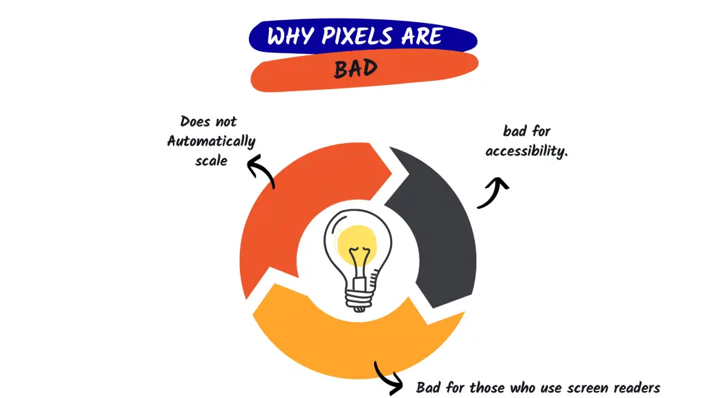
Pixels are a static unit of measurement. This means that they cannot be used to automatically scale elements on a page.
In responsive design, it is important to be able to scale elements based on the size of the screen or browser window. Otherwise, your website will not look good on mobile devices or larger screens.
Pixels are also bad for accessibility. Users who have difficulty seeing or those who use screen readers will have a hard time viewing your website if the font size is set in pixels.
Instead of using pixels, you should use relative units like rems or percentages. These units are relative to the parent element, which means they can be used to automatically scale elements on a page.
Rems are especially good for accessibility because they can be used to increase the font size for users who have difficulty seeing.
So, if you want your website to be responsive and accessible, avoid using pixels in your CSS. Use relative units like ems or percentages instead.
Are Pixels still Valid in 2022?
In 2022, pixels will no longer be the “go-to” unit of length for web developers. The main reason for this is that pixel values are based on the resolution of the device that is being used to view the website.
This can cause major problems when a website is viewed on a device with a different resolution than what the developer used when designing the website. The website will either appear too small or too large on the new device, which can be very off-putting for users.
Pixel Vs Rem
In the past, web developers have used pixels to define font sizes. However, this is no longer the best practice. The reason for this is that different browsers have different default font sizes.
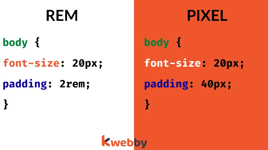
The term “root em” in CSS rem means “root em,” a unit of measurement that represents the font size of the root element. This implies that 1rem equals the html element’s font size, which is usually set to 16 pixels by most browsers.
REM Unit = Font size of the root html x Specified value of the element
For example, if Font size of root html element, say, 20px and padding value is assigned as 2rem, then computed value of REM in pixel will be 20px * 2 = 40px;

This can cause a website to appear differently on different browsers, which can be very confusing for users.
Instead of using pixels, web developers should use the rem unit. The rem unit is relative to the root element, which means that it will always be the same regardless of the browser that is being used.
This makes it much easier for developers to create websites that look consistent across all browsers.
In conclusion, pixels are no longer the best unit of length to use when styling a website. The rem unit is a better option because it is relative to the root element and it will always be the same regardless of the browser that is being used.
Responsiveness
In the web developer’s never-ending quest for site responsiveness, particular practices have become commonplace for many developers.
These practices are typically embraced by the more experienced developers, whereas many newer developers simply don’t know those practices exist.
Now that websites need to be designed with responsiveness in mind, the developer should use something more dynamic than pixels.
REM For Pixels
A far superior approach requires a mindset focused on implementing percentages, max-widths, and the rem unit.
This allows the HTML elements to scale according to the size of the screen. Images and sections should nearly always have the capability to effortlessly shrink and grow as needed.
Arguably, the most important reason to avoid using pixels is that pixels are static units. They don’t allow for scaling.
By using a unit such as rem, it can be set on the root element of the page, and everything after that can be sized relative to that one declaration. In other words, it’s possible to adjust the size of every element on the page with just one simple change to the style sheet.
Why REMs are an Ideal Choice?
There are particular elements, however, that will require their sizes to be hardcoded. Again, rems are the ideal choice here unless the element is very small. Items such as widgets are good examples of elements whose sizes could be hardcoded.
It might be best to code them to a particular width, and then change that width once a certain minimum screen size is reached. But for the most part, developers should focus on fluid element design.
Websites from the early 2000s were less likely to implement these rules. They were much simpler and substantially less dynamic.
But CSS has grown and advanced by leaps and bounds over the years. What was common practice 20 years ago has been abandoned in favour of newer, more powerful, and more intuitive features.
By utilizing the aforementioned techniques, developers can easily create high-quality, visually appealing, and highly responsive websites.
Also read Why You should not use a Site Builder (3 Reasons)
Conclusion
While it is perfectly understandable to want to use pixels when first starting out with CSS, it is important to be aware of the other options available. By using pixels, you are limiting yourself to a single unit of measurement.
There are many other units of measurement available in CSS, and by using them you can create much more flexible and responsive designs. In the long run, using other units of measurement will make you a better developer and help you create better websites.
So, what are you waiting for? Start experimenting with other units of measurement today! Your future self will thank you.


