In today’s fast-paced world, conveying complex qualitative information in a clear, visual manner is essential for effective communication, especially in professional settings. Harvey Balls, the simple yet powerful graphical tool that has revolutionized how we represent qualitative data in documents, reports, and, notably, PowerPoint presentations.
These round ideograms excel in depicting completion levels, satisfaction rates, or any qualitative attribute across various comparison tables – be it evaluating products by features like price, quality, or safety.
Creating Harvey Balls in PowerPoint doesn’t just enhance your slides’ visual appeal; it makes your message more digestible. Think of them as the more nuanced siblings of pie charts or bar charts, offering a sophisticated way to showcase project status, comparative analyses, or even employee performance metrics, all without overwhelming your audience with plain text or complex tables.
Whether it’s showing a project as 75% complete with a three-quarters filled circle or indicating a high satisfaction level with a fully shaded ball, Harvey Balls communicate effectively where words fail, providing a better understanding of project management, product comparisons, and data visualization tasks.
How to download Canva as PowerPoint (PPT) file in 2 Clicks
Steps to create Harvey Balls in PowerPoint
Mastering how to create Harvey Balls in PowerPoint is a skill worth having in any toolkit, especially for those keen on enhancing their presentations, reports, or any PowerPoint template with these visually engaging elements.
From inserting basic shapes to adjusting fill colors and utilizing the shape format tab for fine-tuning, this guide will walk you through every step to add Harvey Balls icons to your PowerPoint slides efficiently.
Whether you’re aiming for a custom Powerpoint Harvey Balls design or utilizing multiple Harvey Balls to compare different attributes, this introduction sets the stage for elevating your PowerPoint presentations beyond mere textual data to a more engaging, informative visual communication medium.
Step 1: Inserting the Basic Shape
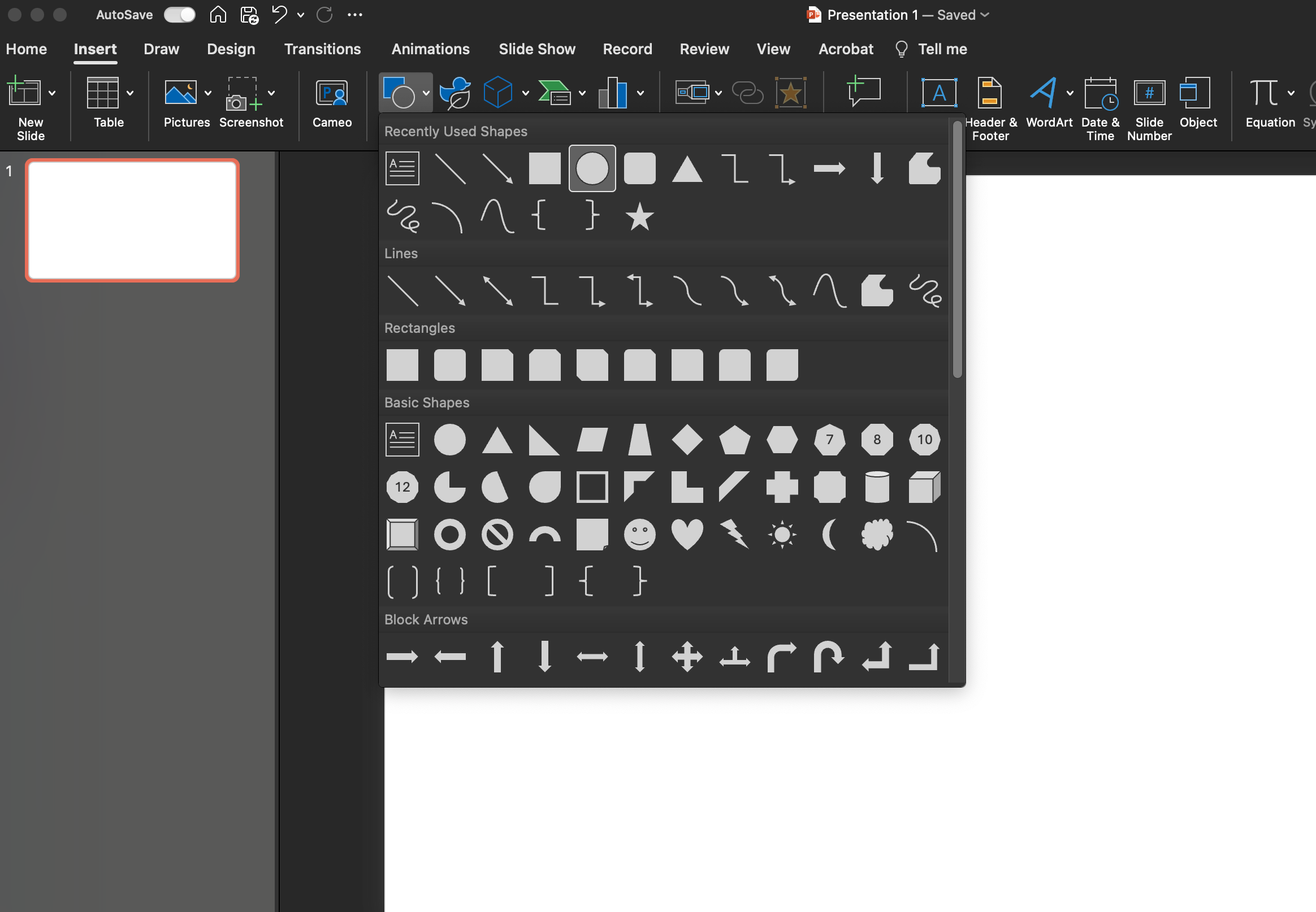
Go to the Insert tab in the top menu bar in PowerPoint presentation, Click on the Powerpoint “Shapes” icon and select the Oval shape. To create a perfect circle, hold the Shift key while you draw on your slide.
Step 2: Formatting Your Circle
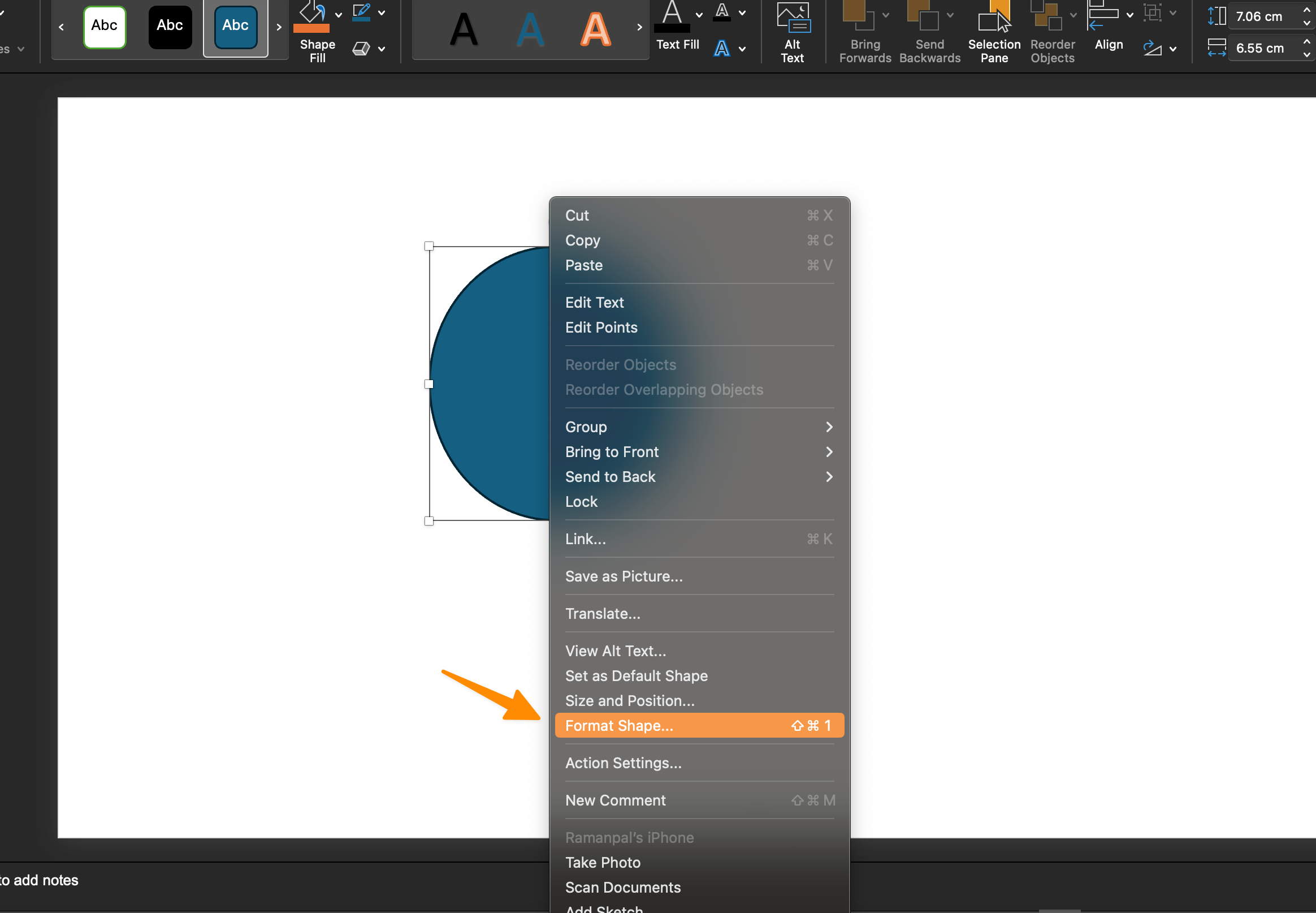
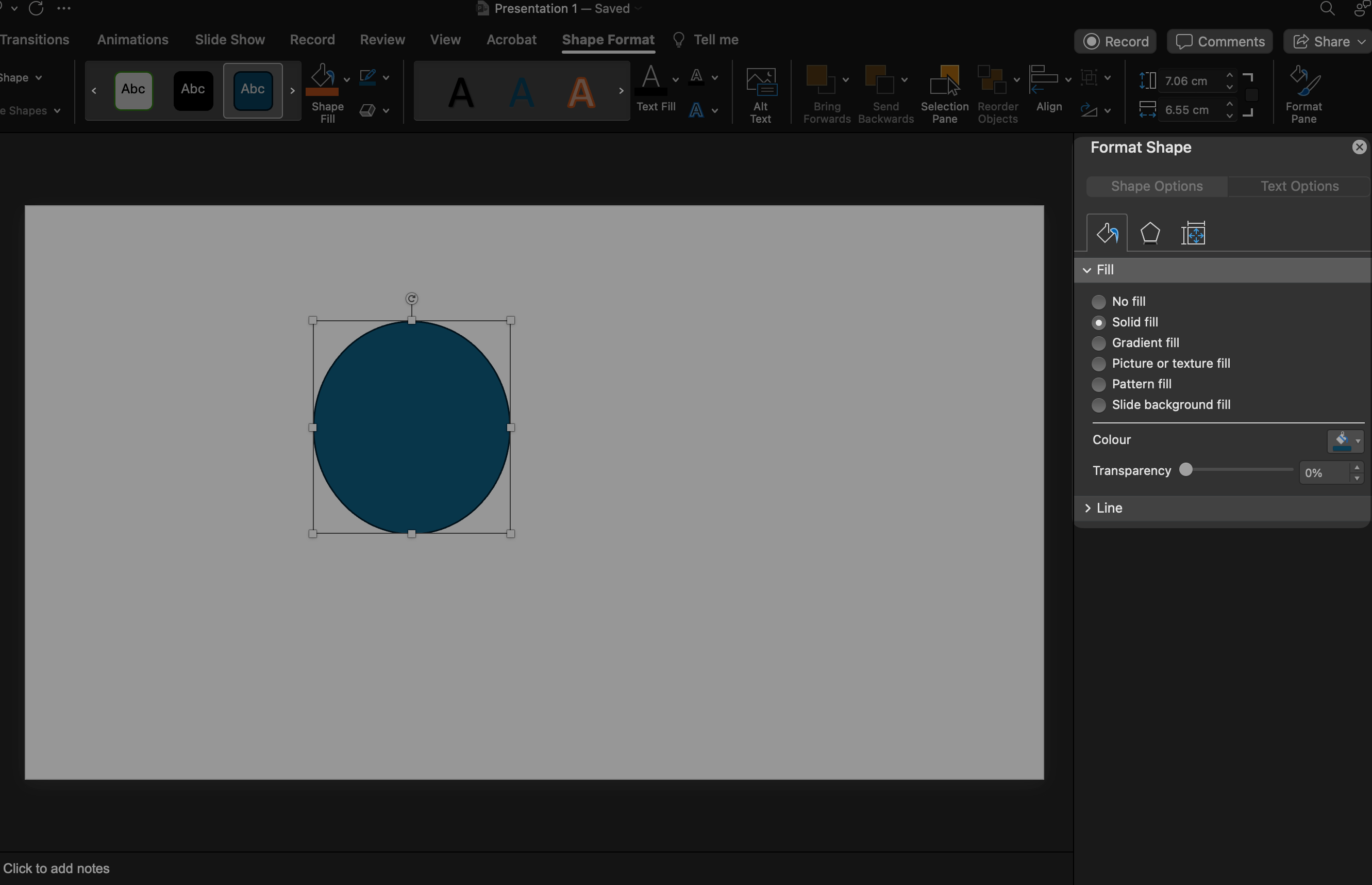
Head over to the Shape Format tab to polish the circle you’ve just created.
Here, PowerPoint offers you a range of presets to choose from, or you can go the extra mile and select an individual shape fill to create a custom Harvey ball.
Step 3: Adding the Partial Circle
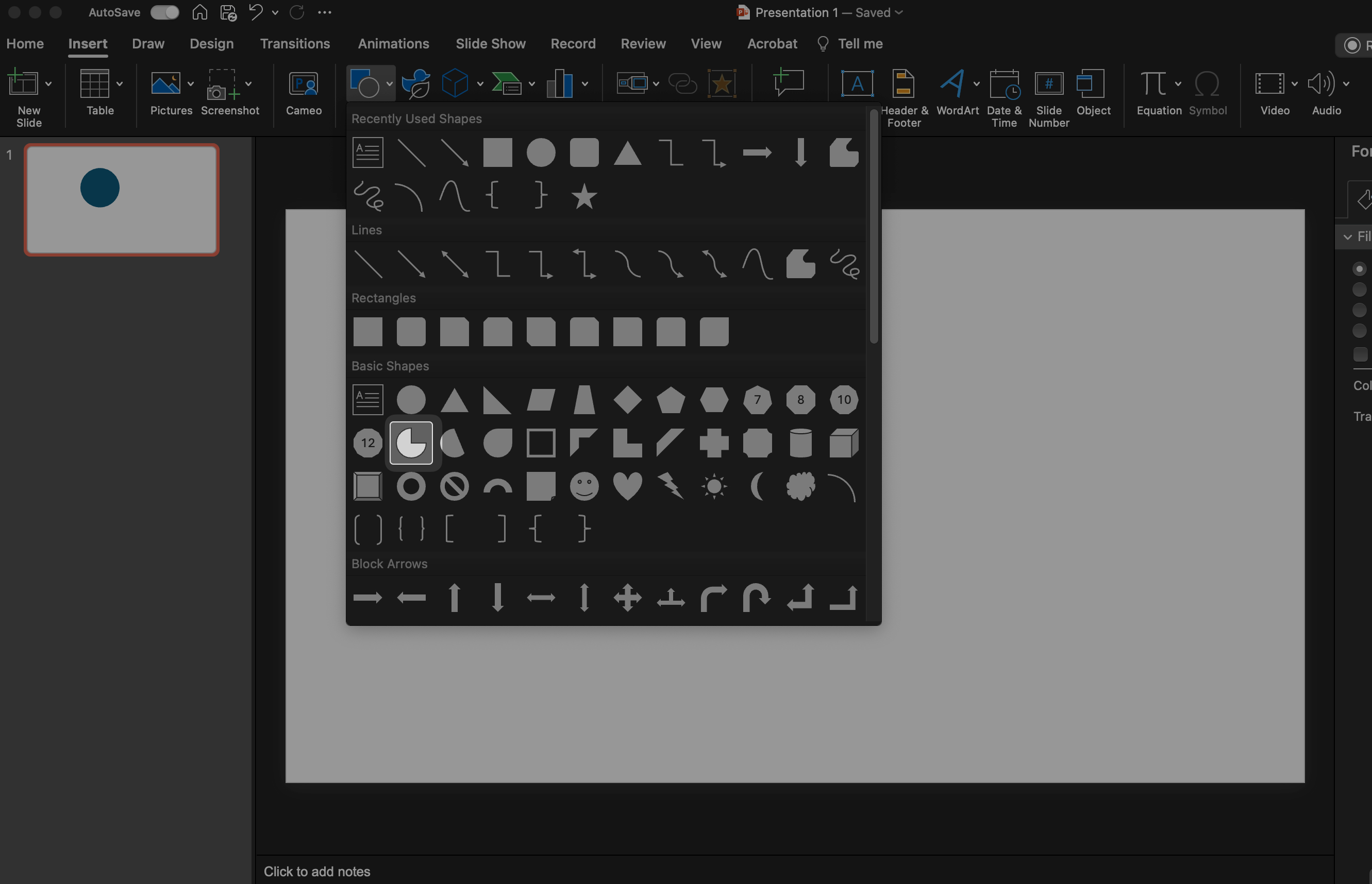
Navigate back to the Insert tab and look for the Partial Circle option.
Draw a partial circle that aligns in size with the first oval by holding the Shift key and dragging the mouse accordingly. It’s crucial that both the shapes are of the same size for coherence.
Remember to format the partial circle similarly, ensuring that it complements the full circle both in shape and shade.
Step 4: Merging the Shapes
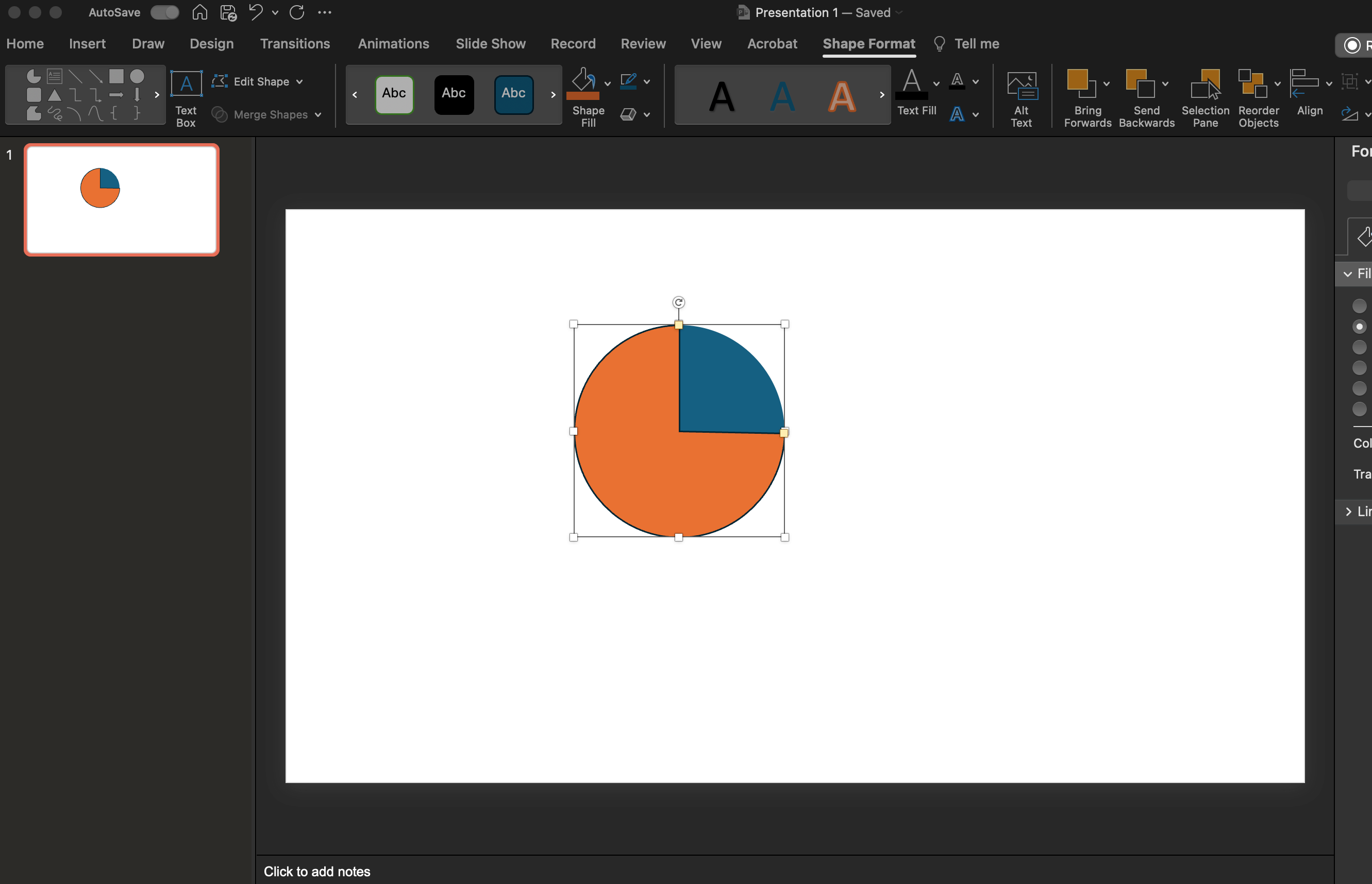
Place the partial circle directly atop the first full circle. You’ll notice orange dots around the partial circle; these serve as handles to adjust the “amount of circle” or shade.
Manipulate these handles to shade the ball exactly as per your requirement, effectively using the shape to represent quantitative data or progress levels visually.
Step 5: Grouping the Shapes
Finally, select both the shapes by holding your left mouse button and sliding it over the created circles. Right-click and choose “Group” > “Group” from the context menu.
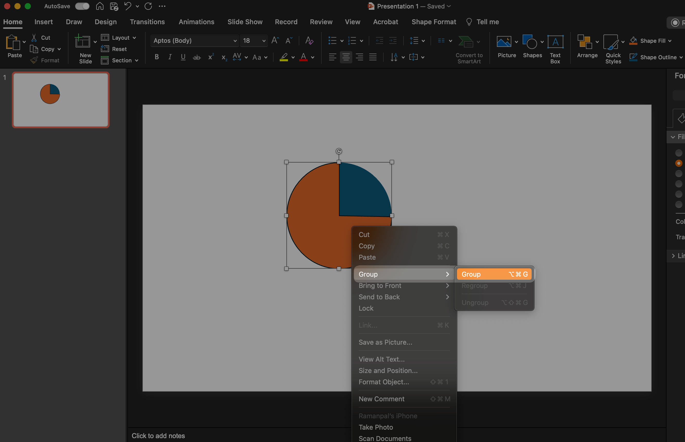
This action amalgamates your two shapes into a singular entity, allowing you to maneuver your newly created Harvey ball across the PowerPoint slide as a cohesive unit.
Grouping simplifies further adjustments or movements, saving space and time while enhancing the presentation’s visual appeal.
Each of these steps underscores the ease of creating Harvey balls PowerPoint widgets, from basic shapes to a grouped, informative visual tool. Whether for project management reviews, data visualization tasks, or comparative analysis in PowerPoint presentations, mastering the creation of Harvey balls significantly augments the conveyance of qualitative and quantitative information.
Advantages & Disadvantages of Harvey Balls
Round ideograms are sometimes known as Booz balls. Harvey L. Poppel, an IT investor, used them for the first time in the 1970s to showcase and compare distinct datasets. Harvey balls are becoming more popular, and they have both advantages and disadvantages. The following are the advantages of adopting a Harvey ball diagram.
Advantages
The advantages of leveraging Harvey balls in PowerPoint presentations are significant and varied.
They enable the display of comprehensive datasets within a singular visual frame. Especially useful in PowerPoint slides or pages, Harvey balls facilitate the presentation of diverse data types compactly. Users can transpose data from expansive tables or documents onto a Harvey ball diagram, simplifying complex datasets into easily understandable visuals.
This is particularly advantageous for comparative analyses, such as juxtaposing sales percentages between competitors, which can be efficiently depicted on a Harvey ball. Consequently, viewers do not need to dissect each column of a comparative matrix—essential insights are synthesized within the Harvey ball diagram, streamlining data analysis while maintaining data integrity.
Harvey balls excel in the visual representation of qualitative data, making it accessible and immediately interpretable to the audience. This contrasts sharply with the cognitive load required to parse through numerical data, enhancing data comprehension without compromising on detail. The substitution of numbers with graphical elements enables quicker data appraisal by the audience, circumventing the confusion often associated with dense numerical information.
Harvey balls are a stalwart feature in reportage and project documentation. Their utility extends beyond mere comparative charts; they are pivotal in project management updates, progress tracking, and comprehensive reporting. Professionals across sectors incorporate Harvey balls in reports and presentations to distill complex data into manageable insights, economizing on space while enriching data interpretation.
Disadvantages
While Harvey balls serve as a powerful tool for visualizing and comparing data within PowerPoint presentations, they are not universally applicable or understood in all contexts.
Not Suitable for All Situations: Harvey balls might not effectively communicate the intended message or data in certain scenarios. When comparing the ratings of two products, for example, a star rating system might be more intuitive. A 5-star rated product is instantly recognizable as superior to one with a 3-star rating, whereas Harvey ball icons might not convey this distinction as clearly.
Limited Popularity: Unlike more universally recognized symbols such as emojis or pie charts, Harvey balls in PowerPoint have not achieved widespread adoption. This limited popularity means that they might not be the first choice for data representation in PowerPoint presentations, with many preferring more familiar visual tools like pie charts and bar charts for displaying their data.
Usability: While the creation of multiple Harvey balls can significantly enhance the visual appeal and qualitative data representation of a PowerPoint slide, not all audience members will find them to be an effective means of communication. The use of different shapes and shades to represent varied datasets can be confusing for some, complicating the comprehension of the data being presented. In these instances, a simple pie chart might be more effective at conveying the same information in a more universally understandable format.
Understanding these limitations is crucial for effectively choosing the right visual communication tools for your PowerPoint presentations. While Harvey balls offer a unique method for qualitative and quantitative data visualization, recognizing when to use them—and when other tools like pie charts, bar charts, or even plain text might be more appropriate—can lead to a better understanding and more impactful presentations.
More PowerPoint Resources
Conclusion
Harvey balls emerge as a quintessential visual tool for qualitative data representation, excelling particularly in the comparison of analogous data sets. Their application shines in scenarios such as contrasting competitor products or dissecting market data, where the nuances of qualitative information are as critical as the quantitative figures. The utilization of Harvey balls in PowerPoint presentations enables a nuanced yet clear comparison, allowing for a concise yet comprehensive depiction of complex data. Although the implementation of Harvey balls PowerPoint icons comes with its own set of strengths and weaknesses, their value in certain analytical contexts is undeniable.
Creating Harvey balls in PowerPoint involves leveraging tools such as the shape format tab and insert tab, along with employing basic shapes like the oval shape and partial circle to craft custom Harvey ball icons that suit the specific needs of your presentation. Not only does this approach save space on your PowerPoint slide, but it also enhances the visual appeal of your data visualization efforts. By incorporating multiple Harvey balls or individual Harvey ball diagrams, presenters can efficiently communicate project status, compare qualitative and quantitative data, or even showcase different employee performances in a visually engaging manner.
Despite the advantages, the process to create Harvey balls and their application is not universally suited for every scenario. For instance, in comparing product ratings, traditional pie charts might offer a more intuitive understanding at a glance compared to Harvey balls PowerPoint slides. Additionally, the recognition and understanding of Harvey ball icons may not be immediate for everyone, suggesting that in some cases, alternative visual communication methods like bar charts, plain text, or even pie charts may be more effective for ensuring a better understanding among all audience members.
Ultimately, mastering how to create Harvey balls in PowerPoint and understanding when to use them can significantly elevate the efficiency and impact of your PowerPoint presentations. Whether you’re presenting qualitative data, managing project updates, or comparing competitor metrics, Harvey balls serve as a powerful tool in your data visualization toolkit, balancing aesthetic appeal with insightful data representation.


