Large layout shifts make a page feel unstable. A user tries to tap a button, and the button moves. A headline jumps after it loads. A cookie banner pushes content down. These shifts hurt user trust and they lower your Core Web Vitals score. This detailed guide shows how to fix “Avoid large layout shifts” using practical checks, clear rules, and copy-paste code patterns.
Key Takeaways
- Measure layout shifts with Lighthouse, PageSpeed Insights, and Chrome DevTools, then confirm the real shifting element.
- Reserve space for images, video, ads, and embeds using width/height, CSS aspect-ratio, and stable containers.
- Stop late-loading UI (banners, bars, popups) from pushing content by using overlays or reserved slots.
- Fix font-related shifts with
font-display, better fallbacks, and size-adjust where needed. - Reduce shifts from async content by using skeletons, placeholders, and predictable component heights.
- Re-test CLS after each change and monitor field data in Search Console and RUM tools.
What “Avoid large layout shifts” means (and why it matters)
Lighthouse shows “Avoid large layout shifts” when your page creates visible movement after the first paint. Google tracks this as CLS (Cumulative Layout Shift). CLS is part of Core Web Vitals. CLS measures how much content moves without user intent.
Use these targets:
- Good: CLS ≤ 0.1
- Needs improvement: 0.1 to 0.25
- Poor: > 0.25
Next, you need to find what shifts and why it shifts.
How to find the exact elements that cause layout shifts
You will fix CLS faster when you can name the element and the event that triggers the shift. Start with lab tools, then confirm with field data.
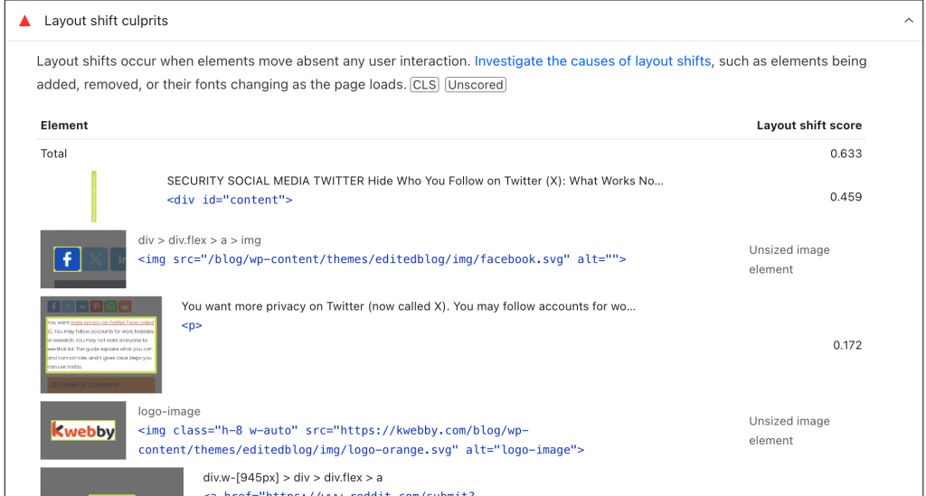
Check Lighthouse and PageSpeed Insights
- Run Lighthouse in Chrome DevTools (Desktop and Mobile).
- Open the “Avoid large layout shifts” audit details.
- Note the listed elements and the “Largest layout shift” entries.
- Run PageSpeed Insights for the same URL to compare lab and field signals.
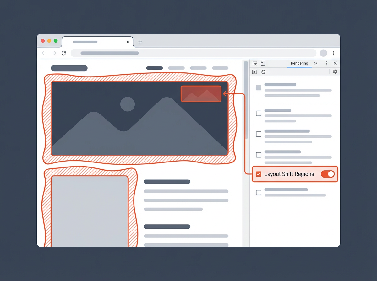
Use Chrome DevTools “Layout Shift Regions”
- Open DevTools → More tools → Rendering.
- Enable Layout Shift Regions.
- Reload the page and watch highlighted areas as they move.
This view gives you a fast visual map of what jumps.
Record a Performance trace and read the “Experience” track
- DevTools → Performance → click Record.
- Reload the page and wait until it settles.
- Stop recording and open the Experience section.
- Click layout shift events to see affected nodes.
Now you have a short list of root causes. Move to fixes in priority order.
Next, you will lock down the most common CLS sources: media, ads, and embeds.
Fix CLS from images, video, and iframes (reserve space)
Media is the top CLS cause on many pages. The browser needs dimensions before it downloads the file. If the browser does not know the size, it lays out the page, then it reflows when the media loads. Your job is simple: reserve the correct space upfront.
Always set width and height on images
Modern browsers use width and height to calculate aspect ratio. This prevents jumps even when the image loads late.
<img
  src="/images/hero.jpg"
  width="1200"
  height="675"
  alt="Product hero image" />
- Keep the attributes even if you use responsive CSS.
- Use correct intrinsic dimensions, not random numbers.
Use CSS aspect-ratio for responsive media
If you use fluid layouts, add aspect-ratio to the container or the media element.
.card-media img {
  width: 100%;
  height: auto;
  aspect-ratio: 16 / 9;
  display: block;
}
- Use the real ratio for each component type.
- Set
display: blockto remove inline image gaps.
Reserve space for iframes and embeds
Embeds often load after the main content. They can expand and push content down. Wrap them in a fixed-ratio box.
.embed {
  aspect-ratio: 16 / 9;
  width: 100%;
  background: #f3f4f6;
}

.embed iframe {
  width: 100%;
  height: 100%;
  border: 0;
}
Fix CLS from lazy-loaded images
Lazy loading helps performance, but it can cause CLS if you do not reserve space.
- Keep
widthandheighton lazy images. - Do not lazy-load the hero image above the fold.
- Use
fetchpriority="high"for the main hero image when needed.
<img
  src="/images/hero.jpg"
  width="1200"
  height="675"
  fetchpriority="high"
  alt="Hero" />
Next, you will fix a major CLS trigger that many teams miss: ads and dynamic slots.
Fix CLS from ads, banners, and dynamic slots
Ads and promotional blocks often load late and change height. The page shifts because the slot starts small and grows. The fix is to create stable ad containers and avoid inserting new blocks above existing content.
Give ad slots a fixed size (or a stable min-height)
- Use known ad sizes when you can.
- Use
min-heightto reserve space when size varies. - Center the ad inside the reserved space to avoid awkward gaps.
.ad-slot {
  min-height: 250px;
  width: 100%;
  background: #f3f4f6;
  display: flex;
  align-items: center;
  justify-content: center;
}
Do not inject content above the fold after render
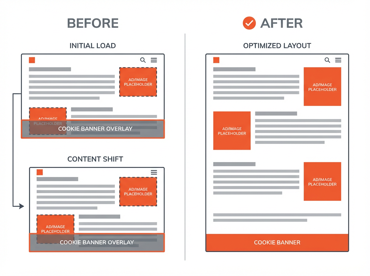
If a script inserts a banner at the top after the page loads, it will push everything down. Use one of these patterns instead:
- Reserve a slot: add a placeholder area in the layout from the start.
- Use an overlay: position the banner fixed and do not affect document flow.
- Insert below the current viewport: add content lower on the page.
Use overlays for cookie banners and promo bars
An overlay avoids layout changes because it does not push content. Use clear spacing so it does not block key actions.
.cookie-banner {
  position: fixed;
  left: 0;
  right: 0;
  bottom: 0;
  z-index: 9999;
}
- Keep the banner height consistent across breakpoints.
- Add padding to the page only if you do it before first paint.
Prevent “collapse then expand” patterns
Some ad libraries render a tiny placeholder, then expand. This creates a large shift. Fix it by:
- Rendering the full reserved slot size from the start.
- Using a skeleton that matches the final height.
- Keeping a stable min-height even when no ad fills.
Next, you will fix font shifts, which can create CLS even on pages with no ads.
Fix CLS from web fonts (FOIT and FOUT)
Fonts can cause layout shifts when text renders in a fallback font first, then swaps to the web font. The swap can change line breaks and element height. You need faster font delivery and more compatible fallbacks.
Use font-display to control swapping
Set font-display in your @font-face rules.
@font-face {
  font-family: "MyFont";
  src: url("/fonts/myfont.woff2") format("woff2");
  font-display: swap;
}
swapreduces invisible text time, but it can still shift.optionalcan reduce shifts by skipping the swap on slow connections.
Preload critical fonts
Preload the main font used above the fold to reduce late swaps.
<link
  rel="preload"
  href="/fonts/myfont.woff2"
  as="font"
  type="font/woff2"
  crossorigin />
Pick better fallback fonts to match metrics
- Use a fallback stack with similar x-height and width.
- Avoid a fallback that makes text much wider or taller.
body {
  font-family: "MyFont", system-ui, -apple-system, "Segoe UI", Roboto, Arial, sans-serif;
}
Use size-adjust for closer matching (when needed)
CSS font metric overrides can reduce layout changes by aligning fallback metrics with the web font.
@font-face {
  font-family: "MyFont Fallback";
  src: local("Arial");
  size-adjust: 105%;
  ascent-override: 90%;
  descent-override: 22%;
  line-gap-override: 0%;
}
Use this only after you confirm font swapping is a top CLS source.
Next, you will handle shifts caused by late data and UI state changes.
Fix CLS from dynamic content and late-loading UI
Many sites load product lists, comments, reviews, or related posts after the first paint. If the container has no reserved height, it expands and pushes content. Fix this with predictable layout boxes.
Use skeletons that match final dimensions
- Create a placeholder with the same height as the final component.
- Keep the number of placeholder lines close to the final content.
- Do not shrink the placeholder after data arrives.
.reviews {
  min-height: 420px;
}
Reserve space for accordions and expandable sections
User-triggered expansion does not count against CLS. But auto-expansion after load can count. Fix auto-expansion by:
- Keeping sections collapsed until the user clicks.
- Rendering the expanded state from the start if it must be open.
- Setting a stable min-height for the container if content loads late.
Avoid inserting new content above existing content
This is a common Lighthouse warning. Examples include:
- “Sign up” bars injected at the top
- Breaking news strips inserted above the headline
- App install prompts that push content
Fix options:
- Render the container in the initial HTML and fill it later.
- Use an overlay that does not change layout flow.
- Insert content below the first viewport.
Stabilize components that depend on A/B tests
Experiments can swap headlines, buttons, and hero blocks. This can create shifts if variants have different heights.
- Keep variant layout boxes the same height.
- Use consistent font sizes and line counts for key blocks.
- Apply experiment changes before first paint when possible.
Next, you will fix CLS caused by CSS and JavaScript patterns that trigger reflow.
Fix CLS caused by CSS, JS, and rendering patterns
Some shifts come from code that changes layout after the first render. This includes late-applied CSS, measuring elements then changing sizes, and animations that move layout boxes.
Inline critical CSS for above-the-fold layout
- Load critical CSS early so the first layout is close to final layout.
- Defer non-critical CSS that does not affect above-the-fold structure.
If the page renders unstyled content first, then applies CSS later, the page can jump.
Avoid layout-triggering animations
Animations that change height, width, top, or left can shift layout. Prefer transforms.
- Use
transform: translate()instead of changingtop/left. - Use
opacityfor fades. - Avoid animating
font-sizeon load.
Do not measure then mutate layout in the same frame
Some scripts read layout values (like offsetHeight) and then write styles right away. This can cause forced reflow and visible movement.
- Batch reads, then batch writes.
- Use
requestAnimationFramefor coordinated updates.
Handle sticky headers without pushing content
A header that becomes sticky can change height and push content down. Fix it with a stable header height.
- Keep the header height constant across states.
- If the header shrinks, use transforms instead of changing height.
Next, you will validate fixes and set up monitoring so CLS does not return.
How to test, validate, and monitor CLS after fixes
CLS work needs a tight loop: change, test, confirm, and monitor. Lab tests catch obvious issues. Field data confirms real users see improvement.
Re-run Lighthouse with consistent settings
- Test the same URL, device profile, and throttling each time.
- Run at least 3 tests and compare the median result.
- Confirm the “Avoid large layout shifts” list shrinks or disappears.
Use Search Console Core Web Vitals reports
- Check Mobile and Desktop groups.
- Track CLS improvements over 28 days (field data window).
- Validate fixes after Google recrawls and reprocesses data.
Add real user monitoring (RUM) for CLS
- Collect CLS per page template (home, category, product, article).
- Segment by device type and connection type.
- Alert on regressions after releases.
Use a CLS checklist for releases
- Every image has width and height.
- Every embed has a reserved box.
- Ads have stable slots and min-heights.
- Banners use overlays or reserved space.
- Fonts preload and have safe fallbacks.
- No script injects content above the fold after render.
Next, use the FAQ section to clear up common CLS edge cases.
Frequently Asked Questions (FAQs)
What is the fastest way to fix “Avoid large layout shifts”?
Start with images and ads. Add width and height to images, then add stable containers for ads and embeds. These changes often remove the biggest shifts.
Do layout shifts from user clicks count in CLS?
No. CLS ignores shifts that happen within 500 ms of a user input. Auto-expansion and late-loading content still count.
Can a cookie banner hurt CLS?
Yes. A banner that pushes content down after load can cause a large shift. Use a fixed overlay or reserve space from the first render.
Why does CLS get worse on mobile?
Mobile screens have less space. Small height changes can push content further. Ads, fonts, and responsive images often create bigger shifts on mobile.
Does lazy loading always cause CLS?
No. Lazy loading causes CLS when you do not reserve space. Keep width and height attributes or use aspect-ratio so the layout stays stable.
How do I know if fonts cause my CLS?
Use a Performance trace and look for layout shifts that happen when fonts load. You can also test by disabling web fonts and comparing CLS.
Final Thoughts
Large layout shifts come from one core problem: the page renders without knowing final sizes. You fix CLS by reserving space for media, ads, and embeds, by preventing late UI from pushing content, and by reducing font swap movement. Run Lighthouse and DevTools to confirm the exact shifting elements, apply the patterns in this guide, then monitor field data to prevent regressions. If you want faster results, start with images and ad slots today, then move to fonts and dynamic components in your next release.


